
Color is a matter of perception. Each color represents a different defined wavelength, yet each of us perceives color differently depending on our sense faculties. Furthermore, we all have different cultural or contextual associations that we tie to color.
There are a lot of great articles and videos about color theory and the color wheel and a lot of tools for generating color palettes out there. But sometimes you’ll find in practice that those articles don’t quite click, that the color combinations don’t match very well or that the generated color palettes just don’t work as well in the context of your project.
So what do you do? How can you start thinking about and seeing colors in a way that makes them easier for you to choose and tweak to your needs?
I’ve done videos and articles before on how to choose UI colors and how to use colors to solve complex UI problems.
But that’s not the only way we can choose colors and for some of you this might be the key to helping you understand this topic.
One of our DesignerUp students was struggling with this recently. Color theory terms like complimentary and monochromatic, saturation and brightness just weren’t clicking for them.
So I set out to break down color in a different way; by pulling from traditional visual and graphic arts like painting and interior design and framing it in a way that makes it simple and relevant for what we do as UI designers.
What I discovered is that on digital screens, there is a formula and safe range of Saturation and Brightness that will result in a perfect palette for each category every time.
Watch the video or jump to the article below to find out how.
Matching color palettes and balancing color schemes
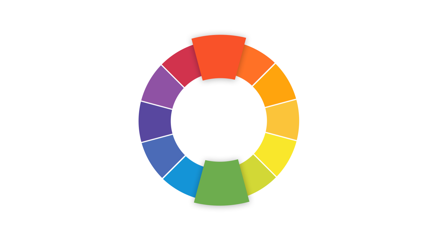
Maybe you’ve followed all the color harmony and color theory tutorials to a tee and generated a complimentary color palette, but you notice that the colors don’t seem to match very well, perhaps they looks harsh or a bit muddy and you're not sure why.
Creating good color schemes is all about matching and balancing hue, tint, tone, shade and temperature. To successfully do this in your design apps you just have to know which levers to pull.
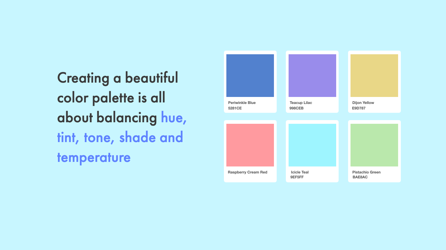
Color harmony and color theory offer some formulas that we can use to start our color palettes its an important foundation to understand and I’ve done a video all about color harmony and color theory here our channel. But creating beautiful color palettes isn’t only about these formulas, it’s also about subtleties of balancing hue, tint, tone, shade and temperature.
These are the ‘levers’ that we can push and pull to achieve the more balanced and unique colors combinations for our UI designs.
So first, a little refresher on what these levers are and what they do.
COLOR is the general term we use to describe every hue, tint, tone or shade we see.
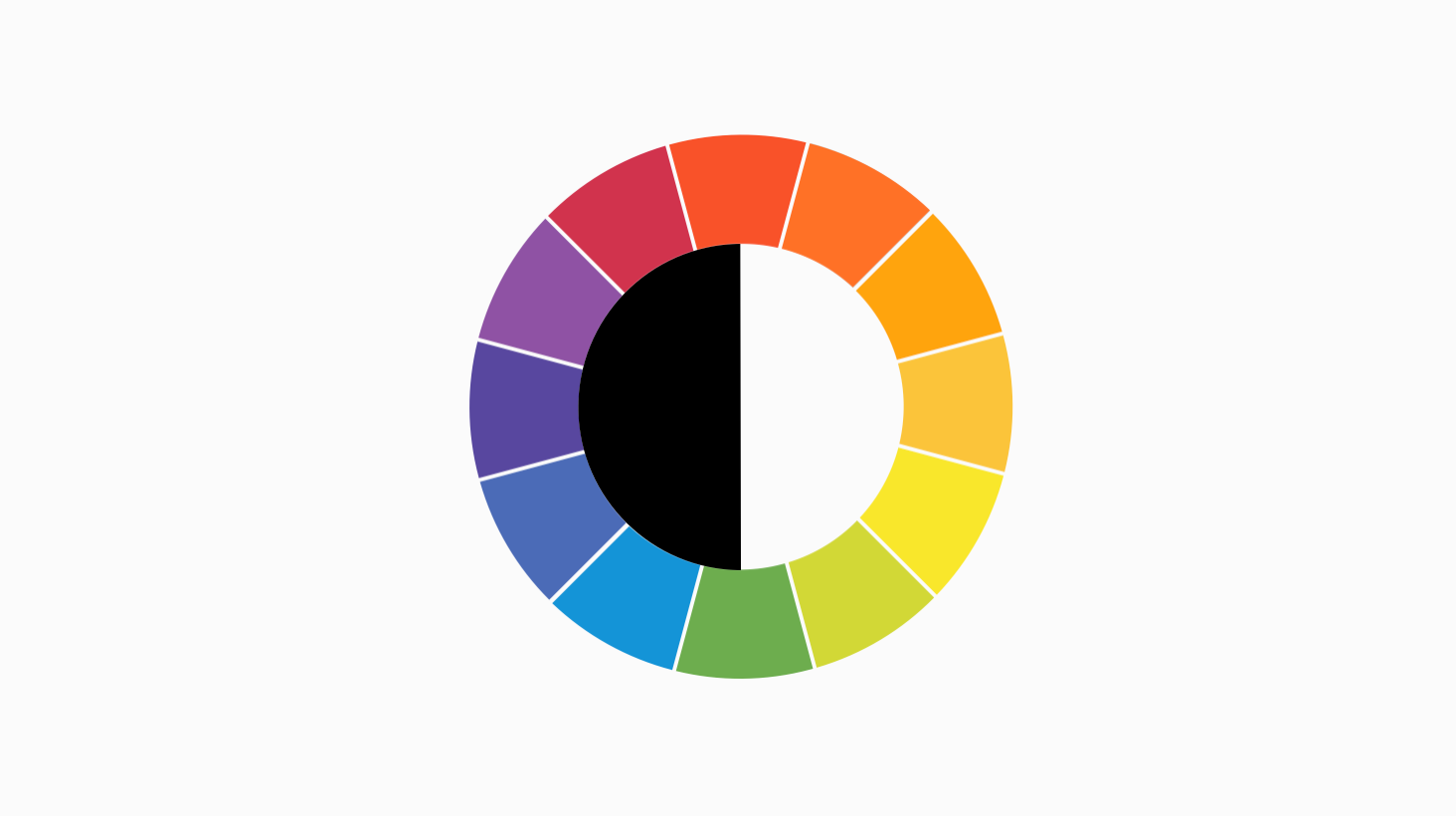
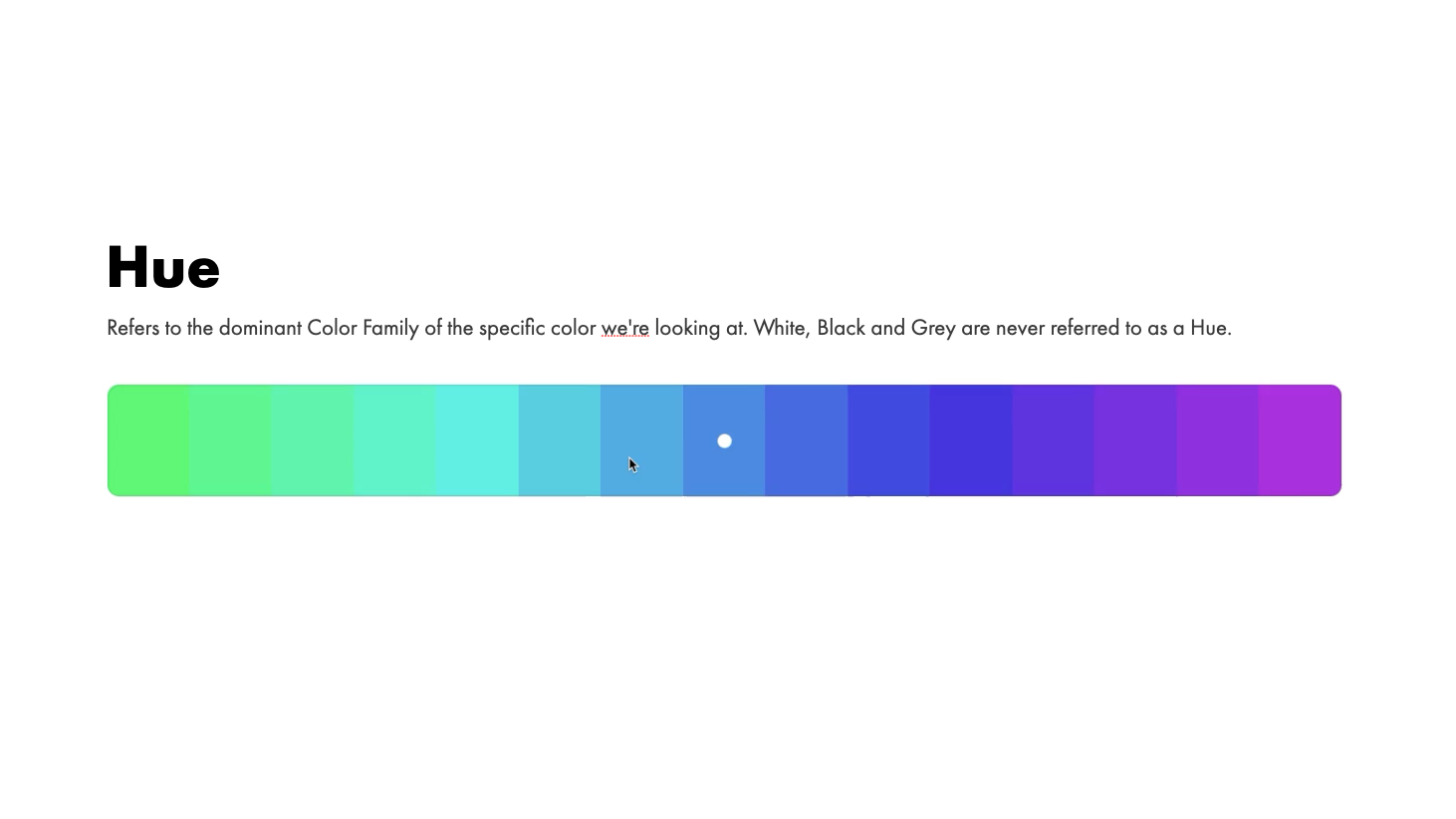
A HUE refers to the dominant Color Family of the specific color we're looking at. White, Black and Grey are not usually referred to as hue or color.
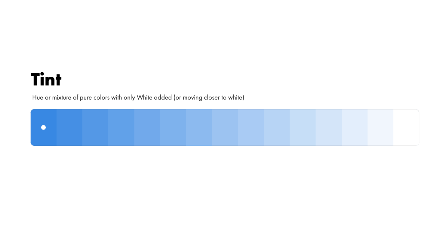
A Tint is any Hue or mixture of pure colors with only White added. A Tint lightens the color, but it doesn't make it brighter. Therefore a Tint can range from slightly lighter than your original color, all the way to White with barely any of the color mixed in.
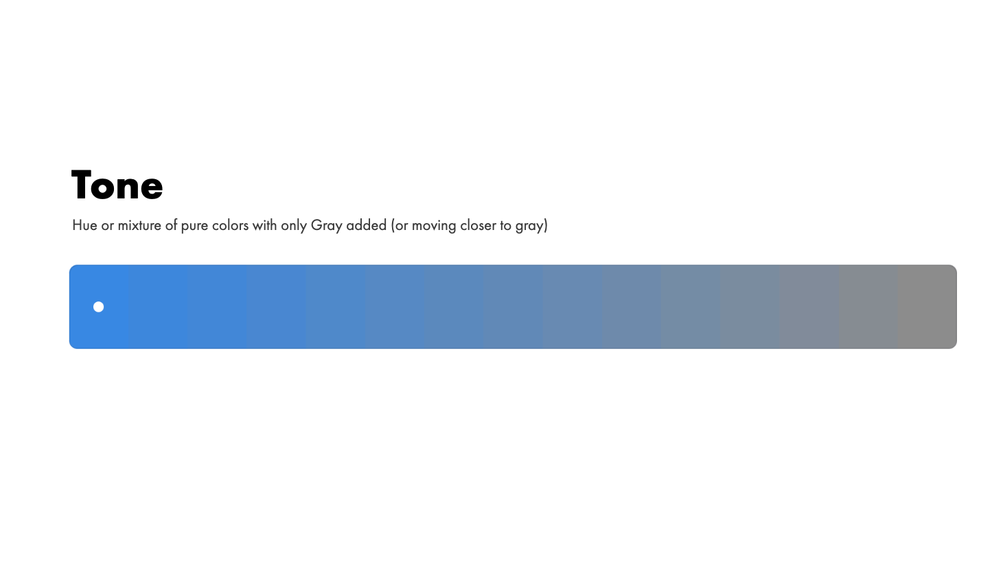
Tone is any Hue or mixture of pure colors with only Gray added. To be precise, this definition considers Gray as truly neutral. In other words, there are no additional pigments in the Gray other than White plus Black. A neutral mixture of Gray, no matter how light or dark, will tone down the intensity of any color.
Toned colors are generally considered more pleasing to the eye. They are complex, subtle and sophisticated. That's because bright pure colors are most often associated with children.
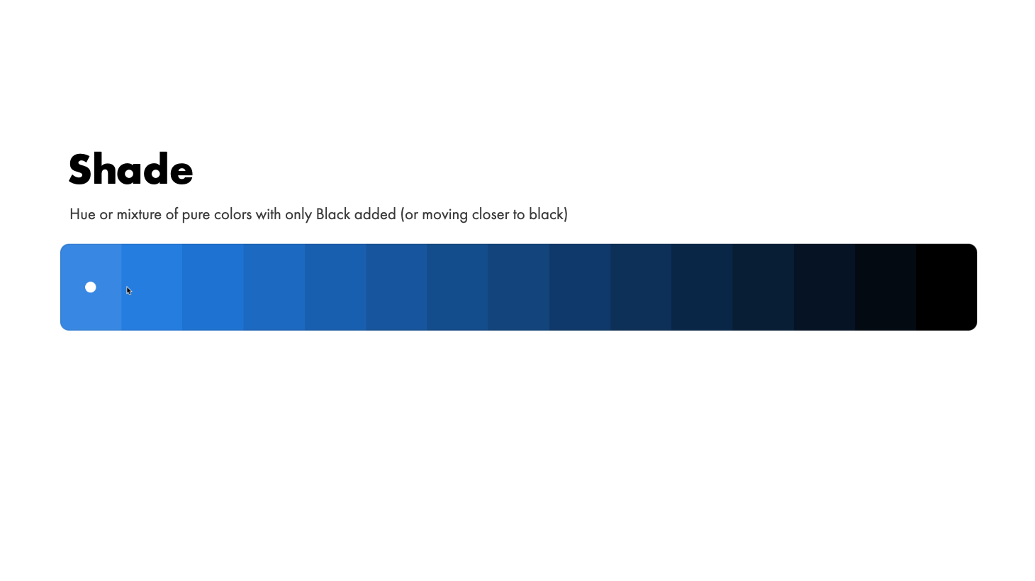
Shade is any pure Hue or mixture of pure colors with only Black added. In other words, it contains absolutely no White or Gray. A Shade darkens the color. It remains the same Hue only a darker version. As has been noted above, even a small amount of White or Gray added to a color, transforms it into a Tone. Therefore a Shade can range from slightly darker than your original color, all the way to nearly Black with barely any of the color mixed in. Done by adding a touch of black to your color.
Temperature - Temperature is more about how we perceive whatever hue we are seeing. and we tend to divide these into warm or cool.
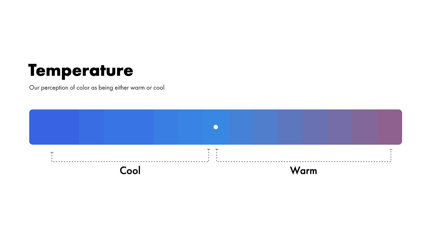
Warm colors - are the colors usually come from increase the red or yellow tones in a hue. These tend to evoke the feelings of passion, coziness, energy and motion. They remind us of sunlight and heat.
Cool colors - are the colors from increasing the blues and greens. These tend to evoke, freshness, winter, stillness, calming. They remind us of ice, snow and water.
To start off it’s important to understand what I mean when I refer to adding white, black or gray.
Color Models and Color Space
Since we’re not working with paint and we’re not actually mixing physical colors together we need to think about his in terms of of screens and for that what we’re talking about is light and the mixing of that light.
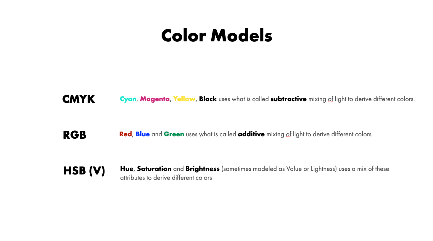
To get a little technical there are 3 different color models you may have heard of that will help us understand how light and color work together a little better.
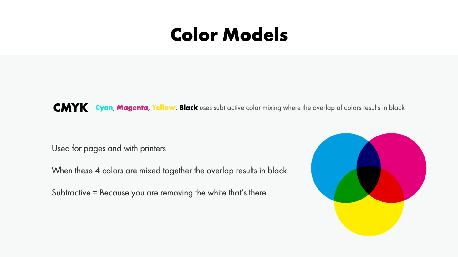
CMYK uses subtractive color mixing. It refers to the way light reflects of a physical white page. The the overlap of colors results in black. Because a page cannot project light and shine it at you it has to have light reflective off of it. So the mixing of these colors added together you are then covering up the white of the page and thus reducing the amount of light that is able to be reflected. Kind of like a kid mixing all the finger paint colors together and getting black.
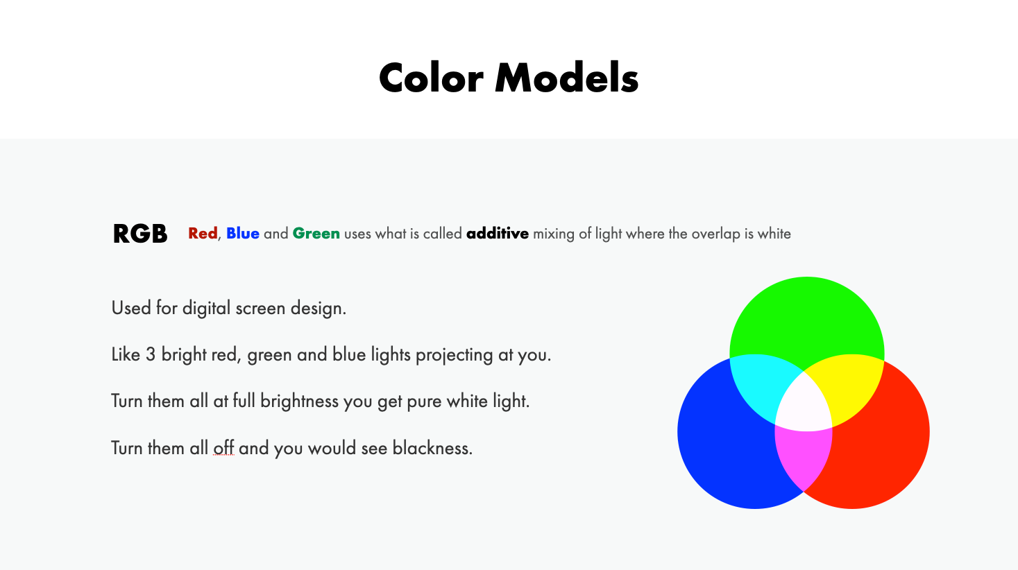
RGB is called additive mixing of light. It refers to the way digitals screens project the light out at us. Thee colors at full brightness result in us seeing an overlap of white. Kind of like being blinded by bright flood lights.
HSB - This stands for Hue, Saturation and Brightness (I talk about this in more detail in my video on choosing UI colors)
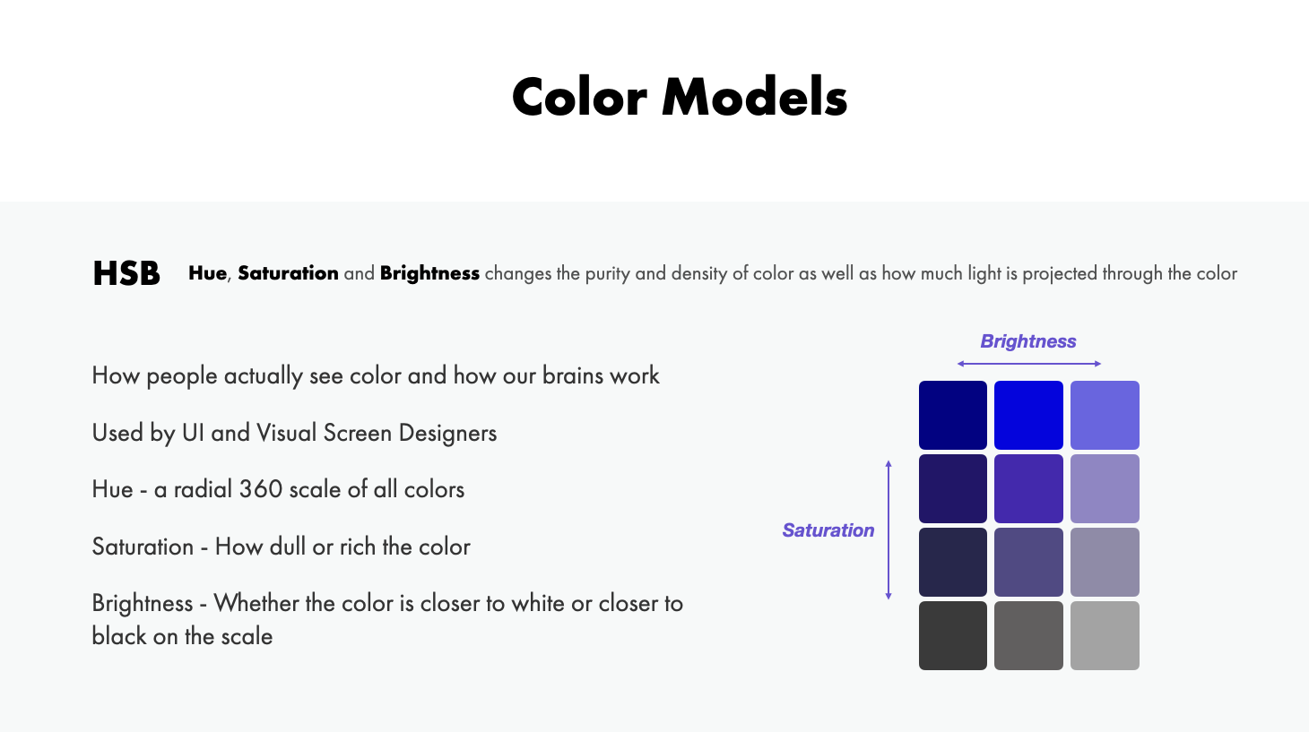
Most of you might be familiar with this as it's what you'll see in your design apps and UI/UX and Product Designers.
The HSB color model provides us with a radial of color (or a color wheel) in which we have a range of hues (the color), saturation (how much color) and brightness (how close to white or black on the scale it is) values.
This is how our eyes and brains interpret color HSB is all about what our eyes see, independent of whether it's light projecting from a screen or on paper.
By mixing the hue (color from the color wheel) the saturation (how vibrant the color is or how much gray is added to it) and brightness (how much white or black is added). This would result in a specific color.
So for the purposes of choosing colors for our UI designs, we are going to using the HSB color model.
Setting the color model in your design apps
Now the computer doesn't know if you are designing for screen or paper and therefore it must be told by our design apps.
By default, programs like Sketch and Figma will show RGB (for screens). You can change this to HSB in your design app, just keep in mind that not all colors are CMYK and RGB reciprocal.
How to change the color model in Sketch

How to change the color model in Figma
For this video we are going to focus on the HSB color model for our world of digital UI screen design but I'm going to talk about it more like a painter to help make this all a little more less technical and a little more practical and relatable.
Download the color formula cheatsheet for Figma and Sketch here!
Color Attributes
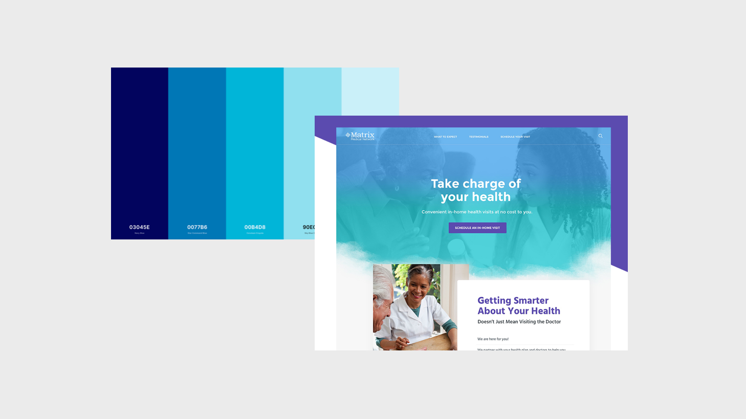
There are two larger groupings of colors that you often hear about. Warm and Cool.
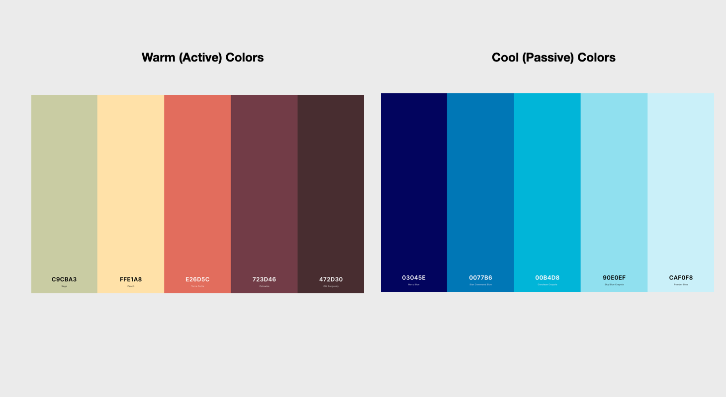
Warm colors are most often considered Active colors which means they draw more focal attention.
Cool colors tend to be considered more Passive and recede a bit.
Depending on how rich the colors are and how they are balanced you could have soft warm colors that play the role of a passive element while more vivid cool colors play an active role.
Color Categories and Families
So now that you understand how colors appear on screen and how to set up our design apps. Let's talk about how we can pull and push on these levers in our design software and balance our color schemes and palettes.
The trick to getting really great look color palettes is to stick with one category or pair one category with neutrals.
The best part is you only need to find 1 color to make it all match!
In order to derive these different color categories we will be focusing on pushing and pulling the levers of Hue, Saturation and Brightness (HSB).
All you need to understand is the formula and the safe range of Saturation and Brightness that to create the perfect palette.
To simplify things, I've group the major colors into 6 main generally recognizable color categories. These reflect the way we normally tend to refer to colors when speaking about them in everyday life:
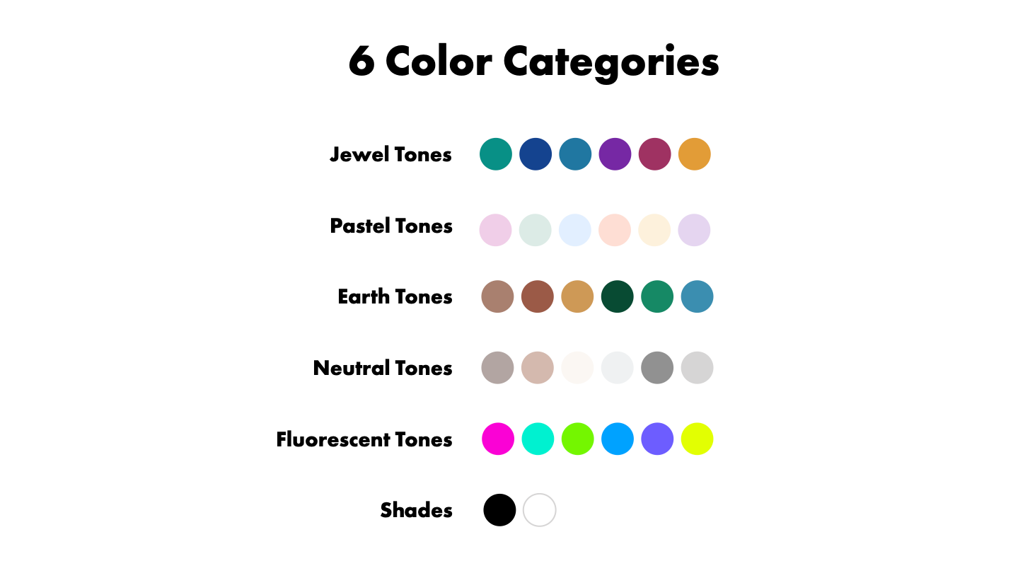
1. Jewel Tones
S:83-73, B: 76-56
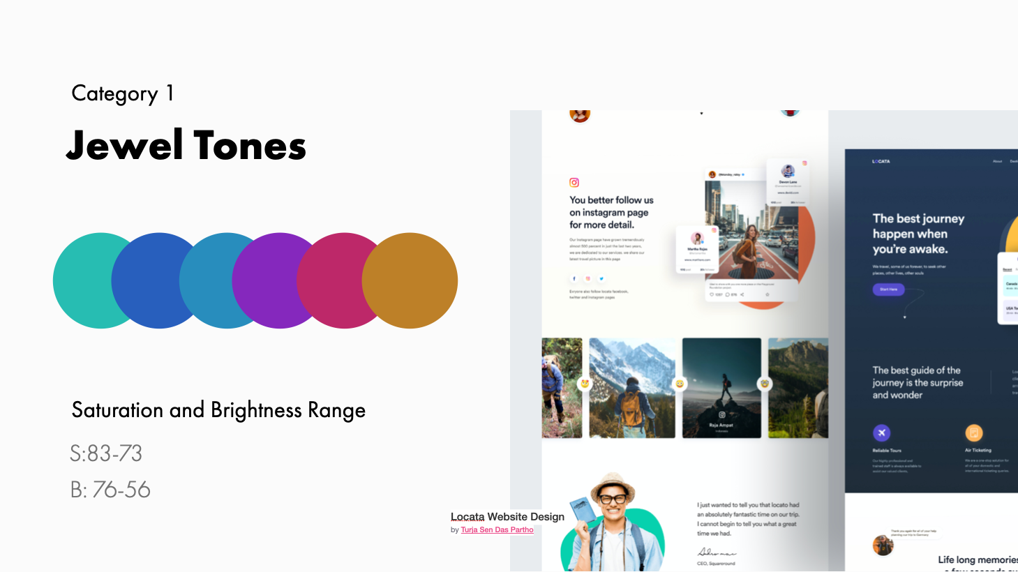
These colors that are richly saturated hues named for gems including sapphire blue, ruby red, amethyst purple, citrine yellow, and emerald green. Think of the deep richness of a red ruby necklace or a royal purple crown. These colors are regal, deep and impart a sense of luxury.
I’ve discovered that the ideal sat and bright for creating jewel toned color palettes lies with a saturation value[ range between and the brightness value range between
2. Pastels
S:14-21, B: 89-96
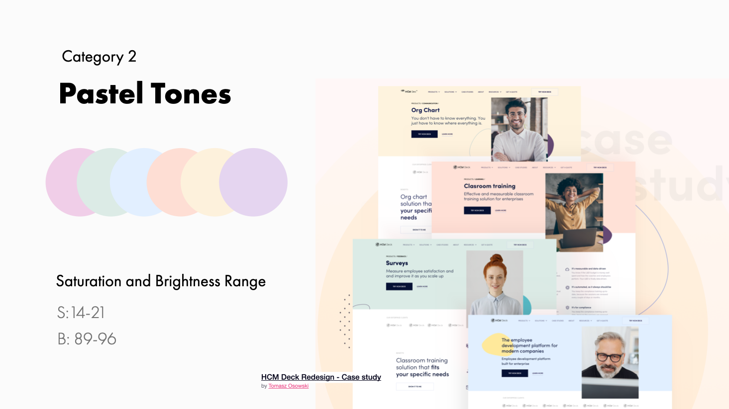
Pastel colors belong to the pale family of colors. Pink, mauve, and baby blue are commonly used pastel colors, as well as colors like magic mint, peach, periwinkle, and lavender. The colors of this family are usually described as "soothing". We create these colors by reducing the saturation and adjusting the tint (dragging into the white area).
3. Earth tones
S: 36-41, B: 77-36
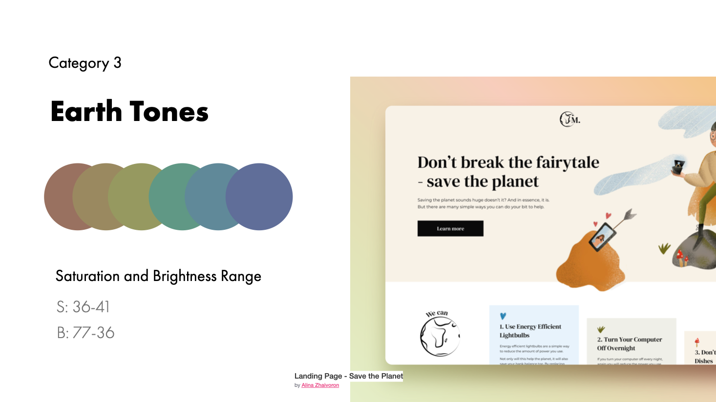
These are colors commonly found in nature. Many earth tones originate from clay pigments like umbre, ochre and sienna. They can be created by combining a pure hue with white, black, or gray. These are considered in the more broad sense a neutral color. They are influenced by the tones of trees, forest, seas and sky and are muted and flat to emulate natural colors. We create earth tones by increasing saturation and adjusting the tone (dragging into gray)
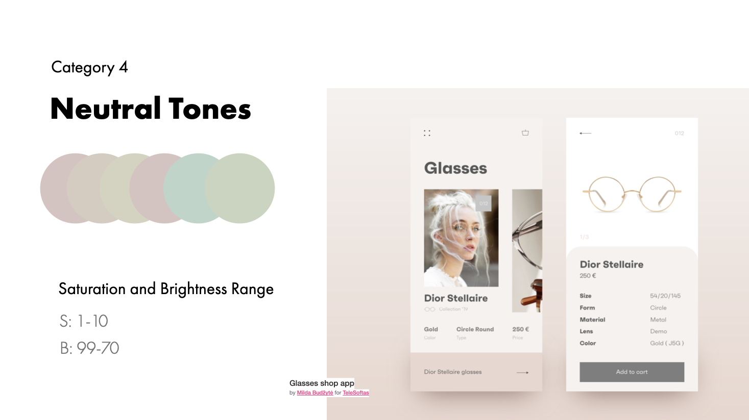
4. Neutrals
S: 1-10, B: 99-70
Pure neutral colors include black, white, beige and all grays while near neutrals include browns, tans, and darker colors. These are create by desaturating colors. They can be paired with any of the above categories to create balance. We create neutrals by decreasing saturation and adjusting the tone, tint and shade (dragging closer to the white/gray/black side of the color picker)
5. Fluorescent / Neon
S: 100-63, B: 100-82
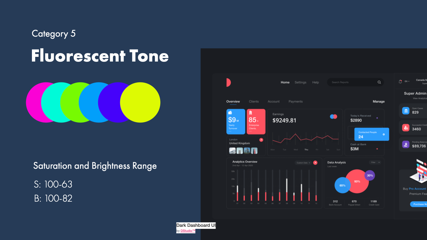
Fluorescence is a result of photoluminescence. Phosphorescent color emits light when excited by visible or ultraviolet light. In the physical world, this is created by neon tubing or ultraviolet reactant paint colors, but in the digital world we can get this same effect by applying very bright and highly saturated colors to our designs. We create these by increasing the brightness and tone.
6. Shades
S: 0-0, B: 0-100
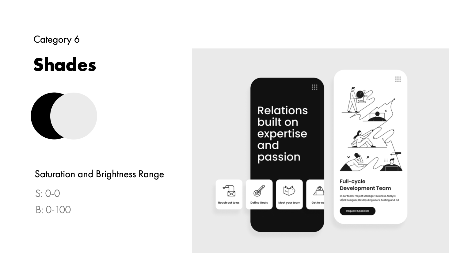
The two main shades are black and white (which are not normally considered colors but rather the absence of light or dark or the addition of pure shade or pure tint), other shades also include varying degrees of gray.
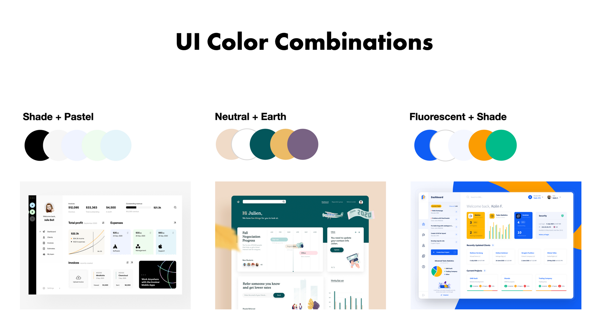
Combining Color Categories
Now you can also combine these by adjusting those levers we talked about earlier. For instance you can have Pastel Earth tones or Neutral Earth Tones:
The best user interface designs use a combination of 1 of the color categories along with neutrals and shades.
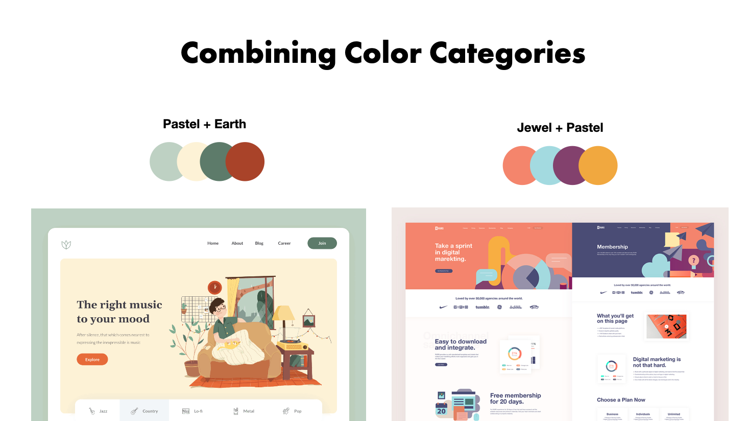
You really only need 1 or 2 colors from 1 or 2 or these categories to design and entire User Interface. Here's more on how to do that.
Why don't we talk about color like this (but probably should)
As digital designers we tend to avoid these categorizations of color schemes because the lingo seems to be reserved for painters, print designers and interior designers that are mixing physical colors. But on a practical level, I've found that referring to color this way can extremely relatable and useful in UI and digital screen design when we are still learning color theory and getting our eyes accustomed to selecting colors that go together.
It isn’t an exact science, but you can see how thinking about color in this way and having some levers and numbers to guide you can help us create more pleasant and refined palettes without all of the guesswork.
Just because something is the way the way it's always been doesn't make it right or better.
It's important to understand the foundations and principles of color theory, but when it comes down to practical application; referencing different disciplines and finding an analogy that works for us can make a big difference.
What matters most as a UI/UX designer is that you are able to use color effectively to be get your message across and create the best experience for your users, no matter how you go about getting there.