
🎨 Creativity Is Pattern Fluency
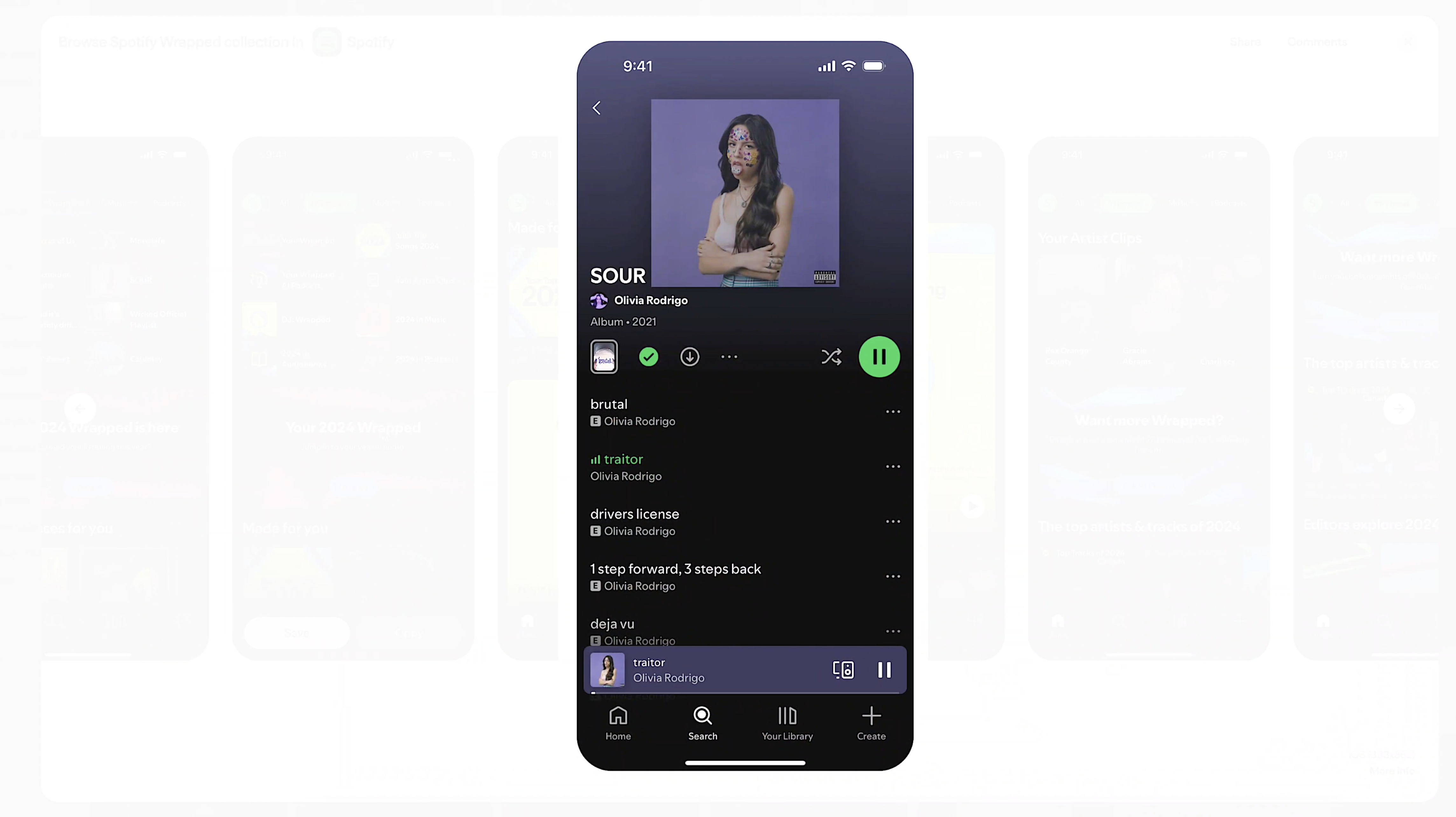
This is how Spotify handles playlists →
That onboarding flow didn't work in A/B tests →
There are 14 ways that I can use interaction patterns for this filter, but I know my users’ tendencies, so I'm most confident in using number 12 →
🧠 These are the kinds of things running through designers' minds.
But how exactly?
Is it just because they're a lot faster than you or because they're more talented or because they've spent a lot more years designing than you?
Actually, it's none of those.
It's just two things that they formed the habit of doing.
And you can do them too and get 80% better at UX/UI in a month's time.
🧩 Patterns Are Stored Recognition
Really great designers can move through design problems faster because they're not inventing from scratch, but because they're scanning through possibilities their brain already knows and thinking quickly about how they can apply them.
Thousands of UI interactions, gestures, flows that they've seen, broken, reassembled along with this natural tendency to see design metaphors in the everyday world around them.
Great designers don't necessarily think faster.
They recognize sooner.
And that recognition is what develops their instincts and what I call the muscle memory of design.
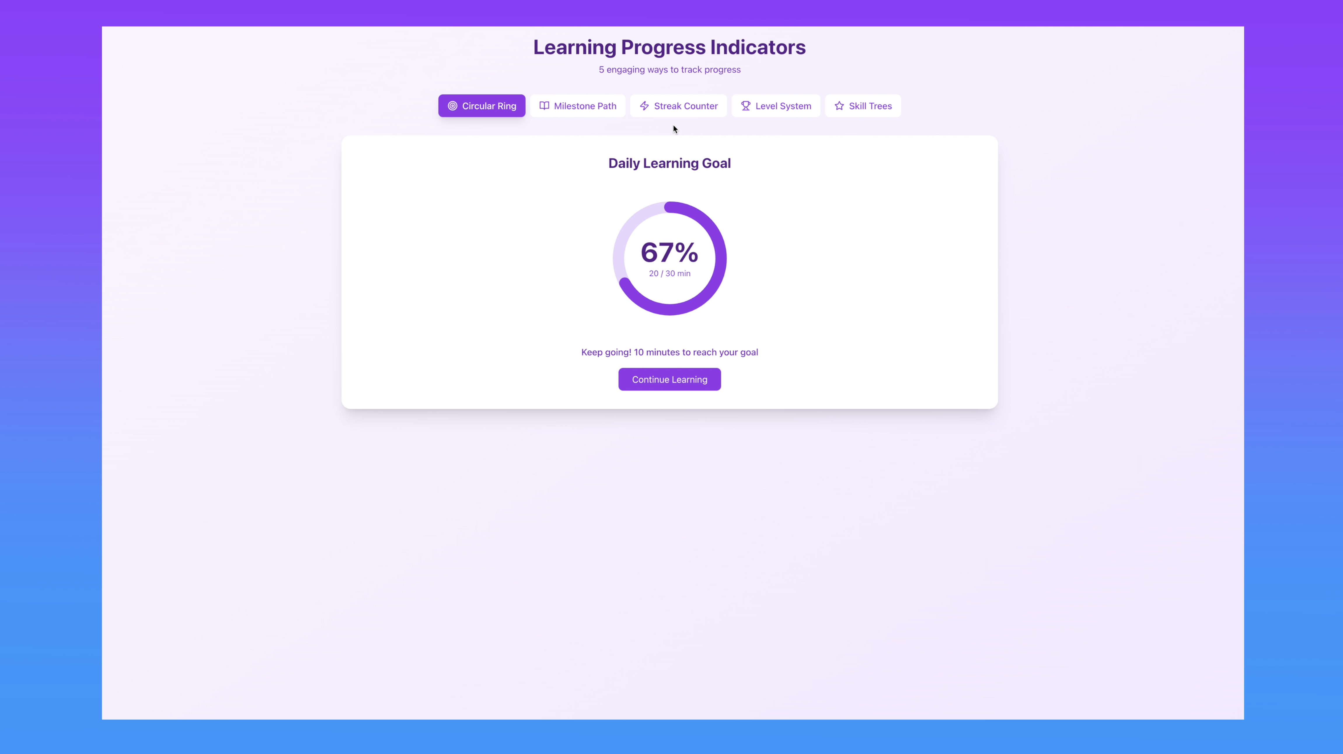
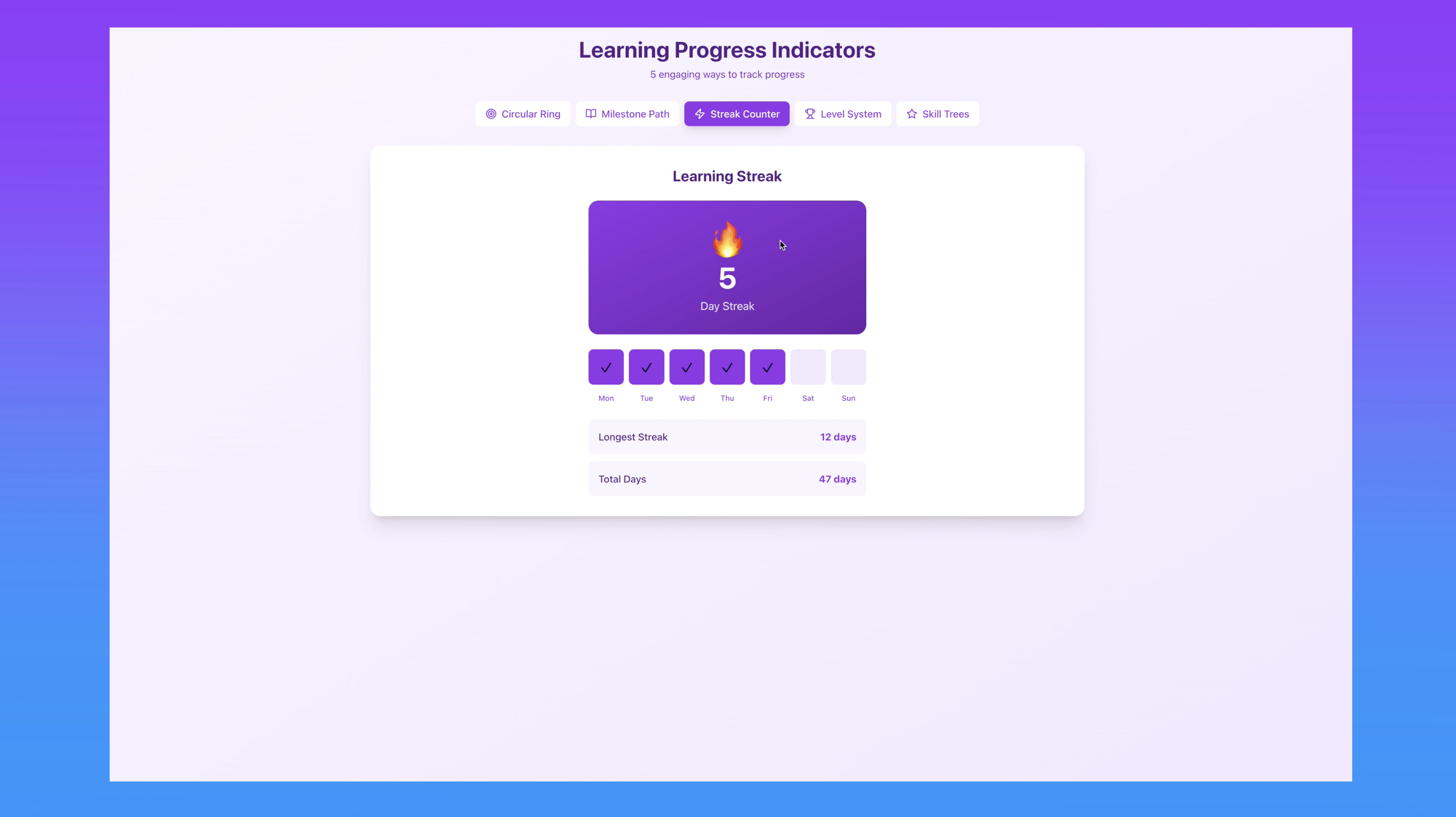
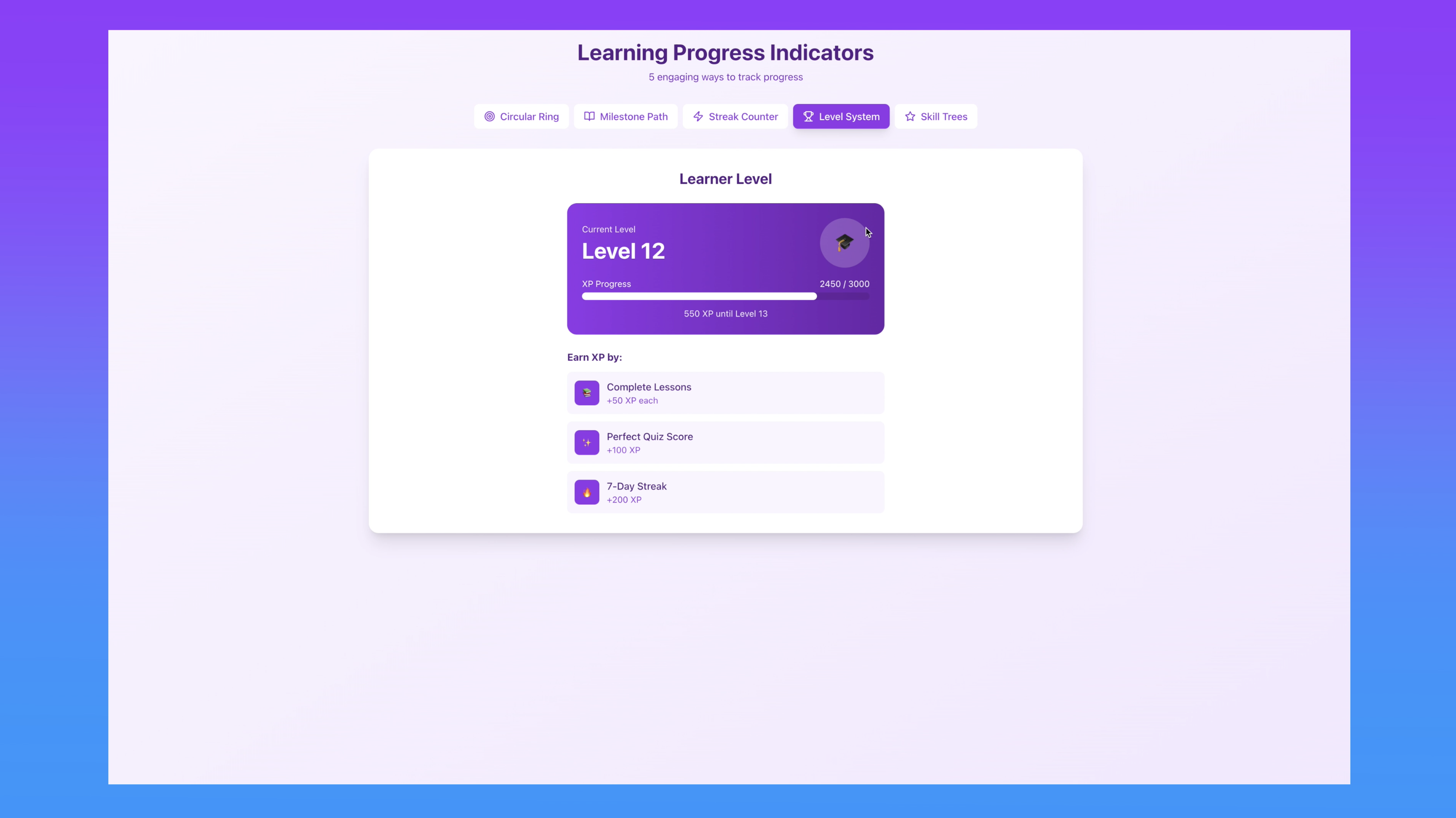
There are so many different ways that you can have a progress indicator, for example. And each one of these is a design pattern.
There can be a circular ring that shows the percentage of a daily learning goal.
There could be a milestone path that looks like this.
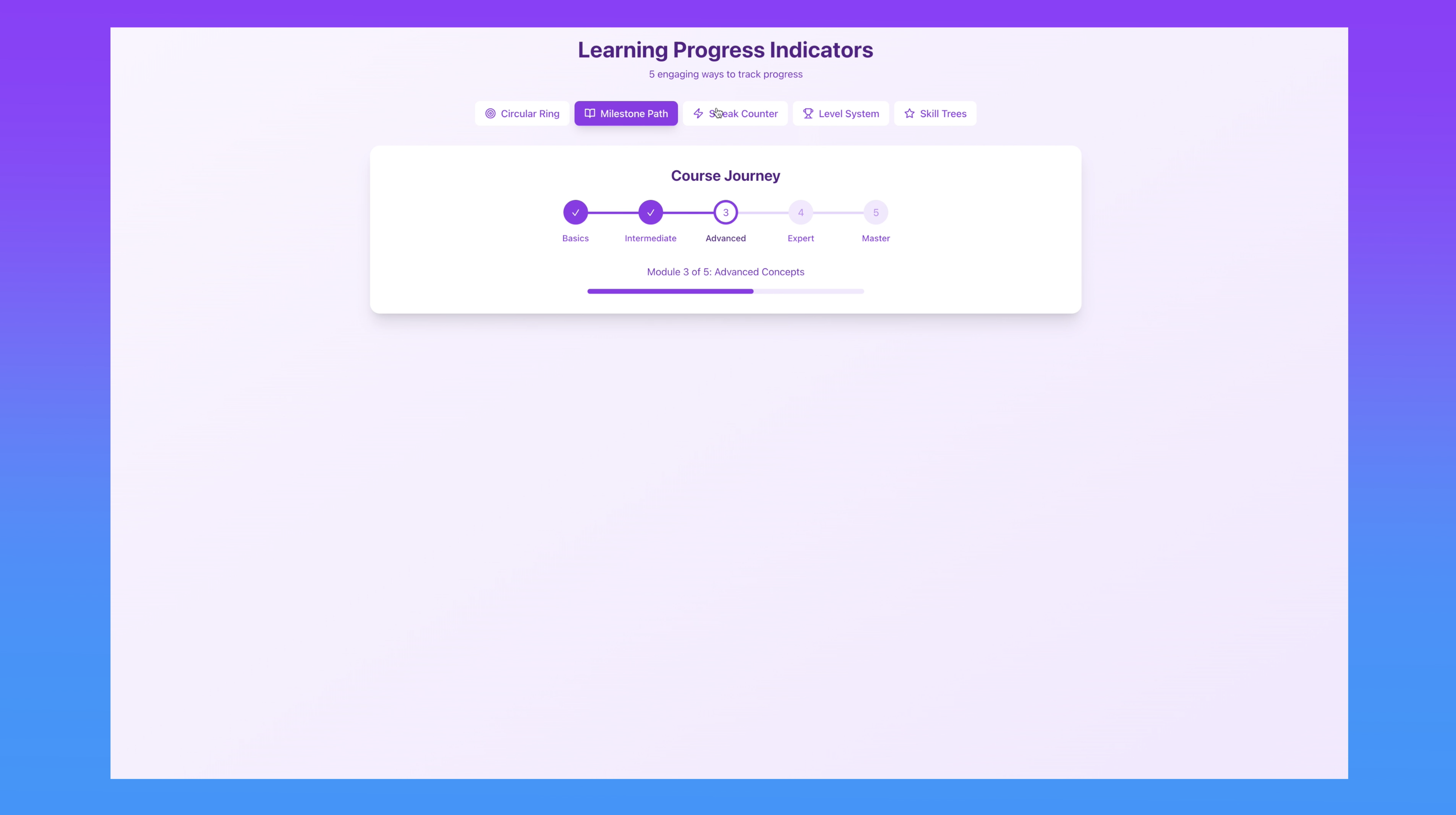
So, it's kind of a step counter that lets you know how far you've come.
There could be a streak counter. You see these a lot on language learning apps that show you days and how long your streaks are.
Maybe it's a level system so that it shows you your current level and where you've got to get to.
And maybe it's a skills tree.
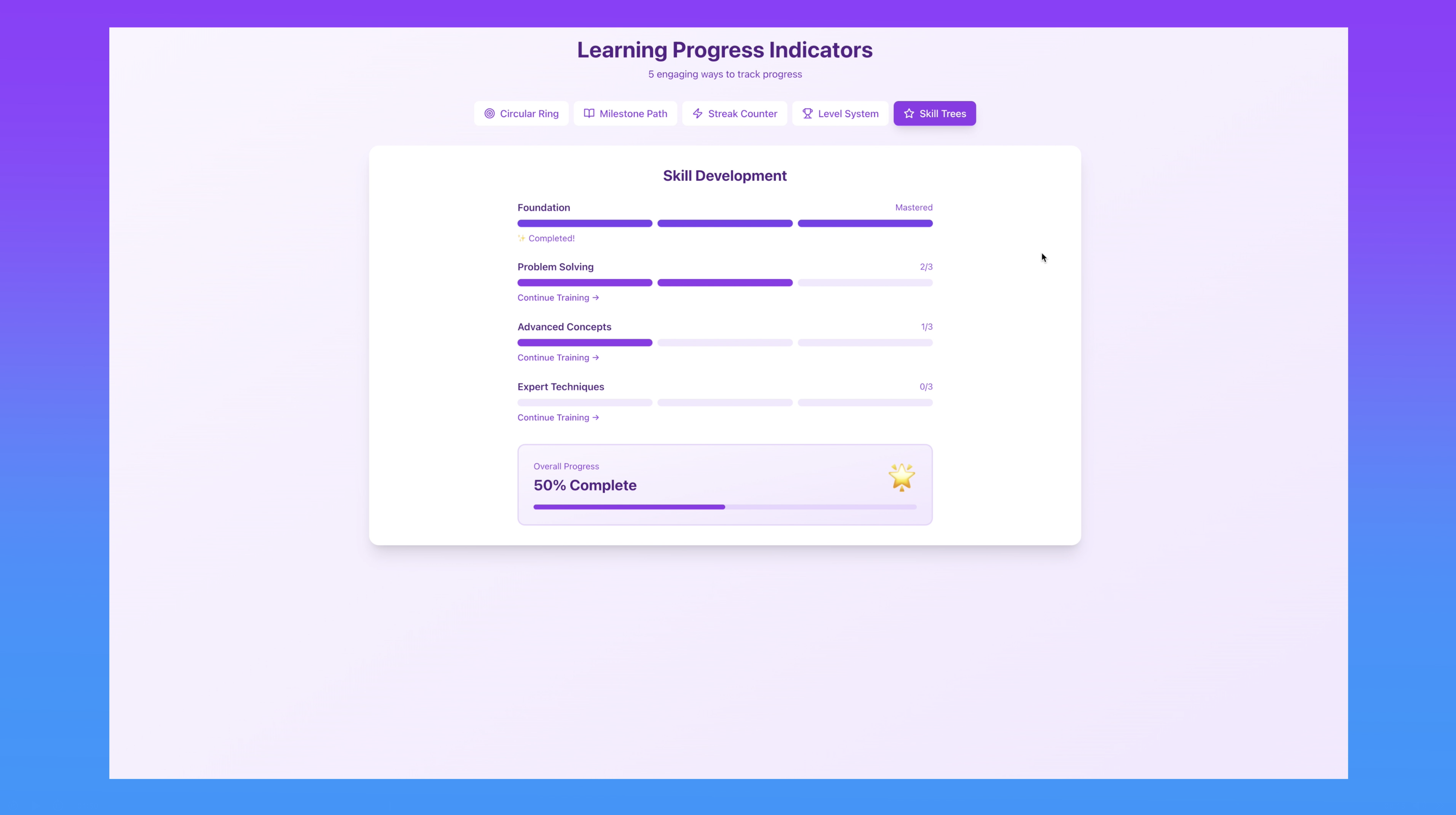
All of these are progress indicators.
And for your particular product or your problem that you're solving, one of these will probably make more sense than the others. And the more of them you've seen and experienced, the larger your playground is.
Design patterns are this memory externalized. They're not hard and fast rules to obey, but examples of flows, placement, rhythm, and cadence of things that we've come to know before in digital interfaces.
Each time you explore an app, you dissect an onboarding flow, or you notice how a tooltip behaves, you're feeding your own internal library of references. That's how you build your muscle memory of design.
To outsiders, this may look like originality, but to the designer, it's simply pattern play.
📚 Building Your Mental Library
Let's try a little exercise
Open up the X app if you have it on your phone and then you can go to your profile or mine. Mine is @LizTheWhizard.
Scroll down and find a post and hit like.
Then scroll down, find another one, and we're going to repost it.
Click the repost icon and click repost.
Then we'll bookmark something.
Now, let's do the same thing again, but this time we're going to be really hyper aware of every action we take and every reaction that the interface has.
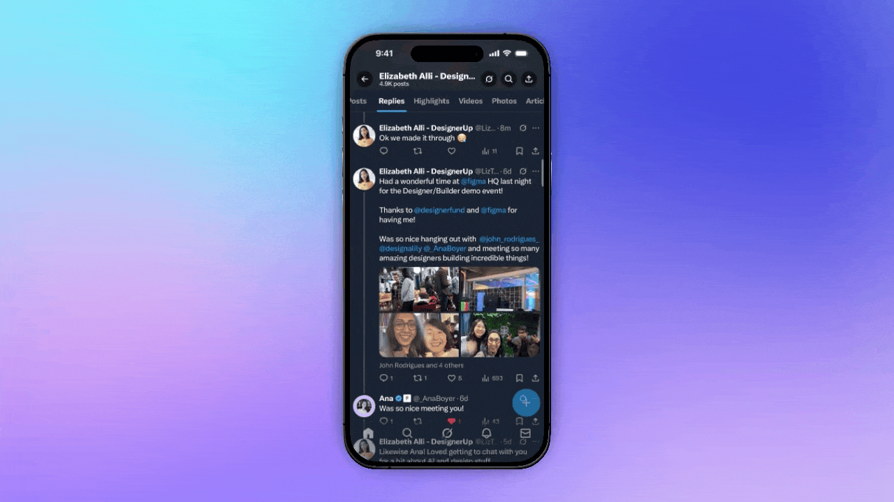
↳Watch how the navigation sticks to the top as you scroll past your title.
↳Notice the subtle animation when you like a post.
↳See how the screen darkens and a panel slides up when you click repost.
↳Tap bookmark and a snack bar drops from the top with an additional action.
↳This is a perfect example of a design pattern and a design system.
The pattern is the sequence of interactions.
The design system is the reusable UI element like the snack bar.
Now that's just one example.
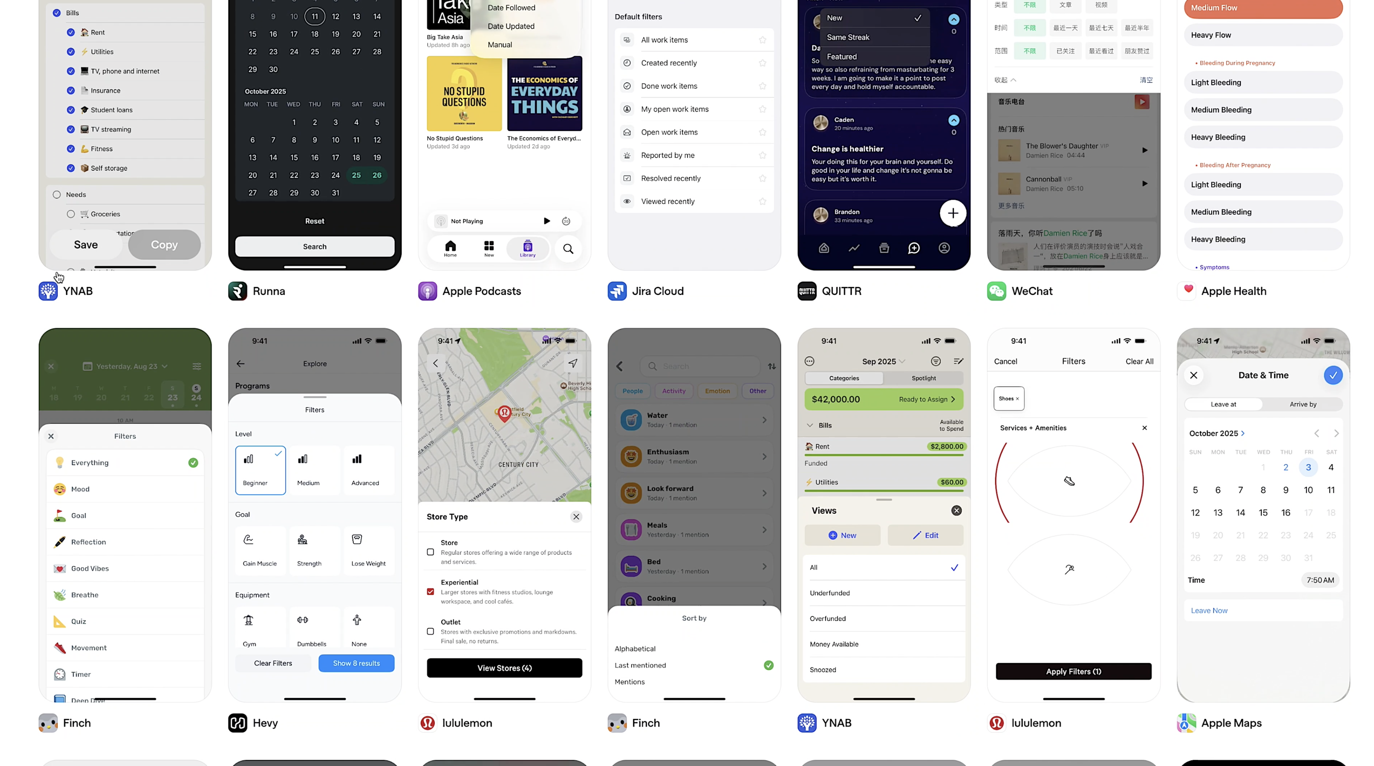
Imagine if you could see hundreds of apps at a glance without having to download each one...
🧰 Best Design Pattern Tool
This is my absolute favorite resource for developing the muscle memory of design and it's called Mobbin.
Mobbin isn't just a gallery of design examples. It's like a design gymnasium for your brain. Each time you scroll through their curation of existing product design screens and flows and patterns, you're doing reps and you're training your eye and your brain to recognize how other teams have solved recurring problems with design.
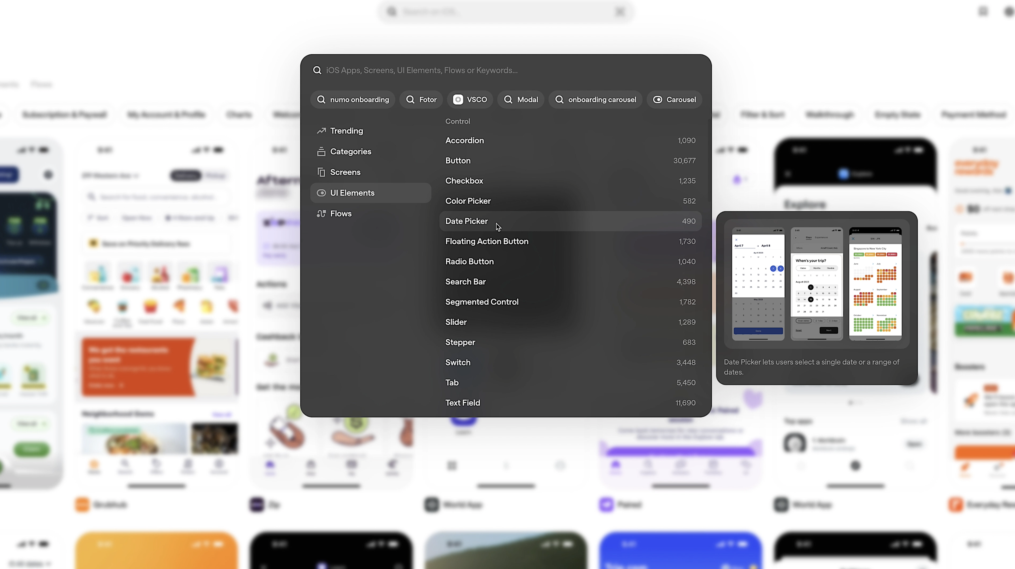
When you know a vast array of design patterns deeply, you can access them more quickly and bend them without breaking them. Users can feel that. They instantly understand it because your new pattern is built on top of their old expectations.
This is why pattern fluency matters.
It lets you go past imitation into synthesis.
The Design Systems Behind The Patterns
If design patterns are the big picture stuff, the flows and the choreography of screen events and conditional reactions, then design systems are the tiny UI components that make up those patterns.
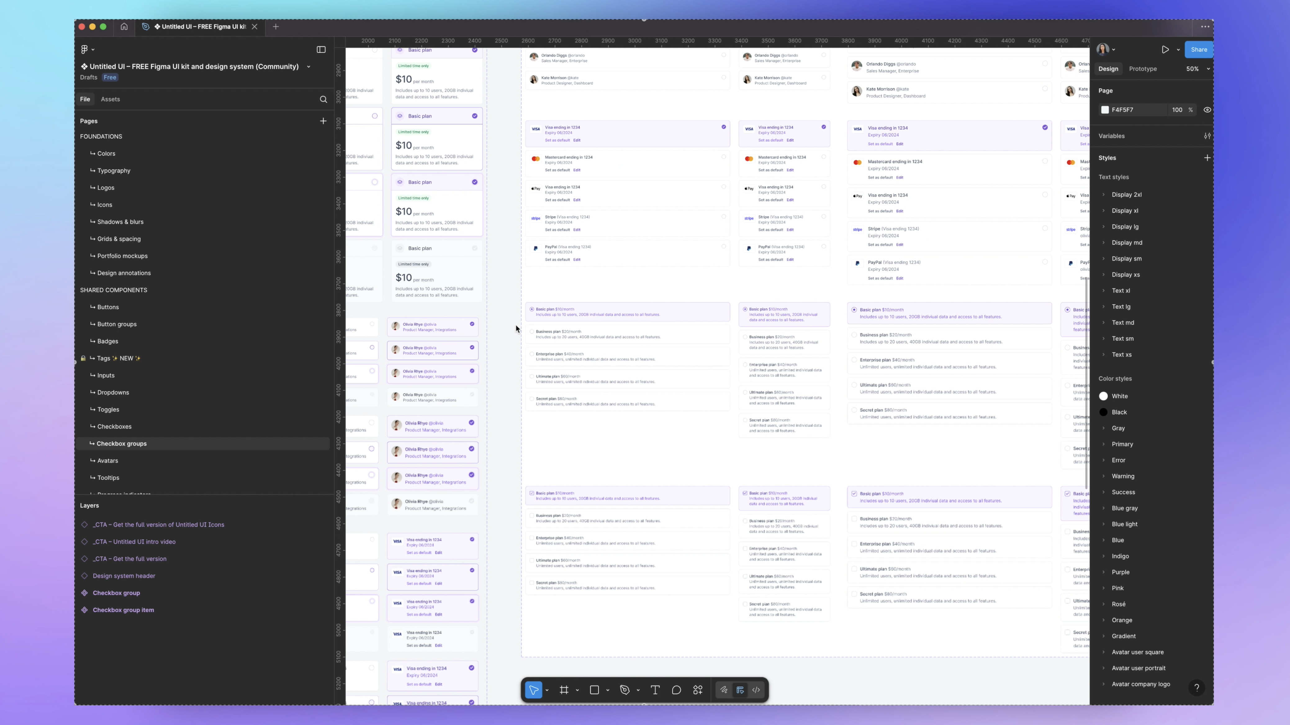
Take Atlassian's design system for example.
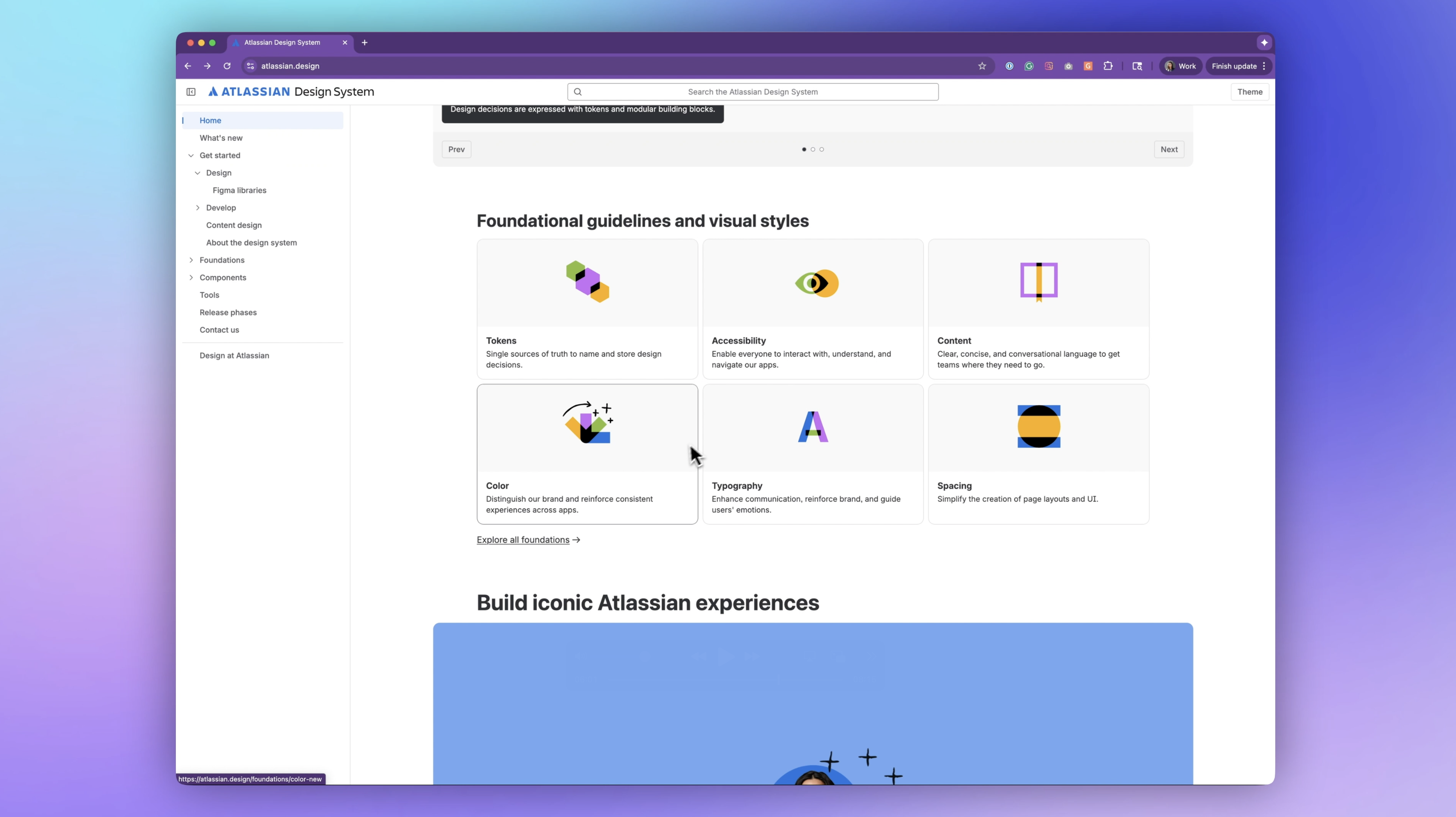
Each element from the colors and typography to the badges, checkboxes, and breadcrumbs are broken down and given purpose and context.
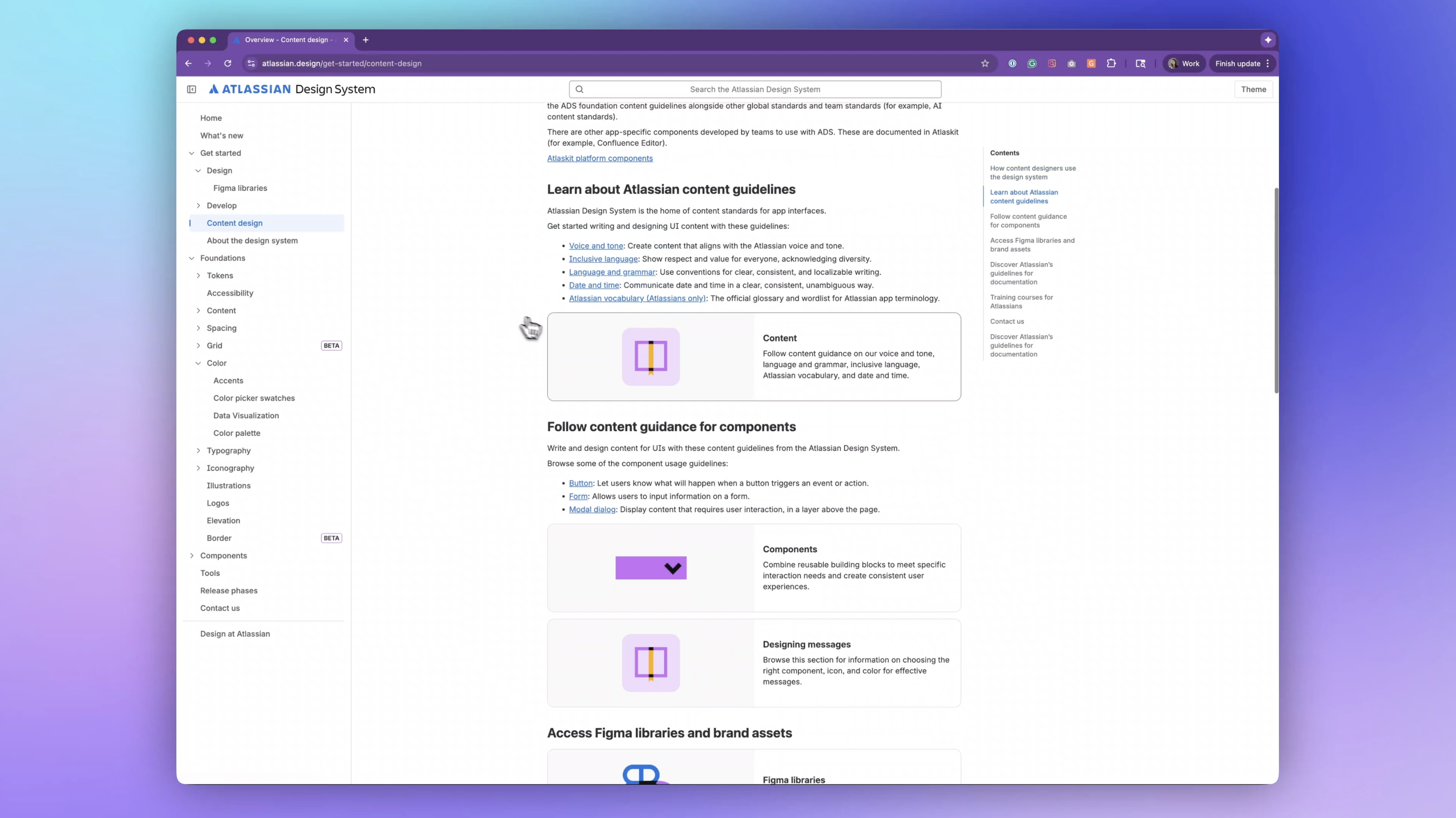
The crazy part is that these design systems and hundreds of others like them from the world's top tech companies are freely available. You can download them in Figma and use them in your own product.
There are even really great white-labeled UI kits like Untitled UI that are worth investing in.
🤳🏽Actions to take for the next month
Here's what to do to improve in the next month
- Sign up for Mobbin and start immersing yourself in how great products solve problems with design.
- Spend time each day mindfully observing the orchestration of what happens in the apps you use every day. Replace passive scrolling with active, aware usage.
- Download existing design systems and learn (and steal) from them. Then try putting them together to create your own screens and components and flows.
If you want to level up that last 20%, come join my Product (UX/UI) Design Course. You'll build a real product and case study for your portfolio with one-on-one mentorship. And for a limited time, I'm giving away 12 months of Figma Pro for free, plus 50% off Mobbin when you enroll.
Want to learn more about design patterns and design systems? Watch this crash course next.