This month alone I have built three polished animated landing pages and an entire CMS and I didn't:
This month alone, I’ve built 3 polished, animated landing pages and an entire CMS but I didn’t:
🚫 Do it from scratch
🚫 Use AI
🚫 Use a UI kit
🚫 Build a design system
🚫 Use a no-code tool
So how did I do it? Well, I used two big cheat codes.
I'm going to show you how to start designing before you even open Figma and find unlimited inspiration, how to create dynamic designs that are functional out of the box, and how to do the heavy lifting of building a product—even if you don't know everything about code or design.
Cheat Code No. 1: Work Backwards
Modern front-end web and app development involves a tech stack, and the most popular tech stack right now uses React and Tailwind. So, as a designer, I decided to do the same.
Now to back up a little bit: if you don't know, React is a JavaScript library that developers use to build websites and user interfaces. So when we hand off our static designs to our front-end developers, this is the language they're coding them in. Tailwind CSS is a styling framework that makes it easy to customize how everything looks.
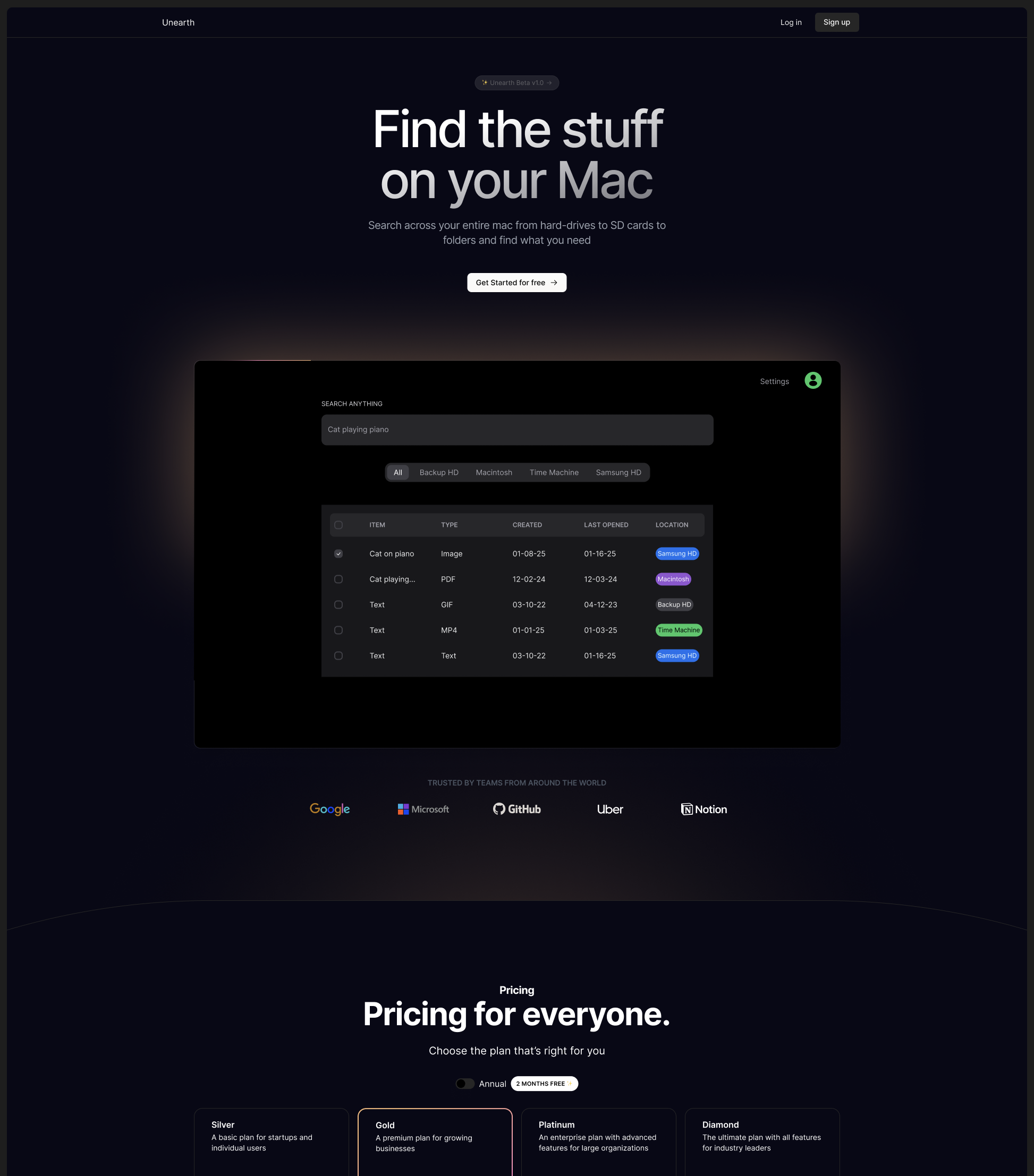
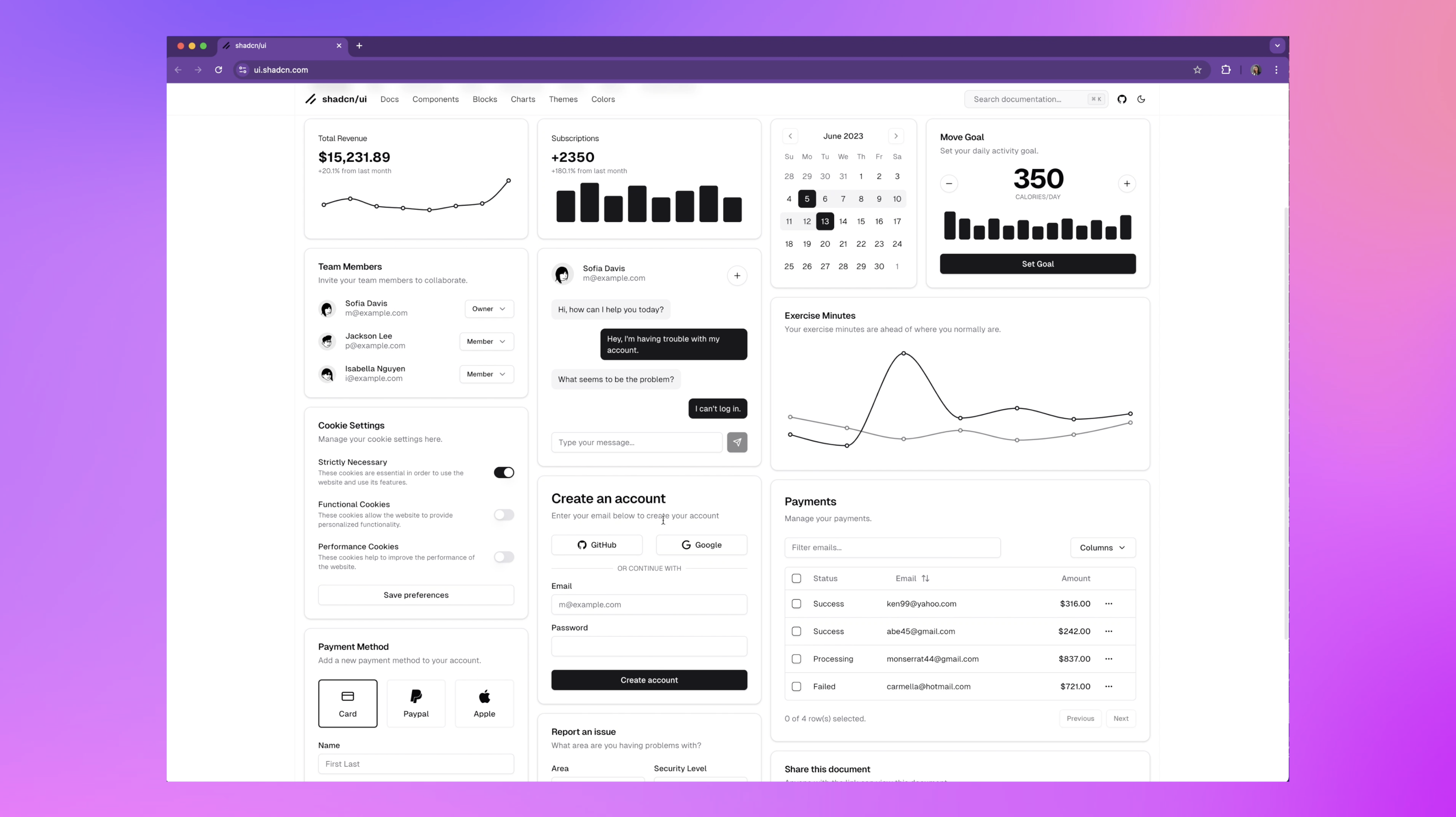
So, as a designer, instead of starting with static designs in Figma, I used an existing UI component library. Now, these are nothing new. Front-end devs and builders have been using these frameworks for a while now, but I'm not talking about any old UI component library. I'm talking about the new generation of UI components that are making it possible to build crazy-looking stuff like this ten times faster.
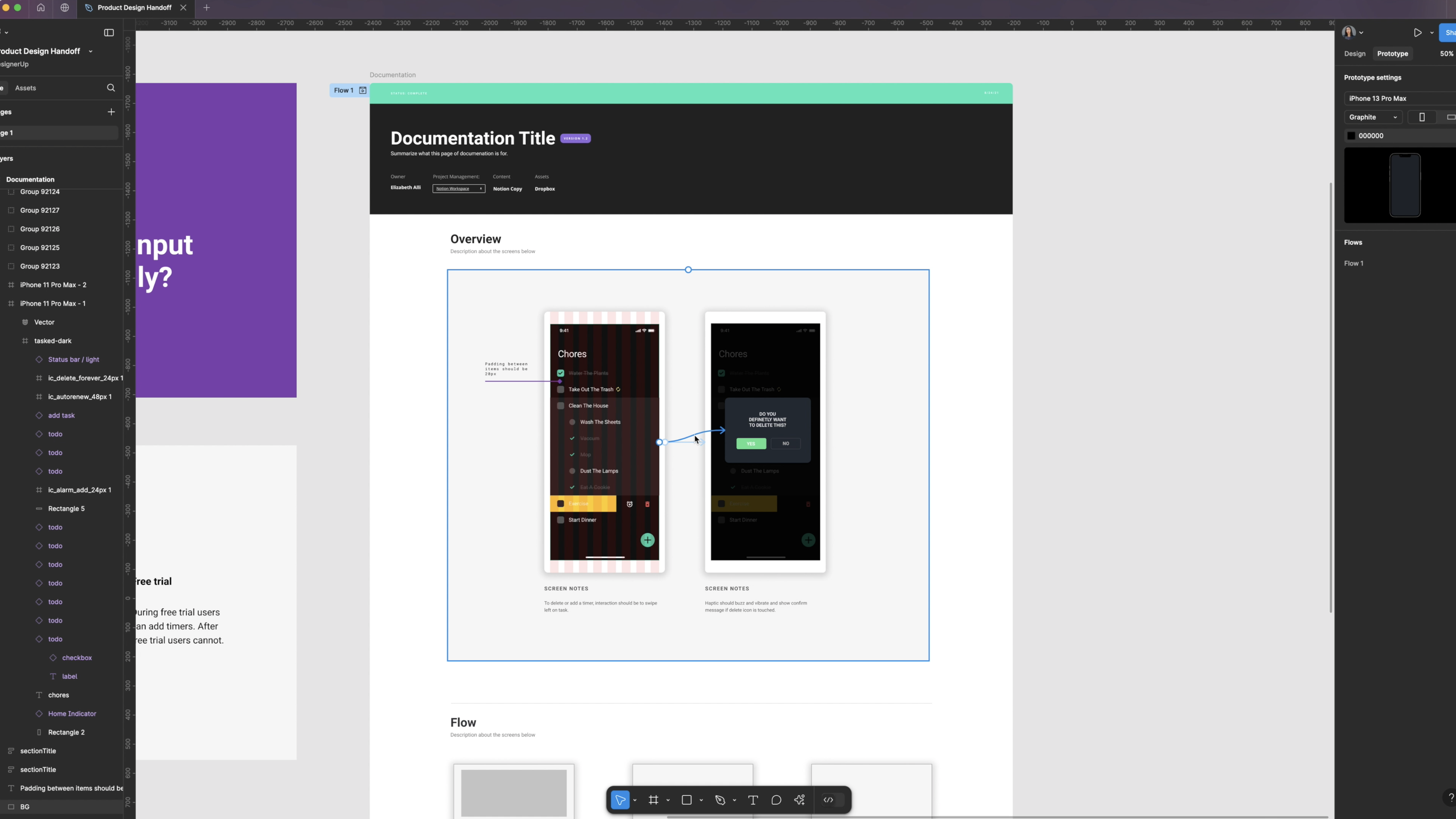
For example, imagine you're designing a popover component or a navigation menu. Instead of starting from scratch, noodling thousands of interactions in your prototypes in Figma, and annotating what you mean for the devs,
you can grab a UI component from a library that's already fully designed and fully coded and developers can plug it directly into your app.
This saves so much time between design and code and ensures consistency between the two because:
✅ It's built for React.
✅ It's completely styleable using Tailwind (without wrestling with weird defaults
✅ It doesn't require you to pick entire color palettes and color scales yourself.
✅ It's copy-and-paste (so you don't need all of those code dependencies)
✅ It includes the sickest animations and micro-interactions (like Framer Motion, built right in).
✅ They also have UI kits for Figma so you can design with them.
Getting started with UI Component Libraries
Here's the process I would use if I wanted to get started with these UI component libraries.
Step 1: Communicate with your developers
The first step would be to communicate with your developers. Have a conversation with them about what they're using. Are they already using React? Do they have a framework in mind? Is there one that you like that they would consider implementing?
Step 2: Get familiar with the UI component library
The next step is to familiarize yourself with some of these UI component libraries. You can sit down together and go through them to see what might work and what might have the components you need. There are some UI component libraries out there with amazing documentation that are also open source. You can go through all of this in detail and see if it'll work for your project ahead of time before you spend a ton of upfront effort implementing things.
Step 3: Grab the Figma UI Kit
The next step is to grab the Figma UI kit and then start using all of the components to assemble your UI screens and flows and customize them.
Example:
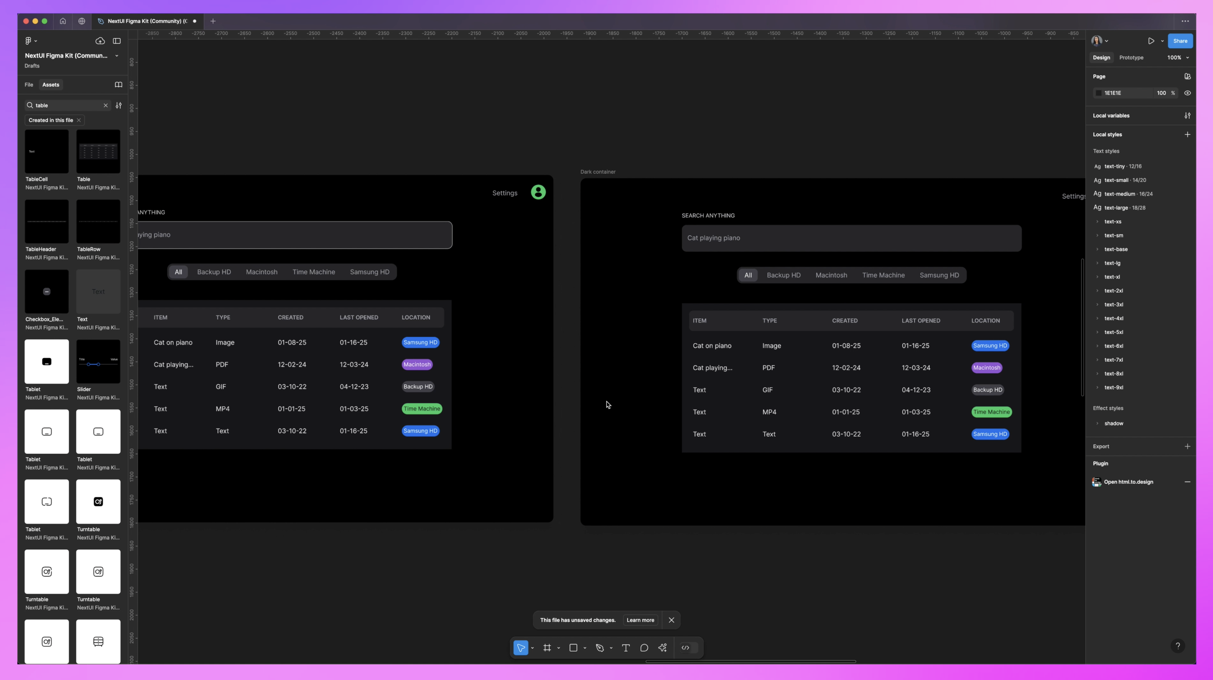
Here I am inside of Next UI Figma kit (which they've recently renamed to Hero UI). You can see that there are themes here in dark mode or light mode.
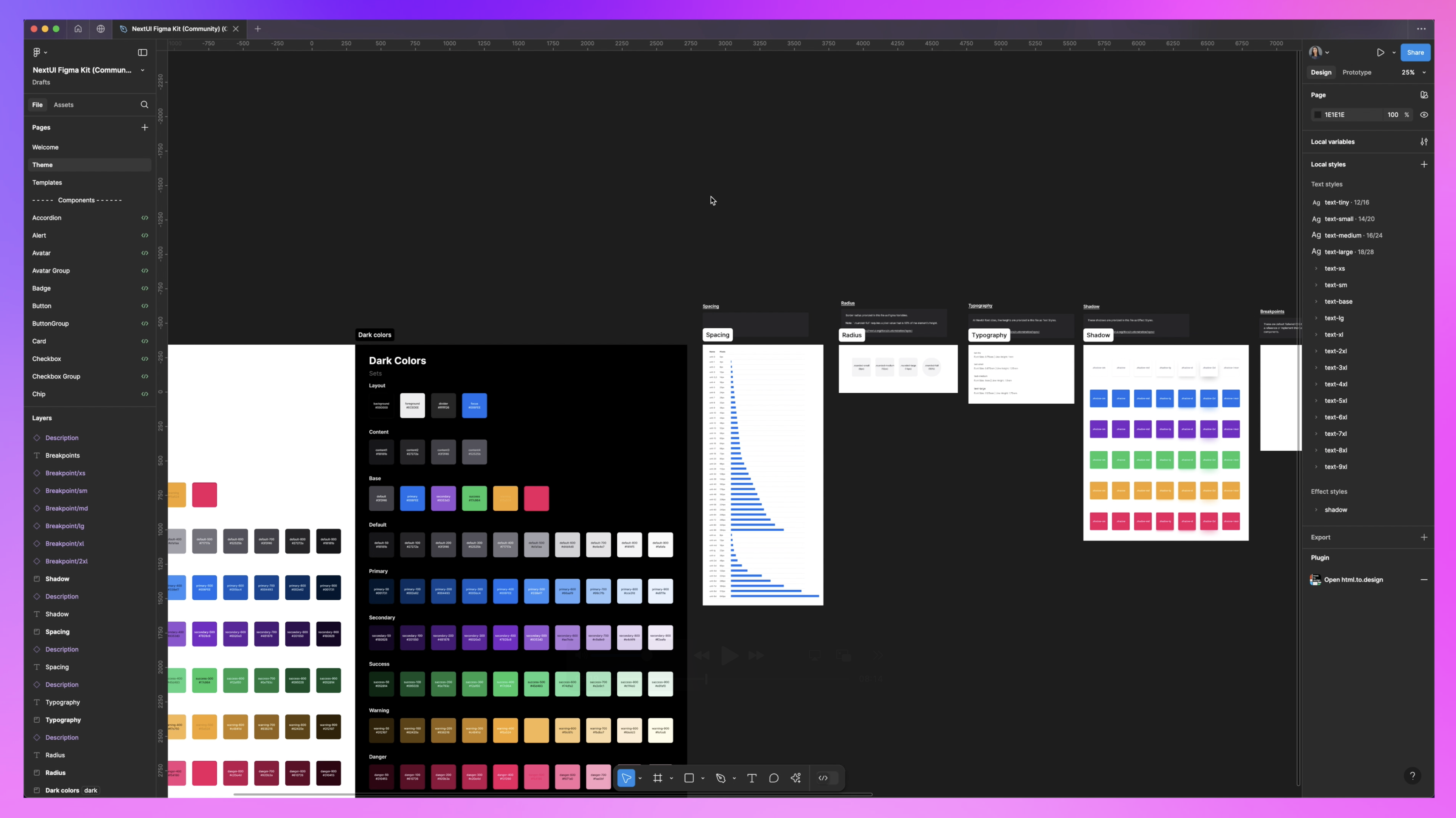
I'm going to grab one of these Tailwind breakpoints (1280 by 768). Then I'm going to create a template page. I'll start assembling these into screens. I’ll paste this here, convert it to a frame, and name this frame "Dark Container."
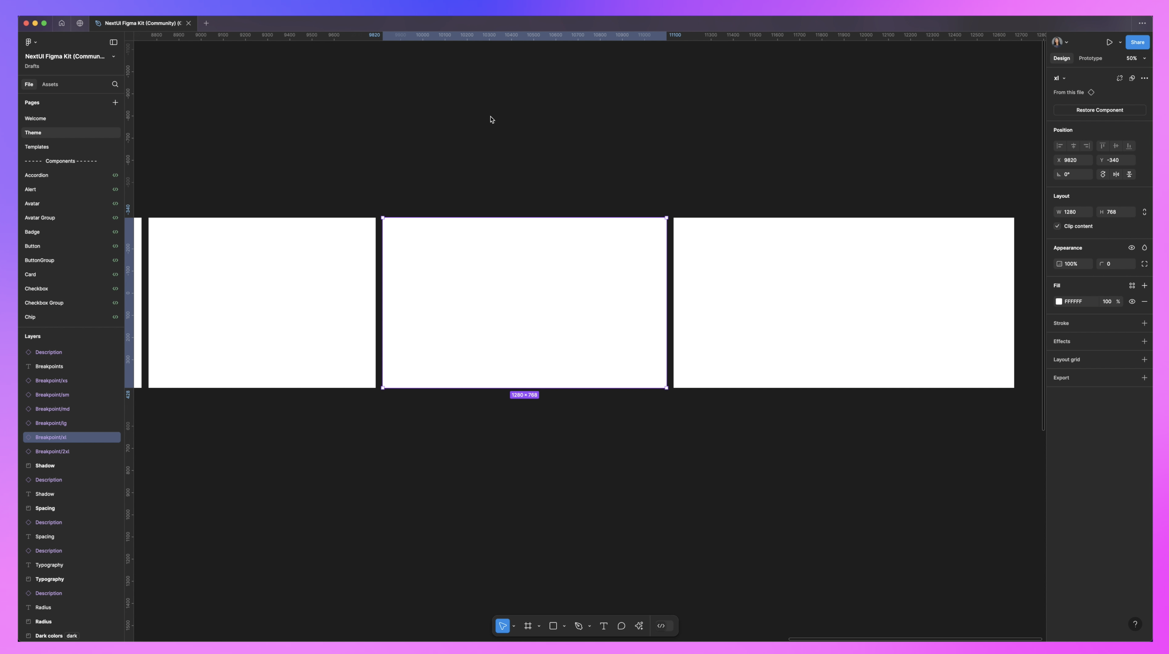
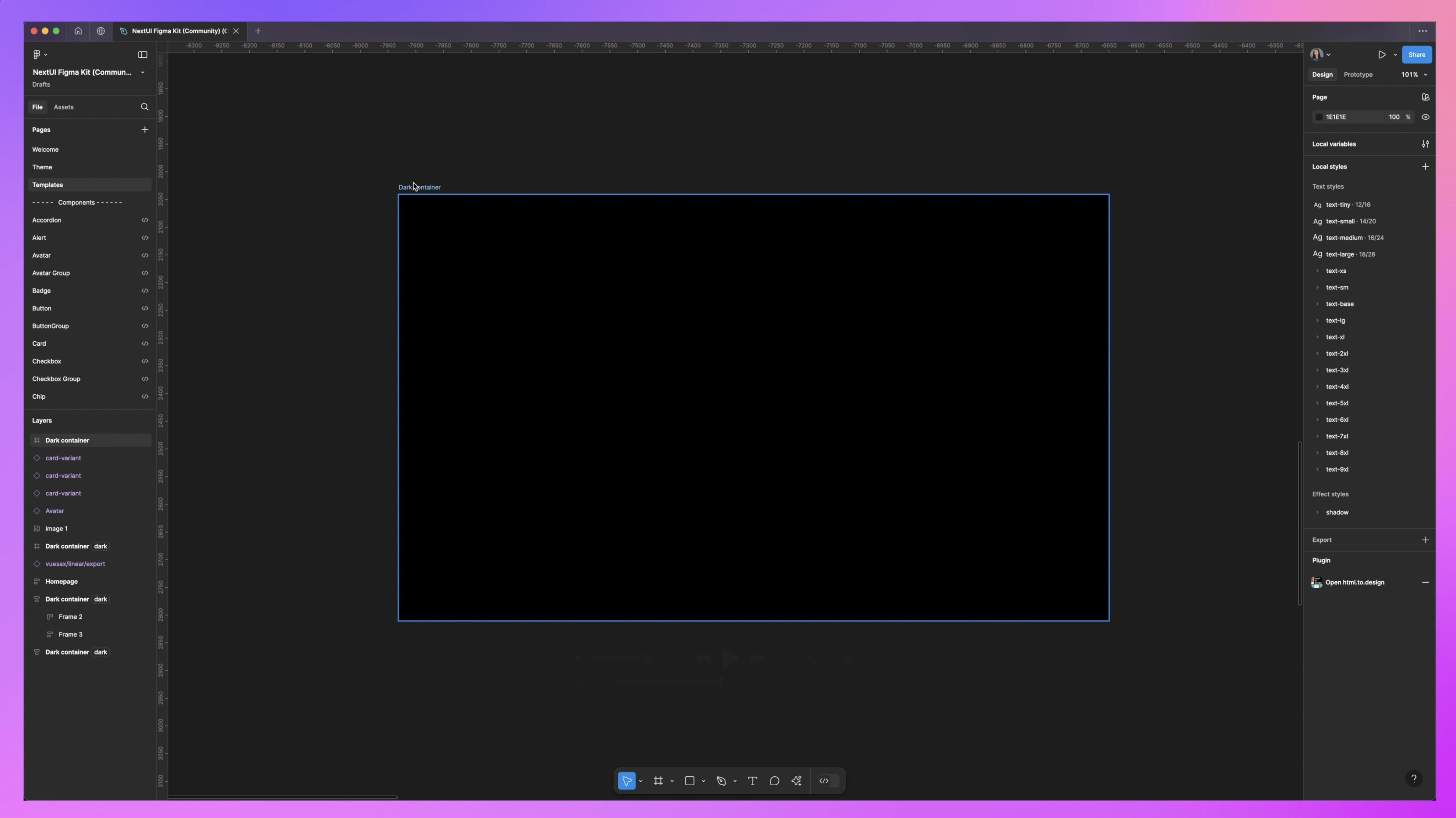
With that, I’ll switch the color selection over to black so that my background's dark.
Then I can start dragging in these components. I'll go over to the Assets tab, search for "tabs," and use that to create my main navigation. You’ll see it’s in white right now, so it doesn’t quite work with the background.
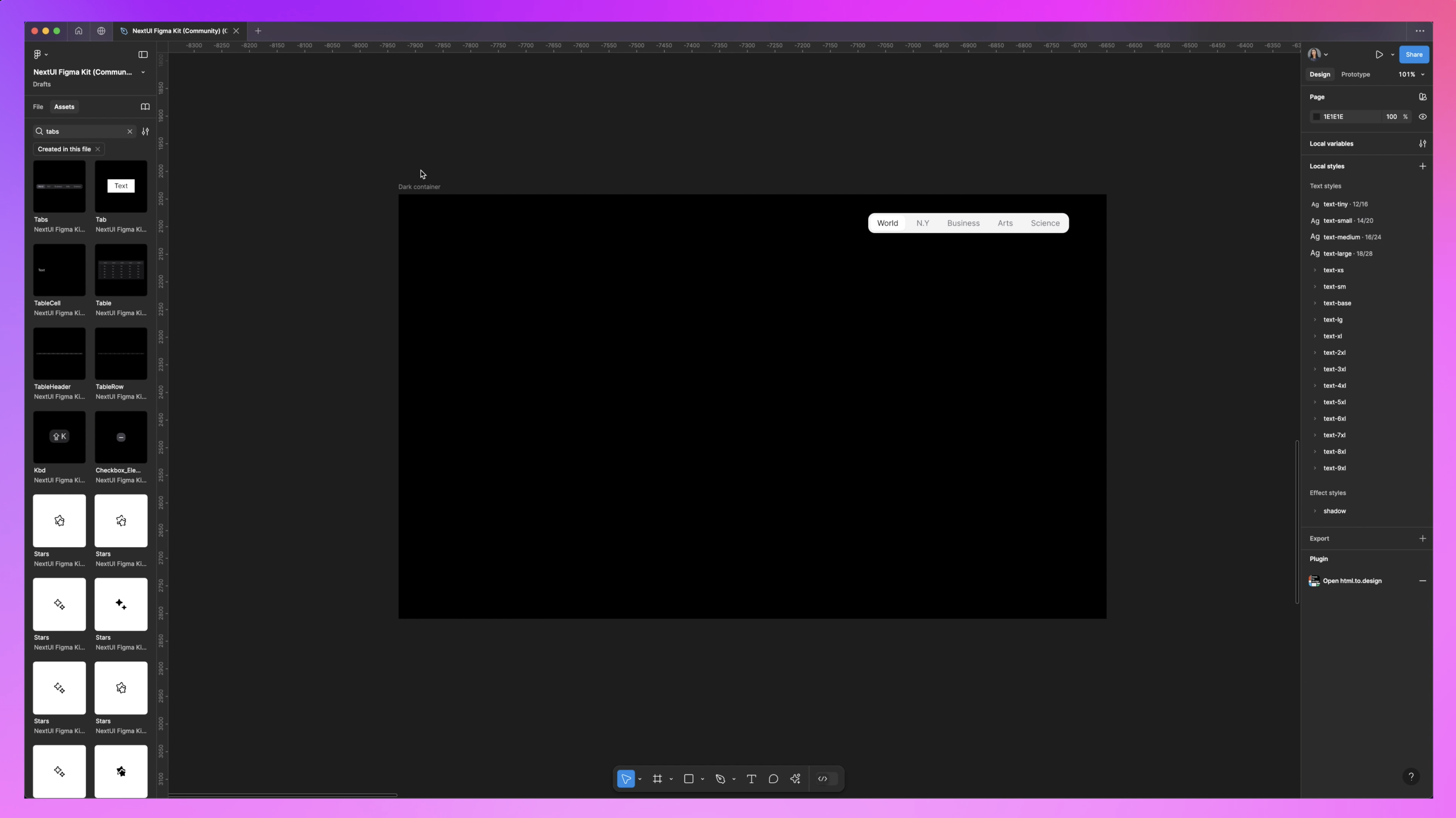
To fix this, all we need to do is select the container, go over to the Appearance property, and click on this little "Apply Variable Mode", button then select 'Tokens' and click 'Dark'. There it is! You'll see it switches right over to dark mode.
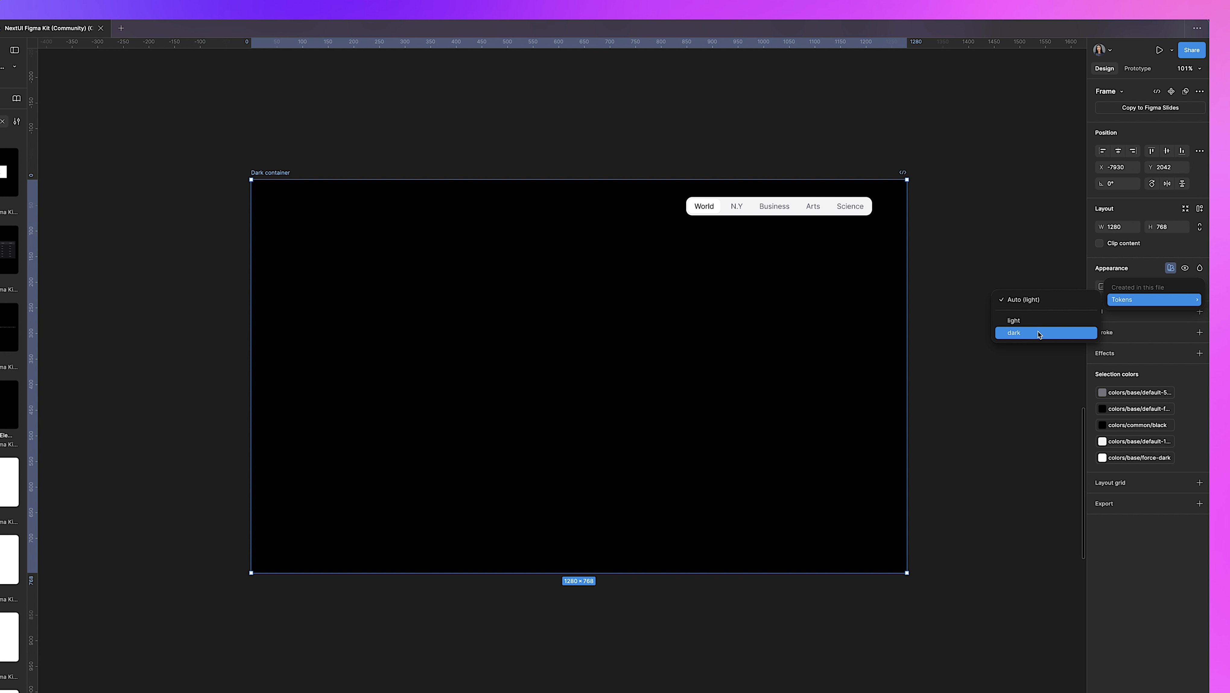
If I want to test in light mode, I duplicate this, select white for the background, name this "Light Container," go over to Appearance, select that token, and switch it to light. You can now just drag and drop components back and forth between light and dark and watch them change automatically!
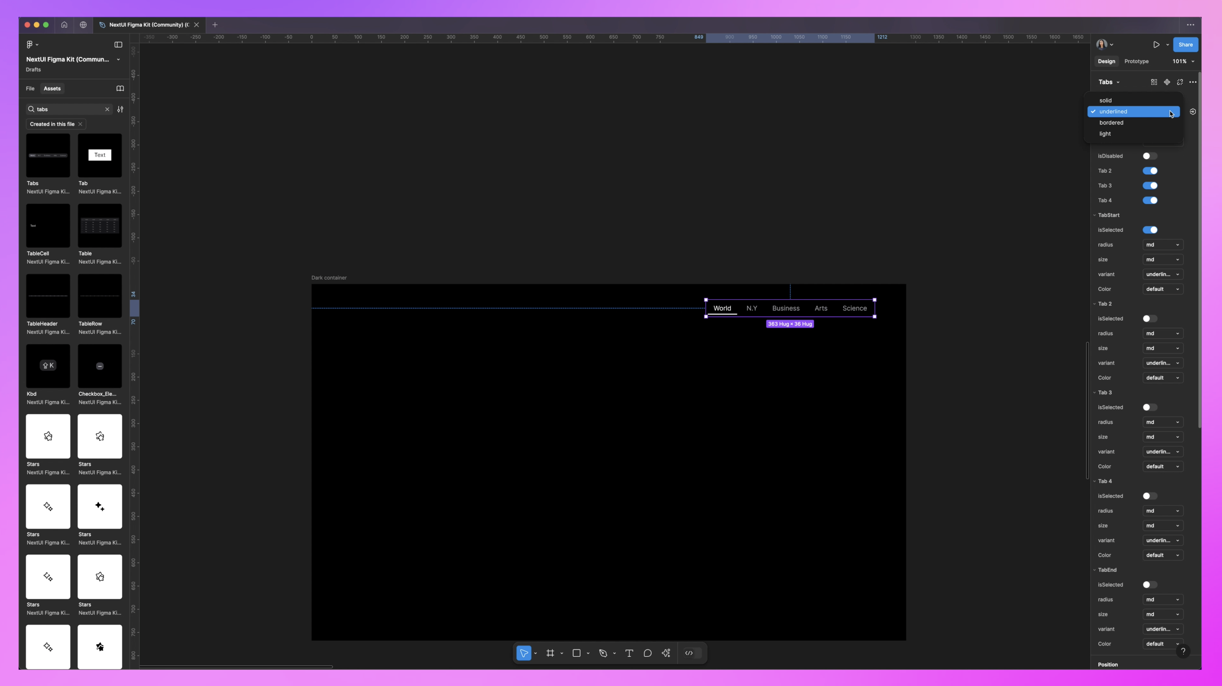
Now we have all of these properties and variables that we can toggle on and off. For instance, underlined here—that's great for navigation. We can remove the background, leave the button hover action.
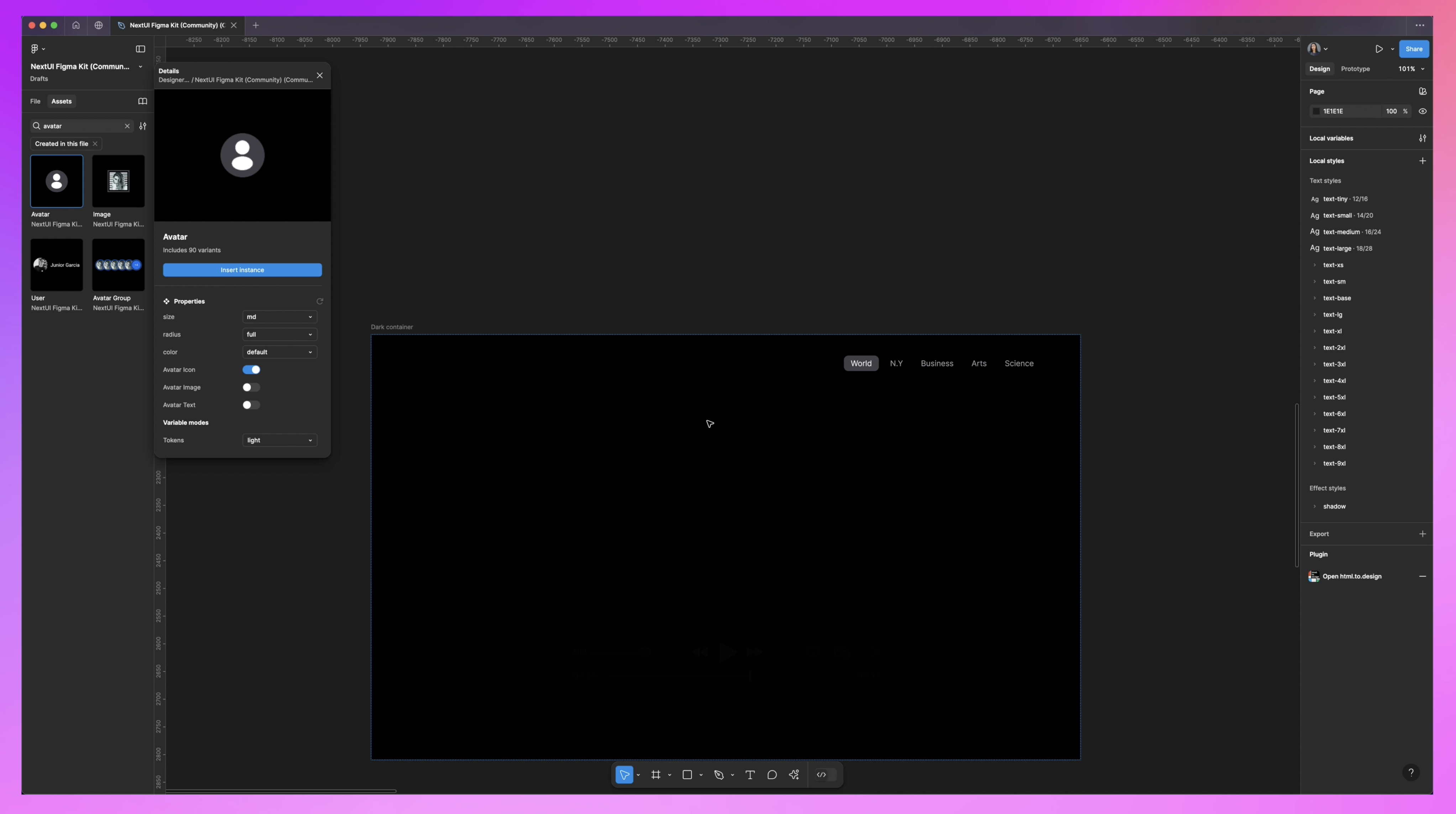
We can drag in an avatar component in for our profile.
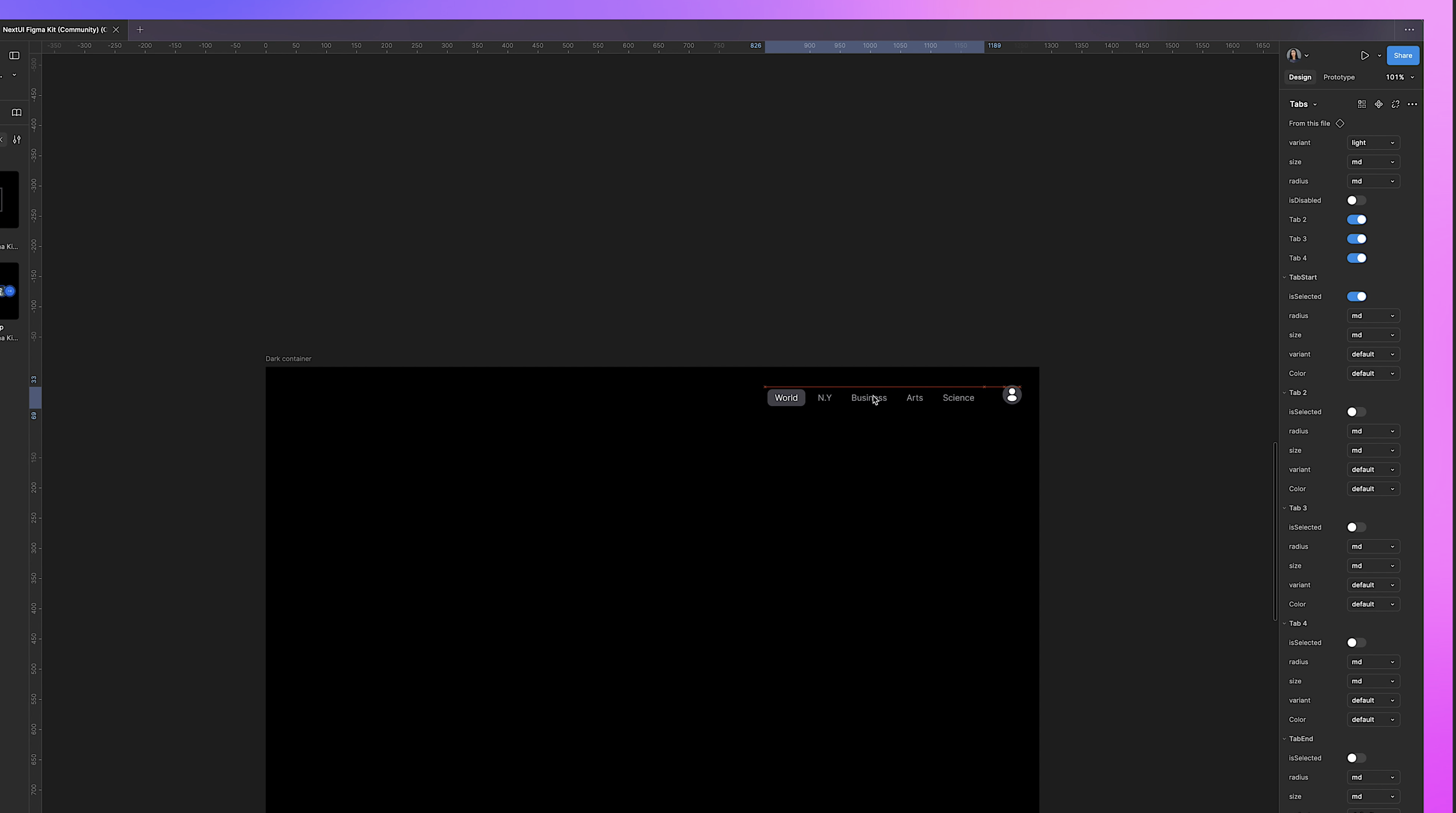
This is a little big, so we go over to the properties and select the small size. Now it's nice and proportional. Then we just keep building.
I’ll drag in this table component onto the screen as the start of my dashboard, customize it by toggling off the selection text box, and add sorting. We can add cards, chips, and keep building.
What's amazing is that this is all available in code. You can refer to this component when talking to your developers—they can see it and the functionality.
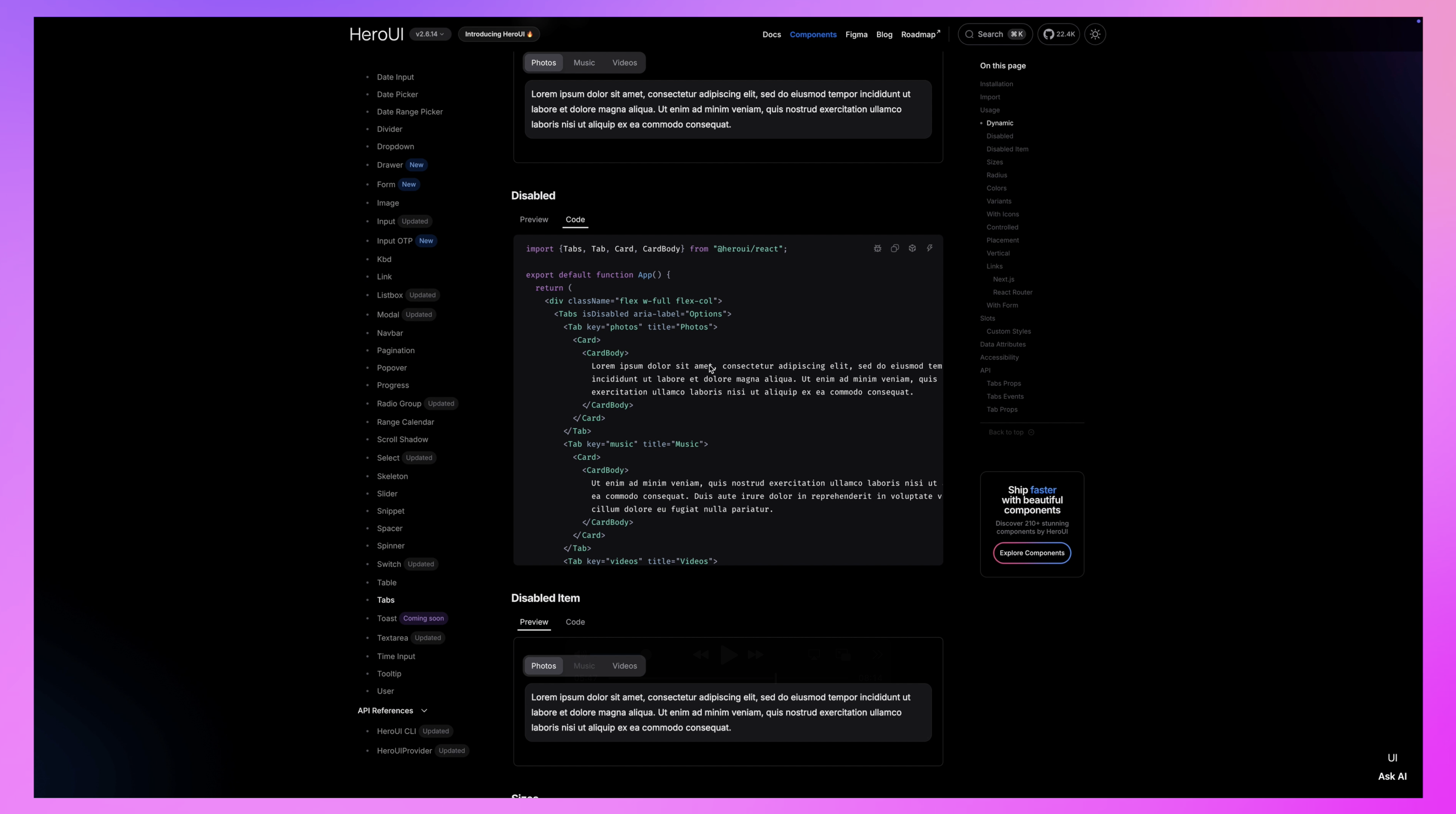
If you're a designer working with developers, you can shortcut so much of the process by starting with these pre-designed components and just styling them. If you're a developer who's not confident in your design skills, these are really well-crafted and ready to go, giving you a great boilerplate to start with.
Now we have more time for the really important stuff: focusing on the user flows and experience.
Normally, when I do this, I collect inspiration from all over the place—taking screenshots or screen captures of apps, doing market and competitor research, and seeing what my users are currently using and how they're solving problems.
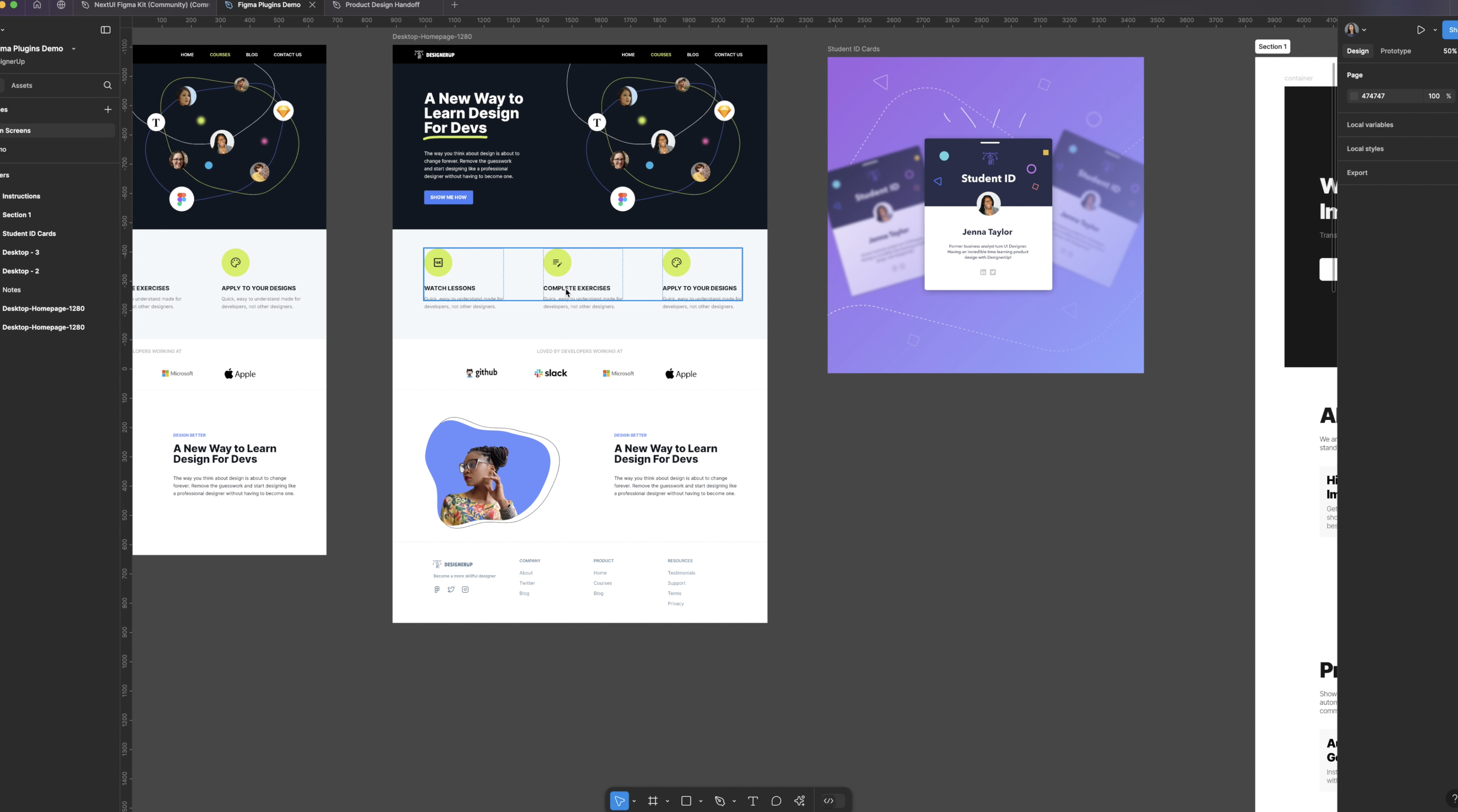
Cheat Code No. 2: Mobbin
This next cheat code does all of that for you, and it’s called Mobbin. This is honestly one of my ride-or-dies because we’re talking about a catalog of screens, flows, interactions, and screencasts of the best apps out there. It’s got a Figma plugin so you can bring all of these into Figma and work with them.
This is Spotify's Wrapped. Here’s the flow of all the screens for that.
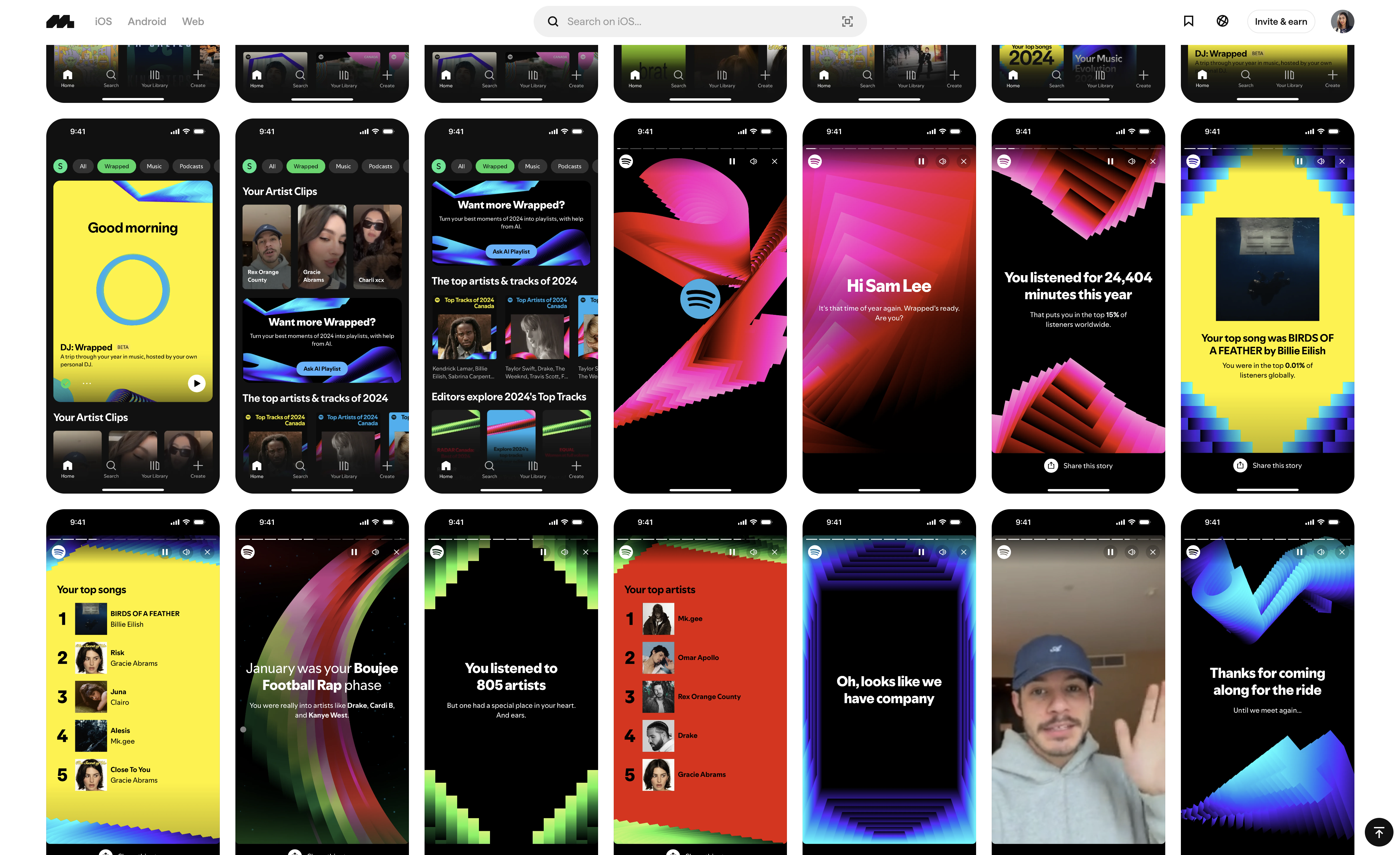
I copied it from Mobbin, opened the plugin, and pasted it right into Figma. It brings all of those screenshots in so I can look through everything and get inspiration.
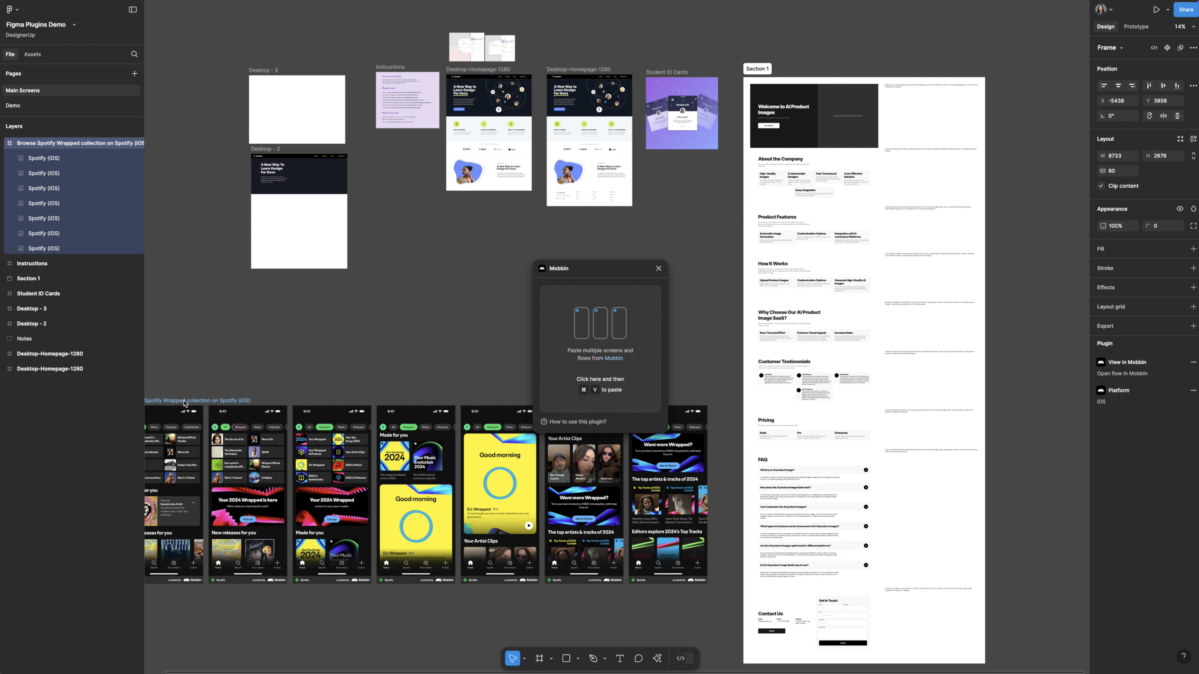
You cannot afford not to subscribe to Mobbin if you are a designer or developer who cares about making great products.
Some things to note about using UI Component Libraries
Remember, you don’t want your codebase to get out of control and unmanageable. Make sure you aren’t just trying to build the kitchen sink out of this. Use these tools smartly and sparingly, and understand the experiences you want to create. Also, ensure everything is well-documented, and make sure all components have their own unit tests to catch bugs early.
What I love about Next UI, for example, is that it integrates with Storybook so you can ensure your components function properly. Next UI isn’t the only component library, though. Here is my full list of the best, hottest UI component libraries, why I love them, and how to use them.
I also have a course where I teach all of this stuff, so if you want to learn more, check it out at DesignerUp.
