This is the most expensive screen you'll design for your product, and yet for most designers, it's an afterthought or something they just copied.
I went deep into paywall, subscription, and upgrade screens — studying hundreds of good and bad examples.
I'm going to show the 6 main types and the psychology hiding in the UI that maximizes conversions and makes users happy to pay for the product.
Paywall 1: Access paywall
The most effective paywalls don't hide value.
They let you see just enough to want more.
What it is
An access paywall blocks a feature until the user upgrades — but the feature still appears obscured in the interface so you can see a hint of you're missing.
And that detail is important.
Because the real power of this pattern isn't the lock.
It's the psychology behind it.
Example
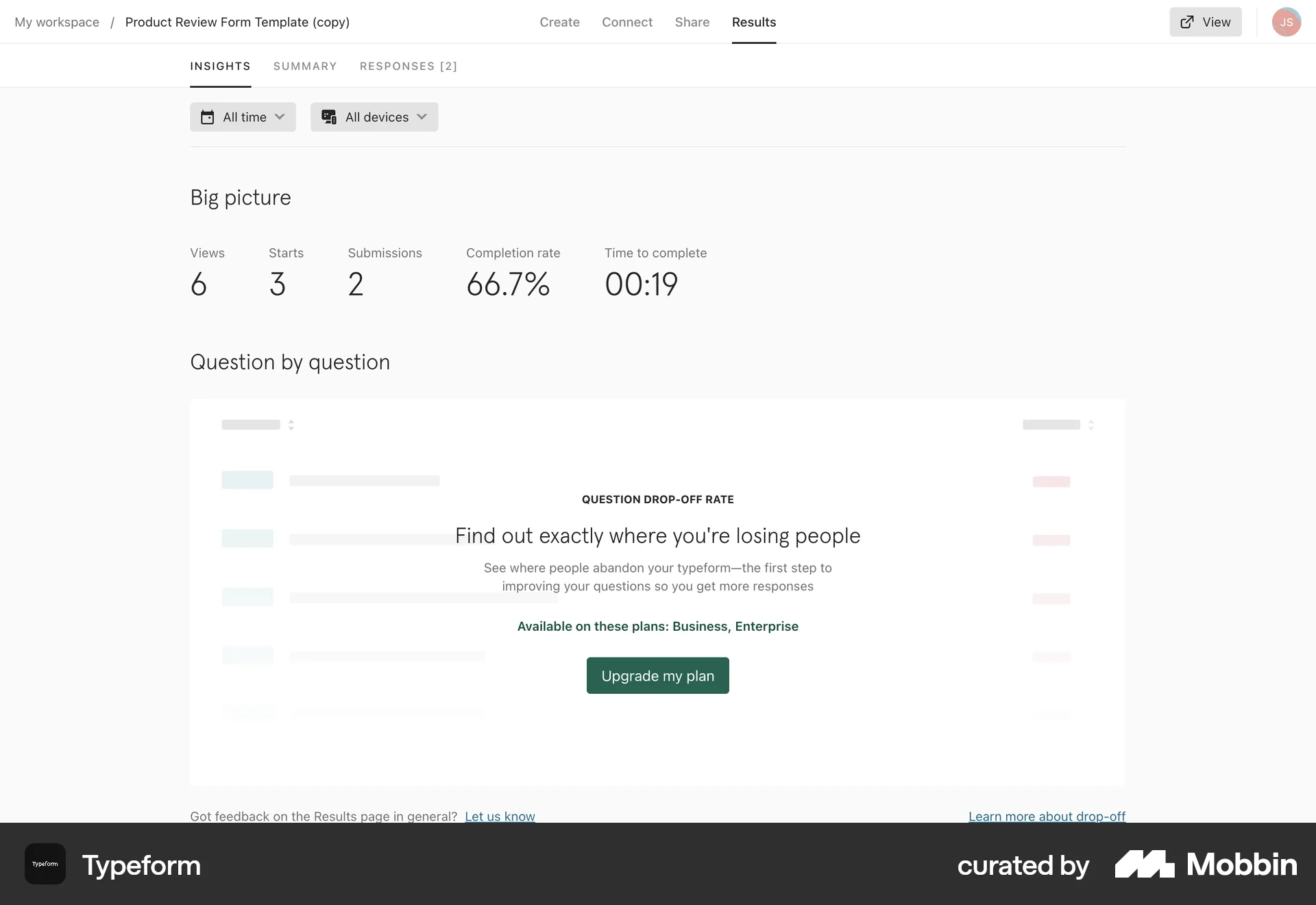
In Typeform's Insights dashboard, users can see basic analytics like views, submissions, completion rate, and time to complete.
But when they reach "Question drop-off rate" — the deeper behavioral insight — the data is locked.
Instead, the UI says:
"Find out exactly where you're losing people." - this UX copy is another important hint
And gives a single action:
Upgrade my plan.
UI pattern
This pattern usually includes:
- The feature visible but blurred or blocked
- A short explanation of what the insight reveals
- The plans that unlock it
- One upgrade CTA
The key detail here is placement.
The paywall appears inside the feature itself, exactly where the data would normally appear.
UX psychology
This pattern works because of principal of earned curiosity.
- The user already has data.
- They already see the dashboard working.
- Now the product reveals that there's a deeper insight hiding right here.
Not somewhere else.
Right here.
So the upgrade doesn't feel like buying something new.
It feels like unlocking the next layer of understanding.
Business model alignment
This works especially well for analytics and insight products.
- Basic metrics stay free.
- But deeper insights — the ones that help you actually improve results — become the upgrade trigger.
So the paywall appears right when the value becomes meaningful.
UX takeaway
The best access paywalls don't interrupt the product.
They live inside the experience, exactly where the value should appear.
Which makes the upgrade feel like a natural next step.
Common mistake: Don't make it sketchy
Locking features before users understand why they matter.
If the surrounding value isn't visible yet, the paywall feels arbitrary instead of motivating.
Paywall 2: Free Trial paywall
One of the most powerful tricks in subscription design is this:
You don't ask people to pay.
You ask them to try the product first.
That small shift changes the entire decision.
What it is
A trial paywall invites users to unlock the full product by starting a free trial, instead of paying immediately.
The product isn't saying: "Buy this."
It's saying: "Experience the full thing for a while."
Example
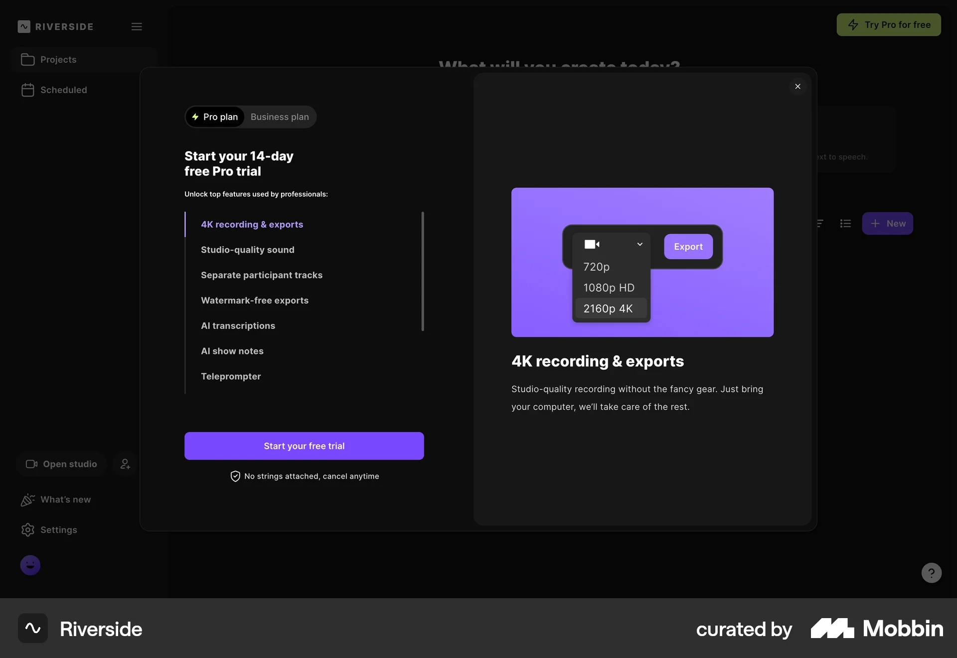
In Riverside, when a user tries to export high-quality video, a modal appears offering a 14-day Pro trial.
You can still do it, it's just that it will have a watermark.
The screen highlights premium features like:
- 4K recording & exports
- Studio-quality sound
- Separate participant tracks
- Watermark-free exports
- AI transcriptions
And the main action is simple: Start your free trial.
UI pattern
Trial paywalls typically include:
- A free trial headline
- A list of premium features
- One primary CTA: Start free trial
- A reassurance line like Cancel anytime
Often, one feature is also visualized — like Riverside showing 4K export quality.
UX psychology
Trial paywalls remove the fear of commitment.
Instead of evaluating price, users evaluate experience.
The mental question changes from:
"Is this worth paying for?"
to
"Do I want the full version?"
And that's a much easier decision.
Business model alignment
Trial paywalls work best when the product's value becomes obvious through usage.
Video tools, design tools, and AI platforms often rely on this model because once users experience premium workflows, they're much more likely to convert.
The goal isn't immediate payment.
It's getting users into the premium experience.
UX takeaway
Trial paywalls shift the conversation from pricing to product experience.
Instead of selling the subscription directly, the interface sells temporary access to the full product.
Common mistake
Offering a trial before users understand why the premium features matter.
If the value isn't clear yet, the trial just feels like another step — not an opportunity.
Paywall 3: Feature paywall

Most paywalls lead with price.
The best ones lead with possibility.
Because when users can see what they're about to unlock, the decision stops being about money.
What it is
A feature paywall shows users the full product experience, but locks the individual features behind a subscription.
The product is usable.
But the best parts require upgrading.
Example
In this Moonly meditation app, the paywall highlights the premium experience up front.
It shows all the things you could unlock:
- Calendar
- Affirmations
- Runes
- Wisdom
- Healing
- Meditations
Then, below that, the subscription options appear with 3 simple options:
- Monthly
- Annually (with a discount)
- Lifetime access
And the primary action: Subscribe.
UI pattern
Feature paywalls often include:
- A grid or list of premium features
- Visual icons or illustrations for each capability
- A simple set of pricing options
- One large CTA to subscribe
The UI focuses less on pricing details and more on what you unlock.
UX Psychology
Principle of Reactance.
This pattern sells possibility.
Instead of saying: "Here's the price."
It says: "Here's the experience you're about to unlock."
The feature icons help users imagine the full product before they commit.
And once that vision is clear, the price becomes easier to justify.
Business model alignment
Feature paywalls work best for content-driven or lifestyle apps where the value comes from a collection of experiences.
Meditation apps, wellness apps, productivity tools, and learning platforms often use this model.
The subscription unlocks the entire library of features.
UX takeaway
Feature paywalls lead with value first.
They show users the product's capabilities before asking for the subscription.
That framing makes the upgrade feel like unlocking a complete experience, not just paying for access.
Common mistake
Listing too many features without explaining why they matter.
If the icons feel abstract, users can't imagine the benefit — and the paywall loses its persuasive power.
Paywall 4: Usage paywall
Here's the section with the UX takeaway and Common mistake content swapped to their correct positions:
Some paywalls don't appear when you explore the product.
They appear when you start succeeding with it.
And that moment — when usage grows — is exactly when a usage paywall shows up.
What it is
A usage paywall appears when a user reaches the limits of their current plan.
Instead of blocking features, the product limits capacity — things like events, storage, messages, API calls, and credits.
When that limit gets close, the interface prompts the user to upgrade.
Example
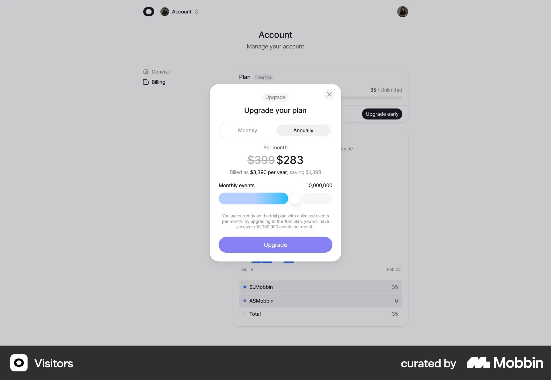
In this Visitors analytics dashboard, the user opens their account billing screen and sees a modal prompting them to upgrade their plan.
The modal includes:
- A monthly vs annual billing toggle
- A discounted annual price
- A usage slider for monthly events
- A clear upgrade button
The context is important.
This isn't a random sales prompt — it's tied directly to usage volume.
UI pattern
Usage paywalls usually include:
- Current plan information
- Usage limits or capacity indicators
- A slider or selector for higher tiers
- A clear upgrade CTA
The UI focuses on scale, not features.
It's about handling more activity.
UX Psychology
This pattern leverages the principle of growth momentum.
The user is already getting value from the product.
Their usage is increasing.
So the upgrade doesn't feel like buying something new — it feels like expanding capacity to keep going.
The message becomes: "You're growing. Let's scale with you."
Usage paywalls are common in:
- analytics tools
- infrastructure products
- API platforms
- SaaS products with measurable activity
Instead of charging for features, the business charges for the volume of use.
Revenue grows as the customer grows.
Business model alignment
Usage paywalls work best when the upgrade moment is directly connected to real usage data.
That makes the pricing feel fair and proportional to value.
UX takeaway
The best usage paywalls feel like a natural extension of success.
They appear exactly when the user needs more capacity, turning the upgrade into a growth moment rather than a barrier.
Common mistake
Triggering the paywall too early, before users have experienced enough success with the product.
If the limit feels arbitrary, the upgrade feels like friction instead of growth.
Paywall 5: Upgrade performance paywall
Some paywalls don't stop you from using the product.
They simply show you a better version of it.
That's the idea behind an upgrade paywall.
What it is
An upgrade paywall appears when a user is already inside the product and discovers a more advanced capability that isn't included in their current plan.
The product still works.
But certain higher-tier capabilities require upgrading.
Example
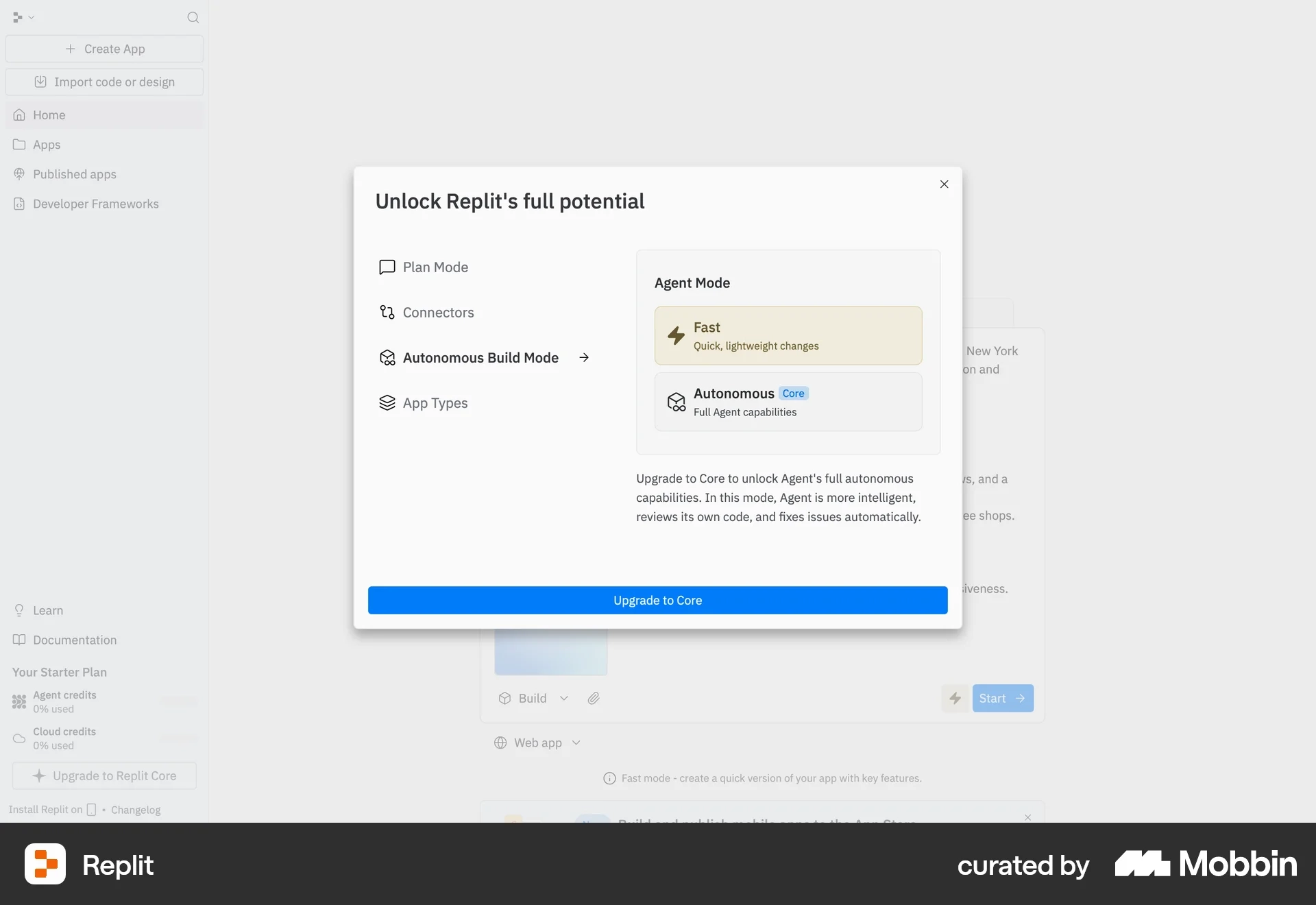
In this Replit interface, the user sees a modal titled:
"Unlock Replit's full potential."
It shows two options inside Agent Mode:
- Fast — quick, lightweight changes
- Autonomous (Core) — full agent capabilities
The advanced option is locked behind the Core plan, with a clear CTA: Upgrade to Core.
UI pattern
Upgrade paywalls usually include:
- A comparison between the current capability vs upgraded capability
- Clear explanation of the additional power or functionality
- One simple upgrade action
The UI focuses on what gets better, not just what gets unlocked.
What this UI is doing psychologically
This pattern taps into aspiration and mastery.
The user is already building something.
Now they're shown a more powerful version of the tool.
Instead of saying: "You can't use this."
The interface says: "Imagine what you could do with this."
It frames the upgrade as leveling up.
Business model alignment
Upgrade paywalls work well for tools where capability grows with user skill, such as:
- developer platforms
- design tools
- AI products
- productivity software
As users become more advanced, they naturally want more power and control.
UX takeaway
Upgrade paywalls work best when the advanced capability feels like a natural next step in the user's workflow.
The upgrade should feel like progress — not restriction.
Common mistake
Hiding the advanced feature completely.
If users never see what's possible, they never develop the desire to upgrade.
Paywall 6: Add-on paywall
Here's another clever psychological trick in SaaS pricing.
Instead of forcing users to upgrade their entire plan…
Products sometimes let you buy just one extra capability.
That's the idea behind an add-on paywall.
What it is
An add-on paywall allows users to purchase individual features or capabilities on top of their existing subscription.
The user keeps their current plan.
They simply pay extra for specific functionality they need.
Example
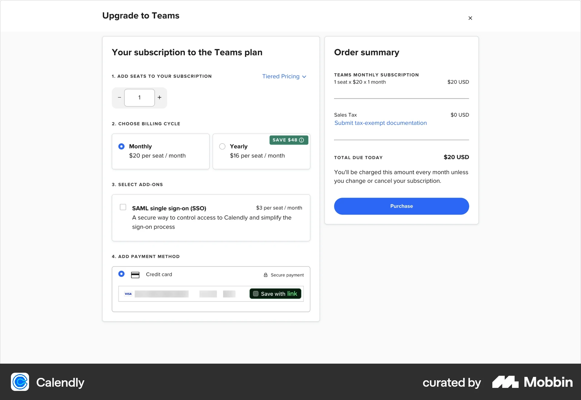
In this Calendly Teams upgrade flow, the user is already configuring their subscription.
They choose:
- Number of seats
- Billing cycle (monthly or yearly)
Then they see an optional add-on:
SAML Single Sign-On (SSO) +$3 per seat per month.
The user can enable it with a simple checkbox before completing the purchase.
UI pattern
Add-on paywalls usually include:
- Optional feature toggles or checkboxes
- Clear pricing tied to the add-on
- Short explanations of the capability
- An updated order summary
The UI treats the feature like an optional enhancement rather than a required upgrade.
UX Psychology
This pattern leverages customization and control.
Instead of forcing users into a bigger plan, the product says:
"Only pay for what you actually need."
That reduces friction and makes the purchase feel more flexible and fair.
Business model alignment
Add-on paywalls work well for products where certain capabilities only matter to specific users. For example:
- enterprise security features
- integrations
- extra storage
- advanced analytics
- compliance features
When they let the company capture additional revenue without forcing everyone into higher tiers.
UX takeaway
Add-on paywalls work best when the extra capability solves a clear, specific problem for a subset of users.
The more targeted the add-on, the more valuable it feels.
Common mistake
Hiding important functionality inside add-ons without clearly explaining why they matter.
If users don't understand the benefit, they'll simply ignore the option.
How to Use These in Your Product Design Process
One of the most useful ways to work with these examples is through the Figma file I’ve put together. Inside it, I’ve curated a collection of real product screens sourced from Mobbin—a resource I come back to often because it gives you direct access to how real products are actually designed and shipped.
Each example includes a link so you can explore it further and understand the full flow and context behind the design decisions. This isn’t just about collecting inspiration—it’s about seeing how patterns are applied in real products, in real scenarios.
What makes this even more practical is how easily you can start using these patterns yourself. Within Figma, you can take any of these screens and send them into Figma Make to generate a version adapted to your own design system (as long as everything is properly set up). It’s a simple way to move from observation into application without starting from scratch.
As you go through the examples, take time to think through the psychology behind them, along with the UI mistakes and best practices they highlight. The goal isn’t to copy what you see, but to understand why it works—and then apply those insights to your own product in a way that helps users see value and take action.