When most people think of good UX/UI design, they imagine sleek layouts, and well-laid out components and user-centered design. And while these elements are all part of the puzzle it doesn't reveal the entire picture. UX/UI design isn’t just about making things look nice or even work smoothly and it's not even about being solely focused on pleasing the users; it’s about whether or not your design is a good vehicle for it's intended purpose.
Great design is not about the thing itself; it's about the meaning it holds for people. - Elizabeth Alli
Consider this: if aesthetics alone could make a product successful, every beautifully designed app would be a hit. But that’s not the case. The difference between an interface that looks good and one that’s genuinely effective often boils down to a few things most people overlook—like understanding business strategy and user needs. Let’s unravel this common misconception and explore why great UI and UX design hinges on a solid grasp of product strategy.
The Common Pitfalls of a “Pretty-First” Approach
Many new designers, eager to create beautiful interfaces, fall into the trap of thinking that great design is only about visuals. But when you prioritize appearances alone, you risk building something that looks amazing yet struggles to solve real-world problems. “I used to think that as long as my designs looked great, they’d speak for themselves,” shared one DesignerUp student. “But I quickly realized that an app’s visuals are only as good as the strategy behind them.”
Real-world design involves aligning aesthetics with a company’s goals, understanding the user’s needs, and creating a product that not only looks good but feels intuitive and practical. That’s why learning the ‘what’ and ‘why’ of UI design is just as important as knowing ‘how’ to design. Students who go through a program focused on business and product strategy gain the skills to make design decisions that are both attractive and strategic.
UX that is Too User-Centric
A highly user-centric design, while valuable, can sometimes steer away from the business’s needs if it focuses too much on “ideal” user journeys. For instance, a news app might prioritize ad-free, uninterrupted reading for the best user experience. While users might enjoy it, this model can hurt the app’s revenue if the design doesn’t also support ad placements or subscription options.
A balanced approach would take user needs into account—by keeping ads non-intrusive and designing a smooth upgrade path to an ad-free experience—while also driving essential business goals.
"I now see design as a strategic tool rather than just a creative one. This approach has transformed my entire process.” — Charles Haddock
Beyond Aesthetics: How to Think Like a Product Designer
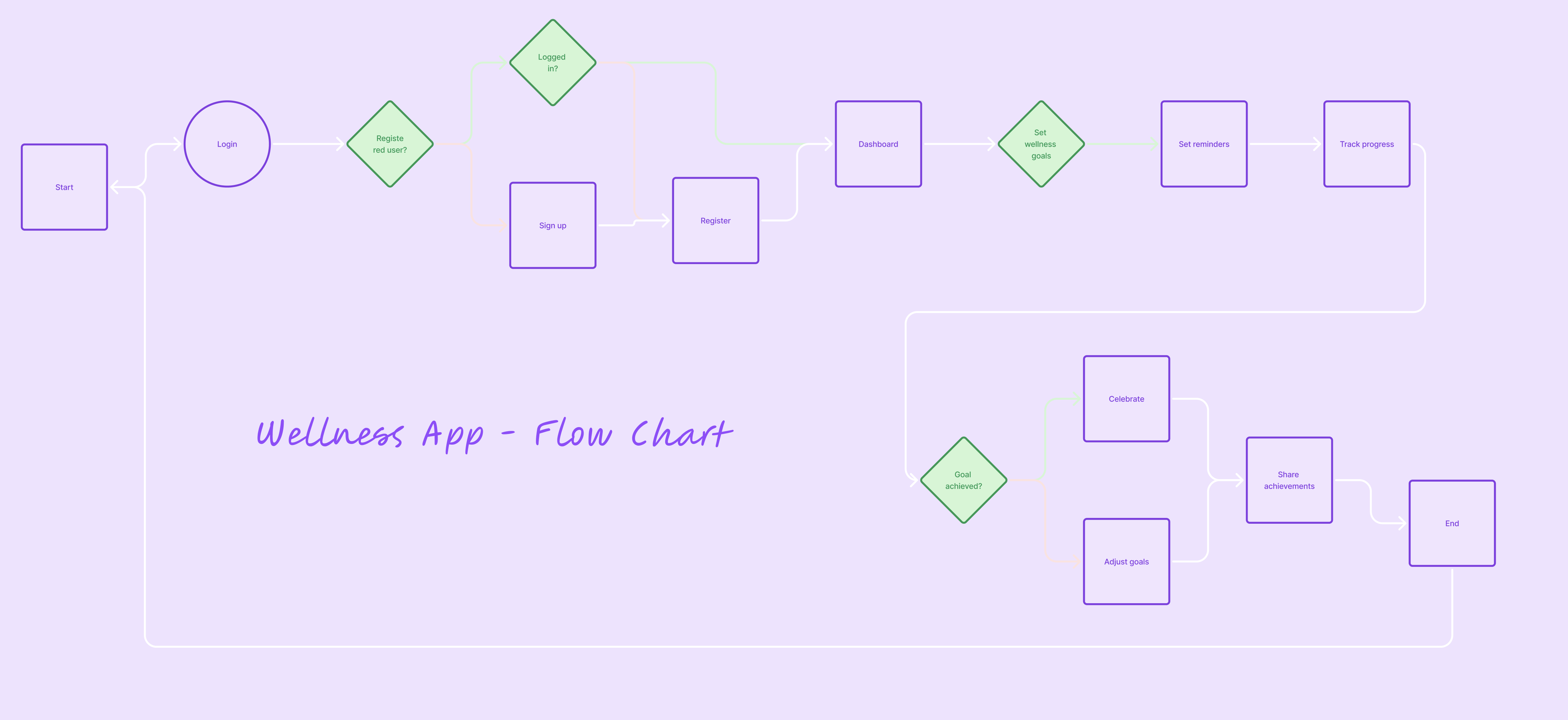
Good UX/UI design begins with a simple yet essential question: what’s the product’s purpose? As a designer, you need to think beyond the surface and understand the heart of what you’re building. For instance, if you’re creating a wellness app, it’s not enough to use soothing colors and peaceful visuals; you have to create an experience that helps users form and maintain healthy habits and also supports the business model of the company that creates this tool. That requires an understanding of habit-forming UX, user psychology, business models and strategic design.

One student from our course noted, “DesignerUp has shown me how to view design through a business lens, which has been a game-changer. I now think about each design element’s purpose and how it impacts the overall product.” This product-first mindset is something we emphasize because it ensures you’re not just decorating a product but contributing to its overall success.
"It’s amazing how this course helped me think about the ‘why’ behind every design decision. I used to focus so much on colors and shapes, but now I see the bigger picture." — DesignerUp Student
Product-Market Fit as the Core of Design
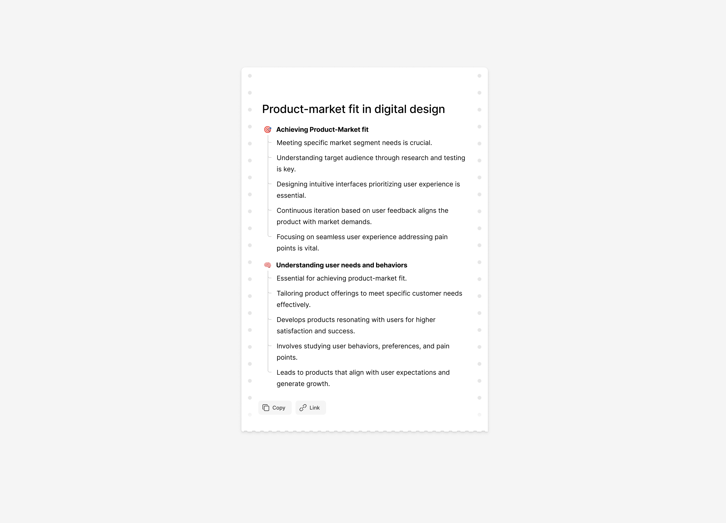
To achieve product-market fit, designers need to understand who their users are and how the product fits into their lives; it’s not about making a product that’s better than your competitors either, about creating a product people will naturally use and rely on because it works for them and their specific workflow just a little better than the others. Here’s how we incorporate product-market fit into the UI design process:
- Know who you’re designing for
It’s not enough to solve a problem, you really need to decide what type of person or group you are solving it for. No market is too saturated if you can dial in your user a little better and more specifically than the rest of your competitors. - Defining User Problems
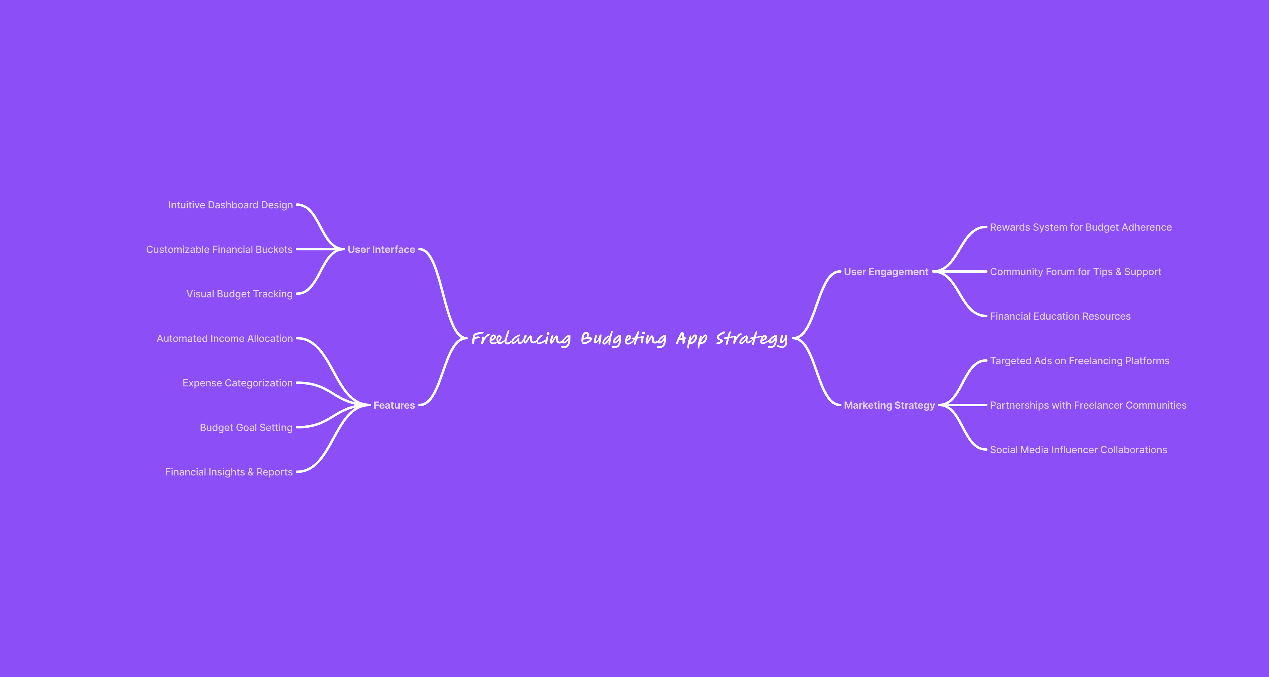
Good UI design is rooted in understanding user needs. If you’re designing an app to help busy mom manage their finances, for example, every design choice should help users with a specific set of issues, behaviours and use cases budget, save, and feel in control of their money. - Aligning with Business Objectives
Products must align with a business’s goals and market positioning. This means creating designs that support the company’s mission, whether that’s improving user engagement or increasing sales. One of my students shared, “I used to think about design from a purely visual standpoint. Now, I design with the company’s business model and goals in mind, and it’s been a total game-changer.” - Iterating for Fit and Functionality
Product-market fit isn’t static; it’s something that evolves as user needs and market dynamics change. Design that’s built to adapt over time not only maintains relevance but also positions the product for long-term success Testing, tweaking, and optimizing my designs based on user feedback is what makes them truly successful.
"It’s amazing how this course helped me think about the ‘why’ behind every design decision. I used to focus so much on colors and shapes, but now I see the bigger picture." — DesignerUp Student

Designers who understand product-market fit are better equipped to make decisions that benefit the entire product, not just the UI. This is where business and product strategy play a crucial role. They ensure that the design supports the product’s value and helps it stand out in a crowded marketplace.
The curriculum in this course for example, emphasizes teaching students how to align their design work with strategic goals. As one student shared, “Learning the business side of design helped me understand that UI isn’t just about visuals—it’s about how the product fits into the market and meets users’ needs.”
Key Principles That Go Beyond Visuals
Here are some pillars of effective UI design that emphasize the importance of a strategic approach:

- User-Centric Problem Solving
At the heart of every successful UI design is a deep understanding of the user and business goals. A beautiful layout that doesn’t address a user’s needs is like a map that doesn’t lead anywhere for them. By focusing on the problem your design is solving, you create something that resonates. Learning to identify the user’s pain points first made my designs more thoughtful and, ultimately, more successful. - Product and Business Alignment
For UI to support the larger goals of a business, it must be built on an understanding of product strategy. In our course, we emphasize this approach so that new designers understand how to create designs that align with business goals. “This was a huge eye-opener for me. I learned to view my designs from a business perspective, which has completely changed my approach,” shared another student. - Effortless Navigation and Flow
A well-thought-out flow makes for an intuitive user journey. Good UI isn’t about throwing every possible feature onto the screen; it’s about creating a logical, comfortable path that lets users achieve their goals without confusion or distraction. A student told us, “One of the biggest things I learned was the importance of removing distractions in the design to make the user journey as smooth as possible.” - Design as a Strategic Asset
UI isn’t just about designing screens; it’s about contributing to a product that delivers real value. When you focus on strategy, each design element serves a purpose and adds to the product’s overall effectiveness. Learn to see design as a strategic tool rather than just a creative one.
“The insights I gained from understanding the product and business side of things gave me the confidence to take on projects with a different mindset.” — DesignerUp Student
Why New Designers Should Learn to Think Strategically
Learning design software and mastering color theory are essential, but they’re just the basics. The real impact comes when you understand the product you’re designing for, the business goals it supports, and the way users interact with it. That’s why DesignerUp focuses on training designers to be strategic thinkers.
Ellen Lupton advocates for a mindful approach to design: “Think more, design less.” encourages designers to invest time in strategic thinking before diving into aesthetics, ensuring that each design element supports the product’s goals and user journey.
When you enroll in a course that covers business and product strategy, you’re setting yourself apart. You’re learning to think like a product designer—someone who considers how each element impacts the product as a whole. “I finally feel like I’m designing with a purpose, not just creating something that looks nice,” shared a DesignerUp student.
Mindful design is at the core of our teachings- learning to understand people and how they think and behave from a non-judgemental and authentic place and then creating solutions that are intention and purpose-driven.
A product-driven approach helps you make decisions that serve a purpose beyond aesthetics. Instead of only choosing a color because it looks good, you’re choosing it because it supports the product’s goals and appeals to the user’s needs.
If you're curious where you stand in terms of your strategic thinking, one good way find out is to take a UX/UI self-assessment. You can take this one for free and following along with this video tutorial.
Conclusion: Invest in Your Skills and Stand Out
If you’re new to UI design, understanding business and product strategy might seem like an advanced topic, but it’s one of the best investments you can make in your design education. These are the skills that will help you stand out in a competitive field, giving you the ability to think critically and solve real problems.
As you think about your design journey, remember that anyone can learn the basics of UI design. The designers who excel are those who understand why design matters and how it aligns with the bigger picture. With a focus on product strategy, you’re not just learning to design—you’re learning to create impactful, effective, and memorable products.
“This course completely changed my view on design. I now understand that good UI isn’t just a ‘nice-to-have’; it’s essential to a product’s success.” — DesignerUp Student
If you’re ready to move beyond the basics, consider joining a course that will equip you with the tools to think like a true product designer.

