
Over the past few months, I’ve been working on improving the onboarding and user conversion for one of the products I'm building. During that time, I studied and analyzed over 200+ onboarding flows to get a better sense of the main types of UX/UI design patterns and the components used in these flows.
For this, I created a Figjam table as well as a Notion table where I've categorized the 14 main types of onboarding design patterns from the world's best apps and I thought it would be useful to share this and how you can borrow from and copy these patterns to enhance your product's user experience.
Here is our table. You'll see that I have all of the patterns listed here on the left, followed by a definition of what it is, the best use case where this is appropriate, pros and cons, the UI elements that you need, and real working examples.
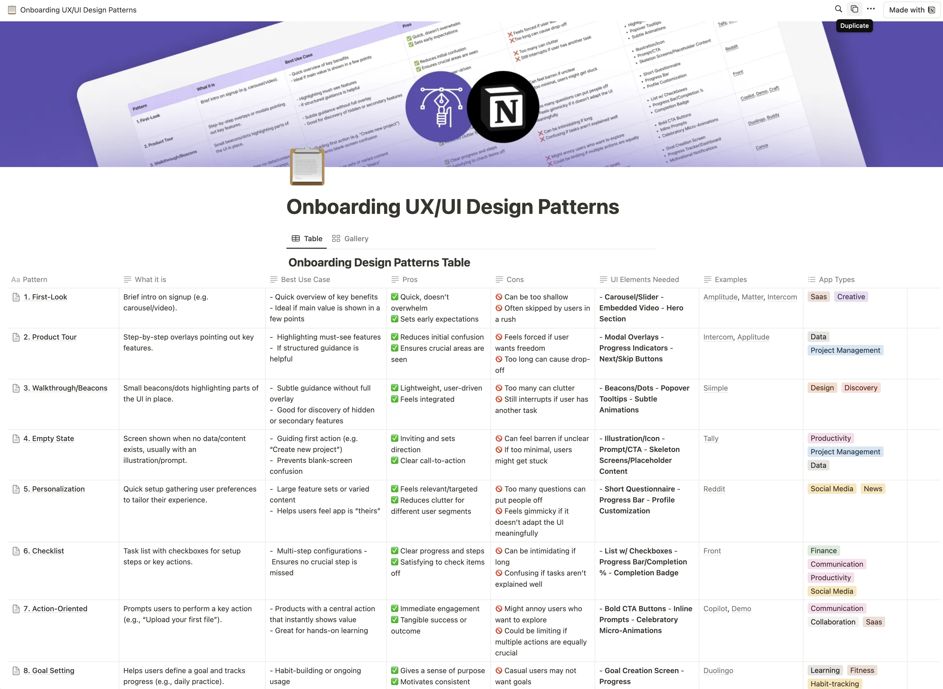
In Notion, I also have these tagged with app type, so if you're, let's say, working on a SaaS app, you can come up here, search "SaaS," and you'll see that I've tagged the ones that are most commonly used in those types of apps. I also have a gallery view here so you can see everything at a glance and all of the examples that I've added.
1. First Look
What it is
A brief introduction to your product that appears right after someone signs up or logs in for the first time. It usually takes the form of a concise carousel or a short video that highlights the product’s main benefits.
UI Components / Design Pattern
- Carousel / Slider: A few panels that open in a modal that people can swipe, click through or use next button
- Embedded Video: Useful if a dynamic in-action preview explains things better than static slides.
- Way to close the modal: Like an x button in the top right
Best use case
- Productivity and collaboration apps (e.g., Slack, Notion)
- Creative tools (e.g., Adobe Express, Canva)
- Complex SaaS tools (e.g., HubSpot, Airtable)
- When you want to give a quick snapshot of how things work
- This is great to show that high-level bird’s eye view of your product’s workspace or workflow in action.
Pros
- Doesn’t overwhelm the user with too much information, you want to keep this to the main big things that they need to understand.
- Helps them preview what’s going to happen and how they can move around your product
Cons
- Can be too high-level if it’s mostly pretty slides with little substance.
- Some of these videos are not edited or paced well and user just loose and patience and want to click off and try it already.
- Some people skip them if they’re in a hurry.
Why we like this pattern
They’re visually appealing and easy to skim. Carousels or sliders let people click at their own pace, while an embedded video can instantly show the product’s feel.
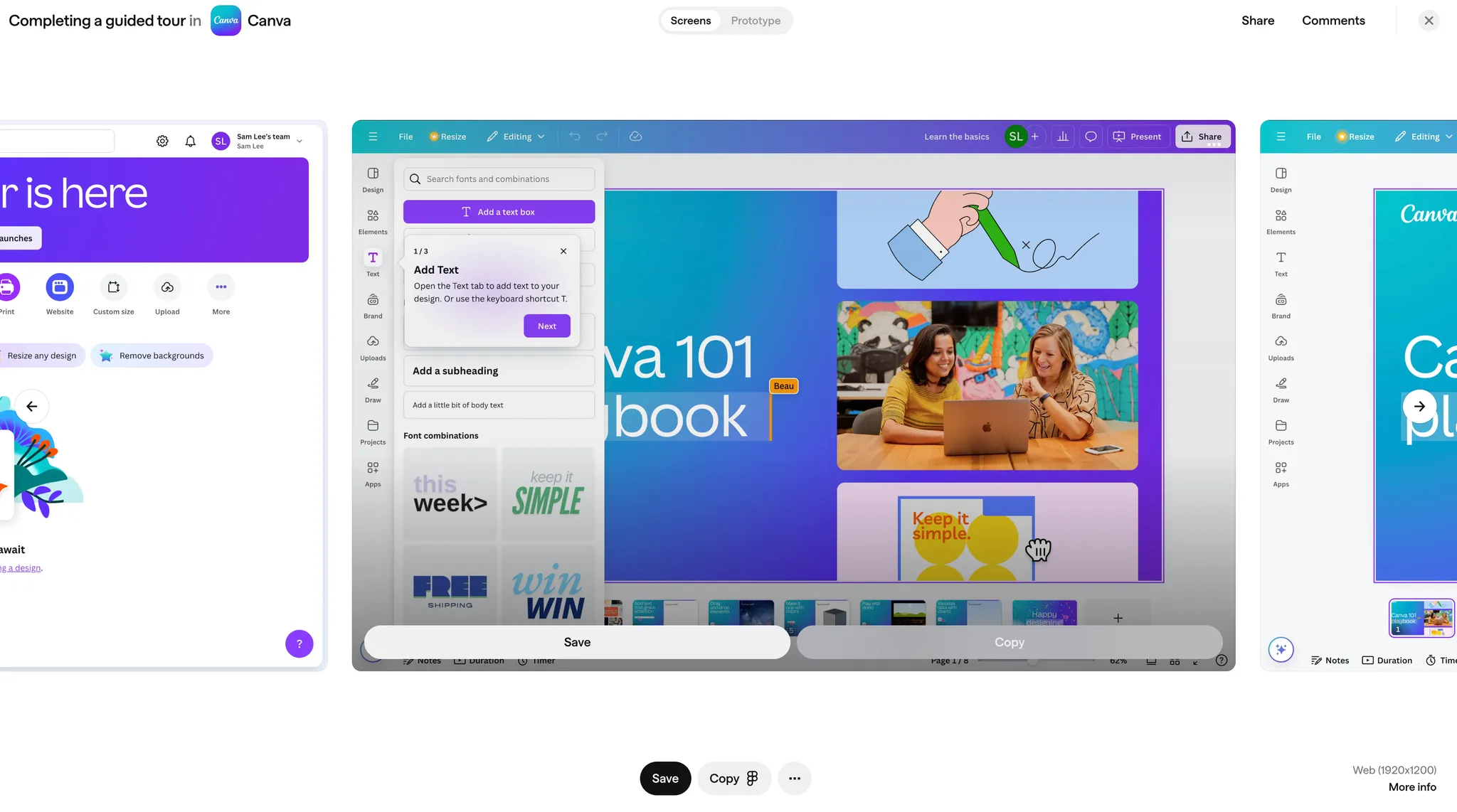
2. Product Tour
What it is
A step-by-step guide pointing out core features of your product. Usually involves overlays or pop-ups that guide new users around the interface in a set order or sequence.
UI Components
- Modal Overlays: Dim the rest of the screen, highlight one feature at a time.
- Progress Indicators: Show how many steps or items remain.
- “Next” and “Skip” Buttons: Give people control over pacing and let them opt out.
Best use case
- Analytics or data-heavy platforms (e.g., Google Analytics, Amplitude)
- Feature-rich project management tools (e.g., Asana, ClickUp)
- SaaS apps with complex interfaces (e.g., Intercom, Salesforce)
- Ideal if there are a few crucial features you don’t want anyone to miss.
- Provides a guided first experience for those who like structured help.
Pros
- Reduces initial confusion by showing exactly what matters.
- Provides a sense of direction and completeness.
Cons
- Might feel forced if people just want to explore.
- Too long a tour can fatigue users, leading them to quit halfway.
Why we like this pattern
They create a clear path without taking over the entire screen all at once. Progress indicators reassure users they won’t be stuck in an endless tour, while “skip” gives them the freedom to exit if they prefer to explore on their own.
3. Walkthrough Beacons
What it is
Similar to a product tour but it uses small beacons or glowing indicators in the interface. That user’s have to interact with before they move on. When users click or hover on these beacons, a pop-up or tooltip explains the feature right it place..
UI Components / Design Pattern
- Beacons / Dots: Small, often pulsating indicators.
- Popover Tooltips: Brief text that appears on click/hover, explaining the highlighted element.
- Subtle Animations: Catch the eye without feeling too “in your face.”
Best use case
- Website builders and customization tools (e.g., Siimple, Webflow)
- Design and editing apps (e.g., Figma, Canva)
- Apps where subtle discovery of features enhances experience (e.g., Shopify, Squarespace)
- When you want to introduce features without using full-screen overlays.
- Stay immersed in the product and by guided through action within it
- Helpful for highlighting parts of the interface folks might not notice on their own or drawing thier attention to things that might be hidden within menus.
Pros
- Feels lightweight and part of the UI (instead of dominating the entire screen).
- Lets users pick which beacon to explore, rather than being forced through a set sequence.
Cons
- Could still distract if users are trying to get something done immediately and it gets in their way.
- Too many beacons can clutter the interface or become visual noise. So don’t try to use this for every single feature that you have.
Why we like this pattern
They provide a gentle nudge in the right places. The subtle nature of beacons keeps the interface from feeling locked down with front-loaded onboarding steps, and popovers deliver more info only if and when the user wants it.
4. Empty State
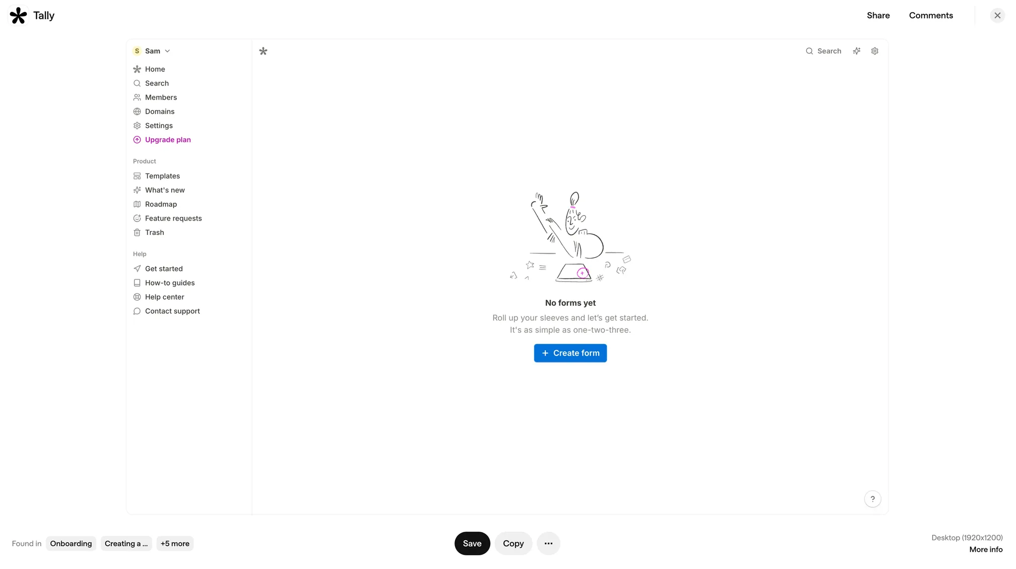
What it is
What the user sees when they have no content or data in a particular feature. Often a mostly blank screen with a small illustration, message, or prompt guiding them on what to do next.
UI Components / Design Patterns
- Illustration or Icon: Visually warms up a blank screen.
- Prompt / Call to Action: Tells users what to do first (“Create your first board”).
- Skeleton Screens or Placeholder Content: A quick preview of how data will eventually appear.
Best use case
- Productivity or content creation apps (e.g., Trello, Notion)
- Task or project management software (e.g., Todoist, Monday.com)
- Apps that rely heavily on user-generated content (e.g., Pinterest boards, Airtable bases)
- When you need to show someone how to add or create their first piece of content. That initial interaction
Pros
- Sets a friendly tone with an inviting message.
- Keeps things uncluttered, focusing on a single nudge or next step.
- Prevents users from feeling lost in a bare interface.
Cons
- Might leave people stuck if instructions are unclear or too minimal.
Why we like this pattern
They transform emptiness into an instructive moment. A simple visual plus a concise call to action helps people understand what’s to do without feeling like they’ve hit a dead end.
5. Personalization
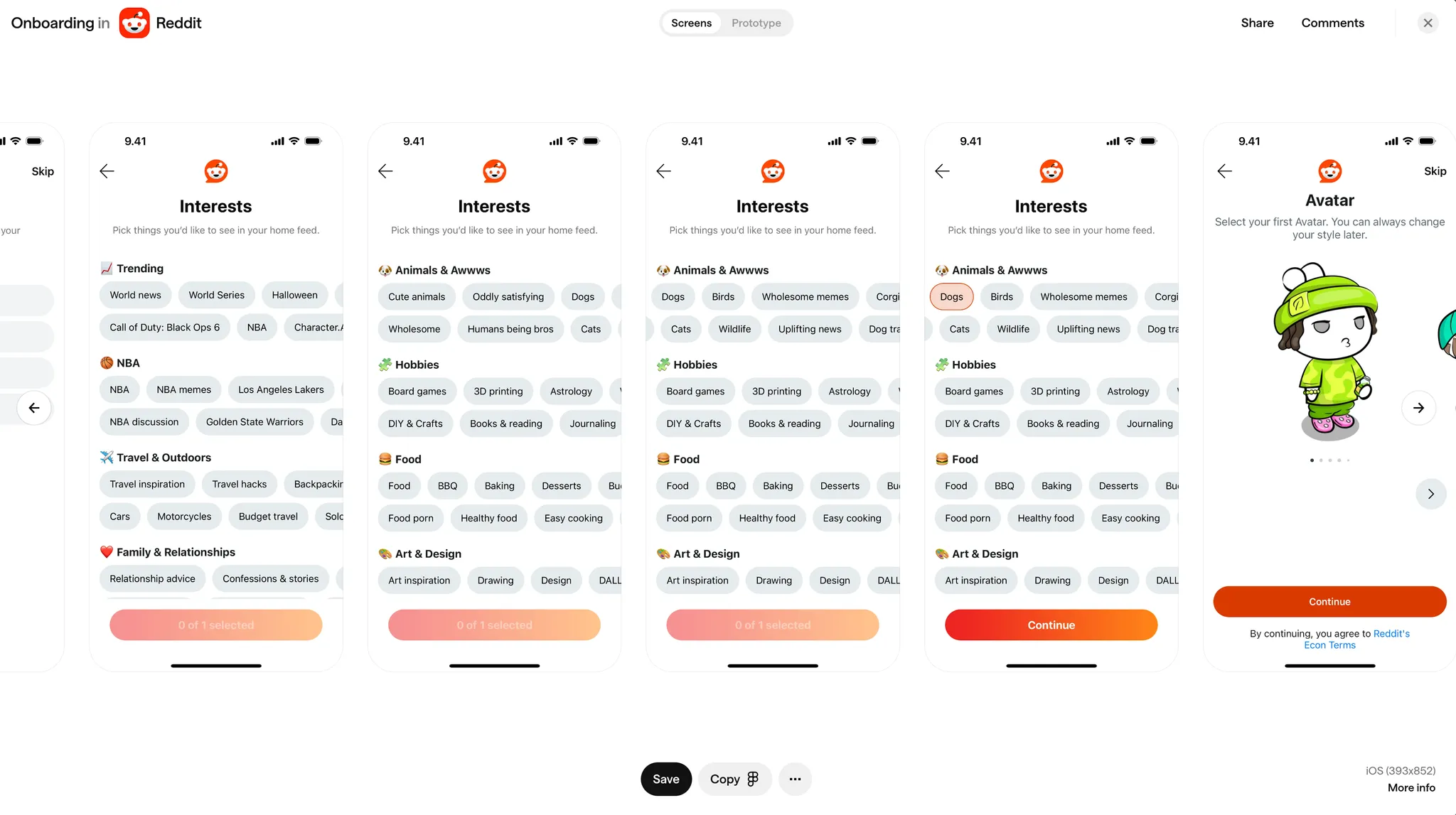
What it is
A quick way to gather user preferences or choices so the product experience can adapt to them (like picking favorite topics or categories or setting up notifications).
UI Components
- Questionnaire or Survey: A short form with checkboxes or dropdowns.
- Selection Chips: Little tags that they can select
- Progress Bar: So user know how many steps remain if multiple questions are asked.
- Profile Customization Options: Sliders or toggles to pick themes, categories, or personal preferences or in the case of Reddit to setup your avatar.
Best use case
- Social media and content apps (e.g., Reddit, TikTok)
- News and media aggregators (e.g., Medium, Flipboard)
- Streaming platforms (e.g., Spotify, Netflix)
- Helpful when your product has many features or content types, and you want to show people only what matters to them.
- Immediately tailors the experience to each person’s taste.
Pros
- Helps users feel it’s “their” product right away.
- It helps with tailor discovery and avoids overwhelming user with irrelevant content because instead it gives you the opportunity to only show them only thing they are interested in or care about.
Cons
- Asking for too many details upfront before users can try the product it can scare some user off.
- If nothing meaningful changes after they answer or they don’t feel like this is custom, it feels like a pointless exercise.
Why we like this pattern
It gives people a sense of this is made for me when they are done.
6. Checklists
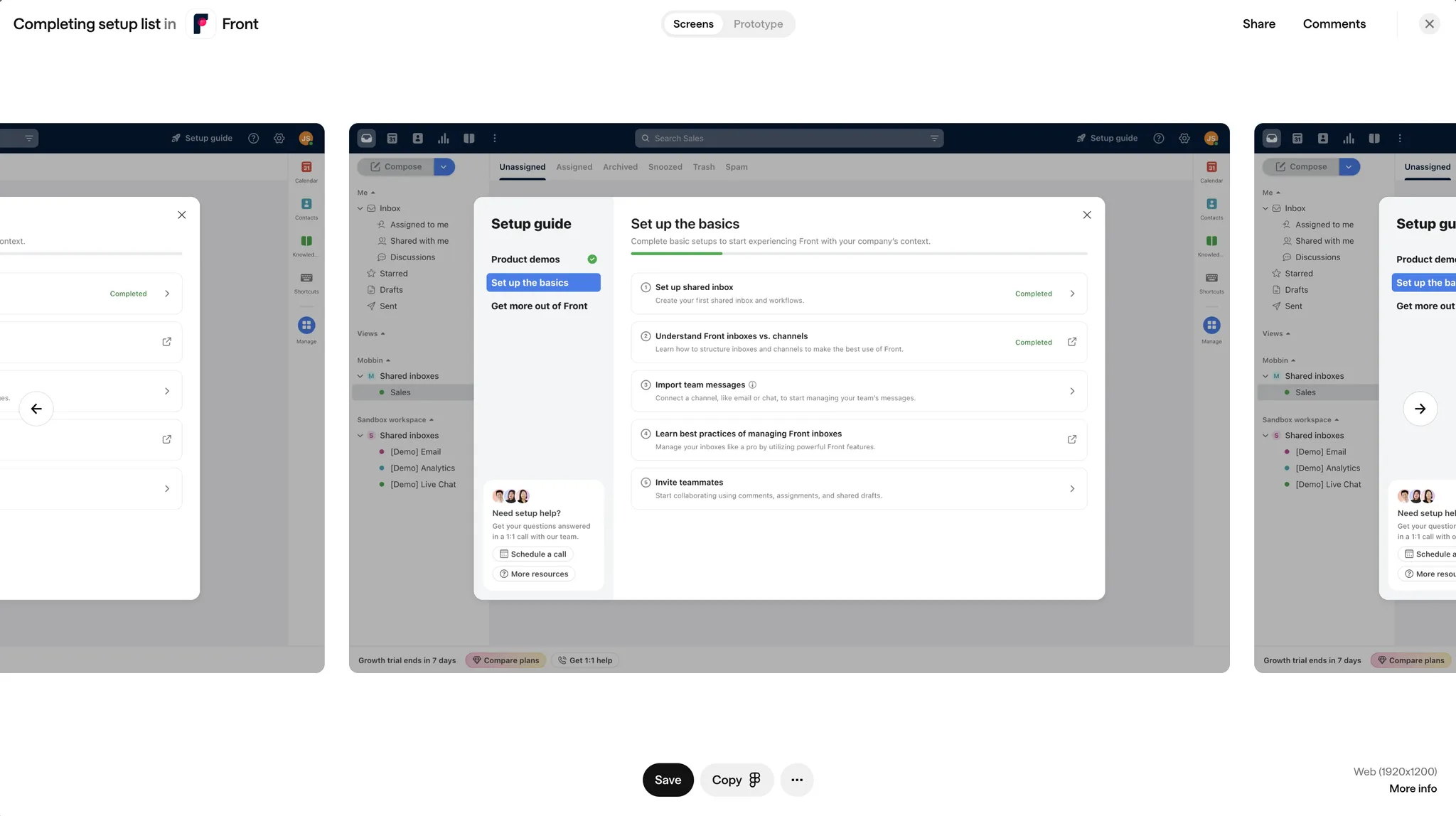
What it is
This is a simple list of tasks for users to complete to get fully set up. Each item is typically a action they need to take, and they can see progress as they go.
UI Components
- List with Checkboxes: Each item has a short explanation and instructions on what to do and where to do it
- Progress Bar or Completion Percentage: Lets users see how close they are to finishing.
- Completion Badge: A small celebratory note once they’re done. Some sort of success message.
Best use case
- Account setup-heavy apps (e.g., accounting software like QuickBooks)
- Productivity and communication tools (e.g., Front, Slack)
- Complex onboarding scenarios (e.g., Shopify store setups, CRM integrations)
- Great for products that require multiple configurations, like connecting accounts or setting preferences.
- Encourages users to systematically explore all the essential features.
Pros
- Very clear, step-by-step approach.
- Crossing tasks off gives a nice feeling of progress.
Cons
- A big list can be intimidating if it looks like too much work.
- If tasks aren’t described well, it might be confusing rather than helpful.
Why we like this pattern
They present the setup as actionable steps rather than vague tips. Checkboxes make each step concrete and trackable, while the progress bar motivates users to keep going.
7. Action-Oriented
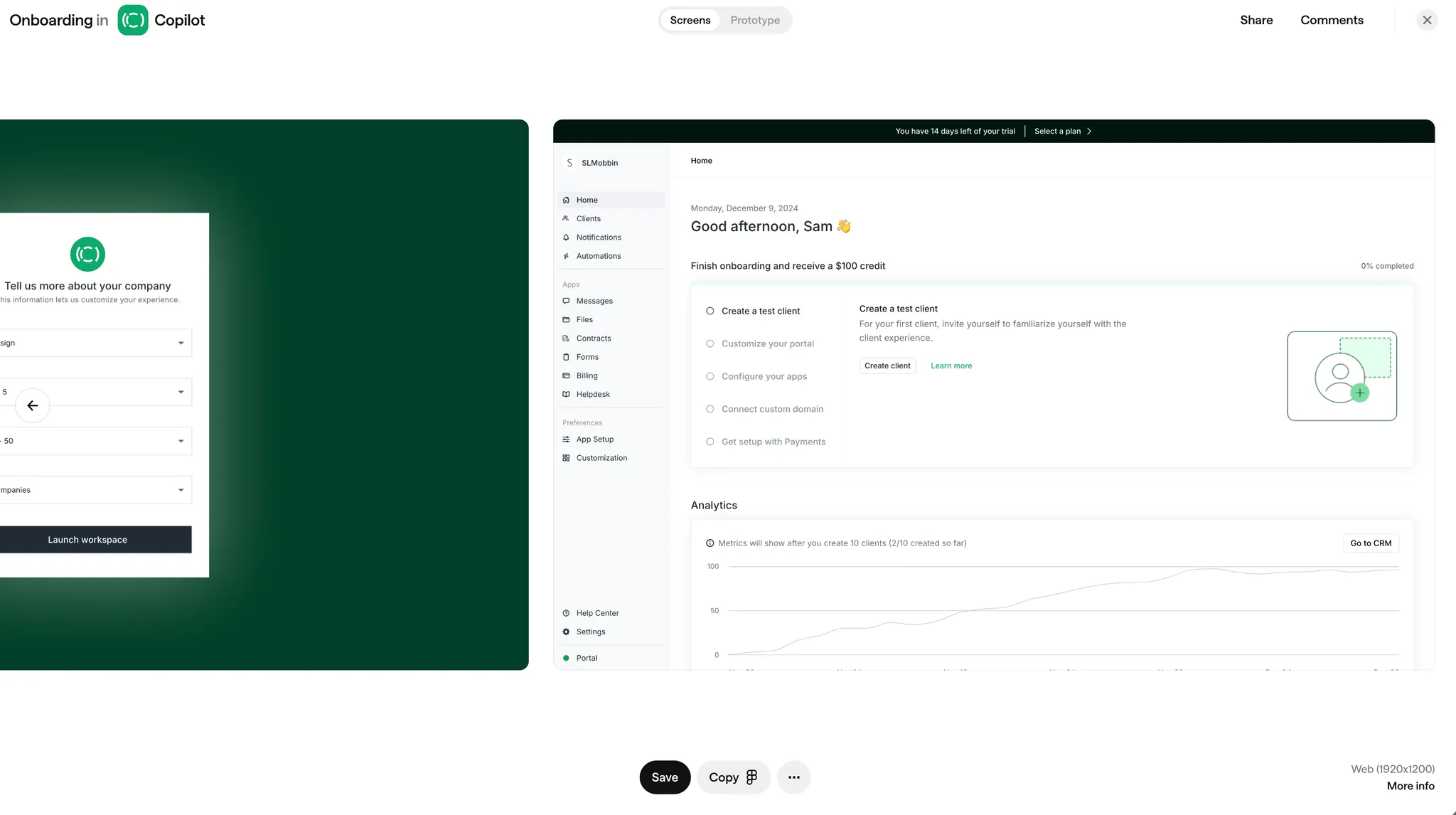
What it is
This pattern prompts folks to do a specific key action instead of just reading about features. It’s all about hands-on engagement from the start. Completing onboarding here may also be incentivized or rewarded.
UI Components
- Bold CTAs (Call-to-Action Buttons): Clear, direct language (“Send your first message now”).
- Inline Prompts: Tiny nudges or labels inside the interface where the user takes the action.
- Celebratory Micro-Animations: A small “hooray” moment after completing the action.
Best use case
- Communication or messaging platforms (e.g., Slack, Copilot)
- Document and collaboration apps (e.g., Google Docs, Dropbox Paper)
- SaaS products focused on quick value demonstration (e.g., Loom, Grammarly)
- When there’s a primary action that really shows off why the product is worthwhile.
- Perfect for software where one core task unlocks major value.
Pros
- Users learn by actually doing and see immediate results.
- Builds confidence early since they accomplish something tangible.
Cons
- Some people might prefer to explore on their own before committing to an action.
- If multiple tasks are equally important, focusing on just one may feel limiting.
Why we like this pattern
They encourage immediate interaction without burying the user in instructions. A direct CTA is easy to see and understand, while a little celebration when they succeed makes the product feel more friendly and fun.
8. Goal Setting
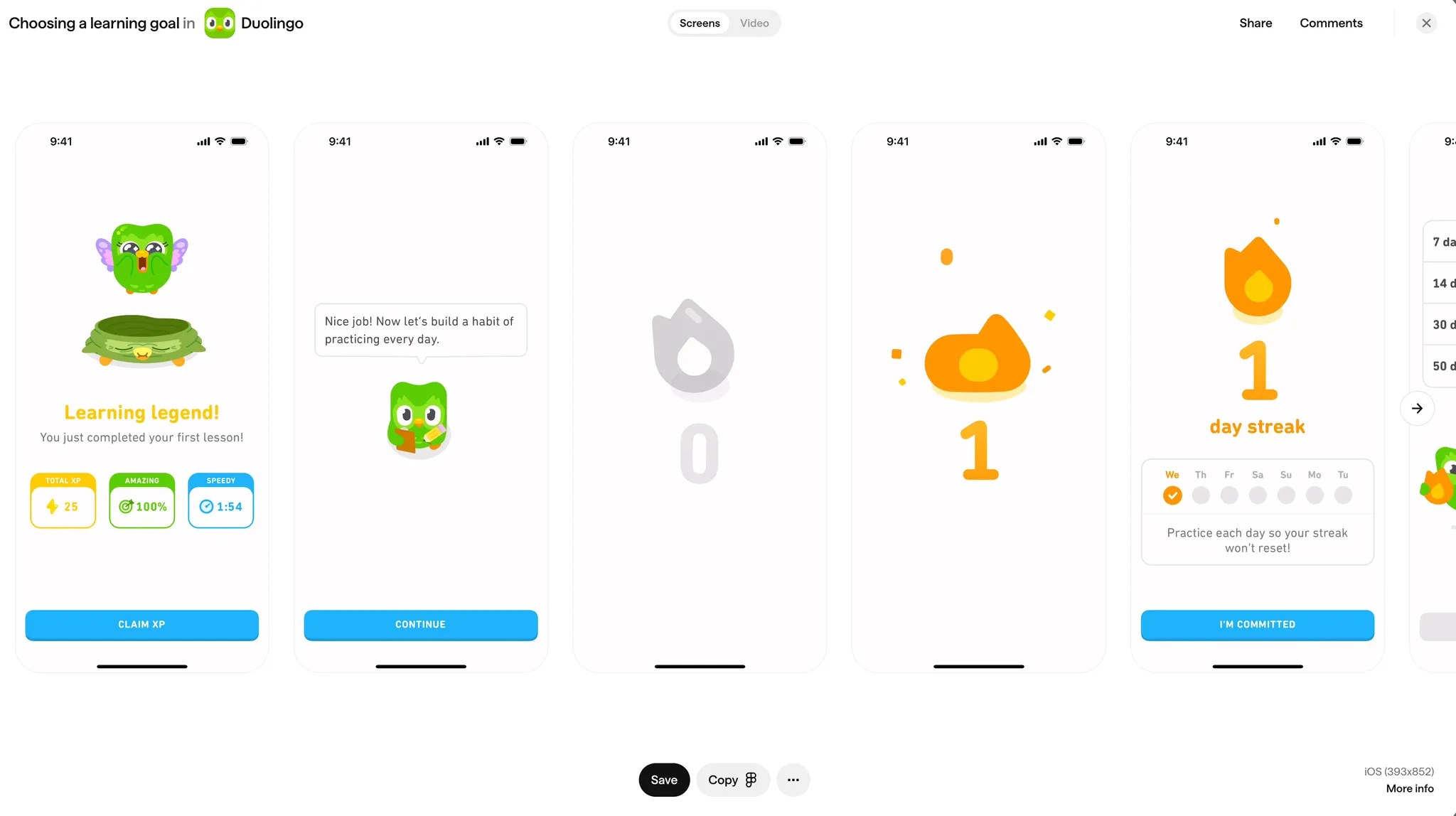
What it is
A pattern where you help users define a goal (like a weekly target) and then track their progress, encouraging them to stick with it.
UI Components
- Goal Creation Screen: A place to set daily, weekly, or monthly targets.
- Progress Tracker or Dashboard: Shows how close they are to meeting that goal, often as a ring or bar.
- Motivational Notifications: Little nudges that remind users to stay on track (though these might be in-app or via email/push).
Best use case
- Learning and education platforms (e.g., Duolingo, Coursera)
- Fitness and wellness apps (e.g., Nike Run Club, Headspace)
- Habit tracking and personal development tools (e.g., Fabulous, Strides)
- Products that rely on consistent or repeated usage.
- Any scenario where you can clearly measure success over time.
Pros
- Gives a concrete sense of purpose.
- Motivates recurring engagement because people want to reach that target.
Cons
- Can turn off users who just want to poke around without big objectives.
- Missing goals repeatedly might discourage some folks.
Why we like this pattern
They neatly frame progress in a way users can easily see and measure. A creation screen helps them commit, a dashboard keeps them updated, and gentle reminders help sustain momentum.
9. Coach Marks
What it is
Small pointers or highlights around different parts of the UI, each offering a short explanation. Think of them like digital sticky notes on buttons or sections.
UI Components
- Highlighted Spotlights: Dim the background, highlight the element in focus.
- Short Text Labels: One or two lines explaining the feature’s benefit.
- Close or “Got it” Buttons: So users can dismiss them easily once they’ve read.
Best use case
- Creative software and design tools (e.g., Canva, Photoshop Express)
- Apps introducing new features regularly (e.g., Instagram, Trello)
- Complex productivity suites (e.g., Microsoft 365, Google Workspace)
- When you need to explain what certain icons or tabs do without permanent text cluttering the screen.
- Especially useful for introducing a new feature to returning users.
Pros
- Doesn’t block everything else, so it feels less pushy than a full-screen overlay.
- Each coach mark is short and sweet.
Cons
- If you add too many, it’s overwhelming and might get ignored.
- Some users will skip them if they feel confident enough to explore solo.
Why we like this pattern
They allow targeted, on-the-spot guidance without making people sit through a long tutorial. The short labels keep it quick and relevant, and the spotlight naturally draws attention to important areas.
10. Demo Content
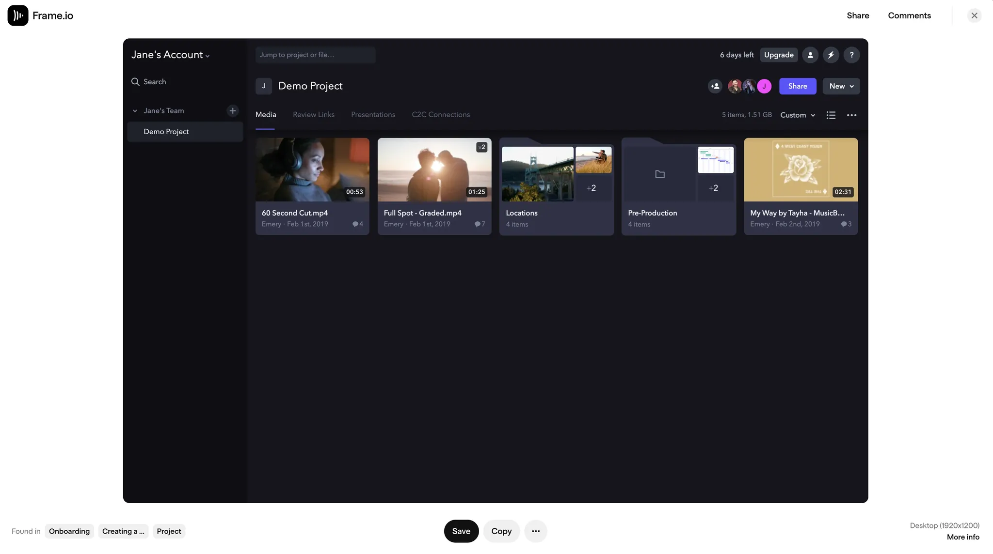
What it is
A sample set of data or project content that people can play with to get a sense of how the interface works, without having to upload or create something from scratch.
UI Components
- Prefilled Templates / Data: Realistic examples people can click around in.
- Editable Example Fields: Let them tweak or modify the sample data to see how things respond.
- Switch between “Example” and “My Content”: So they can easily move on when they’re ready to start fresh.
Best use case
- Data analytics and reporting tools (e.g., Tableau, Google Analytics)
- Creative software with templates (e.g., Figma, Adobe XD)
- SaaS apps where immediate exploration is valuable (e.g., Frame, Airtable)
- Tools that revolve around data, like analytics or design platforms.
- Any product where seeing it in action speaks louder than blank screens.
Pros
- Instantly shows the workflow in a more realistic way.
- Reduces friction because users don’t have to set up everything themselves.
Cons
- Might confuse some folks who think the sample data is theirs.
- Doesn’t necessarily reflect someone’s real-life scenario, so it could still feel abstract.
Why we like this pattern
They let users explore the product’s full capabilities from the get-go. Editable sample data helps people experiment in a “safe” way and often clarifies how things work more effectively than just reading instructions.
11. Simulation
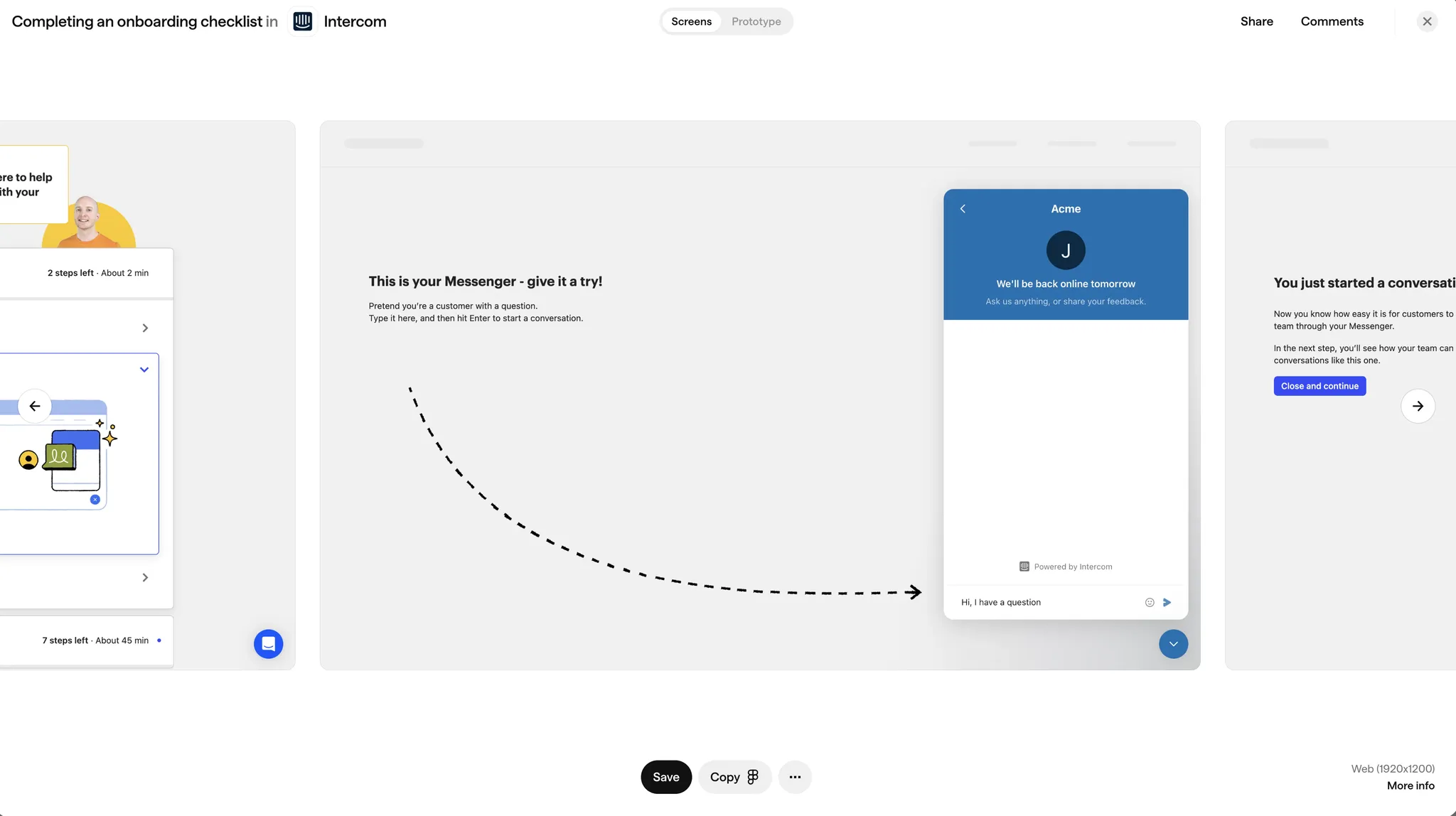
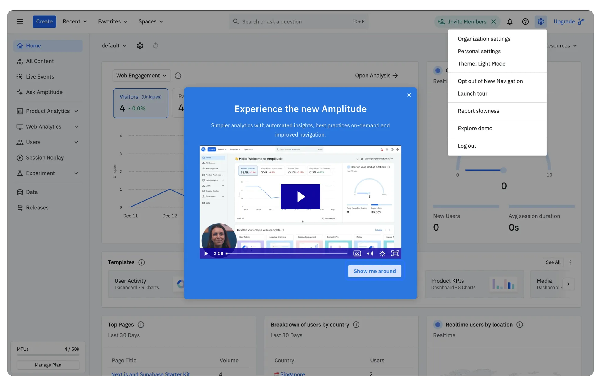
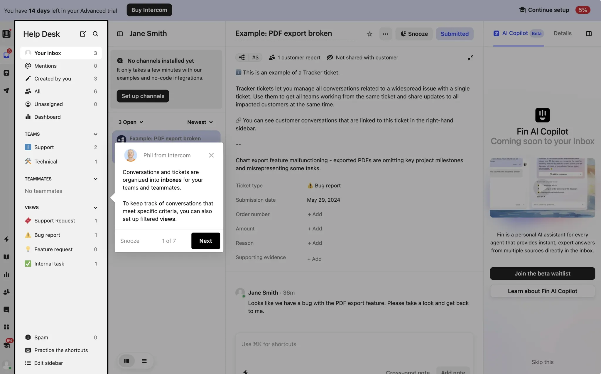
Number eleven is Simulation. This is an interactive or recorded demonstration that shows the product in action under realistic conditions.
For example, Intercom does this when setting up a chatbot. Users can test the messenger and see how it responds, simulating the real experience before going live.
The UI elements mimic the real user experience but include guidance to ensure users understand what’s happening.
You'll see this in customer support tools (Intercom, Zendesk), collaborative software (Zoom, Slack), and SaaS platforms (Salesforce). This is ideal for complex products that require customization.
12. Self-Segmentation
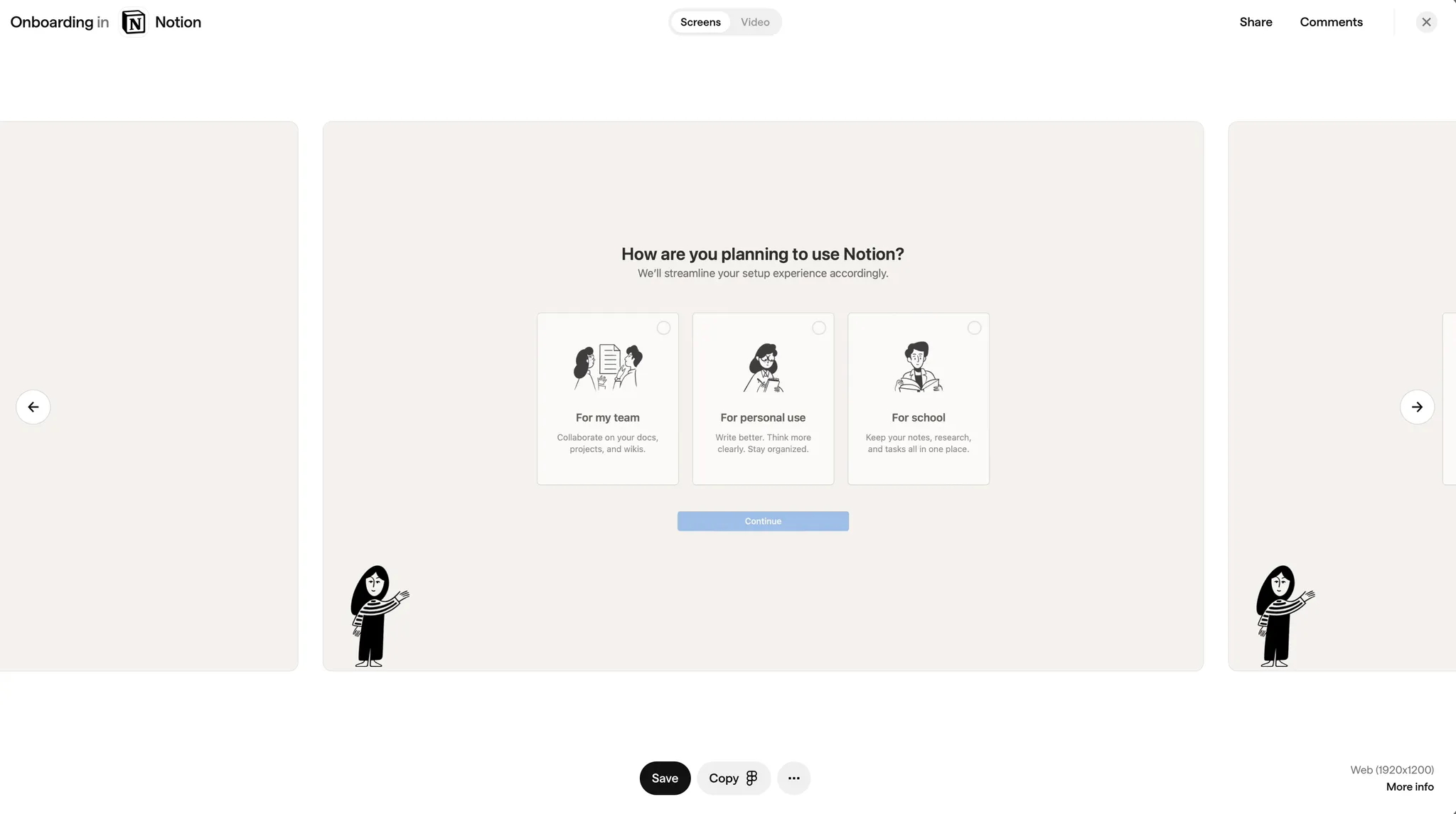
What it is
An approach that asks users to pick the path or user type that best describes them (e.g., “I’m a teacher” vs. “I’m a student”), so the onboarding flow can be tailored.
UI Components
- Segment Buttons or Cards: Each option neatly labeled, often with a quick “who this is for” line.
- Short Explanations: Help users pick the best match.
- Customized Follow-Up Screens: The product changes based on the choice.
Best use case
- Multi-purpose productivity tools (e.g., Notion, Monday.com)
- Educational software (e.g., Khan Academy, Edmodo)
- Business apps serving varied user groups (e.g., HubSpot, Mailchimp)
- If your product serves multiple user types with distinct needs.
- Helps reduce clutter by skipping irrelevant features.
Pros
- Makes the experience feel more relevant.
- Streamlines onboarding so different users get different flows.
Cons
- Too many categories can be overwhelming or confusing.
- If someone picks the wrong category, they might see a bunch of irrelevant prompts.
Why we like this pattern
They guide people to the right experience from the start. Clear button labels and quick blurbs prevent them from guessing, and splitting the next screens ensures each segment sees only what they need.
13. Contextual Tooltips
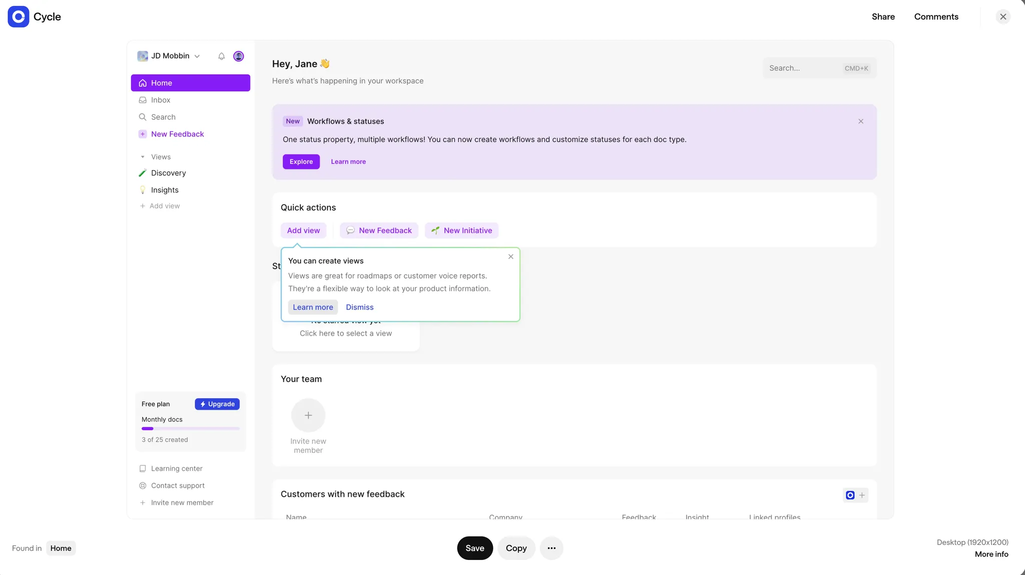
What it is
Pop-up tips that appear exactly when users hover or click on something that might need more explanation. They show up at the moment of need, rather than covering the screen.
UI Components
- Hover or Click Tooltips: Usually a small box with a sentence or two.
- Arrow Pointer: Visually links the tooltip to the specific button or icon.
- Close / “Got it”: Lets folks dismiss the tooltip once they understand.
Best use case
- Complex workflow or editing tools (e.g., Adobe Photoshop, Figma)
- Data visualization dashboards (e.g., Cycle, Databox)
- SaaS applications with many hidden or secondary features (e.g., Trello, Airtable)
- When your UI has advanced or hidden features that aren’t super obvious.
- If you want to keep the screen minimalist but still offer help.
Pros
- Keeps the design clean, only appearing when relevant.
- Feels less pushy than a mandatory walkthrough.
Cons
- Users might never see the tip if they don’t hover or click in the right spot.
- Repeated appearances can be annoying if not managed well.
Why we like this pattern
They provide bite-sized info right in context, without cluttering your layout. Hover/click triggers keep it subtle, and the quick dismissal option lets users continue working without interruption.
14. Just-In-Time Modals
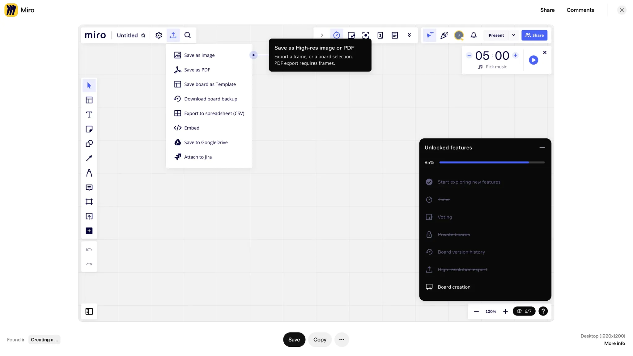
What it is
A modal that appears exactly when it’s relevant — for example, the first time someone tries a feature after an update, or the first time they return and attempt a new action.
UI Components
- Modal Dialog: Pops up over the interface with a brief explanation.
- Short Setup Prompt: A concise line about what’s new or how to use the feature.
- Opt-Out Buttons: “Don’t show me again” or “Remind me later” so users aren’t stuck seeing it repeatedly.
Best use case
- Apps frequently updated with new features (e.g., Miro, Slack)
- Collaboration or productivity tools (e.g., Asana, Notion)
- Software that introduces occasional significant UI/UX changes (e.g., Google Workspace apps, Adobe Creative Cloud)
- Pointing out recent changes or new features at the moment someone engages with them.
- Works well if you track usage so you know when to show help or tips.
Pros
- Timely, so people are more likely to pay attention.
- Makes sure the info arrives when it’s actually needed.
Cons
- Can interrupt the flow if people just want to get the task done.
- Too many unexpected modals can quickly become frustrating.
Why we like this pattern
They deliver crucial information right at the moment of relevance, which is often the most effective time to teach. Giving users a quick way to dismiss or snooze ensures they aren’t repeatedly startled by the same message.
15. Bonus: Information Gathering
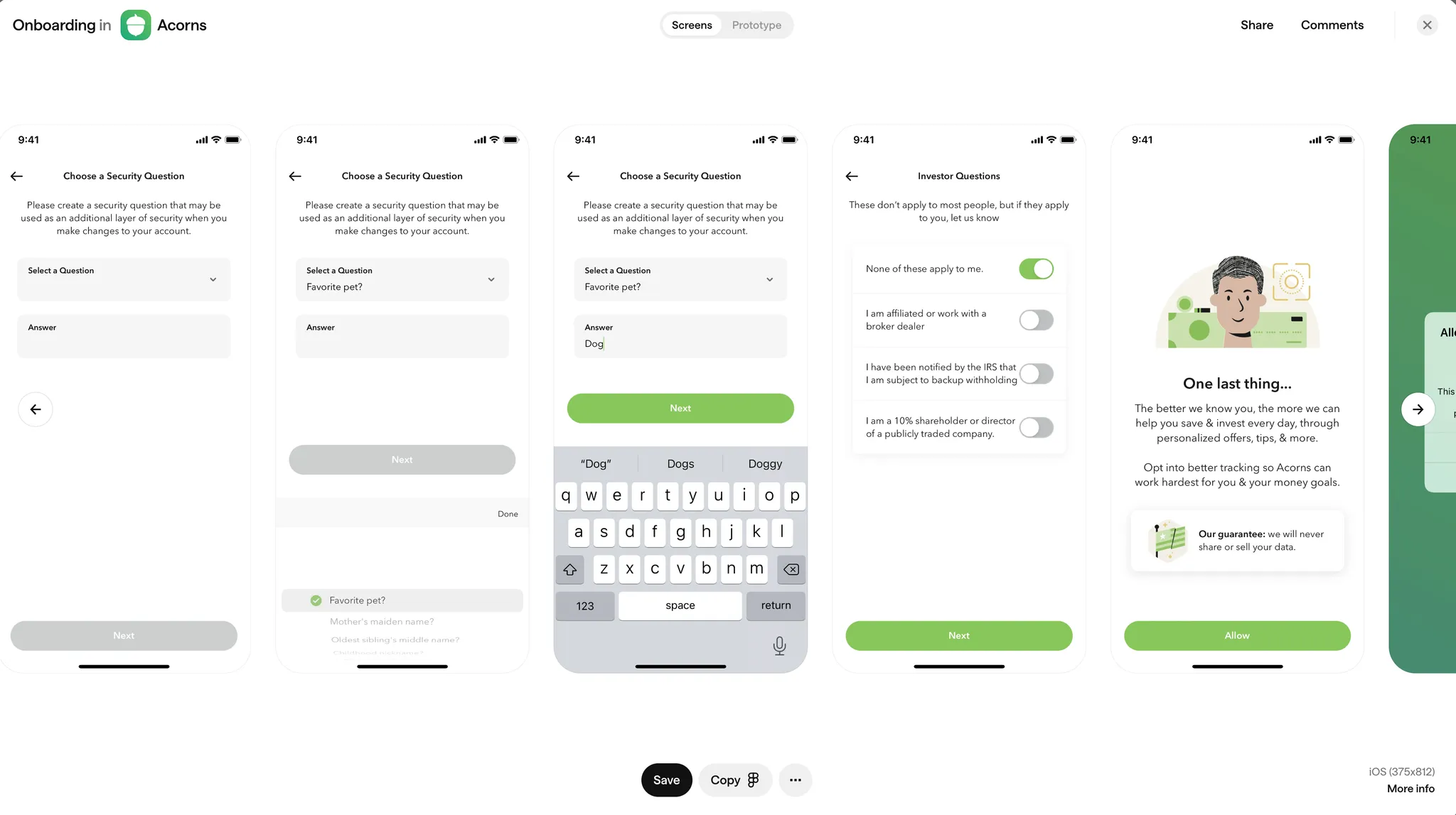
Number fifteen is a bonus pattern: Information Gathering. This is used when an app requires a lot of upfront user input before being useful.
For example, Acorns needs to collect financial details before users can start investing. Users must set up security questions, link bank accounts, and choose investment preferences.
This onboarding type is common in finance apps, HR platforms, e-commerce personalization (Etsy), and recommendation engines.
These flows can be long or short, depending on the required setup.
Final Thoughts
These onboarding patterns are highly effective at engaging users. Many of them can be combined depending on user behavior and preferences.
The real challenge is knowing how and when to use them. To do that, you need to understand the golden rule of user onboarding and the three main elements that create a great user experience.
If you want to learn more about that, read this next!
 DesignerUp
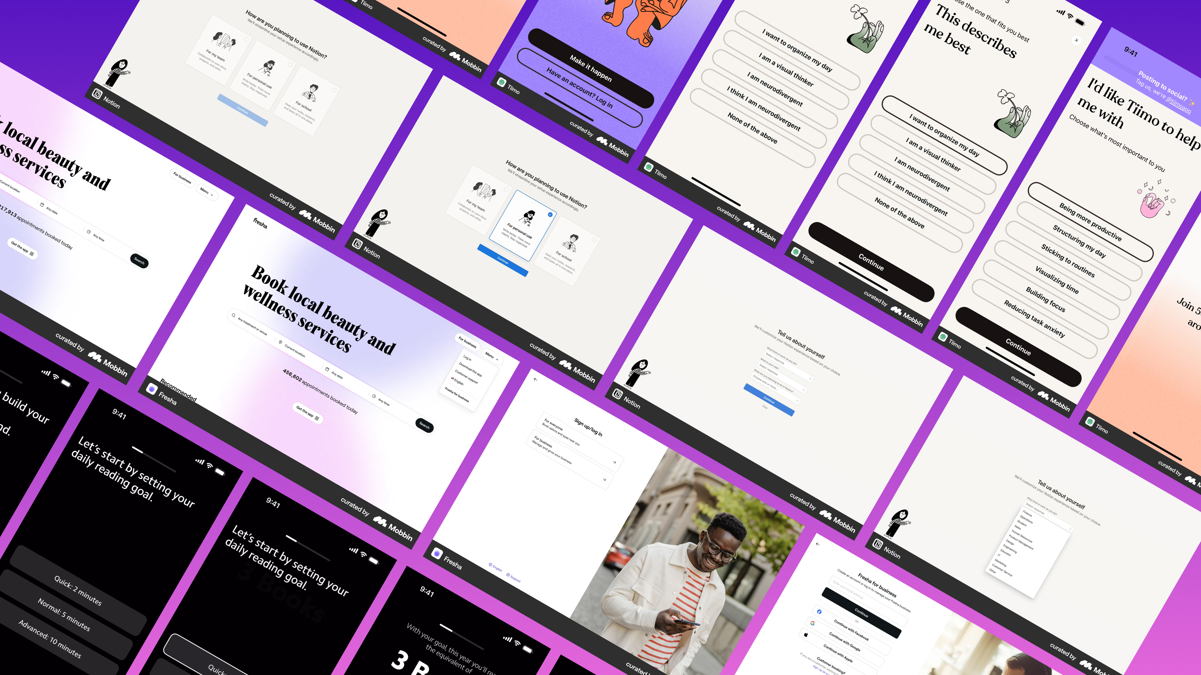
📚 I teach a comprehensive, affordable course all about product (UX/UI), business and strategy, so if you’re interested in learning that sort of thing check it out.