
This is Part 5 of our UI Design in Practice Series
Separating content is a crucial part of designing layouts and information architecture. It allows us to delineate different groups of content and better manage areas of dense information. We can accomplish this with a simple UI element called: dividers.
Let's explore some examples and discuss how to decide which style may best suit your content separation needs.
In its purest form, a divider is typically a thin line that separates lists or groups of content.
Below we'll tackle horizontal content seperation using a variety of divider styles.
The Horizontal Line
A simple 1px line is often an effective solution for separating horizontal content blocks and page sections.

Adjusting the width of the line to either match the width of the surrounding content (i the example above) or allowing the line to fully bleed to the ends of the page (in the example below) can determine just how dramatic and decisive the separating will be.

The Gradient Background
Another element that can achieve visual seperation while also allowing for more fluid content visibility is a gradient background.

You can determine the color of the gradient by using almost any existing color from your design with the opacity at a level of <20%.
Another example of gradient separation is using a curved object:

There are no limits to what shape your seperation element can be. In the example below, a free transformed shape creating a wavy pattern can offer an eye catching result.
Pro Tip: Start by drawing a rectangle layer, use the pen or vector tool in your design app of choice to manipulate the rectangle into a shape of your choice.

Diving into deeper levels of your content hierarchy, dividers can be used in areas to separate headings from paragraph content in a variety of ways.
Whether it's a line (top examples) or a few small dots (bottom examples), design elements like these offer ways to pull in color and interest to these particular areas of dense text.
In the next section we'll explore options for separating vertical content blocks.
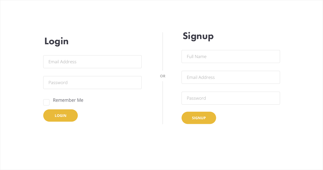
The Vertical Line
Much like the horizontal line, a vertical line often is an effective solution for separating side by side content blocks.
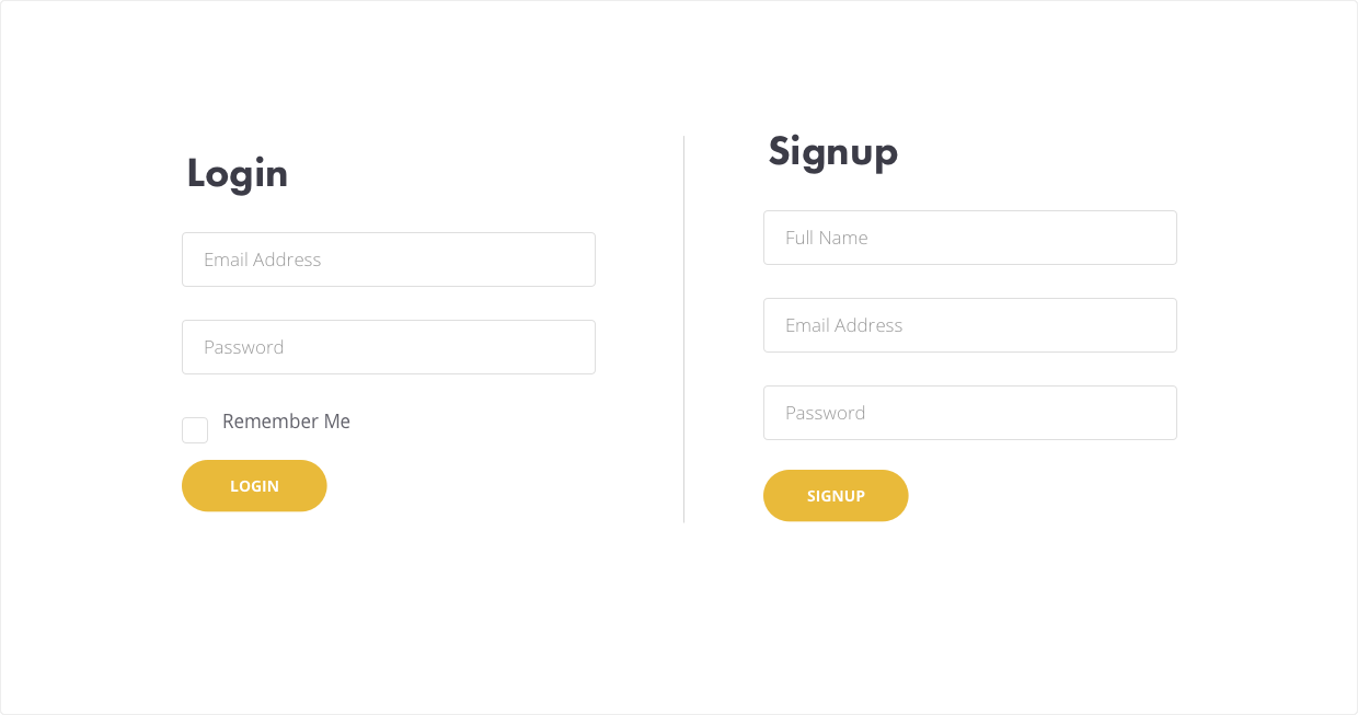
We can embellish our vertical line element be adding a small indicating word in the middle of the line.
Pro Tip: Start with a solid vertical line, then create a small square with the color of your background and place it on top of the vertical line, then position the square in the middle of the vertical line. Finally, add your text layer above this square layer and you're set!
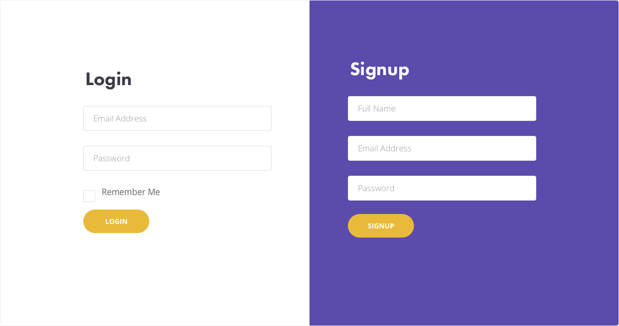
A light background on the section of content in which you want to emphasize is another subtle way to separate vertical sections.
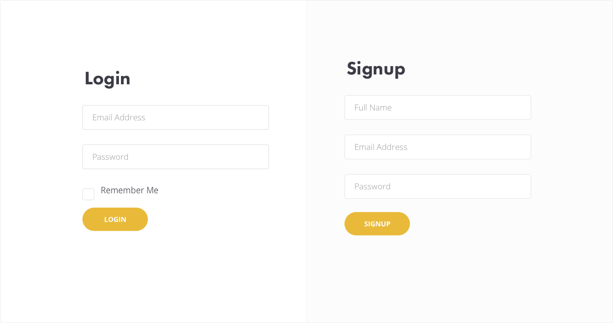
For a more dramatic effect, use your accent color as the background of the emphasized section and adjust the colors of your content within this section for higher contrast.

Find this article helpful? Get more content and free courses by signing up to our newsletter below!