
It might seem like choosing a font is a quick, minor step in your UI design process. But with so many options it can be really time consuming to narrow down the perfect font or decide on the right font pairing for your designs.
You also might be surprised to learn some things you could be overlooking about your font choices. I've created this font funnel to help you narrow down your options and choose the right fonts that align best with your product, your audience and your brand and make the process of choosing beautiful and functional fonts easy.
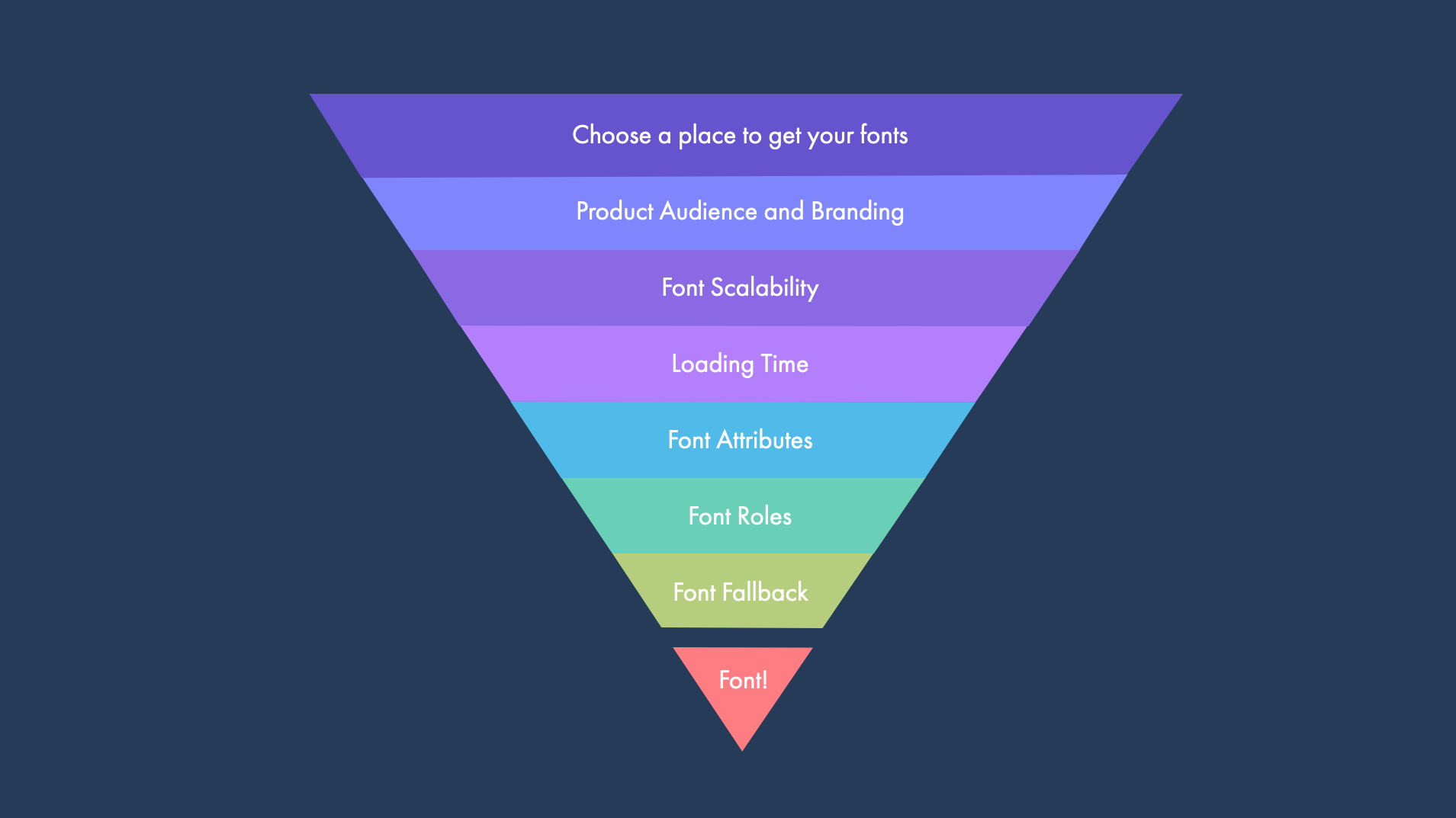
Stage 1: Where to get your fonts
Based on prices and options, there are many different places to get fonts, these are called independent font foundries or font libraries.
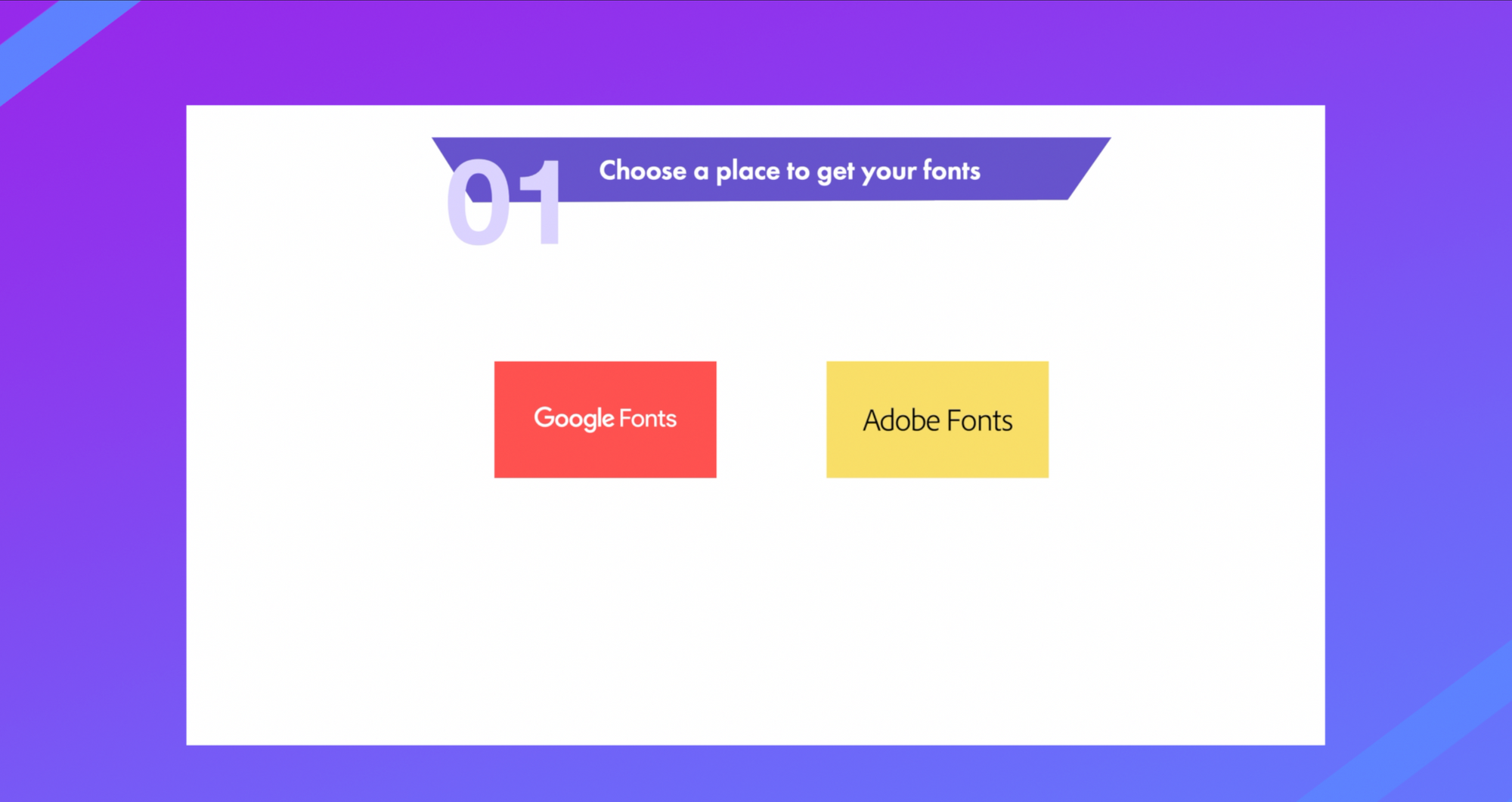
Two of the most popular resources are you guessed it Google Fonts and Adobe Fonts. Google and Adobe are the defacto choice because the fonts here are open source, they are optimized for fast loading times and they are hosted.
Stage 2: Product Branding and Audience
This part starts with research. If you haven't already done so in your UX process it's important to understand the taste and aesthetics of the users or customers that will be interacting with your website or user interfaces.
It's also a great idea to take look at the fonts your competitors are using. Do you want to establish yourself as a clear part of a certain industry or do you want to stand out and shake things up?

Knowing what your users will resonate with along with the unique differentiators you want to highlight in your product is the first step to aligning product, audience and brand through your font choice.
Stage 3: Font Scalability
Fonts are both utility and art.
For maximum utility, readability is the most important thing. Fonts should be readable regardless of the size.
Pay particular attention to smaller sizes. Think about context how does it look on phones vs desktop screens check it out on dark mode and light mode.
Try applying to a typography scale to test this.
Stage 4: Loading time
So you've found the most beautiful font that perfectly reflects your vision for the brand.
Not so fast, something we rarely consider as designers when creating our static mockups is loading time, but the performance cost of the fonts we choose can have a huge impact on both user experience and business goals.
So why is loading time so important?
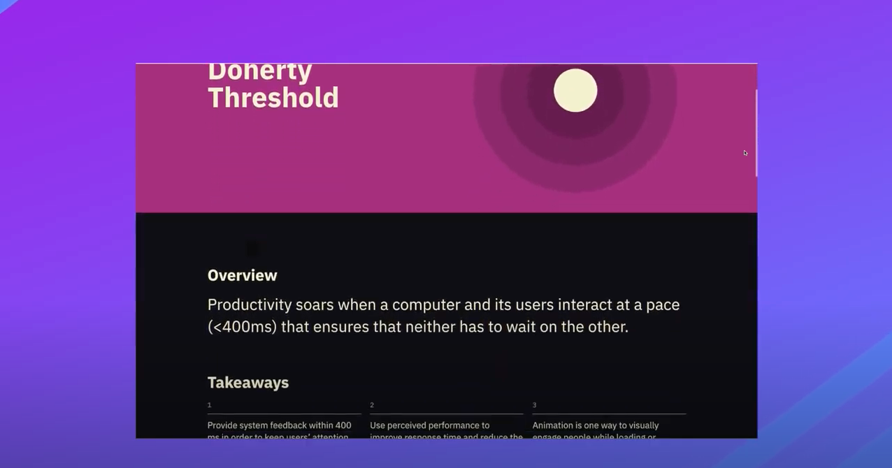
Doherty Threshold is a UX law that says we should "Provide system feedback within 400ms in order to keep users’ attention and increase productivity".
Web developers must take the fonts we've used in our design and implement the font files to be rendered in our browsers by importing the font file which depending on the size of that file, increases the load time of our pages.
So looking up a font's loading time is a really important element to consider before choosing the font.
Another way to help reduce font loading time on your site is to only download the font weights that you need. Each font weight that's included adds additional size so sticking to about 3-4 major hierarchies that are important for your design.
If you do think there might be an issue with slow load times based on the fonts you've chose, communicate that to your developer so they can make the necessary provisions.
Stage 5: Font Attributes
Font format - Another consideration that not all formats of fonts are supported on all browsers. To make sure it is web safe font. A font is web safe if it is TTF, OTF, SVG and WOFF to ensure that your fonts will render across all of the most common browsers.
Font style - Based on your user research you'll want to match your font's personality to your brand's personality you researched earlier.
You can usually get a sense of a font's personality by looking more closely at the letterforms. Is it a serif (more serious style) thick sans serif (tech style), handwritten for a more organic human touch. Serif vs Sans Serif
Font Family - Choose a font that comes from a large family (to have more size and style options to play with and less different font families to deal with) check out my other video on the difference between fonts, font families and typography here.
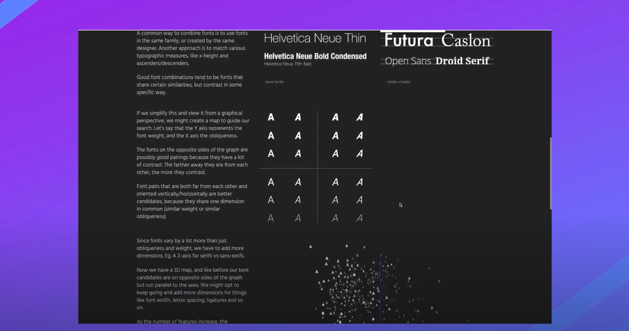
Font combining - Not too close, not too far - If you must combine more than one font family then it's important to understand what pairs well together and what doesn't.
While this is quite subjective there are some combination that are just more dissonant than others.
Don't combine fonts that are too similar but only slightly different, this creates visual conflict, instead use something with balanced contrast between the letterforms. Of course you don't want to choose fonts with no relationship either.
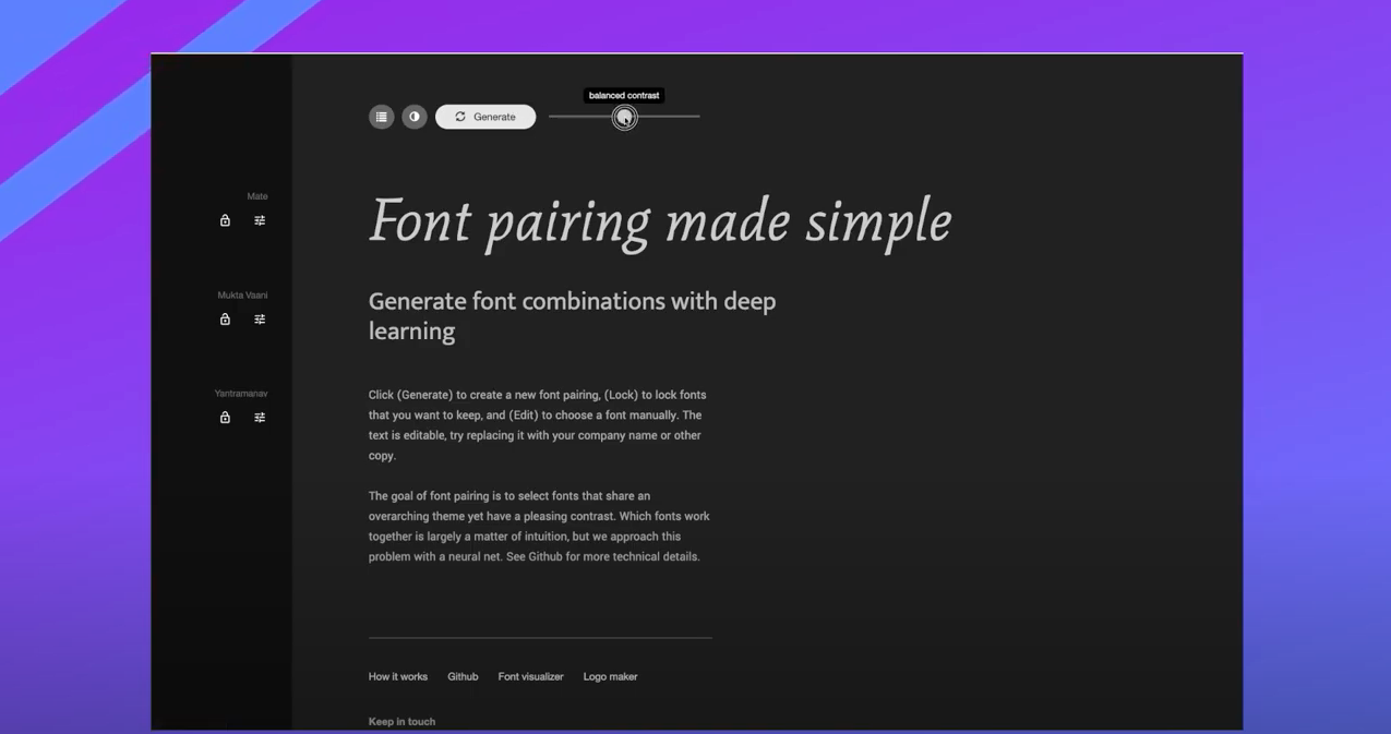
To really understand the relationship between similarity and contrast of fonts would required an analysis of the attributes of letterforms, so while that's a topic for another day, I've created another video with some amazing tools to that do the font pairing work for you.
Stage 6: Font Roles
Assign distinct roles to fonts or typographic treatments such as, all caps, h1s, h2s, body, subtitles etc.
Creating a style tile, UI kit or Design System can help greatly in this. Here's how you can learn and steal from some great design systems.
Stage 7: Font Fallback
So you finally made it to the end of this long distillation to the perfect font choice, but there is one more tiny little thing... Throw it all out. That's right. Ever notice that there are a string of fonts defined in the code other than the ones you chose for your designs? Well that's because browsers, as clever as they are, still need a backup plan.
That means that if for some reason your font doesn't render properly then the browser will default to the user's system font instead. So just one last test, make sure your type looks good at one of the defaults and let your developer know what your fallback choice it.
By using this funnel process, you will be able to more intentionally filter down your font choices like magic to arrive at the best options for your UI or web designs.
For more lessons like this check out our Product Design (UI/UX) Course and community.