
Font, typeface, typography, type family? Are they different? Are they the same? How does it apply to UI design?
Sometimes we hear these terms used interchangeably, but they are not actually the same and there are some distinct differences that can be helpful to know as a UI designer.
A type classification - is the category in which they fall into. The most common ones used on the web for UI designs are:
- Sans Serif
- Serif
- Slab Serif
- Blackletter
- Handwriting
There are others but those are more commonly reserved for graphic design projects where the focus is on aesthetic rather than readability, responsiveness and user interaction.
A typeface - is the design or style of the alphabetic letters themselves (so Helvetica, Times New Roman, San Francisco for example)
A font - is a digital representation of single version of that typeface with one weight, width, and style of a typeface (Helvetica light 12px, Times New Roman Bold 18px are each individual fonts)
A type family - is a collection of all of the fonts (Helvetica light, bold, regular italic)
Typography - how the font or typeface is applied arranged and treated on context
So the hierarchy would be something like this:
Sans Serif (Type Class) > Roboto (Typeface) > Roboto Thin (Font) > Entire Roboto collection (Type Family)
Note: Typography itself is an art and science and when applied to UI design and web has its own unique considerations and limitations something I go more deeply into in our product design master course so check that out if you want to learn more.
A foundry is a place where you can go to find digital fonts that are available for download or purchase and sort or filter by these attributes. There are many large and small foundries with two of the most common being:
Now let's look at font usage in the context of some actual Visual and UI designs:
BambooHR uses a combination of two typefaces on their homepage. Both google fonts.
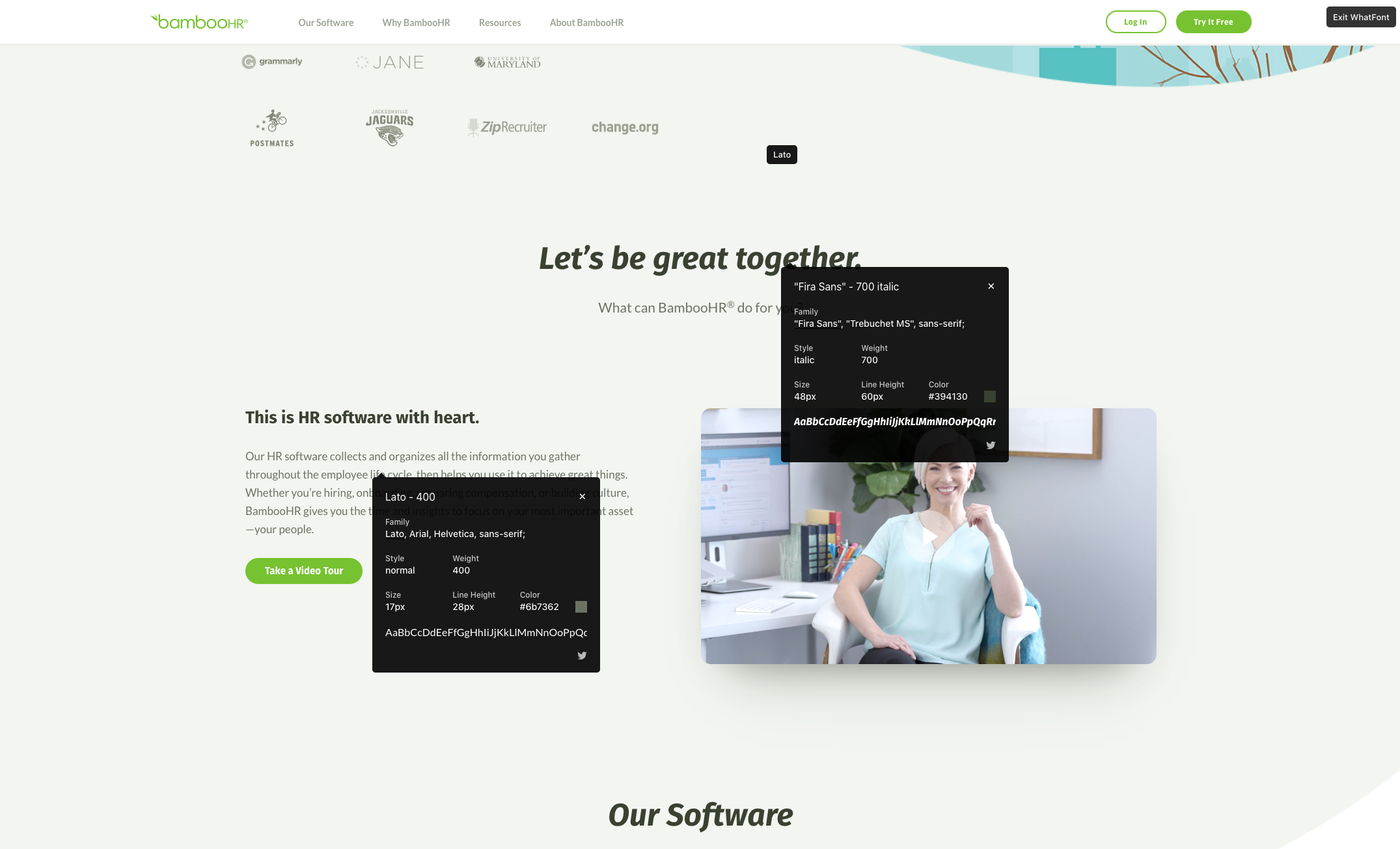
The type classification here is Sans Serif
The typeface is Fira Sans for the heading and Lato for the body
The font is Fira Sans Bold for the heading and Lato Regular for the body
Typographical treatment for the headings is 48px font size with 60px line height and for the body it's 17px font size with 28px of line height.
Userbit is another example (which incidentally is a product that we proudly partner with to give our students an exclusive discount to)

Type family here is Sans Serif
Typeface is Inter by Rasmus Andersson available on Google fonts
Font is Inter Black for the headings and Inter Regular for the sub headings
Typographical treatment 28px for the headings with 46px line height and 19px size for the subheadings and 35px of line height for the body.
Hopefully this clears up some differences and gives you a little better command of the language and terminology around fonts and type in visual and UI design.