Linkedin is a powerful tool to find new job opportunities as a UX/UI or Product Designer. But it's only as good as your ability to showcase what you're about and optimize it to be found by the right people.
Here's how to craft a magnetic Linkedin profile that gets you noticed by UX, UI and Product Design recruiters, hiring managers and clients so you can get more of the right design opportunities into your inbox!
The things I share here apply whether you are looking for your first job or you are well into your career and have worked wonders for my design students.
Watch the video
Why are you on Linkedin?
The first thing to ask yourself is 'Why are you on Linkedin?' Is it to find a new job, is it to grow your professional network, is it to build your own personal brand, authority or influence, or to sell your freelance or professional services?
You need to be specific about the type of audience you want to attract and what your goals for being on the platform are.
It can be helpful to understand what stage you are in your career
- Are you Starter?
- Are you Transitioner?
- Are you a Climber?
- Are you a Builder/Creator?
- Are you a Service Provider?
Filling out Your Profile
Your profile overall should show and tell the story of your career journey. It should connect the dots between your past, present and future. It needs to be very compelling, specific and clear about exactly what you have to offer and the audience that you are trying to attract.
Writing your Headline
If you do nothing else, writing a strong, clear and focused headline goes a long way in getting you noticed and understood on Linkedin. Your headline is the 220 characters that show up right under your name. Your headline should communicate at a glance what you do and align with what your audience is searching for.
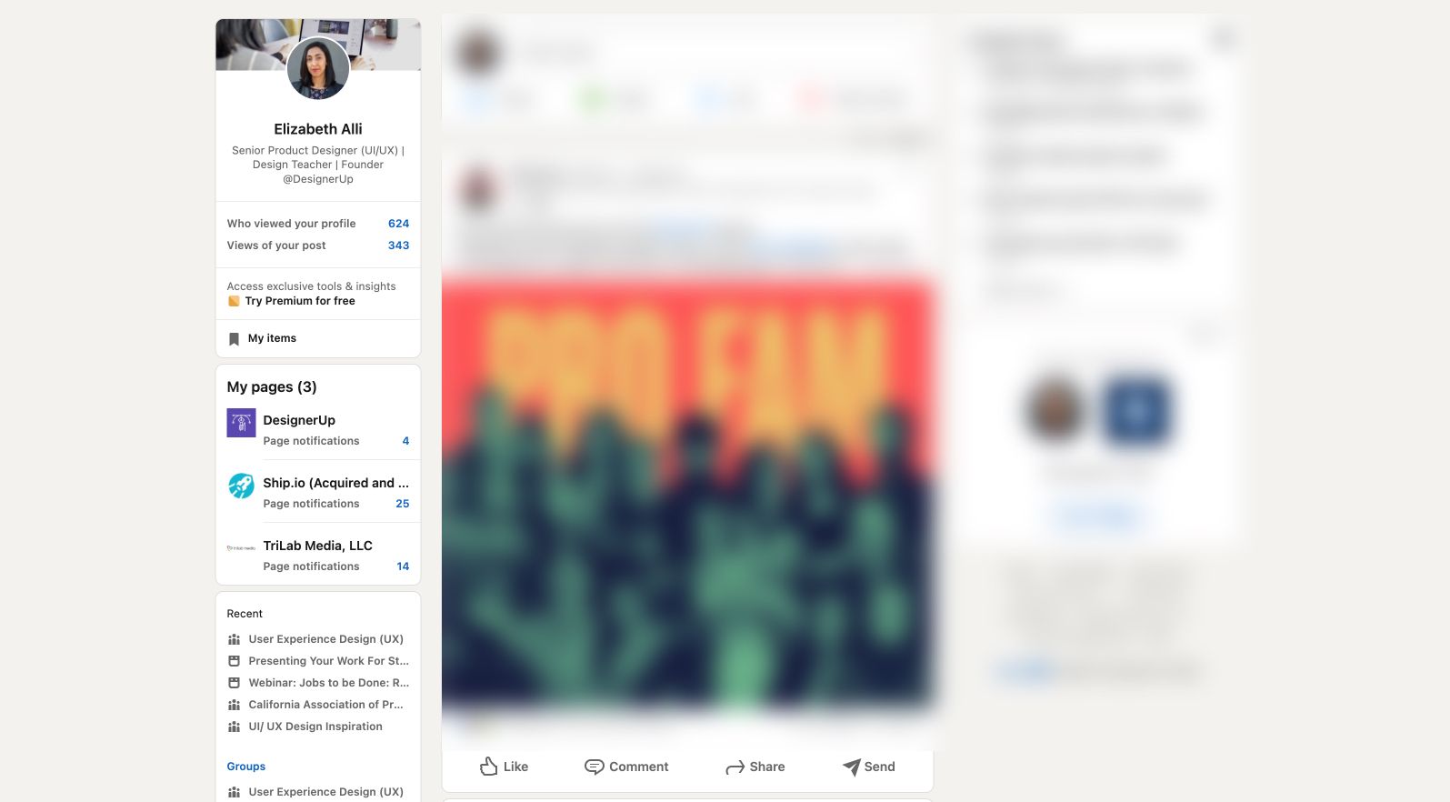
Your heading shows up in many places throughout Linkedin.
It shows up on the sidebar card of your profile
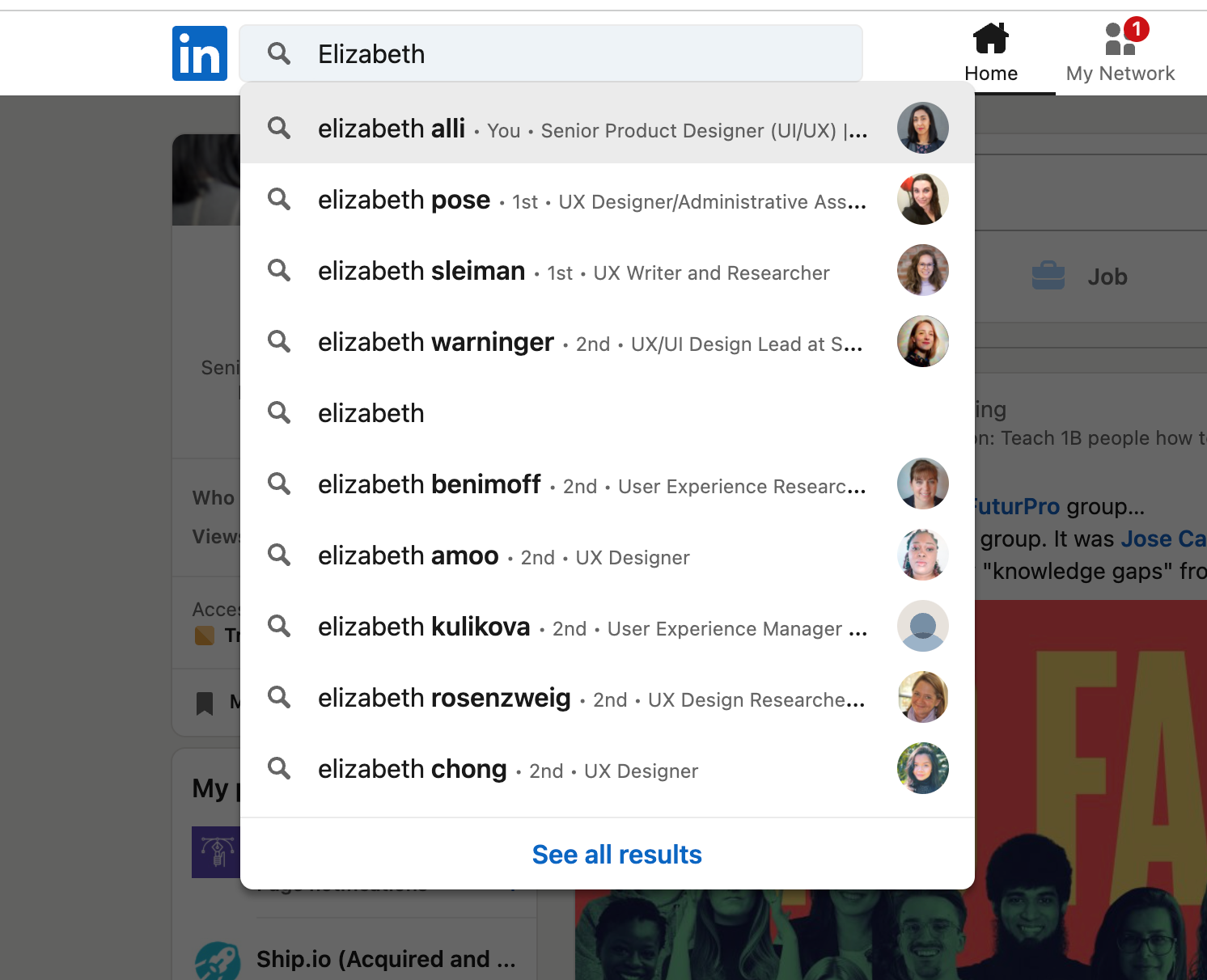
It shows up as a truncated version in the drop-down when someone searches for your name.
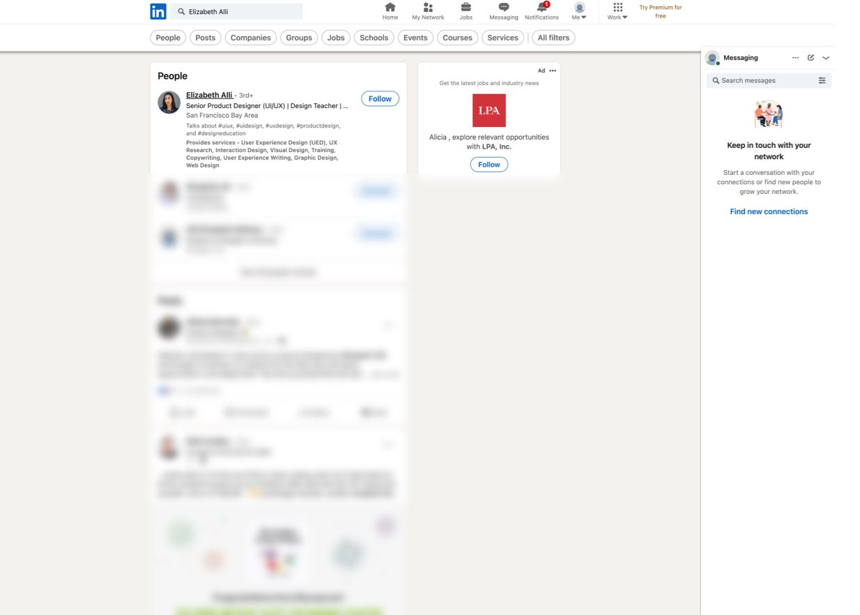
and on the search results page when someone types in a keyword or keyphrase
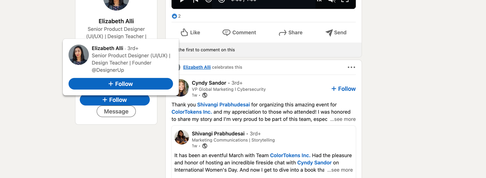
It also shows up on your profile hovercard every time you leave a comment on a Linkedin post or leave a reaction.
There are many different ways you can write your headline statement. I recommend trying the Pipe Method, which starts with your current title or position followed by the pipe symbol and then a statement that includes keywords and specifics that help people understand and find you.
Title | Specific Achievement or Accolade
UI Designer | Creating award-winning Mac Apps
Title | Quantifiable experience
Product Designer | 15 years building startups
Title | Helper statement
UX/UI Designer | Helping health-tech companies create better patient outcomes
Title | Focus statement
Senior UX Reseracher | Focused on design accessibility and sustainability
Title | Ambition statement
Junior UX Researcher | Passionate about mobile design for complex data | Fin-tech | Web3
Your About Section
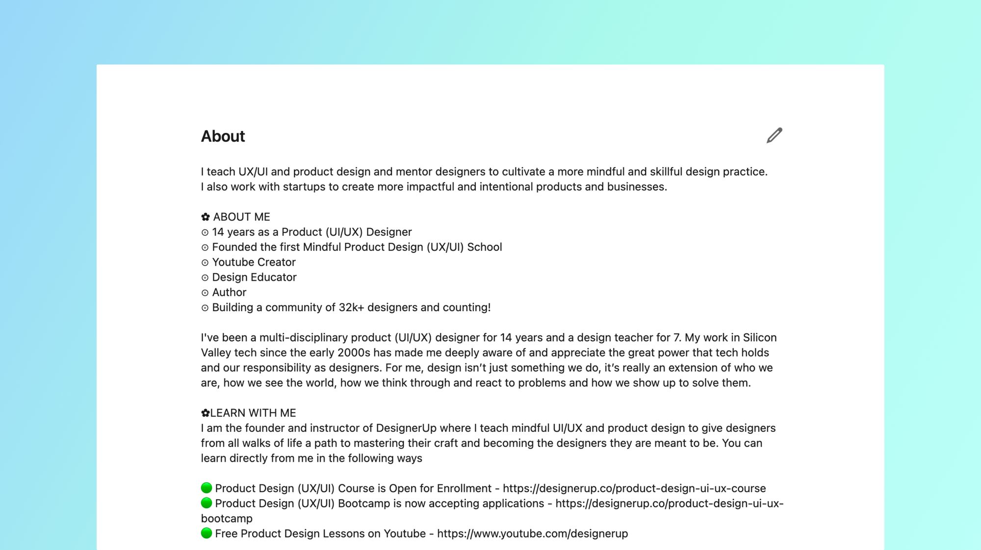
The purpose of your About section is to attract the right opportunities to you and tell your story.
The first 265-275 characters show up on your profile before someone clicks on 'see more'. This is where I recommend including a clear focused Personal Value Proposition Statement
So for example I could say: "I am a product designer creating compelling user interfaces for early-stage B2C startups to help them increase acquisition, activation and de-risk their design investment."
Try to keep it scannable and focus on the value and the ROI behind the work. Tell them about the impact you've made. Use emojis or bullet points to separate and draw attention to your achievement of things you want to highlight.
Rather than just listing out your skills, use storytelling to describe a situation you found yourself in where you were able to apply the skills you have. This makes it much more relatable and draws the audience into an emotional space.
The importance of Keywords
Keywords are extremely important to include here in your About section and throughout your profile sections. Keywords are used to tag your profile for relevancy by the algorithm. This doesn't mean that you should stuff your profile with buzzwords, what it doesn't mean is that you are including keywords that match the search terms your ideal audience is looking for and tie them into your personal story. You can learn more about how to search job postings for keywords and pull out insights that you can apply to your profile.
Experience Section
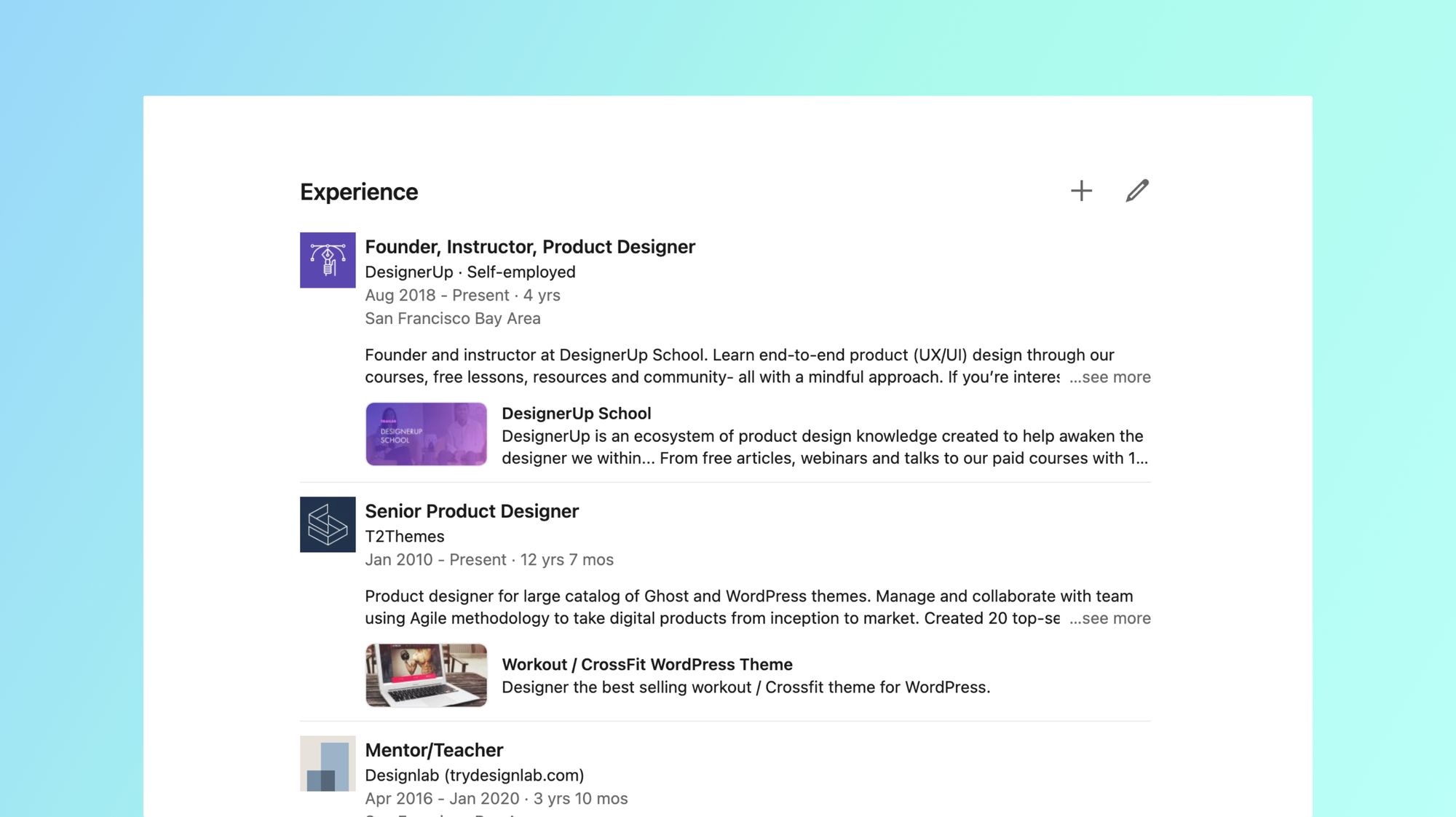
This section is intended for you to list jobs you were hired to do. This could be full-time, part-time, client work or freelance jobs.
Make sure to fill in the descriptions outlining what you did during your work in that role. Talk about how you collaborated with others, what you contributed, the impact you had and what you learned.
Education Section
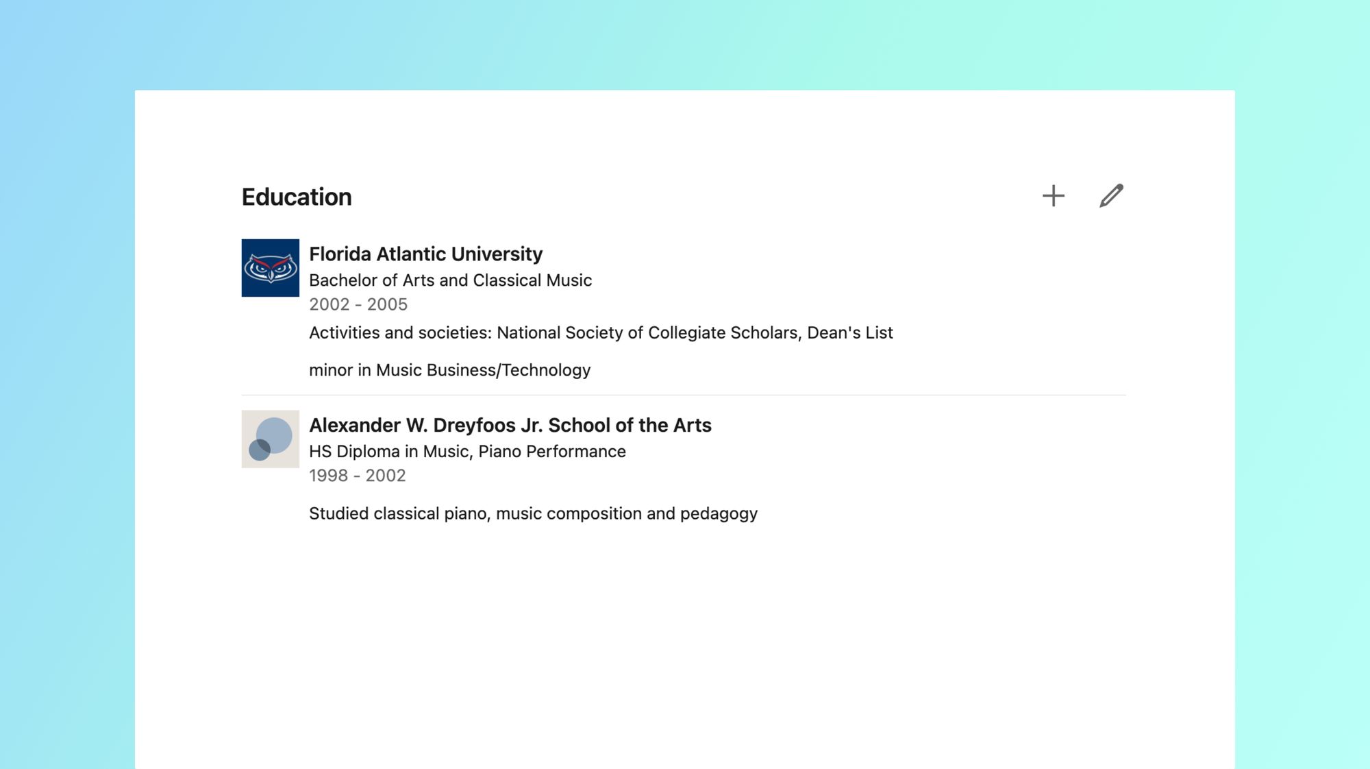
Here is where you can list any High school, secondary school, trade school, college, university or other accredited programs that you attended. This is another opportunity to describe what you learned there, how you apply that to the work that you do and list any academic achievements you may have made. Again, utilize keywords here to target what you audience is searching for.
Licenses and Certificates
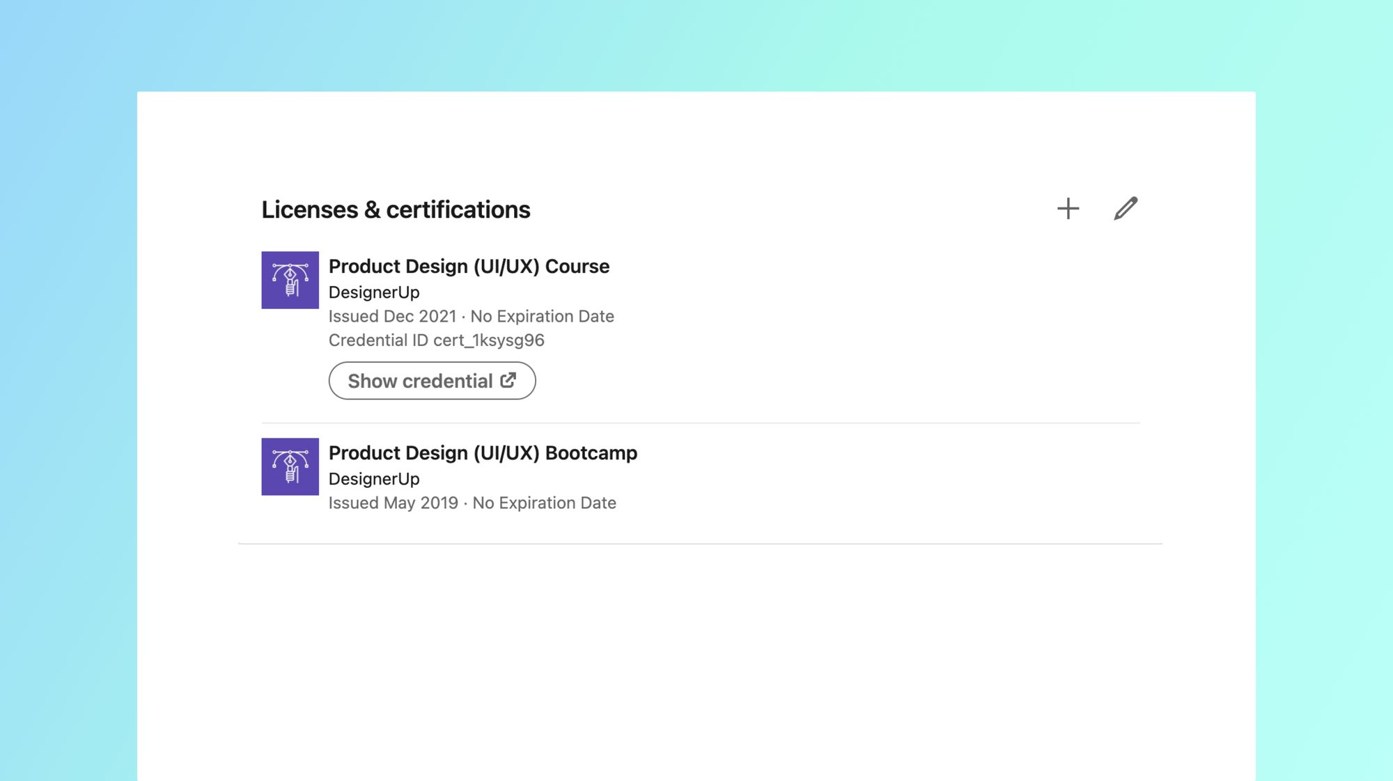
This area is an additional section that can be added to showcase any trade licenses or certificates that you've received from institutions. You can link directly to the credential for reference and add in other information about it.
Courses Section
Another additional section that you can add to your profile is the Courses section. This allows you to display courses that you are currently taking or have completed. This is great if you are enrolled in a design bootcamp or design course.
Skills Section
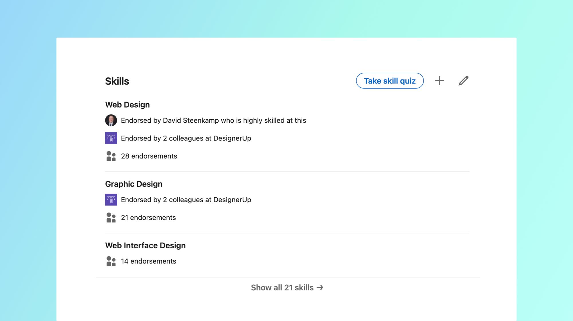
If you have technical skills using certain design software applications or in specific disciplines of design this is a great place to add them to your profile so others can endorse and verify these for you. You can invite your connections to endorse your aptitudes in the areas that you add and it's as easy for them as clicking the plus button on your profile.
Recommendations Section
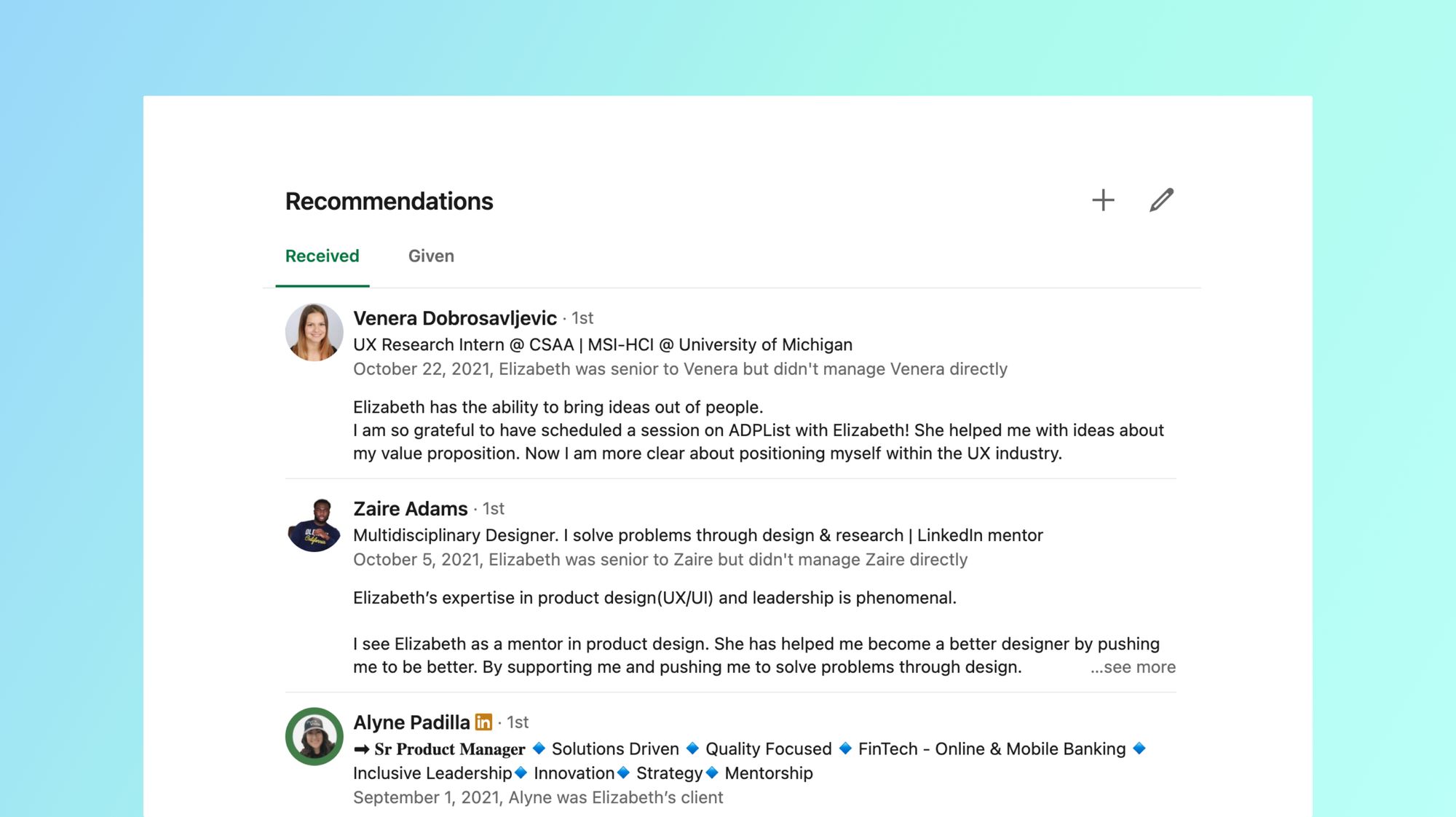
This very important but highly overlooked section is for reviews and recommendations. Social proof is such an important part of how we make decisions about other people so having such stellar reviews here can go a long way to promoting your good reputation to others. If you haven't done any real-world projects yet or had your first design job or client I recommend reaching out to mentors and colleges to start. Once you've done a project don't forget to periodically reach out to your collaborators, managers or clients for reviews and testimonials. You can use the link directly in your Linkedin profile to request a recommendation from someone.
Projects Section
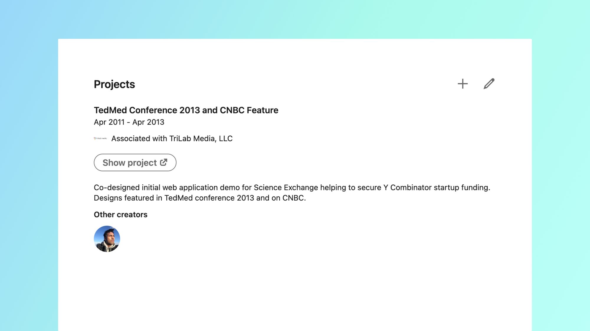
I like to use this area to showcase smaller projects I've worked on. These could be things you've done on your own, design challenges, client work or even partially complete projects that never shipped. You can also use this to share open-source projects and add collaborators that contributed to the project. If you are in need of creating some great projects and case studies here to help you create a more impressive resume consider enrolling in our affordable Product (UX/UI) Design Course.
Featured Section
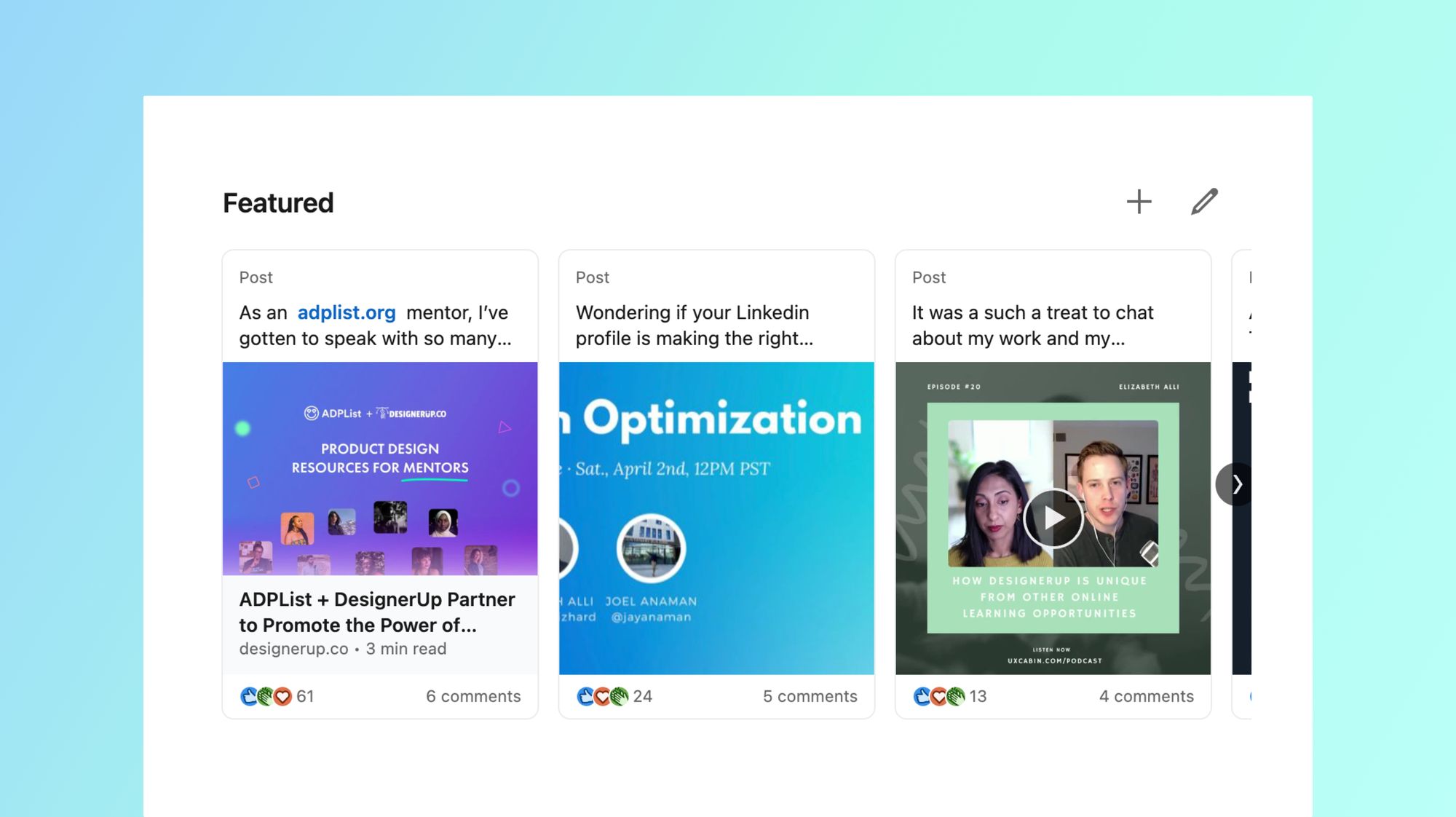
Once you've got some great projects, LinkedIn activity or other interesting posts to share you can add these as highlights to the Featured section of your profile which appears just below your Bio.
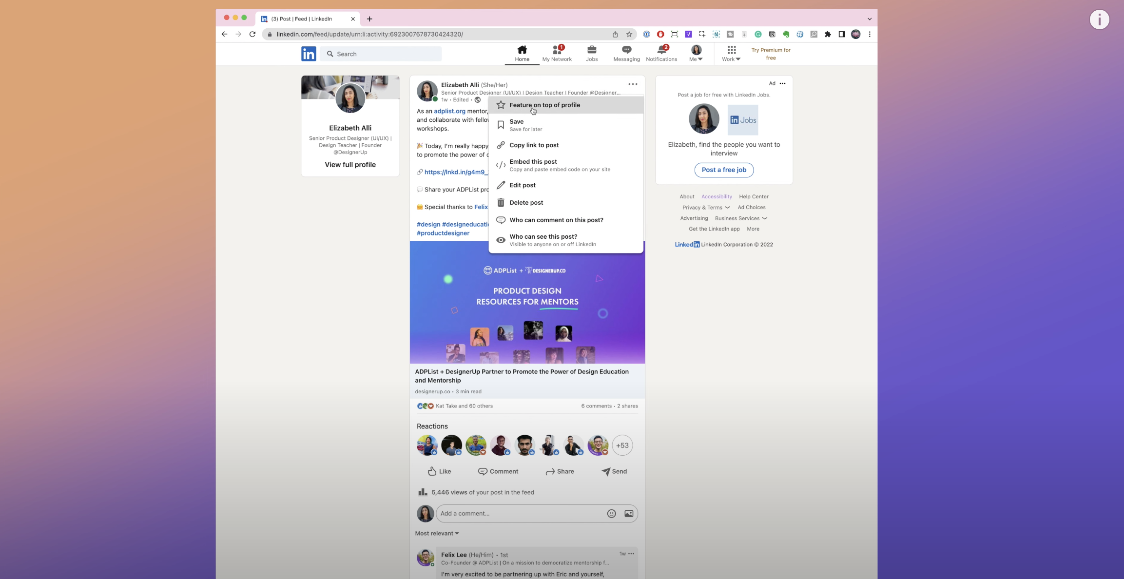
To add some to your Featured section just navigate to the post, click on the 3 dot content menu in the upper right-hand side of the post and click 'Feature on top of profile'
Creator Mode
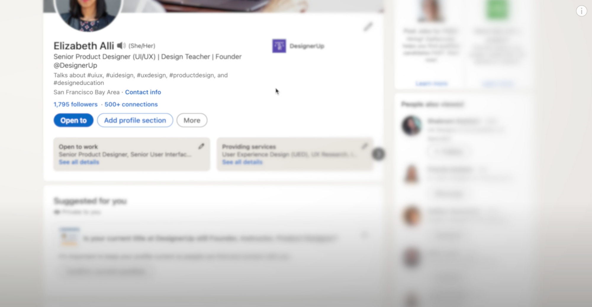
If you are posting content regularly in order to attract more freelance opportunities or build up your personal brand on LinkedIn you can turn on Creator Mode which opens up some more features and analytics for you to work with. You will be able to add hashtags with the topics that you post about the most to appear under your headline and
Exporting your Resume as PDF
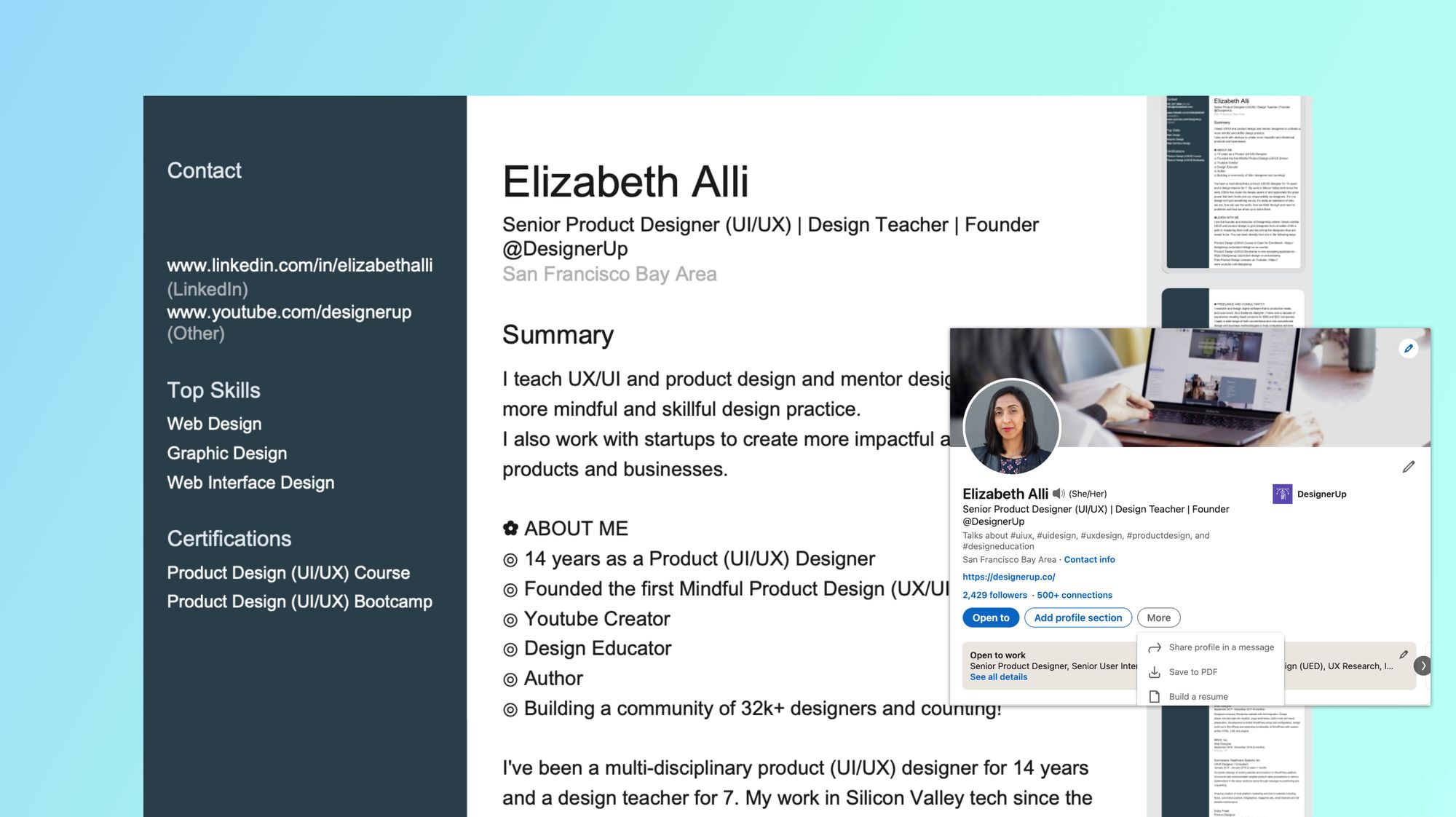
Did you know that you can design and export a perfectly formatted resume directly from your Linkedin Profile? This awesome little-known feature is the easiest way to create a PDF version of your resume to share when applying to jobs and you can fully customize and include and exclude parts of your profile. Just click on the More button under your headline and then select 'Save to PDF' to export a pre-formatted version of your profile with contact info, or click on 'Build resume' to access the customization options and save multiple versions.
And that's it, if you follow these steps to fill out your profile and optimize it for your audience you are guaranteed have recruiters and clients breaking into your inbox with the right opportunities for you!
What to check out next
Here is a collection of UX/UI career resources that set you on the path to your dream job!
