These UI design trends and styles are everywhere right now, but you might not know the story behind them or how to design user interfaces that look like this.
In this guide, we'll dive deep into the interesting history behind some of most popular UI design trends and styles and what makes up their unique design characteristics so that you'll know exactly how to recreate these user interface design trends and styles yourself.
Watch the Video
Watch the full video tutorial to learn the step by step process of designing these UI design trends and styles yourself.
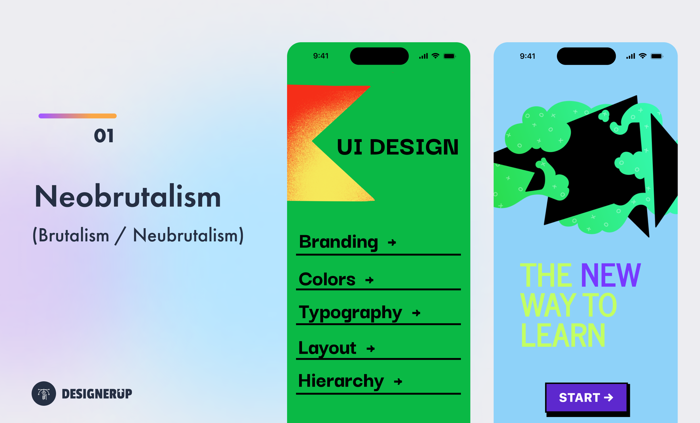
1. Brutalism/ Neubrutalism / Neobrutalism
A design style characterized by raw, rough, and unpolished aesthetics, often featuring bold typography and harsh, unusual color combinations and unconventional layouts.
Brutalism as a design movement emerged in the mid-20th century, primarily in architecture, but also extended to other fields like graphic design and UI design.
Brutalism originated in the 1950s and gained popularity in the 1960s and 1970s. The term "Brutalism" is derived from the French word "béton brut," meaning "raw concrete." The movement was characterized by its use of exposed concrete as the primary building material, showcasing the material's raw, unadorned aesthetic.
The origins of Brutalism can be traced back to the architectural works of Swiss-French architect Le Corbusier. He believed in using honest and functional materials, emphasizing the expression of the building's structure. Le Corbusier's Unité d'Habitation in Marseille, France (completed in 1952), is considered one of the early examples of Brutalist architecture.
Brutalist architecture aimed to prioritize functionality, often emphasizing the building's structural elements, such as beams, columns, and concrete surfaces, as visual features. The movement sought to create bold, monumental structures that reflected an honest expression of their purpose and construction. Some key characteristics of Brutalist architecture include:
While Brutalism originated in architecture, its principles and aesthetics have influenced other graphic design, visual design and UI design. In visual and UI design, Brutalism can is often referred to as neobrutalism or neubrutalism.
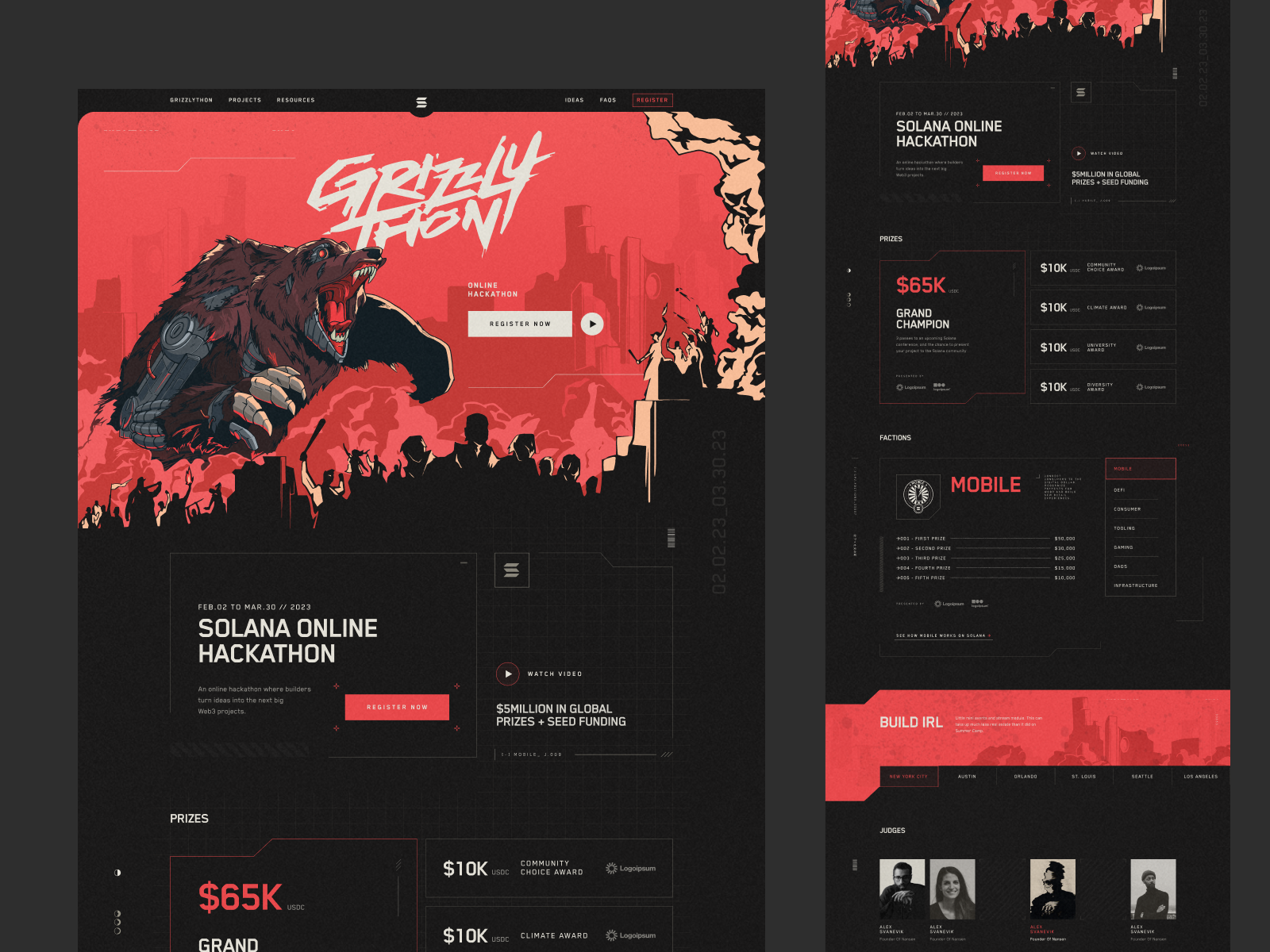
Neubrutalism emerged out of the brutalist style. It ignores beauty in favor of simplistic forms and functionality that can be seen as an opposite to the minimalist design styles
Clashing colors, heavy dark outlines, blocky heavy card components, strongly defined abstract shapes, Huge, bold typography.
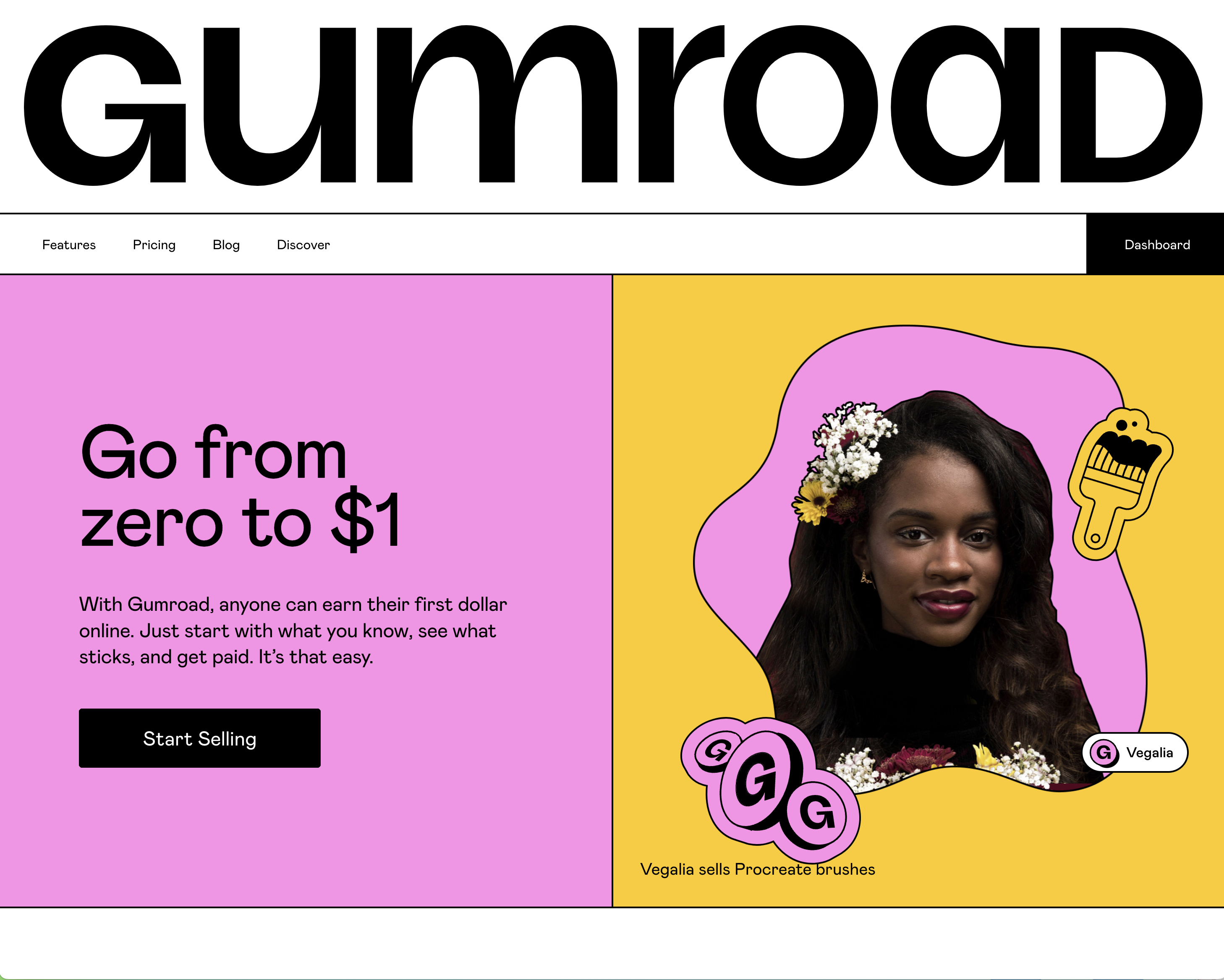
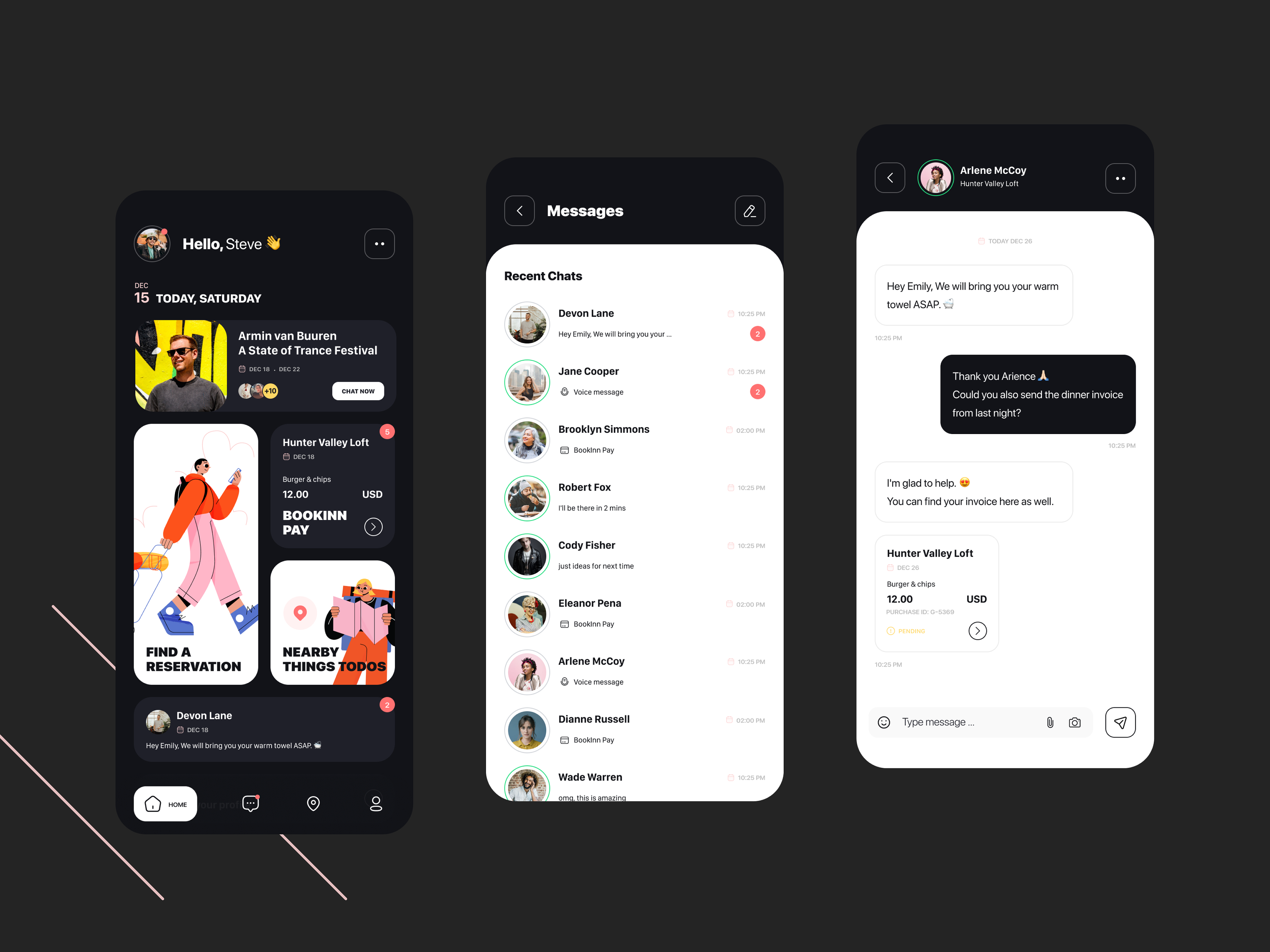
1. By Md. Shahadat Hussain | 2. Mohamad Azizi | 3. Gumroad
Neubrutalist UI Design Style
- Bold Typography: The use of large, heavy typography with strong, sans-serif typefaces.
- Dark, Heavy Black Outlines and Borders: You'll most commonly see cards and buttons outline with heavy black borders.
- Clashing colors with High contrast: Strong contrasts between colors, typography, and background elements for visual impact.
- Unconventional Layouts: Embracing asymmetry, irregular grids, and non-traditional alignments.
- Unusual shapes - You'll ususally find abstract, irregular geometics shapes used to evoked reaction and emotion.
- Rough and raw aesthetics: Incorporating rough textures, conflicting colors and the use of unpolished or unrefined visual elements.
Examples of Brutalism in visual and UI design can be found in websites like Figma, Gumroad and other sites that embrace a larger than life, bold styles in an unapologetic and raw visual way.
2. Bauhaus
In contrast to Brutalism, Bauhaus is a melding of fine arts and craftsman(woman)ship. Bauhaus translates to ‘building school'.
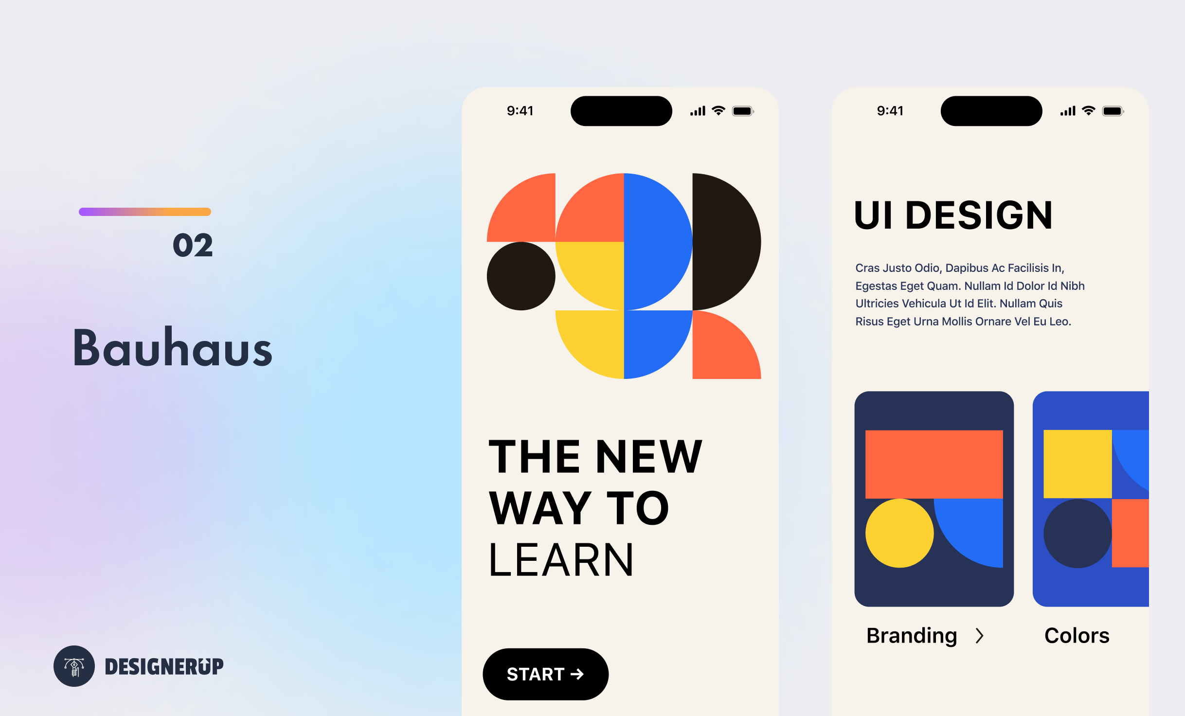
Bauhaus design originated at the Bauhaus German school of design, Founded by the German Architect Walter Gropius in 1919. Out of this school came an entire far-reaching design philosophy that embraces the principles such as functionalism, simplicity, and the use of modern materials and techniques. It aimed to bridge the gap between fine arts and practical design, and to create objects that were not only aesthetically pleasing but also functional.
The historical background behind Bauhaus can be traced back to the aftermath of World War I in Germany. Gropius sought to create a school that would address the need for a new design language that could meet the challenges of the modern industrial age. The name "Bauhaus" translates to "building house" in English, signifying the school's focus on the integration of various artistic disciplines and the connection between art and technology.
The school attracted numerous influential artists and designers, including Wassily Kandinsky, Paul Klee, Ludwig Mies van der Rohe, and Marcel Breuer, among others. Their collective work and teachings at Bauhaus left a lasting impact on the fields of architecture, industrial design, typography, and visual arts.
The Bauhaus UI Design Style
- Minimalism: Bauhaus emphasized simplicity and the elimination of unnecessary ornamentation. This minimalist approach is evident in many contemporary web and UI designs, where clean lines, ample white space, and a focus on functionality are key elements.
- Grid Systems: Bauhaus popularized the use of grid systems in design. Grid layouts provide structure and organization, enabling designers to create balanced and harmonious compositions. This approach is frequently employed in web design to ensure consistent alignment and visual hierarchy.
- Simple Typography: Bauhaus placed great importance on typography, considering it an integral part of visual communication. Bauhaus typography often featured sans-serif typefaces with geometric shapes and and clean lines. This influence can be seen in modern web and UI design, where minimalist, legible, and geometric fonts are commonly used.
- 2d Shapes and Patterns - Regular geometric 2d shape patterns particularly the square, triangle and circle.
- 3 Main Colors: Bauhaus embraced bold, vibrant colors to evoke emotions and create visual impact. The color palette often used are the primary colors of red, yellow and blue or using a white and black color palette with a single accent color that could be red or blue.
Overall, the Bauhaus movement revolutionized design by emphasizing functionality, minimalism, and the integration of different artistic disciplines.
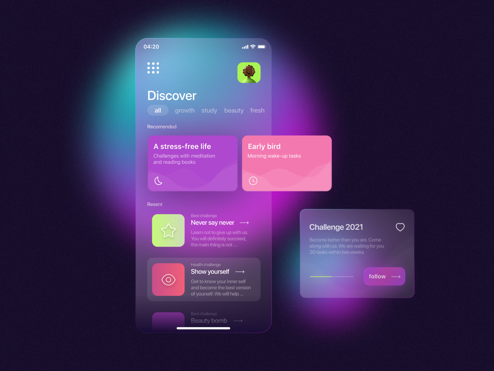
3. Neumorphism
A more recent design style, neumorphism combines skeuomorphism and flat design, using soft shadows and highlights to create a realistic, three-dimensional appearance.
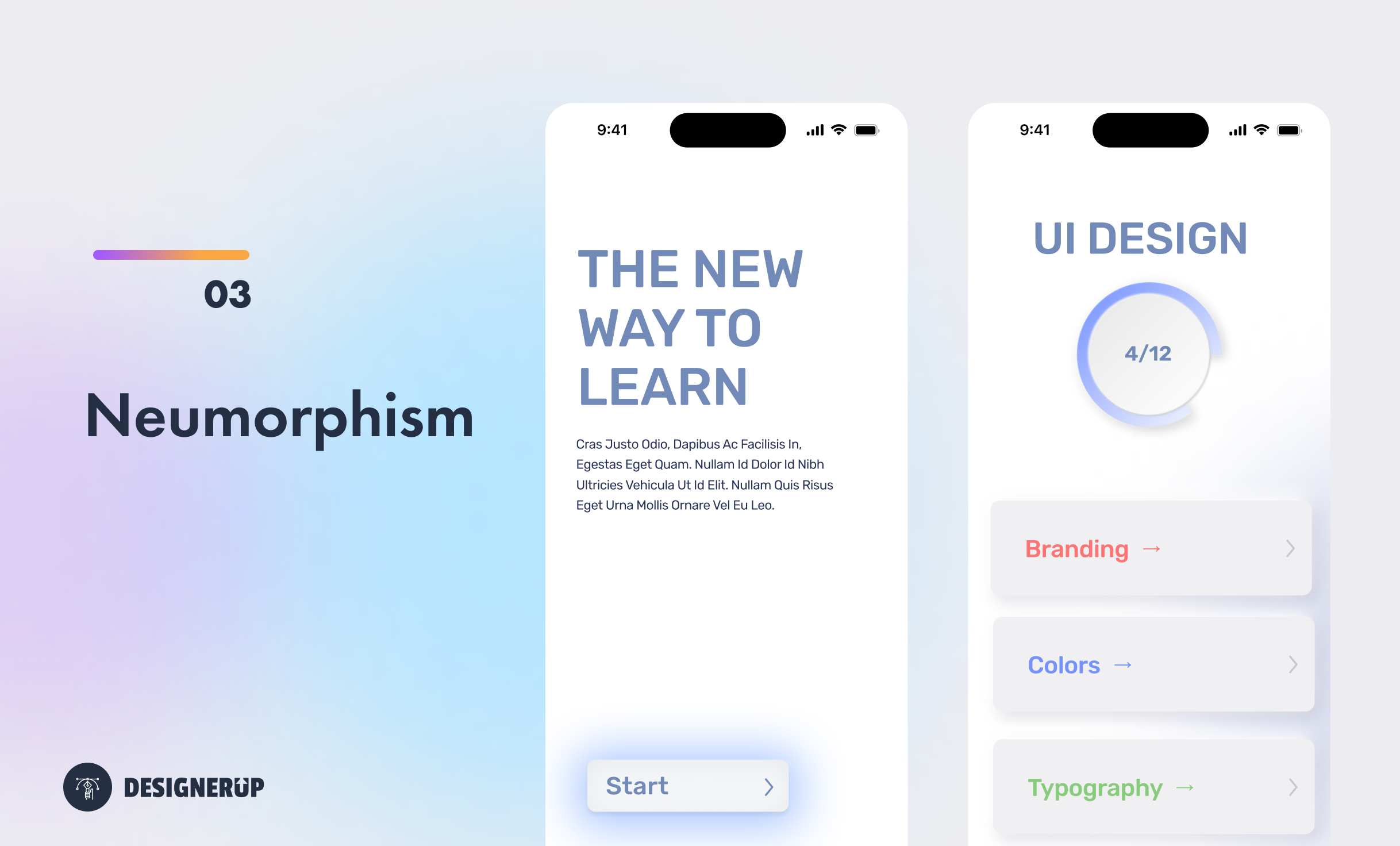
Neumorphism is a design trend that emerged in the early 2020s as a response to the flat design aesthetic that had dominated UI and visual design for several years.
The term "neumorphism" is a combination of the words "new" and "skeuomorphism." Skeuomorphism refers to the design approach that uses realistic textures, materials, and visual cues from the physical world to represent digital interfaces. Neumorphism builds upon this concept by adding depth, shadows, and highlights to create a tactile and realistic visual experience.
Neumorphism is characterized by a combination of skeuomorphic elements and minimalistic design principles, creating a soft, three-dimensional appearance. It often involves the use of subtle shadows and highlights to simulate the appearance of physical buttons, cards, and other interface elements. By blending elements of skeuomorphism with minimalism, neumorphic designs aim to strike a balance between realism and simplicity.
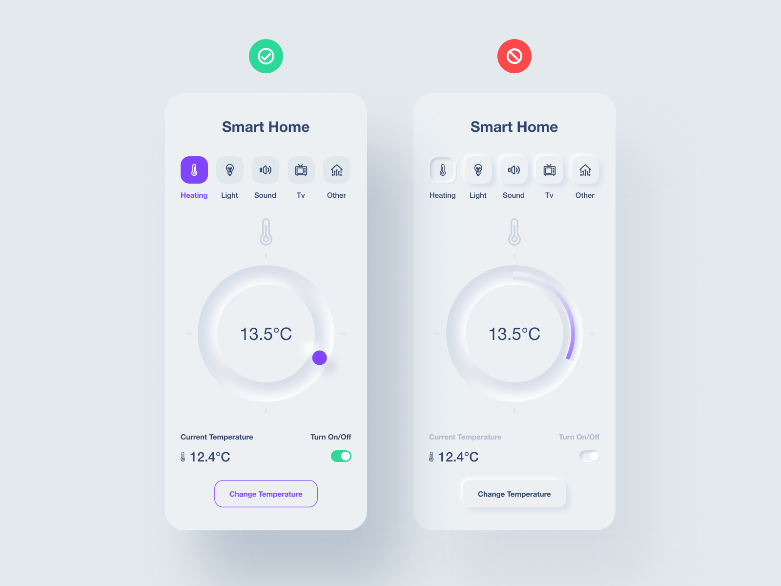
The Neumorphic UI Design Style
- Realistic Buttons: Neumorphic buttons have a soft and tactile appearance, with shadows and highlights creating a sense of depth. The buttons often have a slight convex or concave effect, mimicking the look of physical buttons.
- Display Cards: Neumorphic cards are commonly used to display information or content in a visually appealing manner. They feature soft shadows and gradients that give them a lifted, floating appearance.
- Physical-like Input Fields: Neumorphic input fields are designed to resemble physical forms, with a subtle embossed effect and shadows indicating depth. The fields have a soft appearance and blend into the overall design seamlessly.
- Raised Icons: Neumorphic icons often have a raised appearance, with shadows and highlights creating a three-dimensional effect. They aim to strike a balance between simplicity and realism.
- Tactile Graphical Elements: Neumorphism can also be applied to various graphical elements, such as progress bars, sliders, and toggles. These elements have a soft, pillowy appearance, with shadows and highlights indicating interactivity.
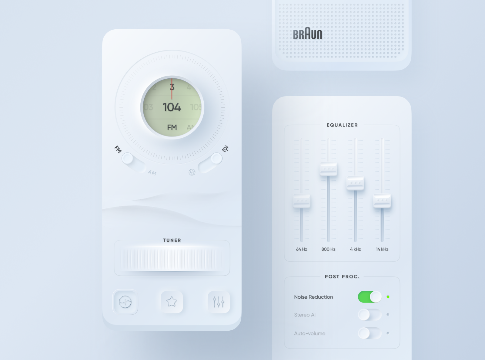
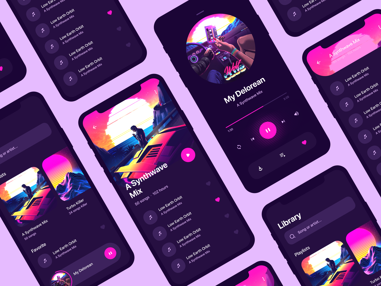
4. Retro Futurism
Retro Futurism design draws inspiration from past eras and seeks to evoke a sense of nostalgia about what we thought the future might look like through the lens of the past. Think Tron, 1980s videos games and 16-bit pixel art.
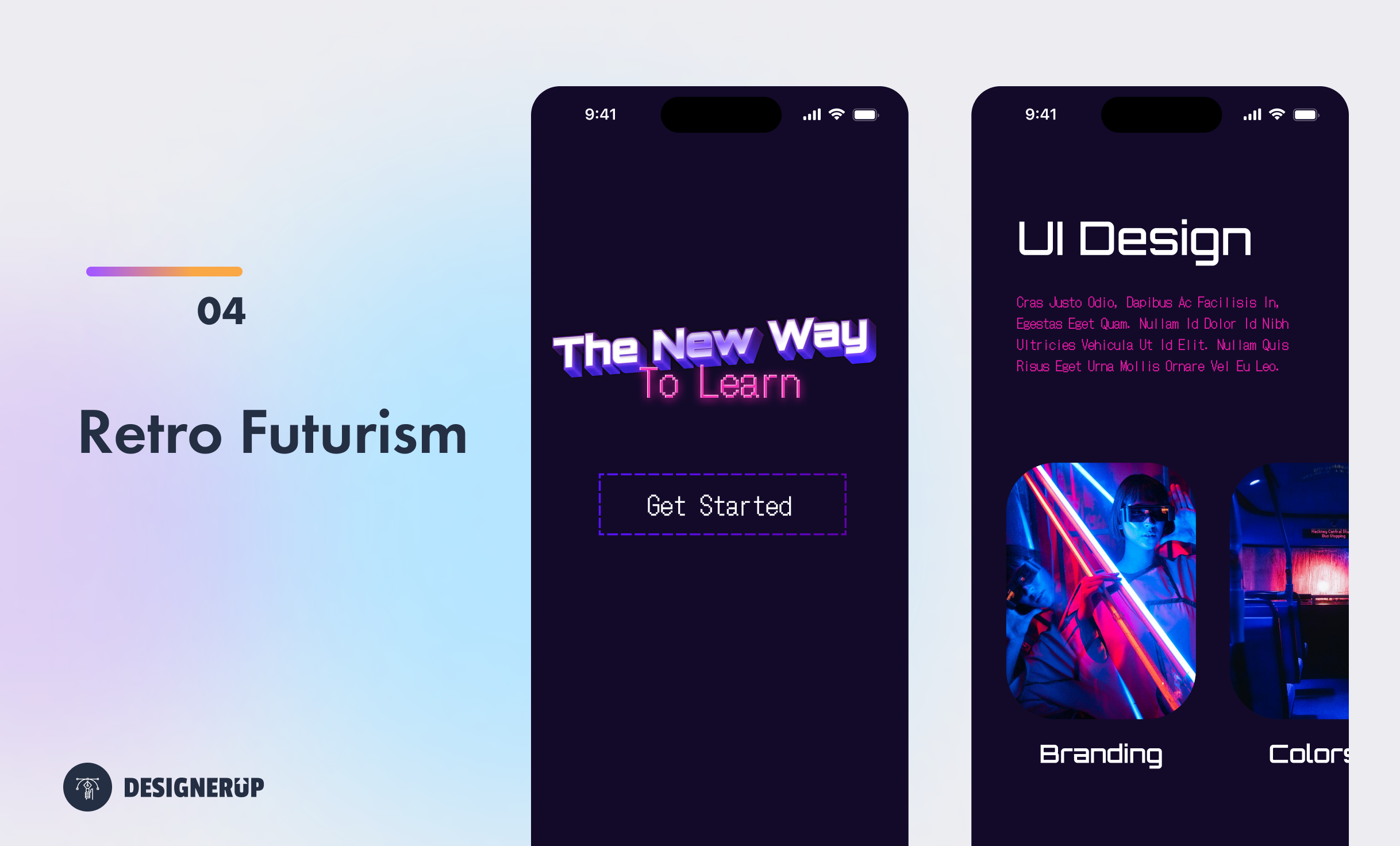
The colors are bright and neon or can be warm with a vintage touch. Interactive elements often mimic the visual styles of retro technology, such as analog knobs, radio dials, or vintage buttons, to create a nostalgic user experience.
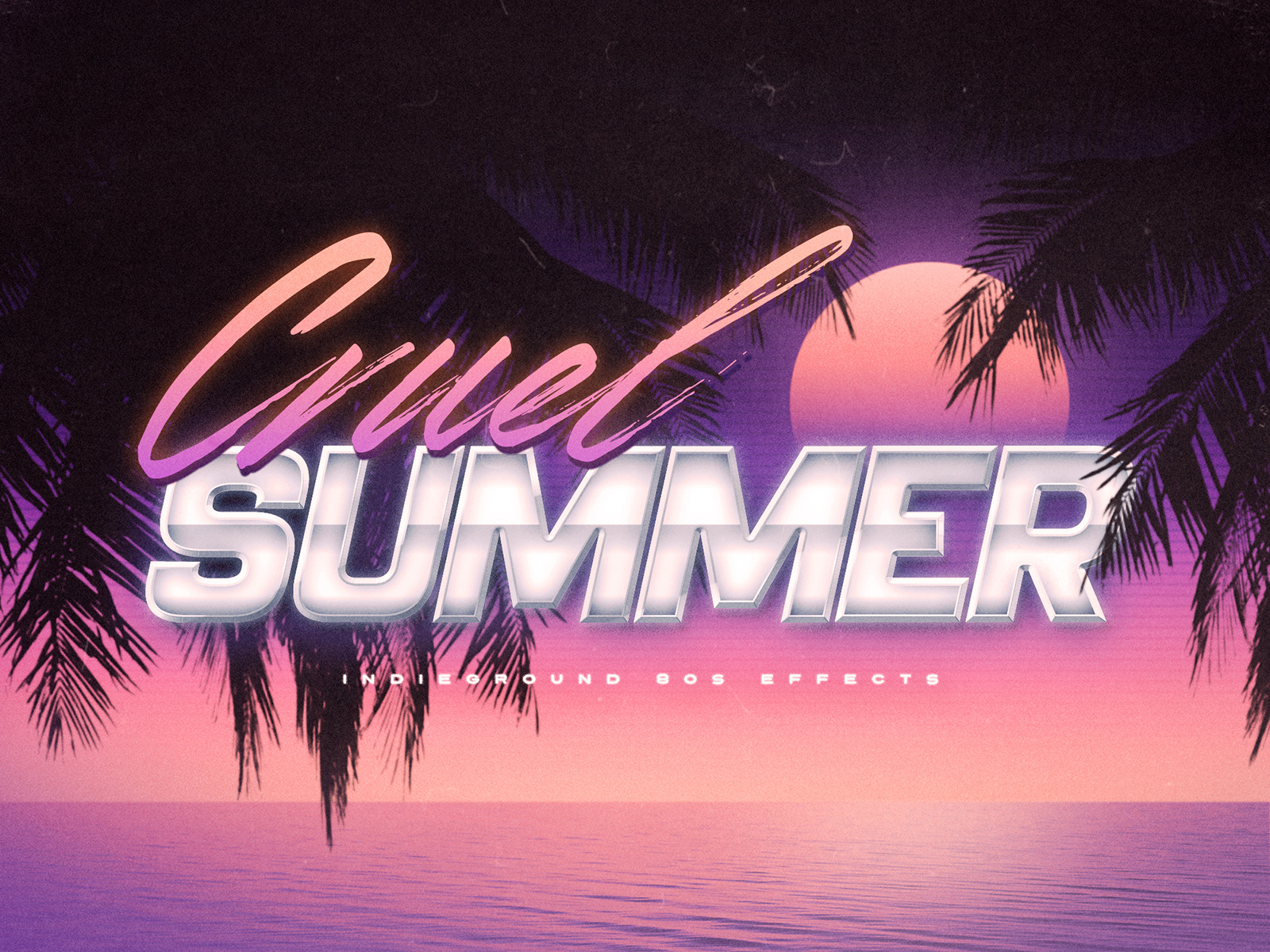
Retro Futuristic UI Design Style
- Color Palettes: Retro Futurism design often incorporates warm and muted color palettes reminiscent of old photographs, faded prints, or retro advertising. Colors like sepia tones, earthy hues, pastels, and vibrant shades commonly feature in this design style. It can also be represented as dark design with a more arcade like vibrancy and neon color pallete
- Typography: Retro Futurism design frequently employs typography styles popular in specific eras such as display fonts with a game-like style.
- Texture and Grains: Retro futuristic UI design often incorporates textured backgrounds or overlays to simulate the appearance of aged or weathered materials. This can include effects like film grain, paper textures, scratches, screen distortion or 16-bit.
- Vintage Illustrations and Graphics: Retro futuristic design often includes illustrations and graphics inspired by vintage advertising, packaging, or posters. These can be hand-drawn or digitally created.
- User Interface Elements: These elements may mimic the visual styles of retro technology, such as analog knobs, radio dials, or vintage buttons, to create a nostalgic user experience.
- Layout and Composition: Retro futurism design may incorporate layout and composition styles inspired by vintage print design. This can include asymmetric layouts, overlapping elements, or collage-like compositions that mimic the visual techniques used in older design approaches.
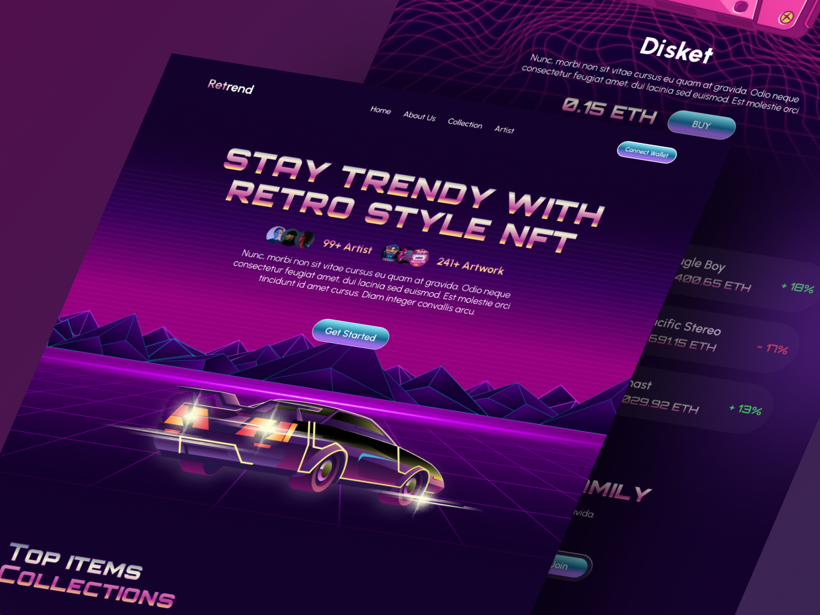
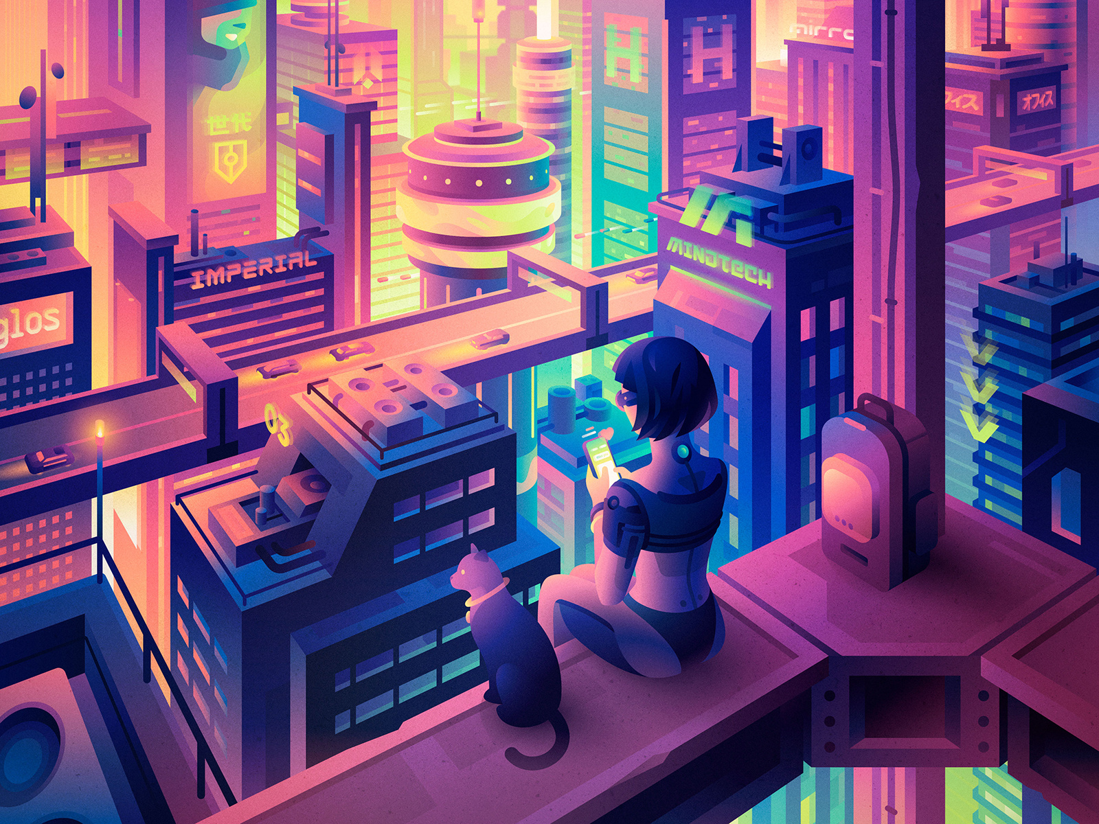
4.5. Cyberpunk
Cyberpunk is very closely related to retro futurism so it doesn’t get it’s own category (think, less retro and more futurism). This style is highly influenced by AI generated art like Midjourney. It’s much cleaner and more minimal and modern often using a combination of dark design, neon colors and jewels tones.
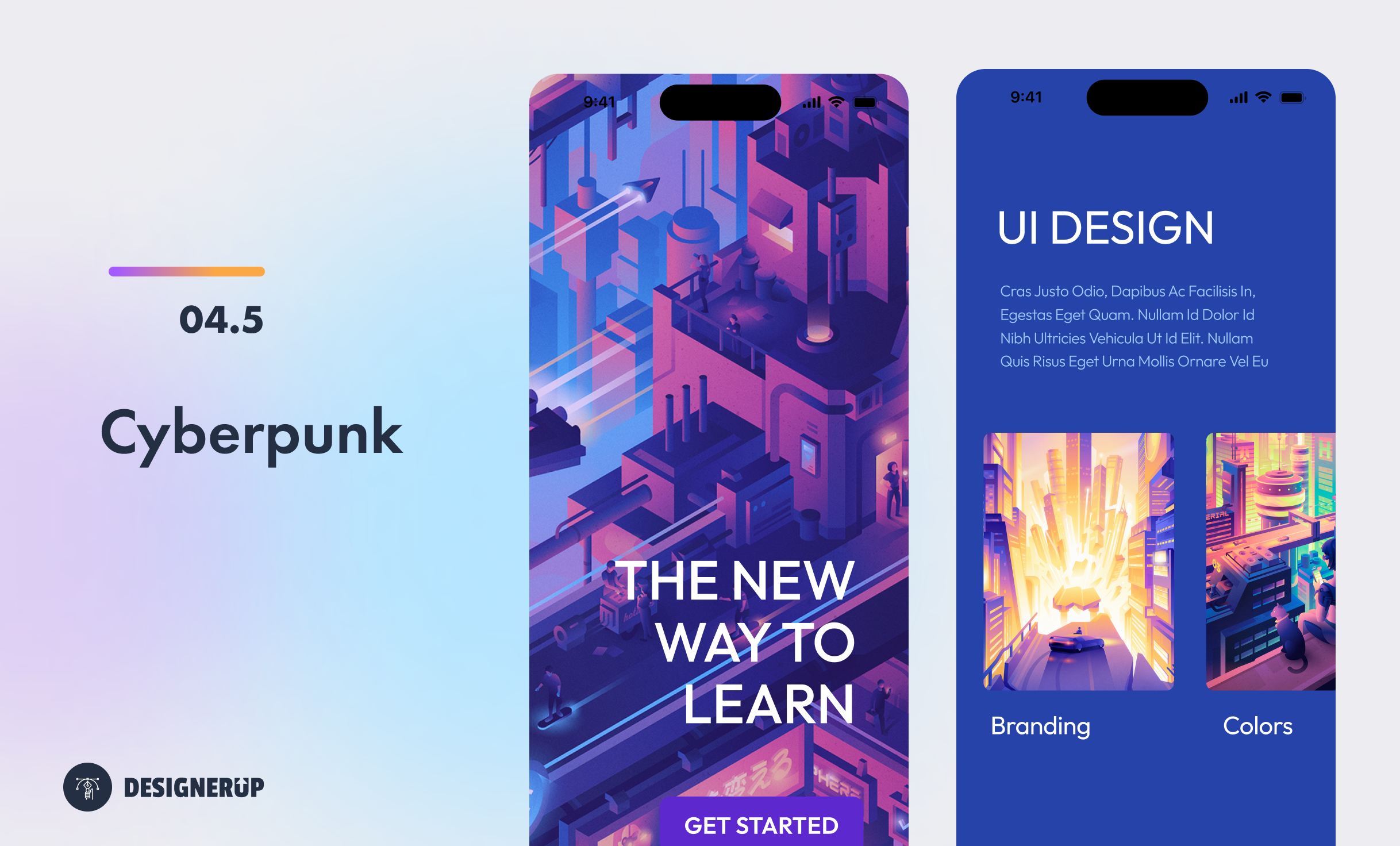
The cyberpunk aesthetic gained prominence in the 1980s and 1990s, coinciding with the rise of personal computers, video games, and digital art. It was influenced by the emerging digital culture, hacker subcultures, and the rapid advancement of technology.
Cyberpunk is a futuristic design style inspired by cyberpunk literature and movies, featuring neon colors, futuristic typography, glitch effects, and dystopian elements. This styles has many similarities to retro futurism, but with a more clean, modern, less vintage approach.
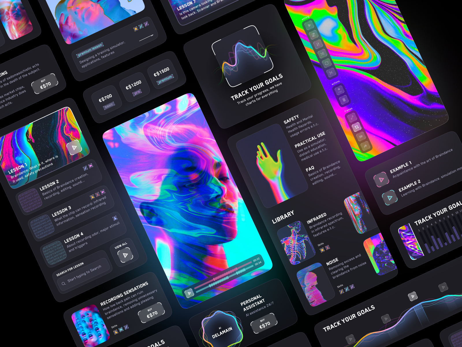
Cyberpunk in UI Design
- Neon Colors and Glowing Effects: Cyberpunk design often features vibrant and intense neon colors, particularly in shades of blue, pink, and purple. These colors create a futuristic and energetic atmosphere, evoking the neon-lit cityscapes of cyberpunk settings.
- Complex and Futuristic Interfaces: Cyberpunk design embraces complex and intricate interfaces, often showcasing advanced technology and augmented reality elements. These interfaces can feature holographic displays, layered information, and interactive elements that reflect the high-tech nature of cyberpunk worlds.
- Geometric Shapes and Grids: Cyberpunk design incorporates geometric shapes and grids to create a sense of order and structure. Grid systems, inspired by computer interfaces, help organize content and create a futuristic and digital feel.
- Gritty and Dystopian Imagery: Cyberpunk design often incorporates gritty and dystopian imagery, reflecting the dark and decaying aspects of cyberpunk worlds. Urban environments, neon-lit cityscapes, and elements of industrial decay or corruption are common visual motifs.
- Futuristic Typography: Typography in cyberpunk design can range from futuristic and sci-fi-inspired fonts to glitch effects and digital distortion. These typography choices enhance the high-tech and digital aesthetics of the design.
- Gaming and Entertainment: Cyberpunk design has a strong presence in video games, particularly those set in cyberpunk or futuristic dystopian worlds. It is also prevalent in movie posters, album covers, and promotional materials related to cyberpunk-themed media.
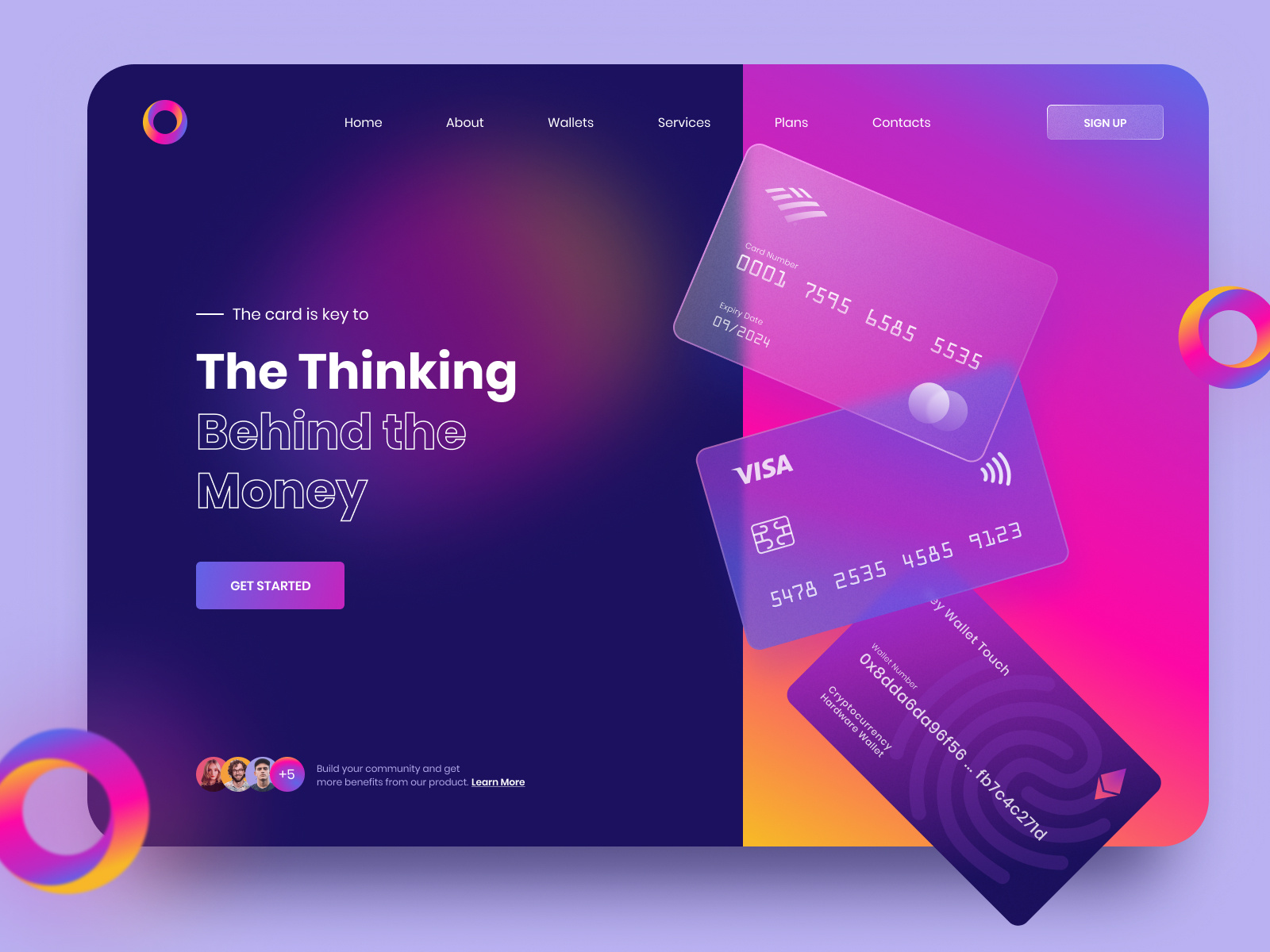
5. Glassmorphism
First appearing when Apple’s released this design style in iOS 7 and on macOS Big Sur, Glassmorphism is a design trend that gained popularity in the UI and visual design community in 2020. It is characterized by a translucent or frosted glass-like effect applied to interface elements, creating a sense of depth and realism. Glassmorphism is often associated with a minimalistic and futuristic aesthetic.
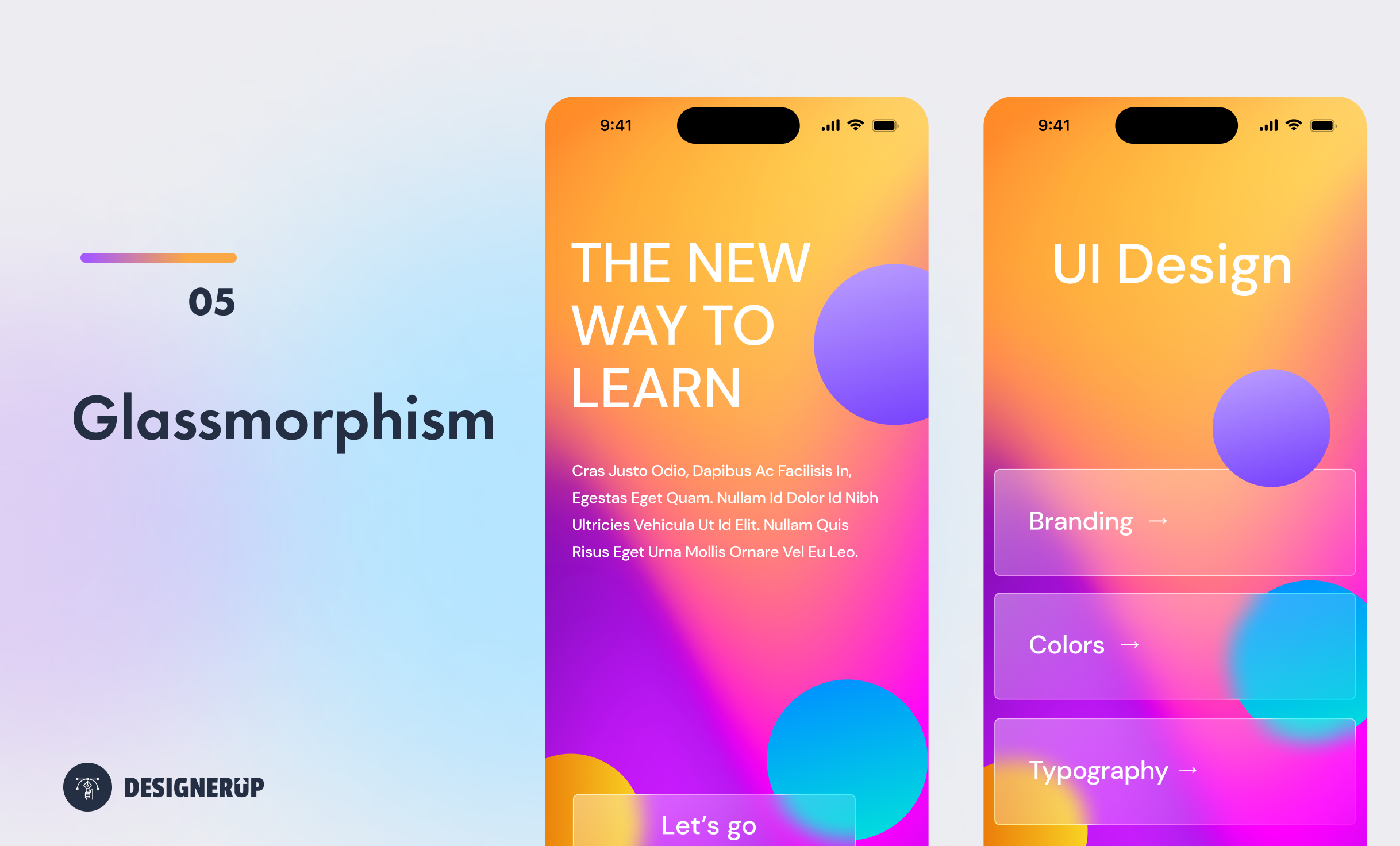
Glassmorphism can be seen as a modern reinterpretation of the skeuomorphism and neumorphism design trends. While skeuomorphism emulates real-world textures and neumorphism combines realism with minimalism, glassmorphism focuses on creating a glass-like appearance.
Mikołaj Gałęziowski | Andrii Perevoznik | Design Studio Oval.no
Glassmorphism in UI Design
- Colorful, Bokeh Backgrounds: The backgrounds are the main visual vehicle for delivering on the glass-like effect. Often brightly colors with blurred our shapes or objects to create a sense of depth.
- Foreground Gloss and Frost - Glassmorphism foreground objects and elements are used to create a blurred and translucent appearance. This effect adds depth and visual interest to the design while maintaining a minimalist and futuristic feel.
- Cards and Panels: Glassmorphic design is frequently applied to things like credits cards, panels, and containers within interfaces. These elements have a glass-like appearance with subtle transparency and blurred edges, giving them a floating or elevated look.
- Buttons and Controls: Glassmorphism is also utilized for buttons and controls in UI design. Buttons may have a glassy surface with a slight gradient and translucent effect. Hover and click interactions can enhance the visual feedback by creating animations or revealing inner shadows.
- Modals and Dialogues: Glassmorphism can be employed in modals and dialogues, such as pop-up windows or overlays. These elements often have a transparent or semi-transparent background with frosted glass effects, allowing the content to appear suspended in the foreground.
- Icons and Logos: Glassmorphic design can be seen in icons and logos, where glass-like effects are applied to create a glossy and reflective appearance.
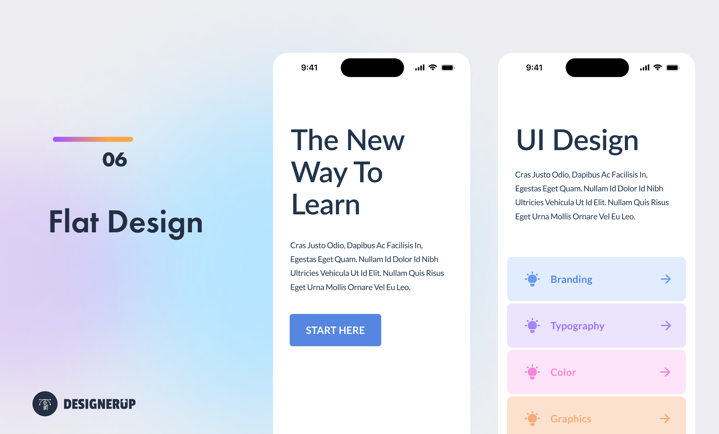
6. Flat
Flat design is a minimalist design style that features simple, two-dimensional elements, solid colors, simple icons, and soft edges and ample white-space.
Flat design emerged as a reaction against skeuomorphic design, which aimed to mimic real-world textures and objects. Flat design gained popularity in the early 2010s and has become a dominant design trend in web, visual, and UI design.
The historical background of flat design can be traced back to the Swiss design style, which emerged in the mid-20th century. Swiss design emphasized minimalism, grid-based layouts, and clear communication. Designers like Josef Müller-Brockmann and Max Miedinger (the designer behind the Helvetica Font) contributed to the development of this influential design movement.
The style was first popularized by Microsoft's Metro design language and introduced with Windows Phone in 2010. Microsoft's design approach focused on simple typography, bold colors, and clean interfaces, which aligned well with the principles of flat design.
Flat UI Design
- Simple and Minimalistic Interfaces: Flat design favors simplicity and clarity, often eliminating unnecessary details and visual embellishments. User interfaces with clean layouts, ample whitespace, and minimal distractions are hallmarks of flat design.
- Clean, Sans-Serif Typography: Flat design often employs clear and legible typography with simple, sans-serif typefaces. Typography is given importance, and hierarchy is established through size, weight, and color, ensuring readability and visual impact Lato, Aller, MuseoSlab.
- Bold and Vibrant Colors: Flat design features vibrant and bold color palettes. Bright and saturated colors are used to create visual interest, establish brand identities, and enhance the overall aesthetics of the design.
- Iconography: Flat design utilizes simple and minimalistic icons. Icons are typically represented as flat, geometric shapes with clean lines and minimal details. They are easily recognizable and scalable, providing clear visual communication.
- Simple Buttons - Square or rounded corners with solid colors and light shadows is the norm when it comes to buttons in flat UI interfaces.
- Minimalistic Illustrations: Flat design often incorporates minimalistic illustrations with simplified shapes and forms. These illustrations contribute to the overall aesthetic, evoke a specific mood or concept, and convey information in a visually engaging manner.
- Mobile App Design: Flat design has been widely adopted in mobile app design, particularly for iOS and Android platforms. The clean and minimalistic interfaces of many popular apps, such as Instagram, Spotify, and Google's suite of apps, showcase the principles of flat design.
Flat design has become the standard for many digital products, as it offers simplicity, scalability, and visual appeal. Its usage can be found across various industries, from e-commerce websites and social media platforms to productivity apps and corporate websites.
Resources To Help You Design These UI Styles Yourself
Trends come and go but knowing the foundations of design is what allows designers to use specific treatments of graphics, images, typography, user interface elements and colors to recreate any of these styles. If you want to understand the entire 6 stage process of UI design this is a great article.
There are some great Figma UI Kits in the Figma community that can help you jump start your designs and get better at designing these types of styles and trends.
My recommendation is not to follow trends but to be so good at your craft and the foundations of design that you can create any style you want.