If you think it’s cool to tell a prompt to design something, imagine being able to tell that prompt to research, design and code it for you. I’m going to show you the entire behind-the-scenes process of how I challenged myself to use Figma’s new AI features to do user research and analysis, generate my UI designs, prototype them, and then turn it all into a real app --and I did it all in just 48 hours. Here's what happened...
The Problem
Last week, I met with my accountant, and he pointed out that the way I was keeping my books wasn’t optimal. I thought to myself, “I wish I had an easy way to see how my money is coming in and to allocate it to certain accounts or buckets.” This way, I could clearly see if I’m putting enough toward investments, savings, taxes, personal expenses, or an emergency fund. Now I want to find out if this is a problem others are having too.

The Plan
Here’s the plan:
- Conduct research by talking to people about their problems and exploring existing solutions.
- Plan and strategize based on the insights we uncover.
- Design the UI and create a single flow or micro-app to test and iterate on.
- Build the app without code by creating the database and functionality.
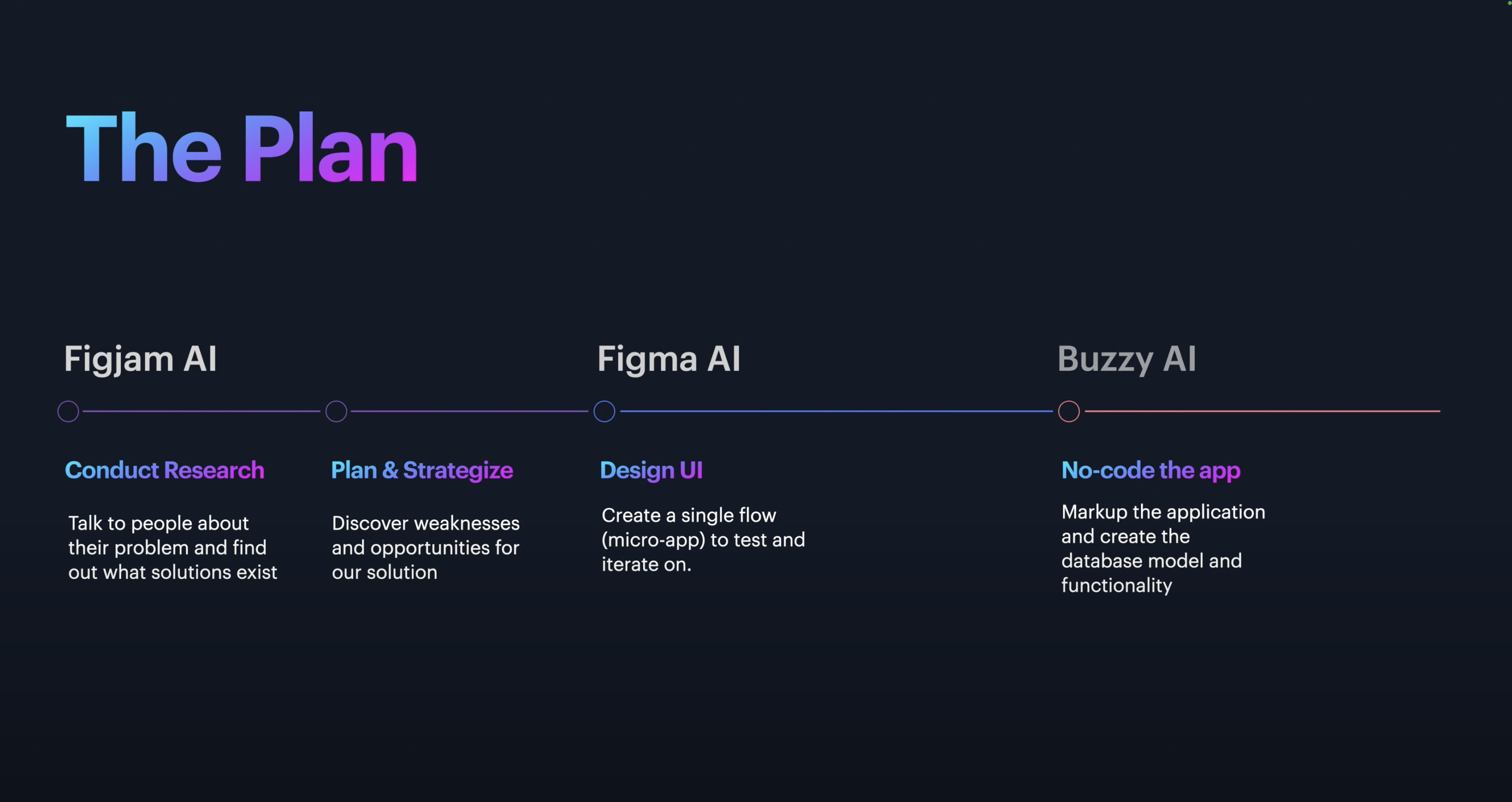
And we're going to do this all in Figma. I'm going to use FigJam AI for the first two steps, then Figma AI, and finally Buzzy AI plugin for Figma.
Brainstorming
To start, I opened up a FigJam file for user research. My first step was brainstorming. I used a button in FigJam to generate a brainstorm using AI insights on freelancer budgeting. It suggested exploring the current landscape of budgeting apps, understanding the unique challenges freelancers face, and considering different strategies.
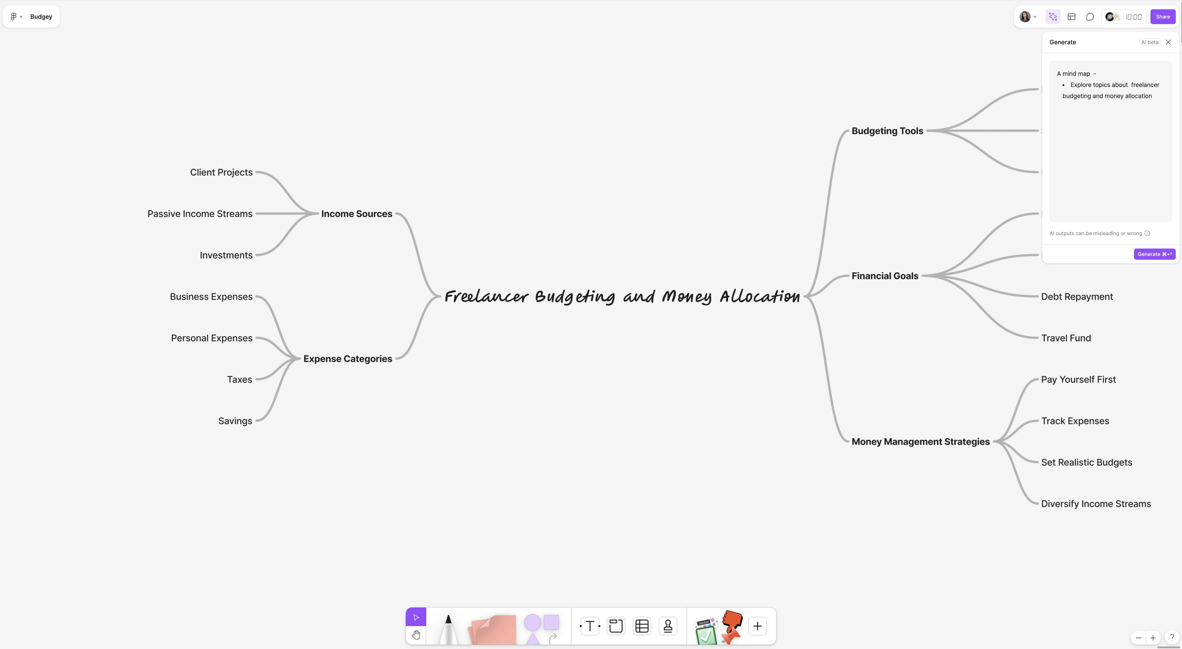
Then, I used AI to generate a mind map, diving into freelancer budgeting and money allocation topics. I could start to see where my MVP could take shape, with buckets for income, expenses, taxes, and savings.
Before diving into user research, I created a quick user research plan using FigJam’s AI-powered “Jambot” tool. I connected my sticky notes to Jambot, which generated a breakdown for my research plan: conducting surveys and interviews, analyzing existing budgeting apps, creating the interface, developing the app, and more.
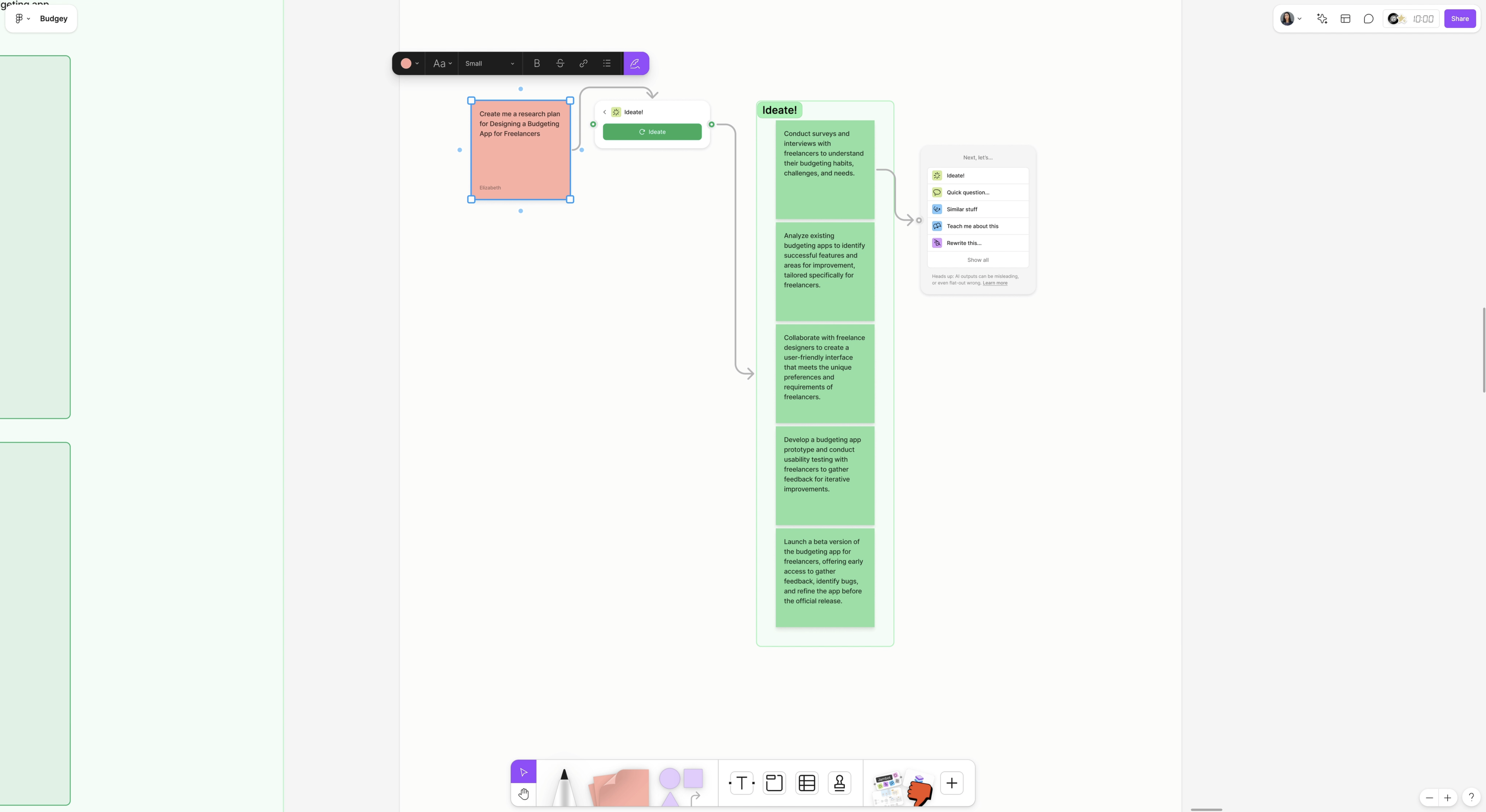
User Research Plan
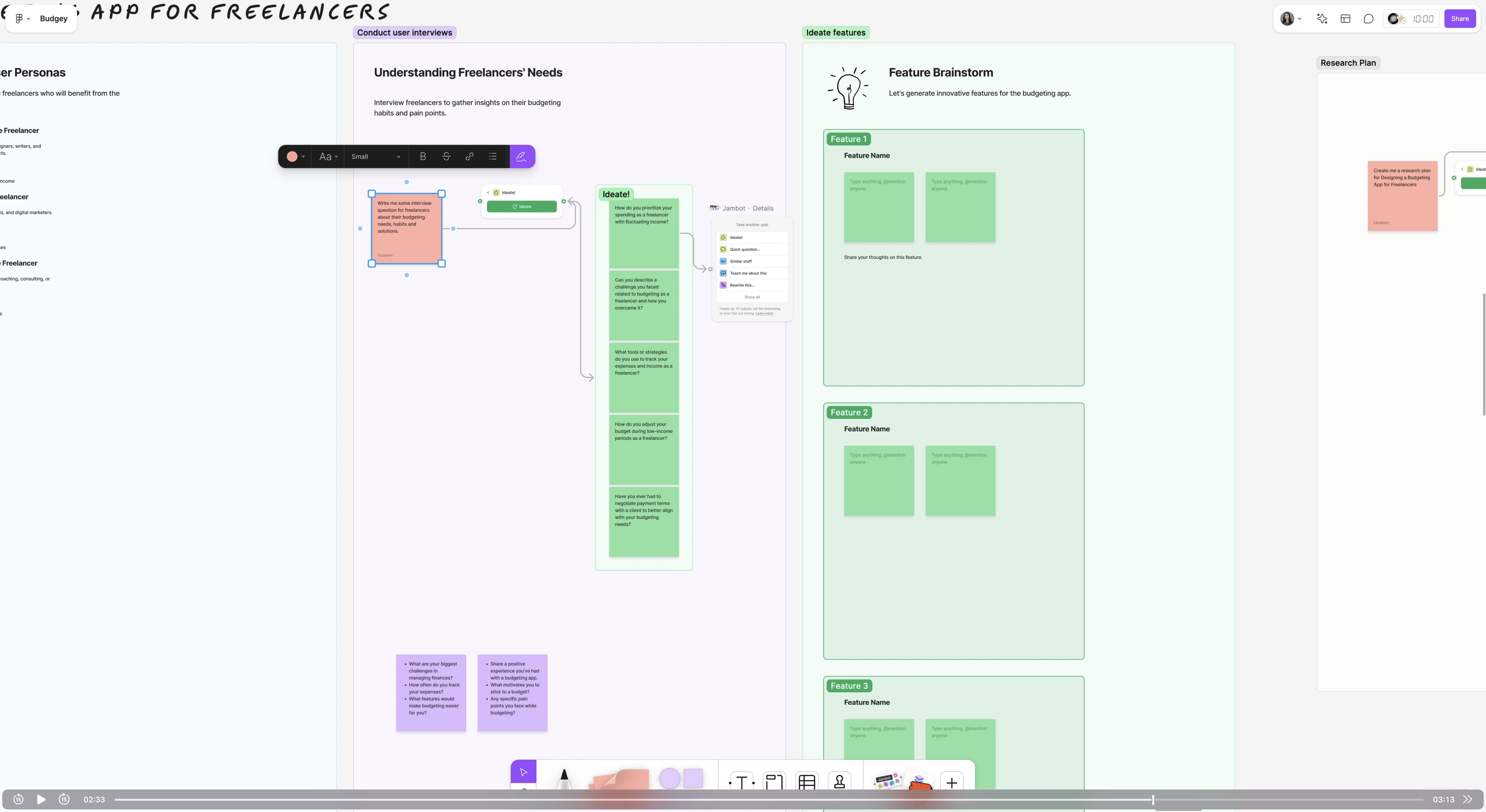
Next, I prepared for an interview I had scheduled. I needed to draft questions, so I used another FigJam sticky note, saying, “Write me some interview questions for freelancers about their budgeting needs, habits, and solutions.” After connecting it to Jambot, I got a set of relevant questions like, “How do you prioritize spending as a freelancer?” and “What tools do you currently use?” These questions were perfect for gaining insight into the budgeting struggles freelancers experience.
Live User Interview
During the interview, I asked questions like, “How do you allocate money for taxes and self-employment costs?” and “How do you decide how much to put toward personal spending versus business expenses?” The feedback was insightful. My interviewee mentioned using a spreadsheet to calculate quarterly income and budget allocations, though they hadn’t yet settled on an investment strategy. This interview validated my idea: freelancers could really use a simple tool to visualize their finances.

Research Analysis
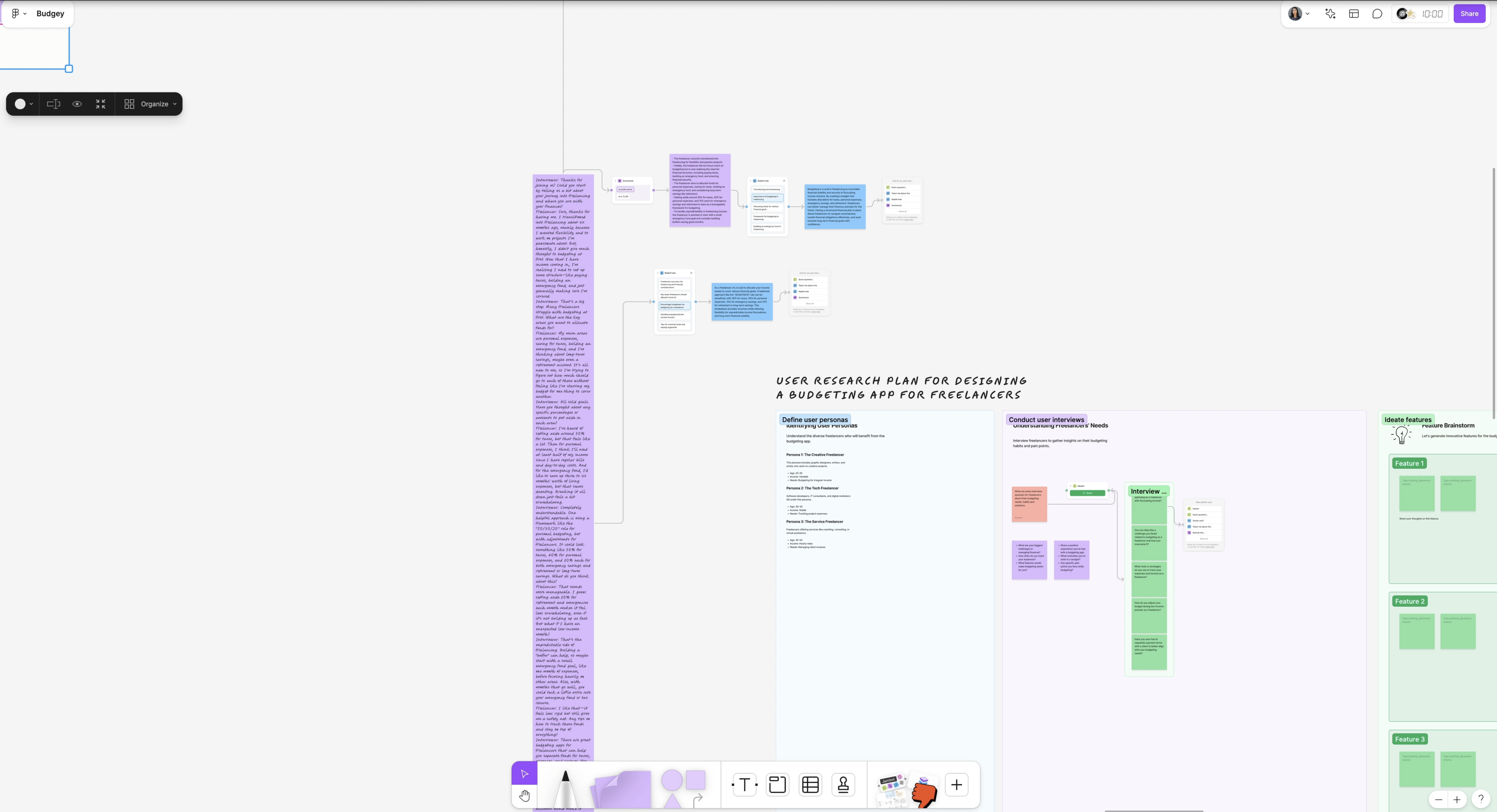
I took detailed notes during the interview and pasted the transcription into a FigJam sticky note. Then, I used FigJam’s Jambot to summarize the key insights in bullet points. Some main points included handling unexpected low-income months, setting percentage-based budgets, and organizing and tracking funds. I realized this would be the primary flow to focus on for my MVP.
Competitor Analysis
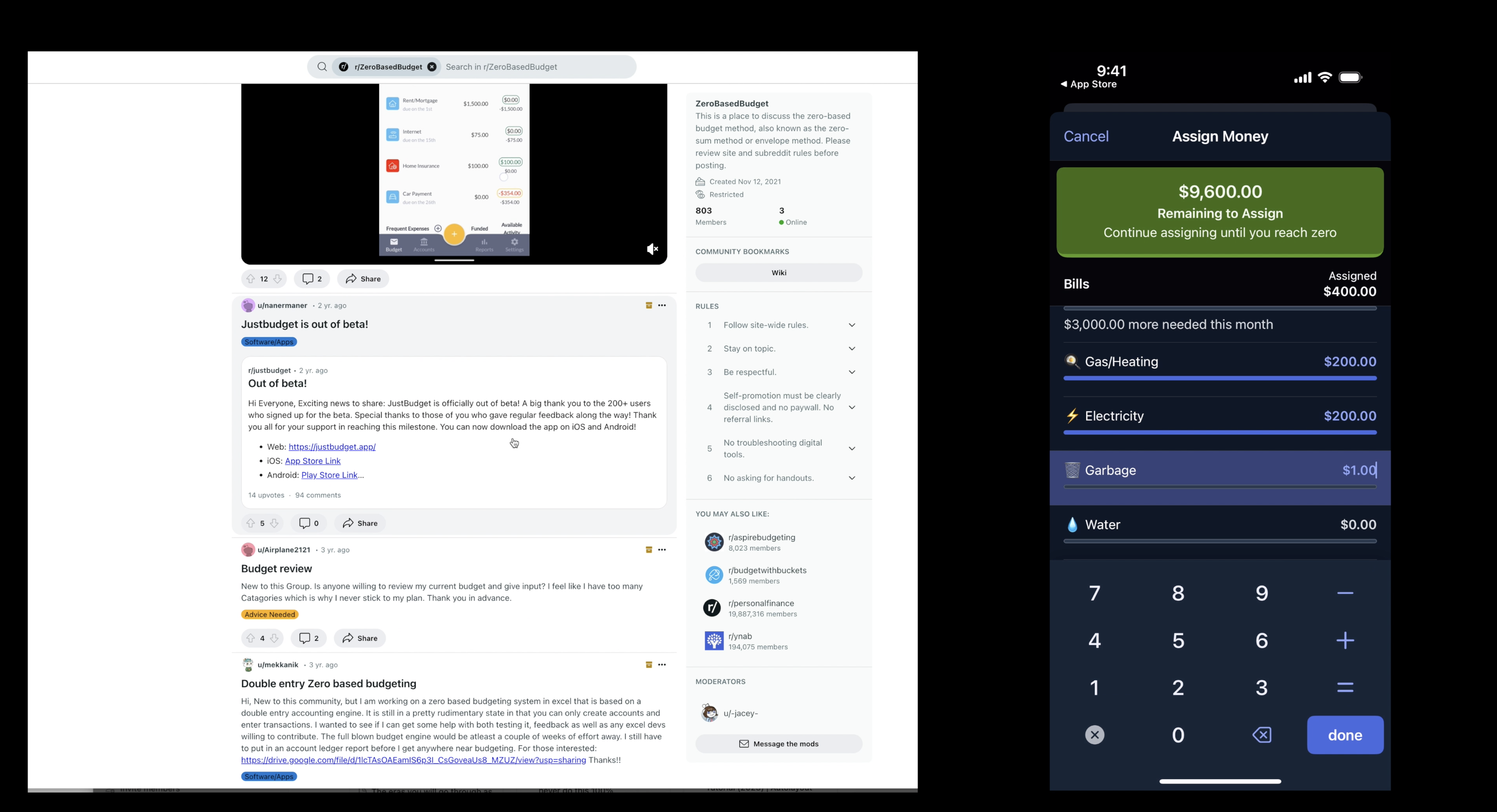
To understand what solutions already exist, I turned to Reddit to see what budgeting tools freelancers discuss. I looked into popular options like QuickBooks and some other highly recommended apps. One app, in particular, kept coming up is called YNAB. I downloaded it to observe its user experience, interface, and interactions. Users could select a bill type and assign an amount, which was a promising design pattern that hadn’t been directly applied to the freelancer space.
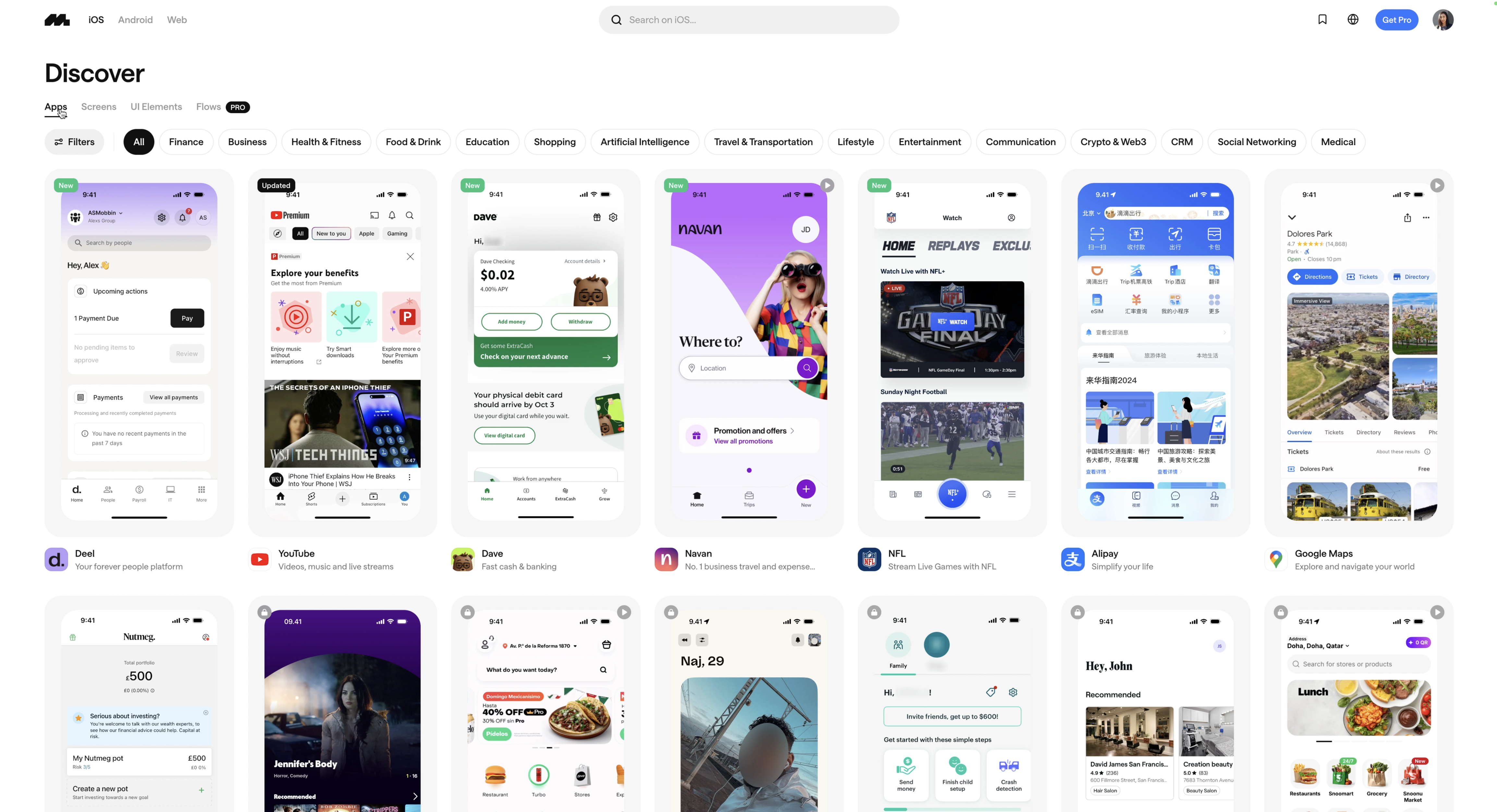
One of my favorite competitor analysis tools is Mobbin, which catalogs thousands of real apps and shows walkthroughs of their flows, screens, and UI elements. I searched for “budget” in Mobbin, and it gave me tons of insights. I highly recommend it for any UX/UI designer.
Flow Chart
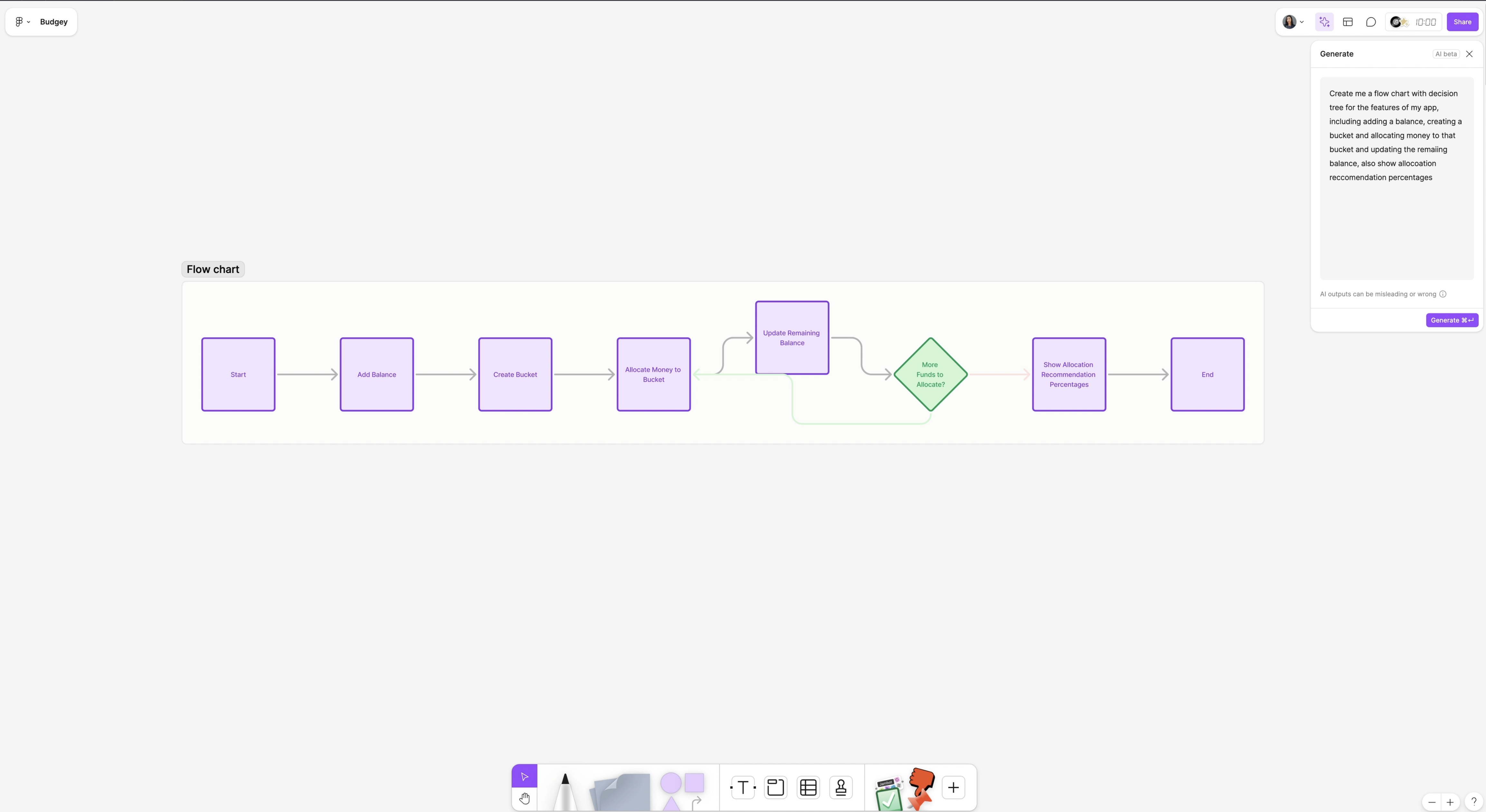
I went back into FigJam and used AI to generate a flowchart, detailing each screen and action needed for my app. The flow included starting with an “add balance” screen, creating buckets, allocating funds, and updating balances. With this as a guide, I was ready to dive into UI design.
UI Design with Figma First Draft AI
With all the research from FigJam, I used Figma’s AI features to create the app’s designs and flows. Figma’s First Draft AI allowed me to toggle between a basic app wireframe or a desktop site wireframe.
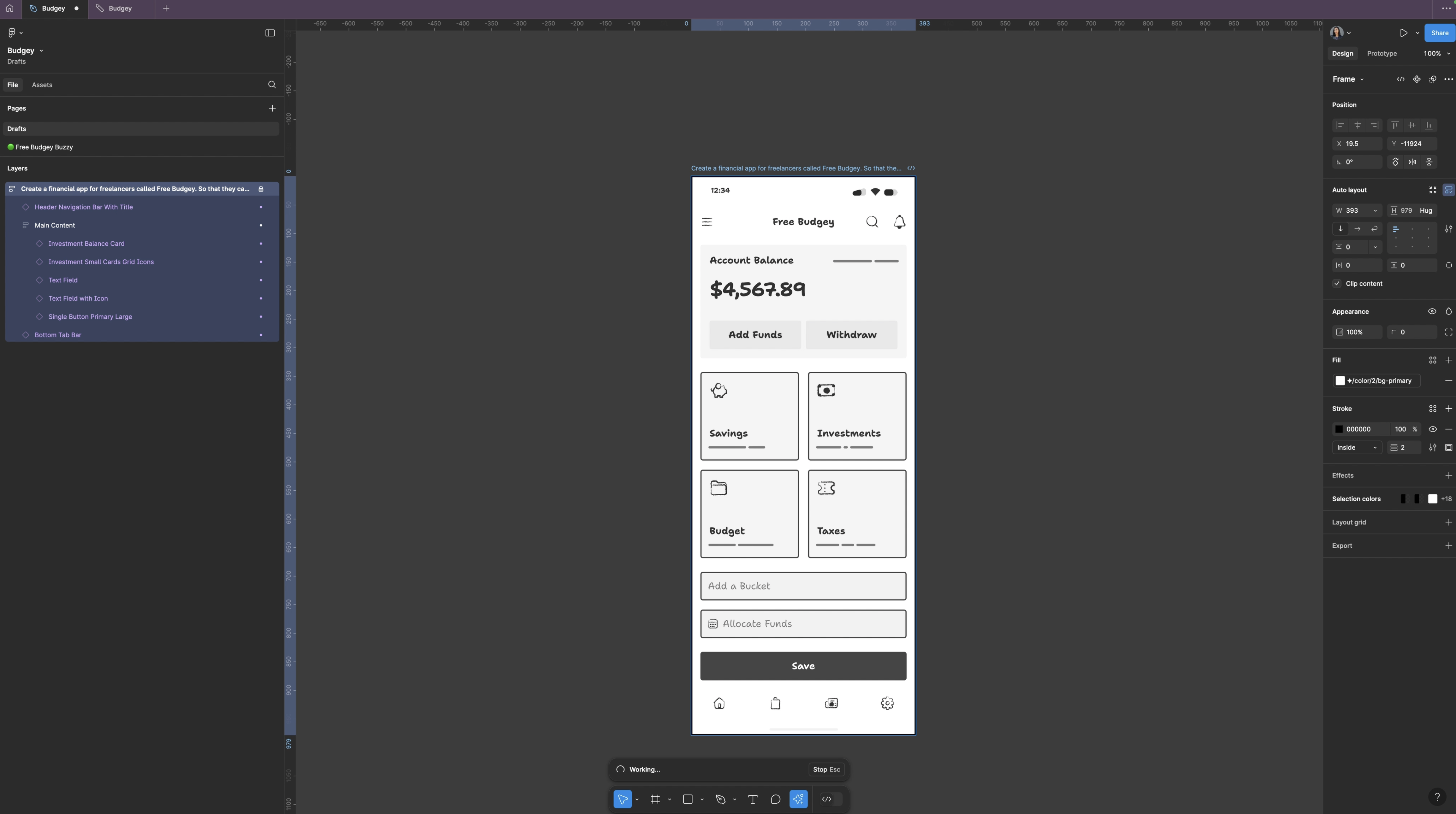
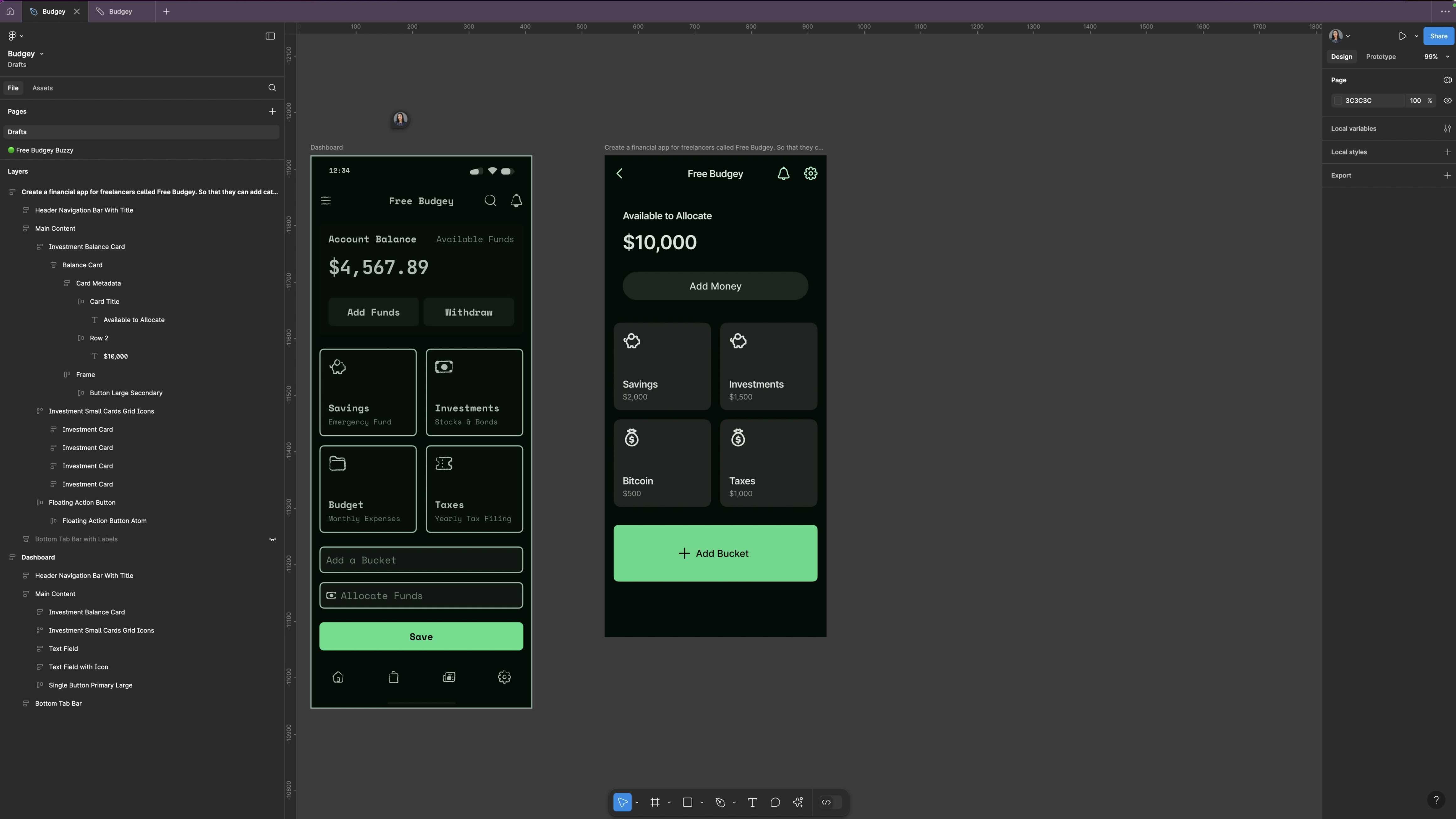
I started by selecting an app wireframe using Figma AI's new 'First Draft' feature and prompted it to generate a financial app. Instantly, the wireframes were ready, and I customized them further by adjusting things like dark mode, colors, button styles, and spacing. I also generated another screen using the same prompt but this time I used the Basic App Generation mode.
Prototyping with Figma AI
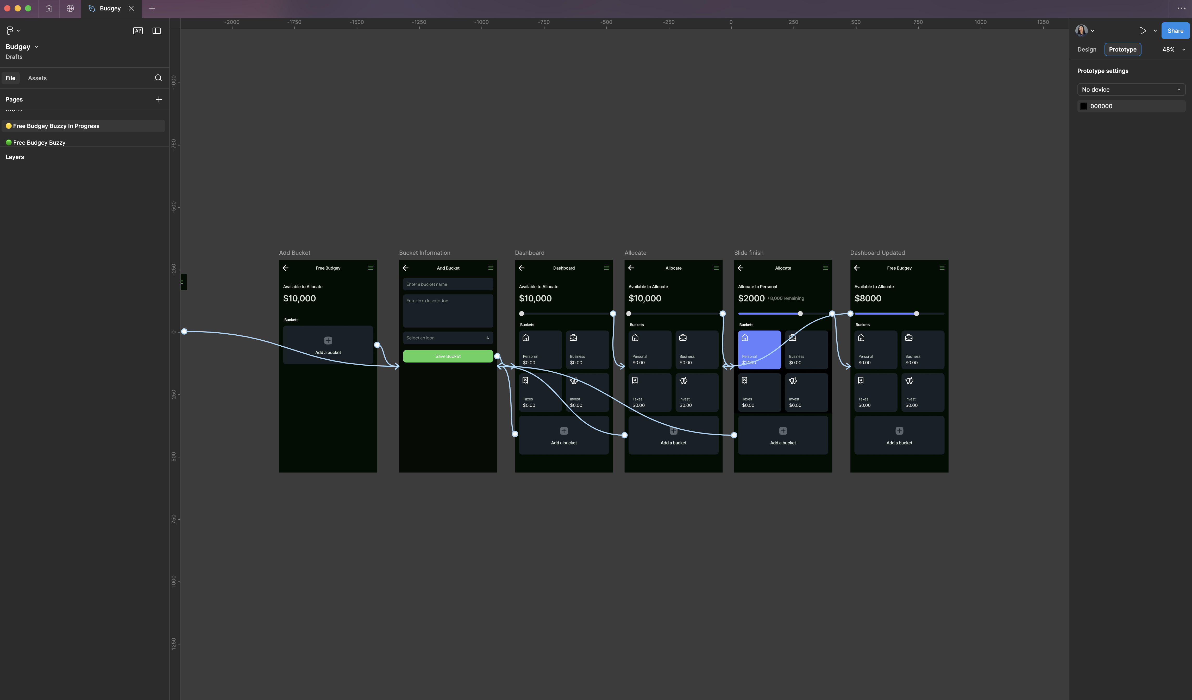
Once the wireframes were in place, it was time to create a prototype. I selected all screens and clicked “make prototype.” Figma AI automatically connected the screens, allowing me to preview and test interactions. Everything was set up perfectly, and I could click through to see how the app would function. This one was a massive timer saver!
Building the Real App with No-Code Plugin Buzzy AI
The final step was turning the designs into a functioning app using Buzzy, a no-code plugin. I set up an account with Buzzy and installed the plugin.
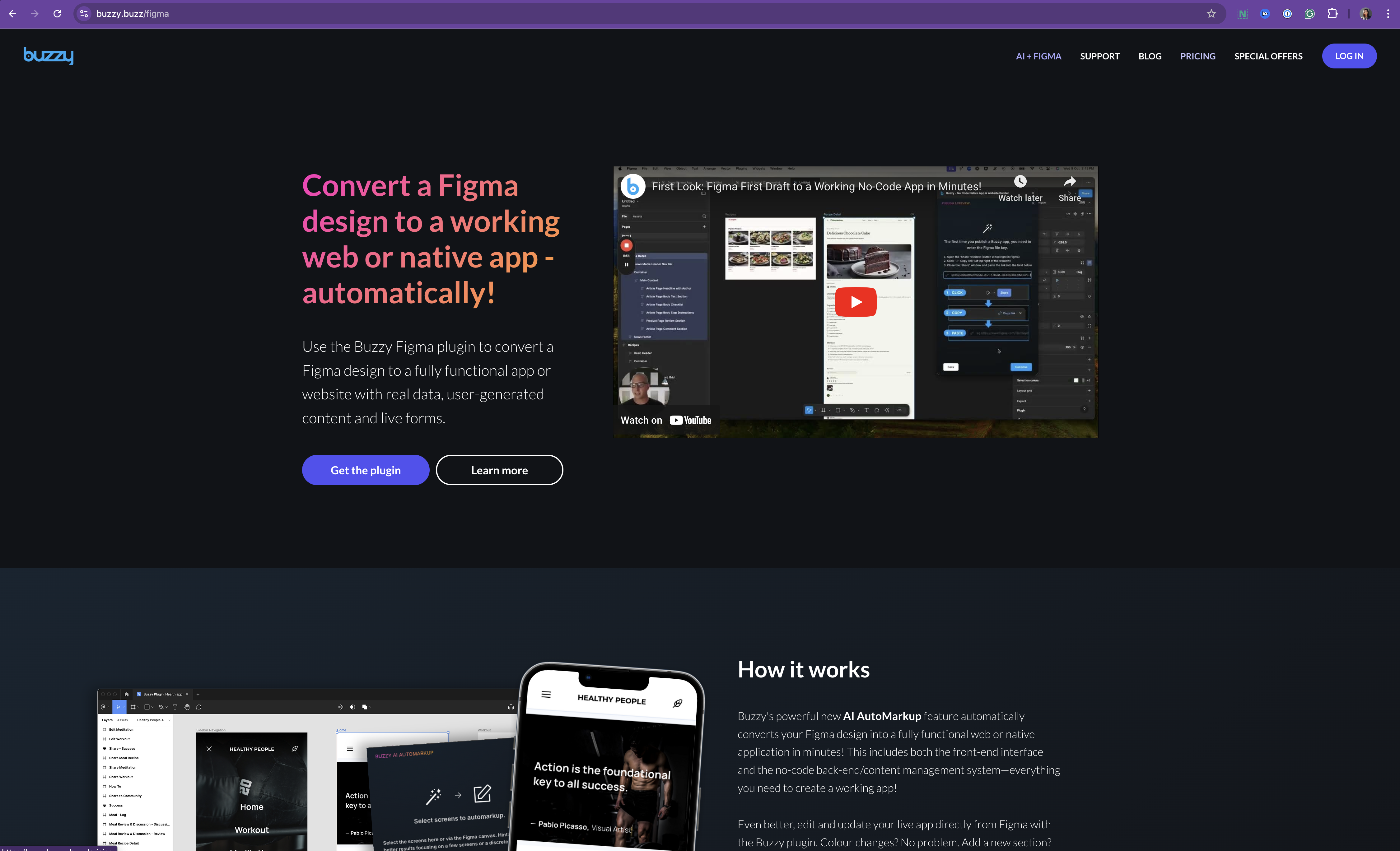
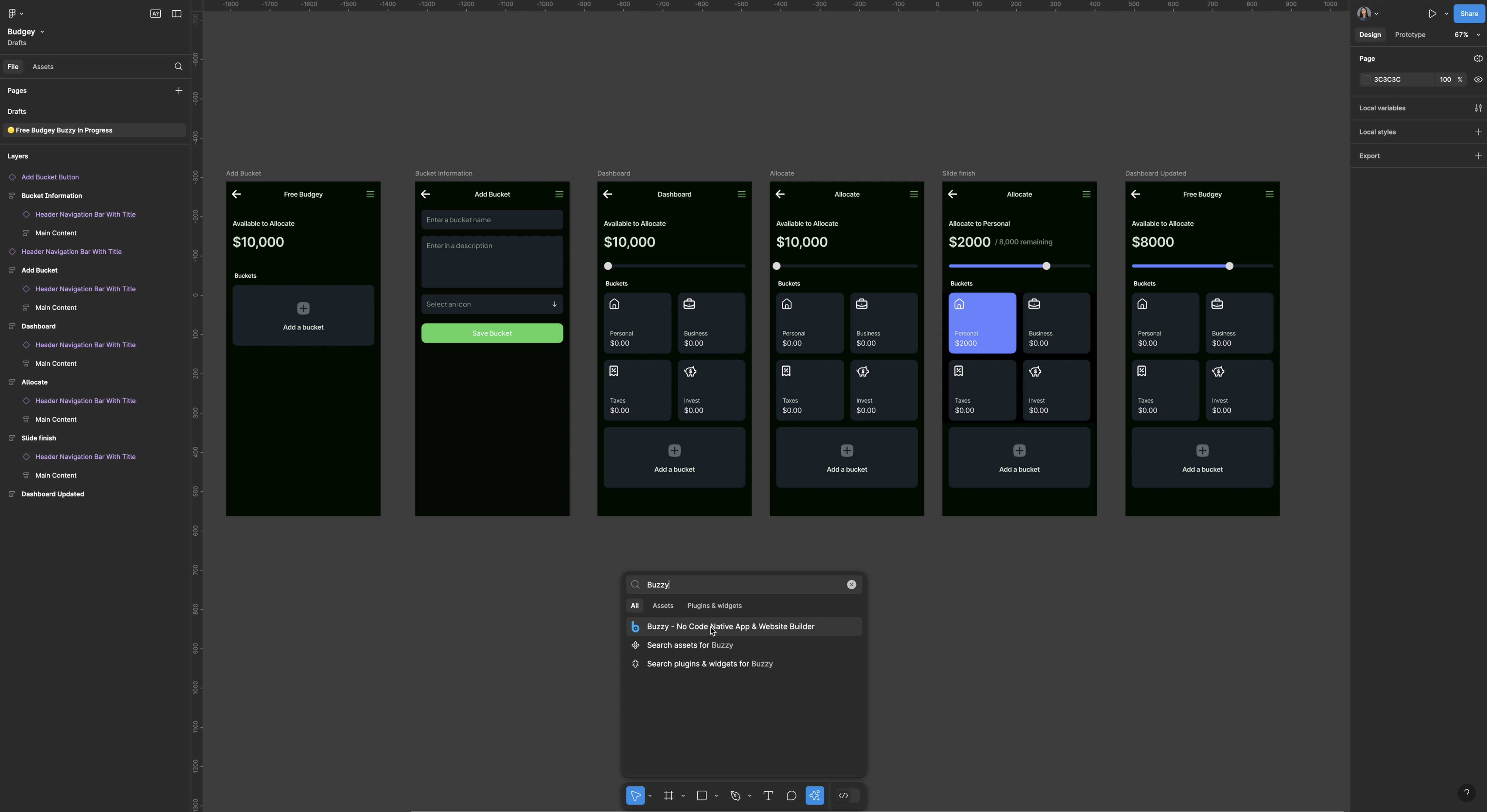
Fig 1. Buzzy Account | Fig 2. Buzzy Figma Plugin
Buzzy’s Auto Markup feature scanned my screens, identified components, and marked them up to prepare them for development.
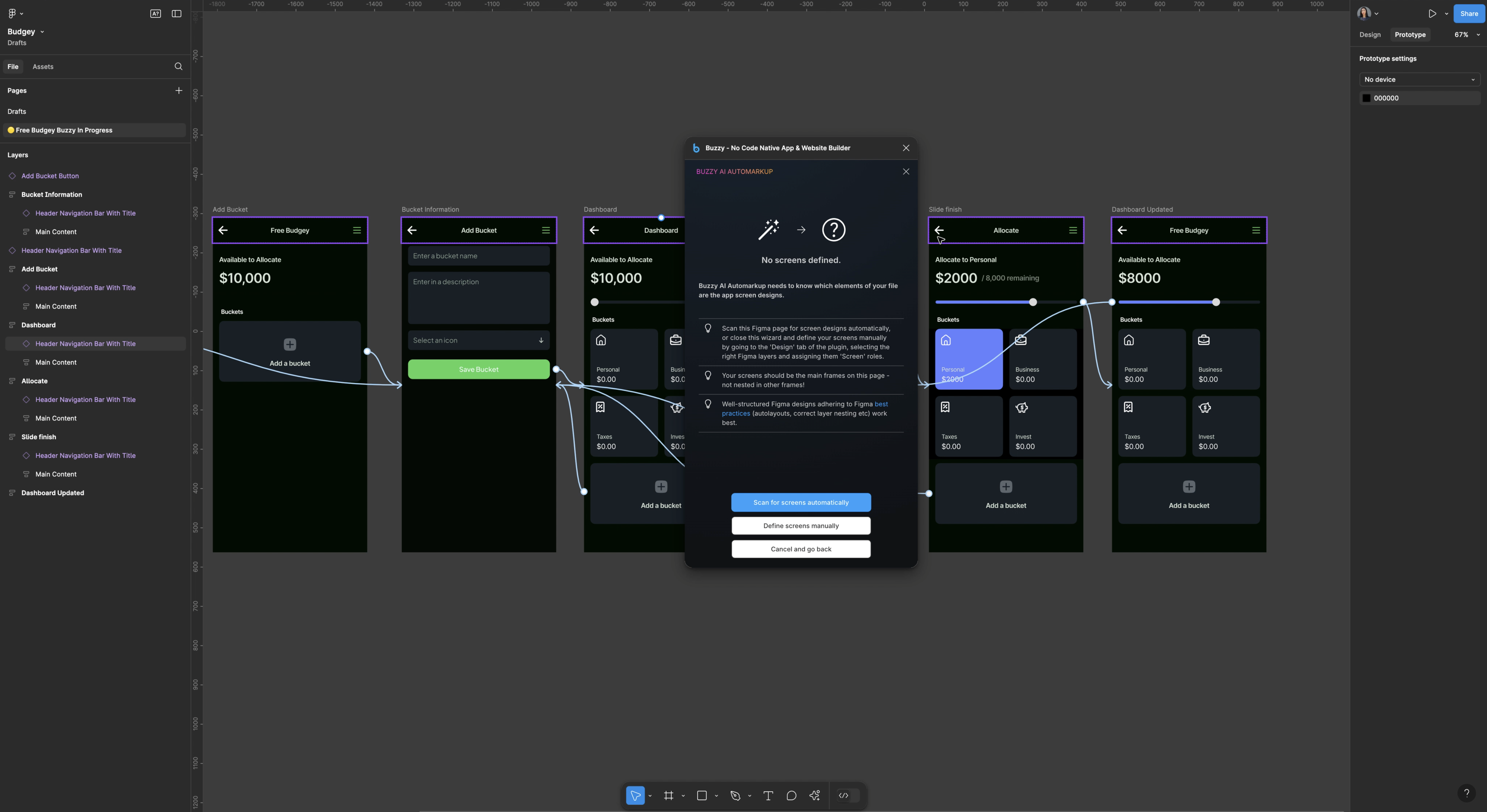
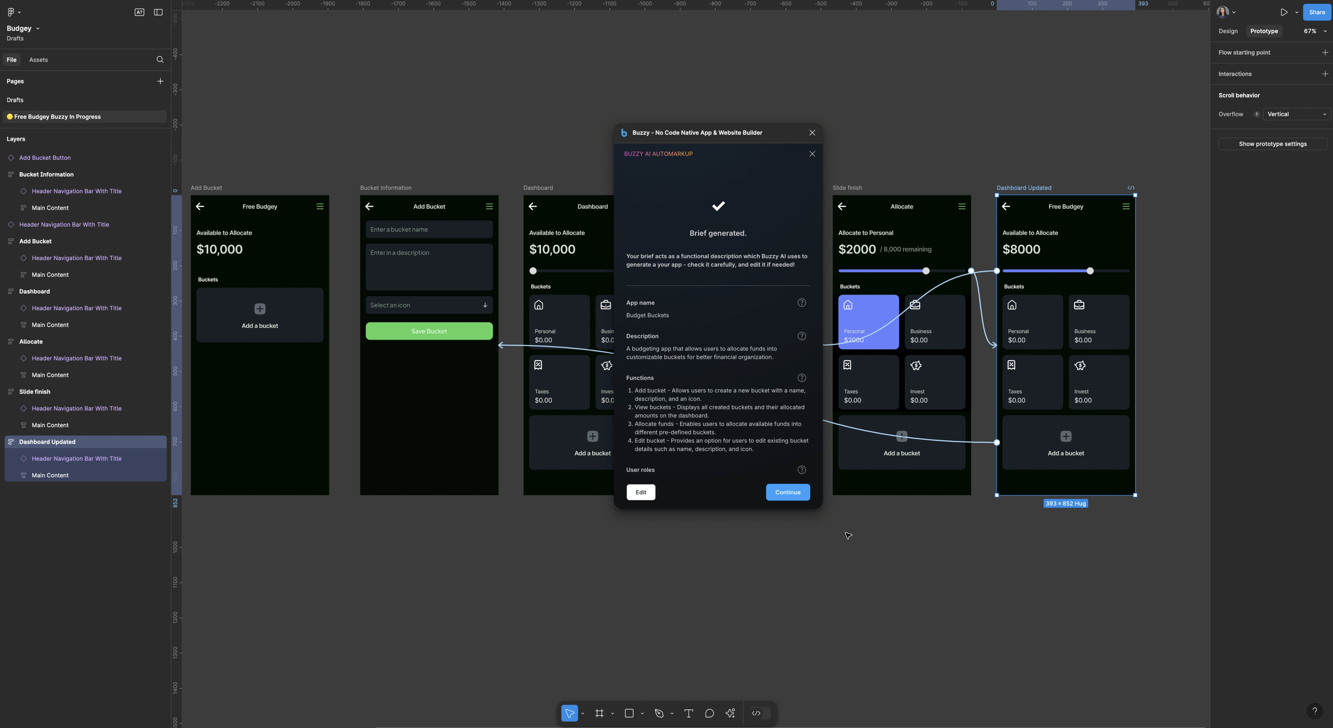
I then generated a brief in Buzzy which is like a product requirements document, which outlined the app’s functions, user roles, and data requirements.
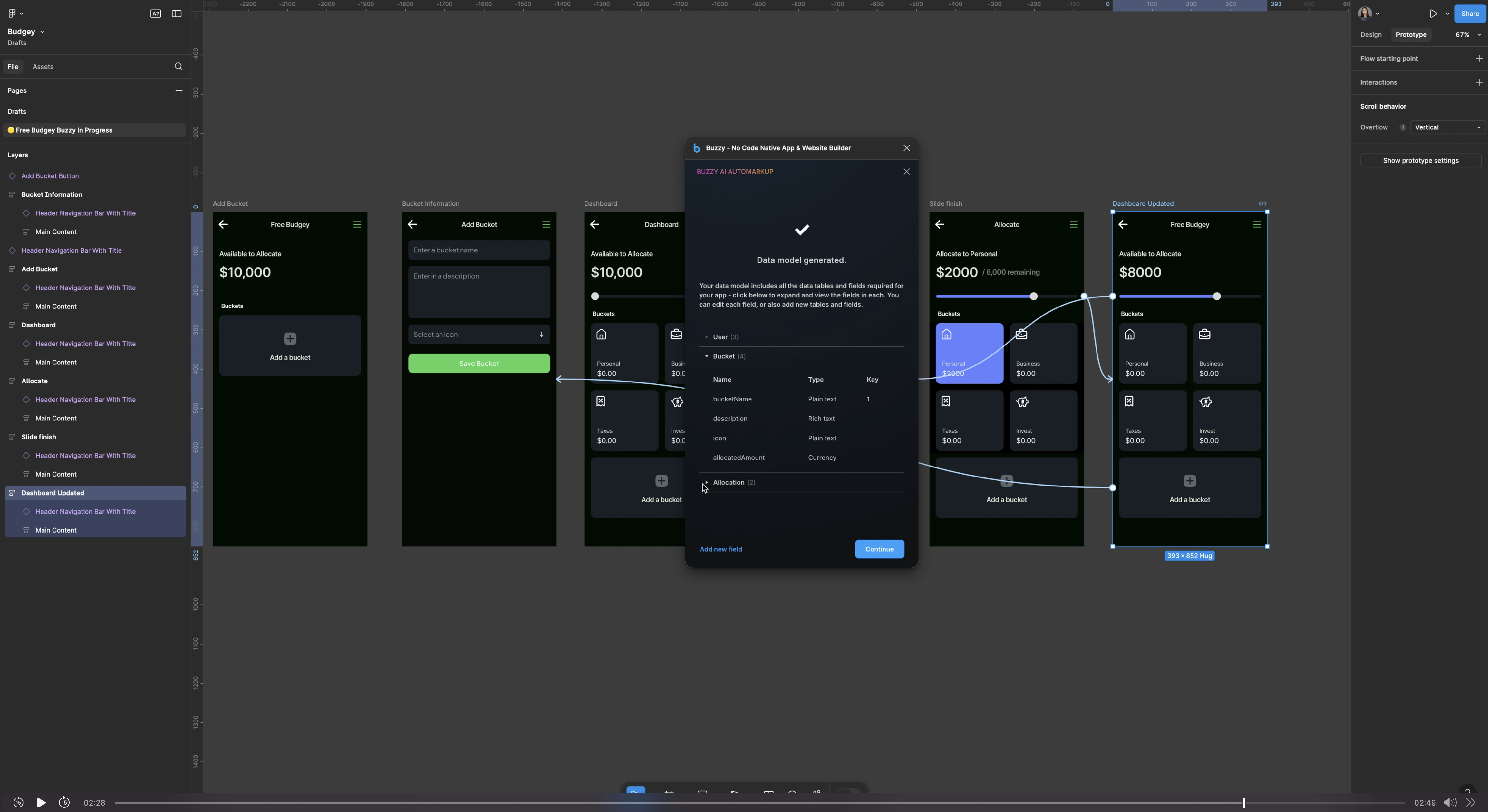
I followed this by creating a database model, where Buzzy automatically set up data tables for users, buckets, and allocated amounts.
Finally, Buzzy connected the screens to the database, making the app structure cohesive and ready to publish.
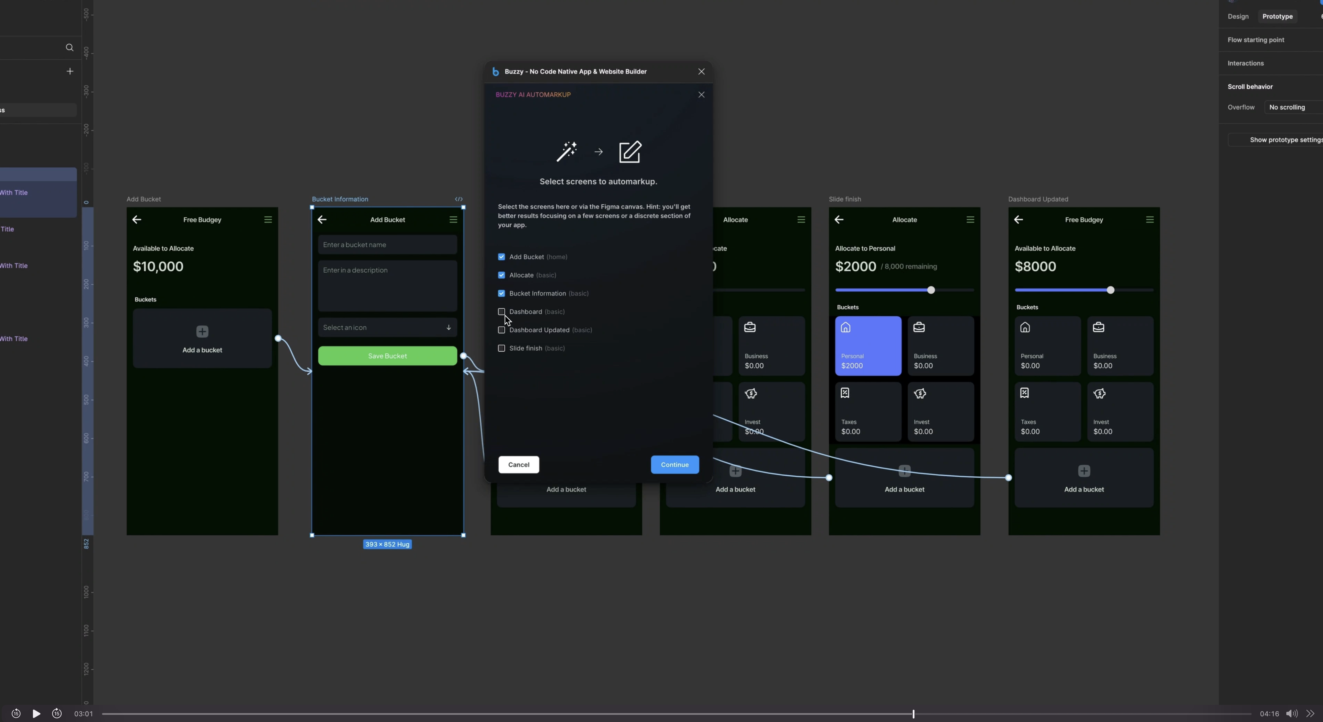
This new Automarkup feature by Buzzy literally saved me hundreds of hours of otherwise manual markup. It's just a simple wizard that's easy to follow and produces awesome results.
Data Design
There were still a few little things that needed to be done manuall so switching to expert mode in Buzzy, I made some manual adjustments to ensure fields and buttons functioned correctly. I designated certain fields as “forms” for user input and linked them to the database.
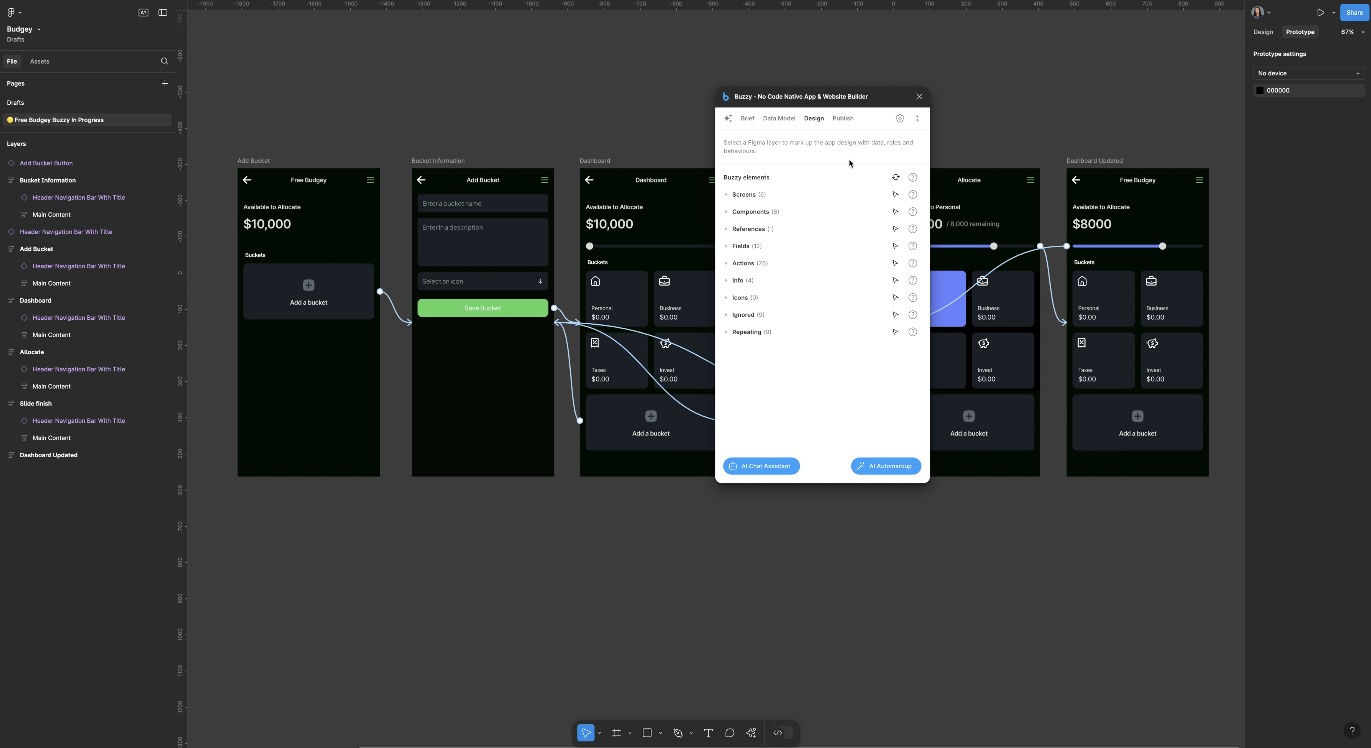
With everything aligned, I published the app and scanned the QR code to test it on my phone. The app displayed perfectly, with features like adding and adjusting budget buckets. It was incredible to see my design come to life.
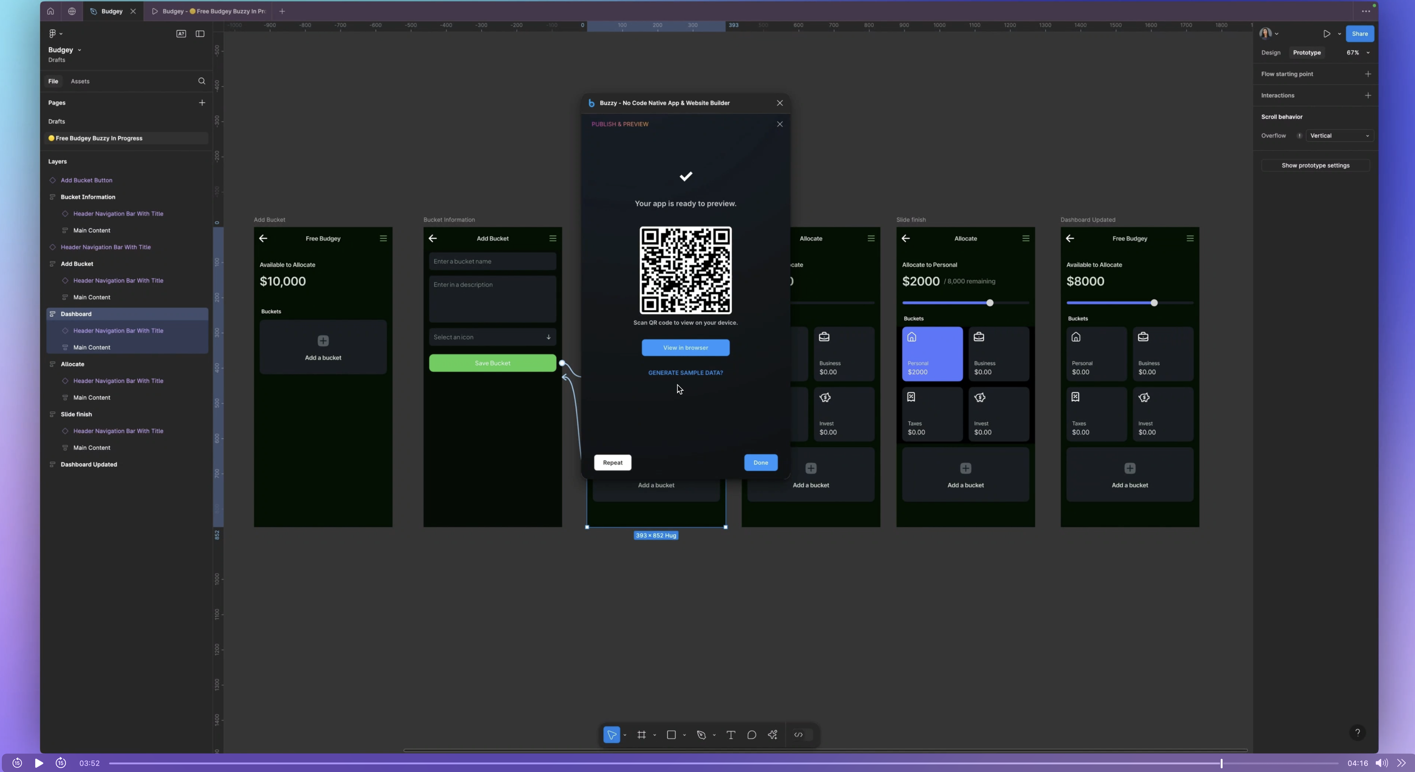
Final Result
I did run into a few snags trying to publish after I made some manual adjustments but after some troubleshooting and guidance from Buzzy’s support team, I successfully published a fully functional app. The app allowed users to create and manage budget categories in real-time, directly within Figma. I realized that when publishing issues arise, clearing the workspace and republishing from Figma is a good fix.
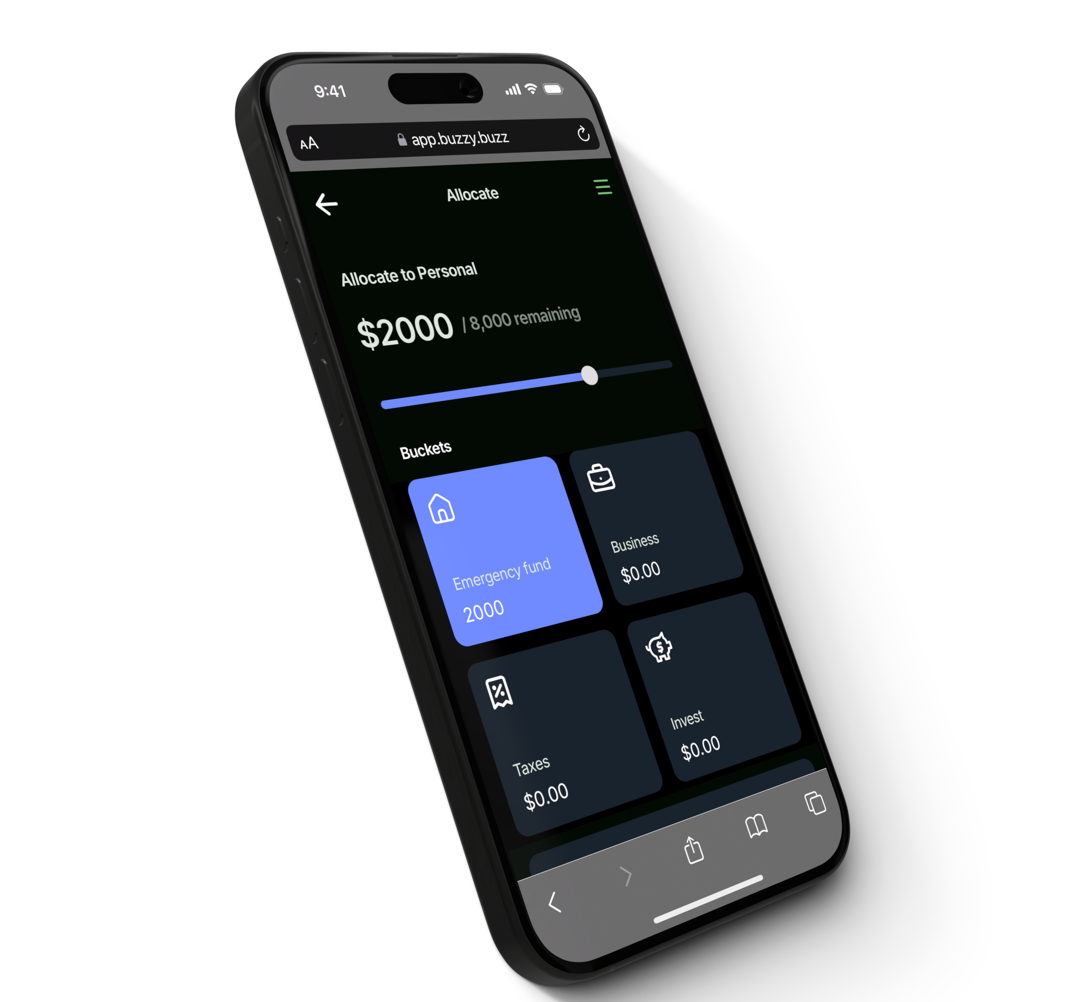
In just 48 hours, I built a complete working app—something that would have taken months without the magic of AI! If you enjoyed this, be sure to check out Buzzy and have a look at my course where I've taught thousands of students the foundations, tools and techniques to become skillful and mindful product designers.
