If you're a UI/UX or Product Designer like I am, you probably get bogged down with all of the data and notes that you have to collect and analyze during your user research and user experience design process, whether you're designing a digital product or app of your own or working with a team or client.
I've used a lot different solutions over the years, like Asana, Trello and Evernote for keeping myself in order, But for me, they each lacked the functionality that I needed and I always ended up having to use multiple apps to get the job done.
Until Notion app came along and I honestly almost cried.
Notion app is like an advanced note-taking app. But beyond that, it's a robust database that you can mold exactly to your needs and map to your mental model. It's so malleable, it can be lightweight (used for things like notes and checklists) or for more complex organization (like editorial calendars and product roadmaps). It's also totally free with real-time collaboration (so you can view and edit along with others).
Annd if you’re interested in saving yourself a ton of time you can download this entire Notion Template Pack here and install it into your Notion workspace with just 1-click!

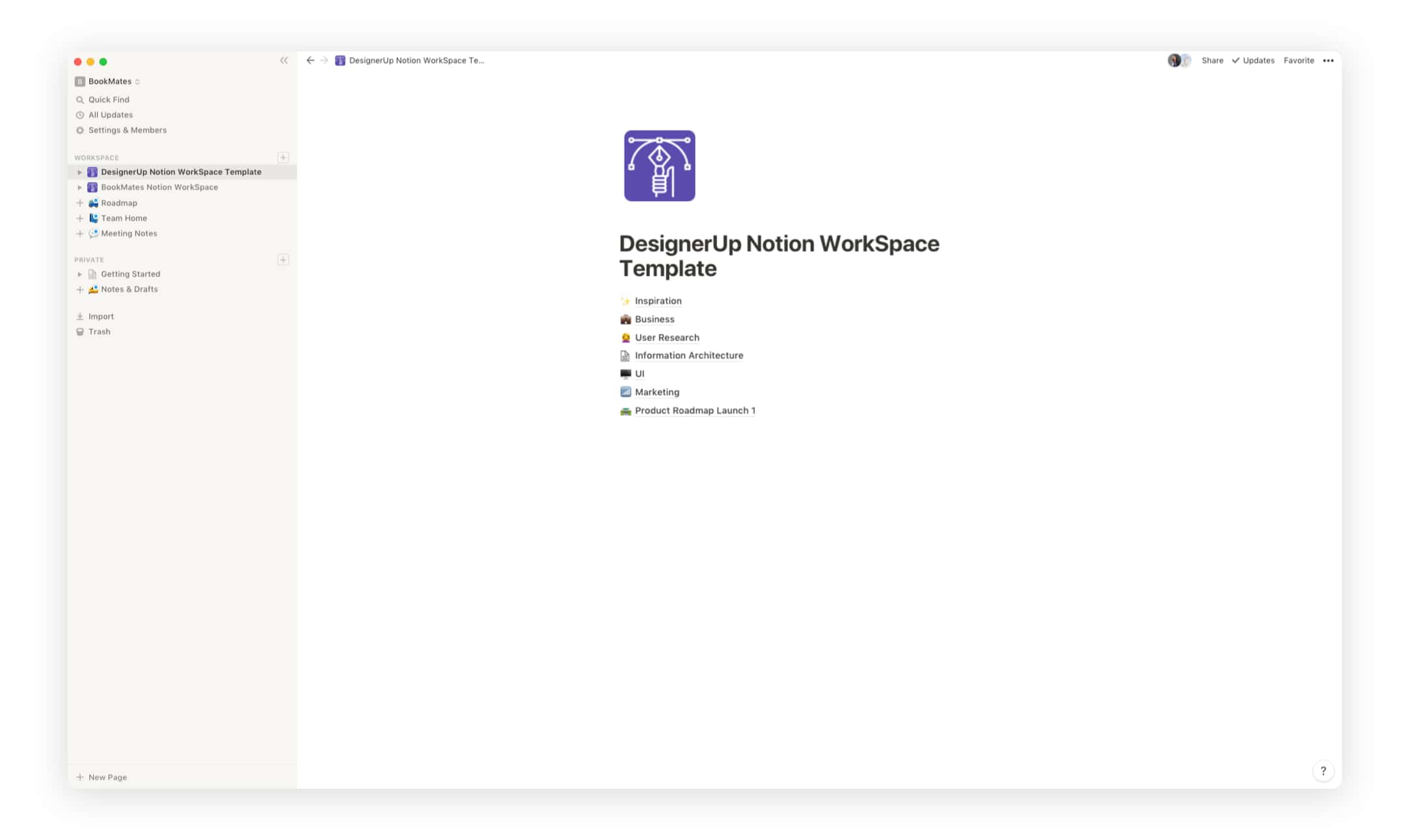
I usually start out by creating a Workspace for my product or project that includes 7 main sections:
✨Inspiration
💼Business
🙋User Research
🕸Information Architecture
🖥UI
📊Marketing
🛣Product Roadmap
Pro tip: Click the default page icon directly in front of a section or page to change the icon or use (CTRL+COMMAND on Mac to bring up your emoticons menu 🙂)
Pages are built using a combination of what Notion categorizes as Basic Blocks, Databases and Embeds and these can be customized, combined and connected to map your content in unprecedented ways.
For the ✨Inspiration Section, I keep things pretty simple by just adding Page Blocks and Text so I can write down my thoughts, brain-dumps and quick notes.
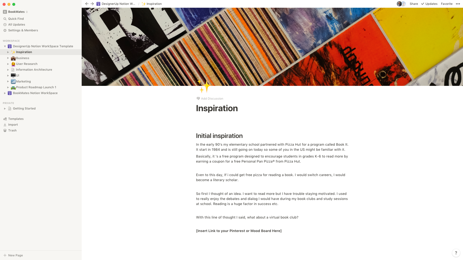
Pro-tip: You can add a cover image by clicking on the Cover Image icon and then selecting a default image, uploading your own or inserting something directly from Unsplash.
Next up is the 💼 Business Section. If I'm working on a product from scratch or even something handed off to me by a client. I like to use this area to log and organize all of the business objectives, directives and things like company vision and mission. Often times, when I'm working on designing a new product, this can take the form of a Lean Canvas or full on Business Plan.
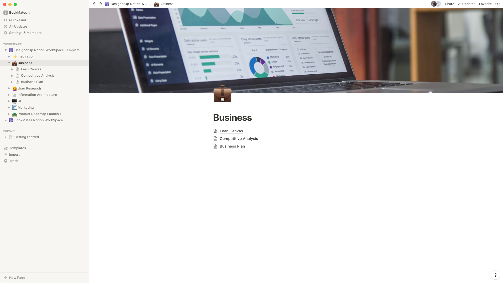
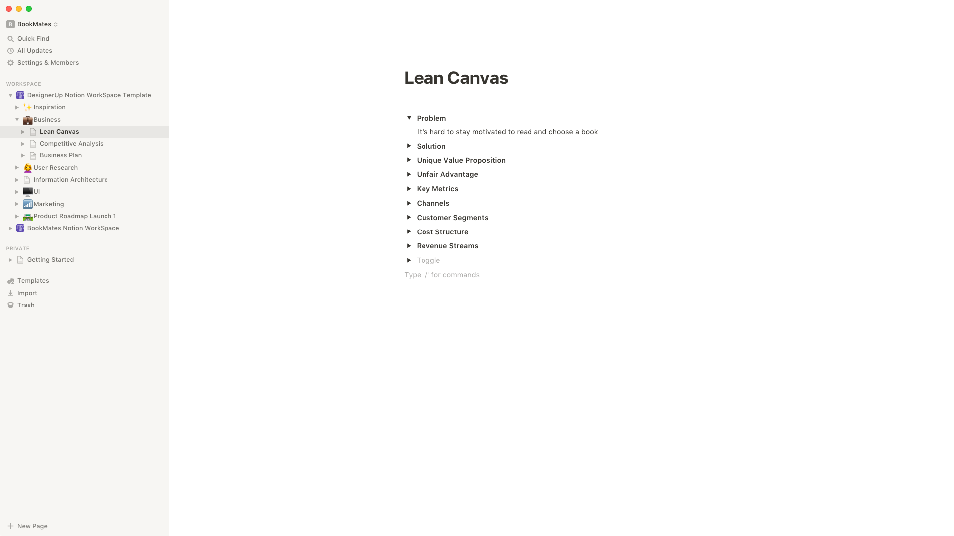
For a Lean Canvas I normally use the Toggle Block and add a separate toggle for each section of the canvas:
Competitive Analysis is the next page in the business section and I like to use the Gallery Inline Block for this one which allows me to create cards for each competitor, that way I can add stats to each of their cards as I drill down deeper into the analysis.
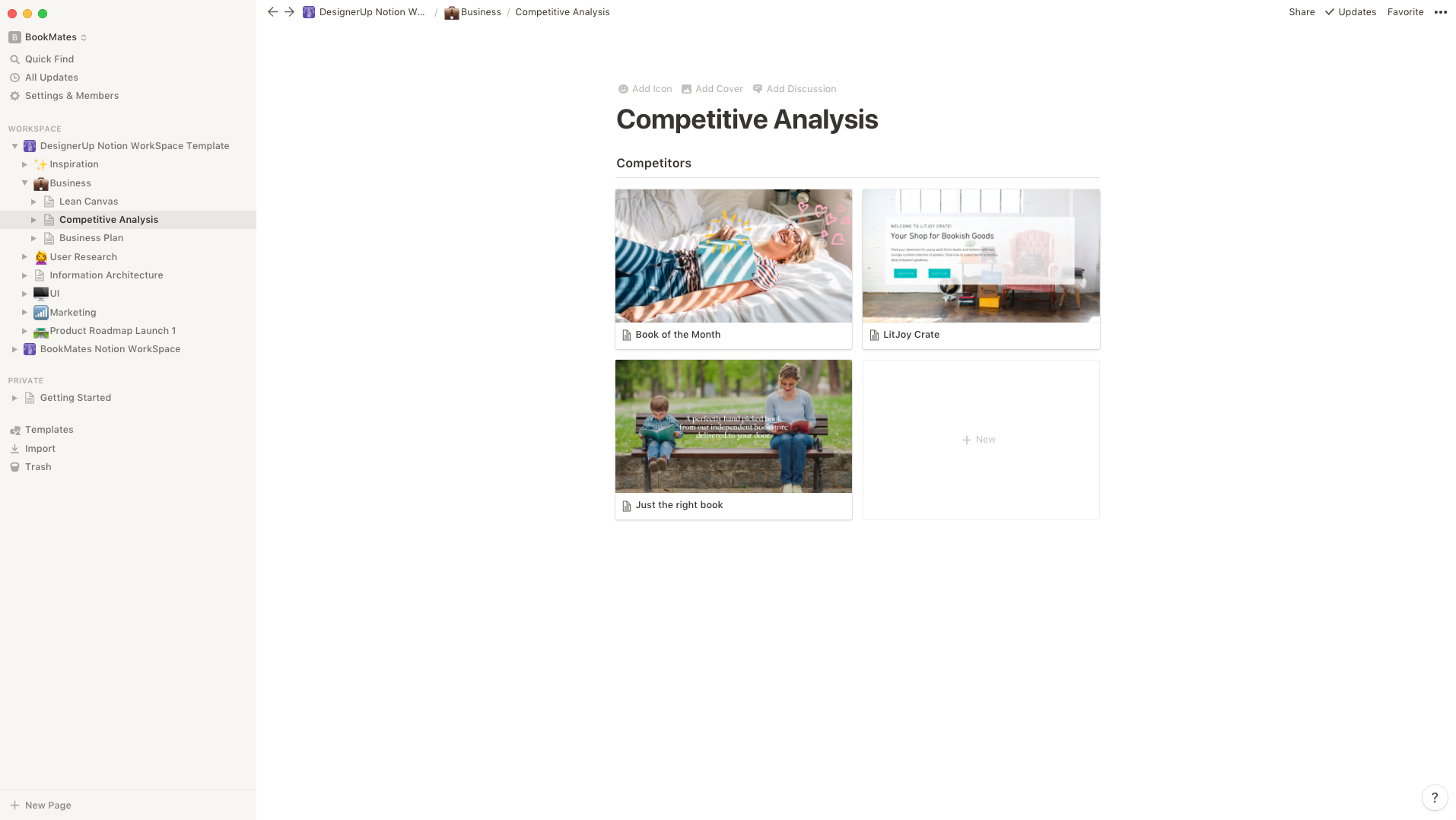
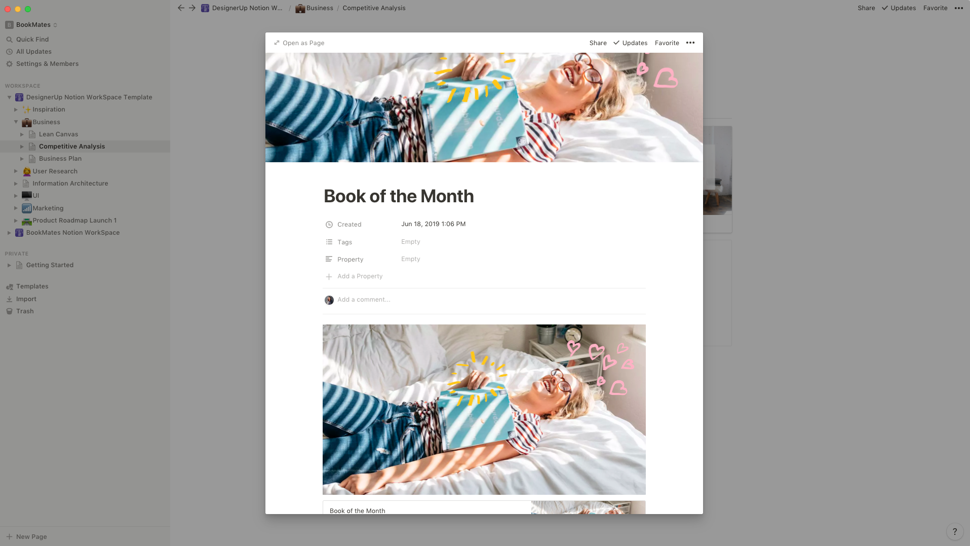
I like grabbing a few images from their website and some of their copy when I'm in recon mode 😎 and adding it to the Gallery Inline Block post so I can get a feel for their brand at a glance.
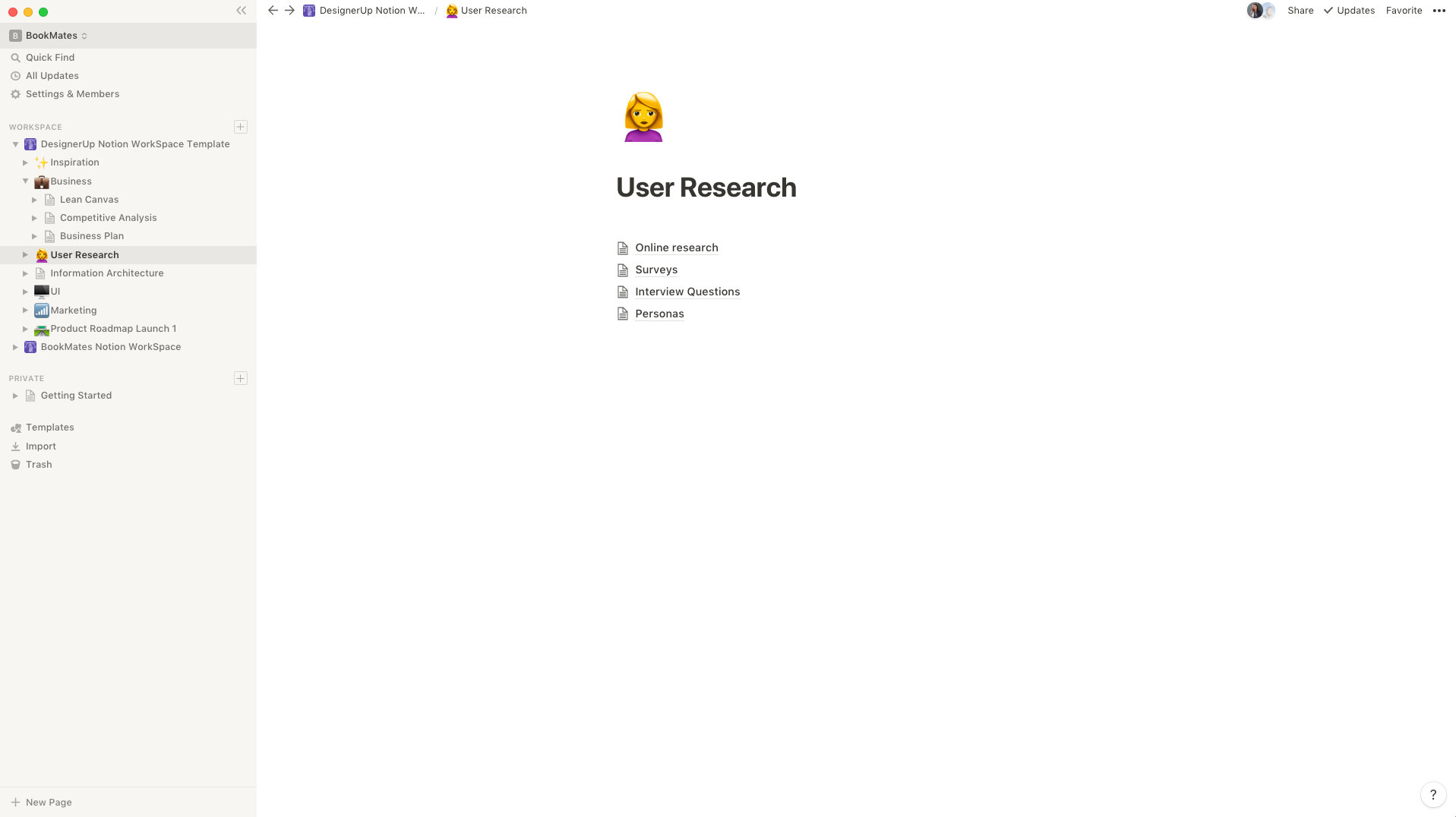
Moving onto the 🙋User Research Section. This area gets a lot of action during the UX process when I'm busy creating surveys, conducting interviews and trying to make sense of all the data I collect from users. I usually have a separate page for Online research, Surveys, Interview Questions and Personas, but you can include many others depending on your process (such as video embeds for ethnographic studies etc.)
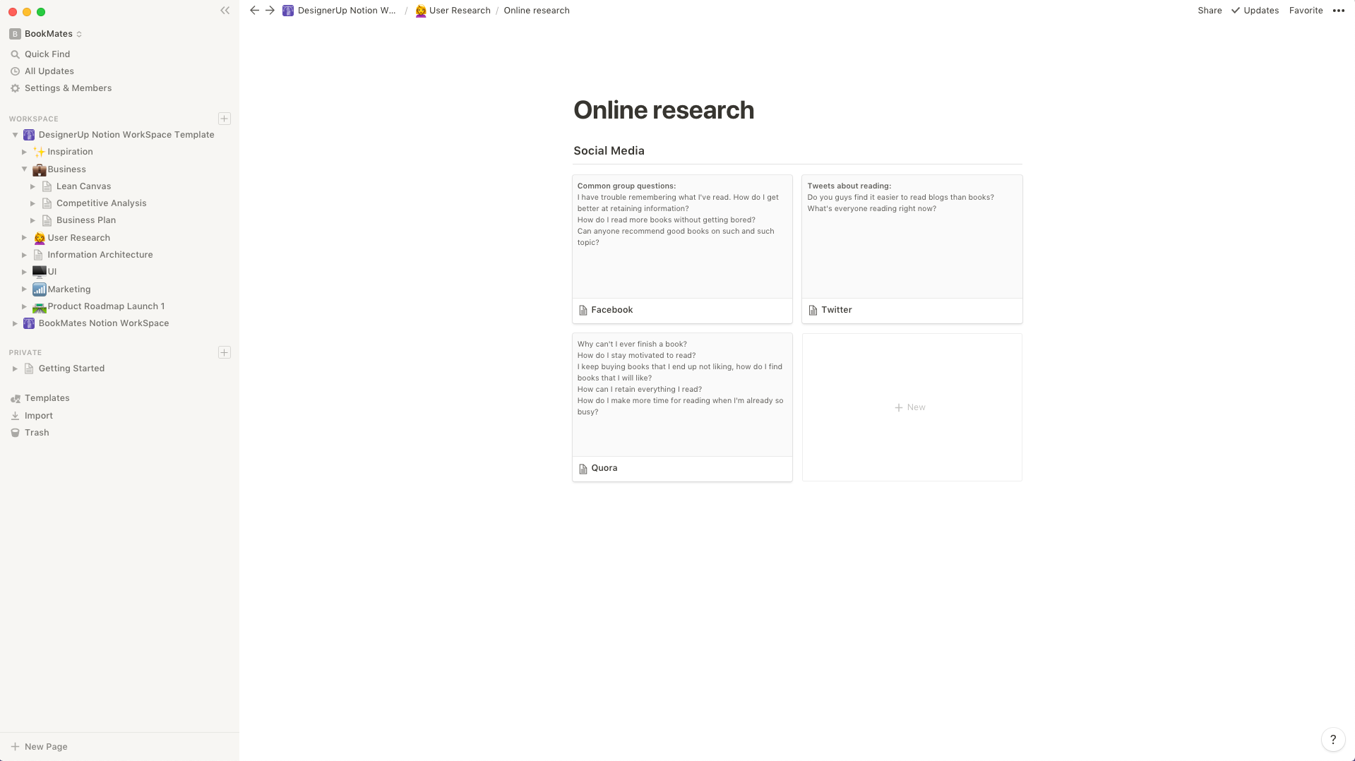
I normally kick off project ideation by sending off some basic online and social media polls and surveys to get the general pulse of my audience. So, for the Online Research page, I like to use a Gallery Inline Block so that I can have a card for each platform and jot down things like commonly asked questions I see in Facebook groups or on Quora related to the problem area I'm researching.
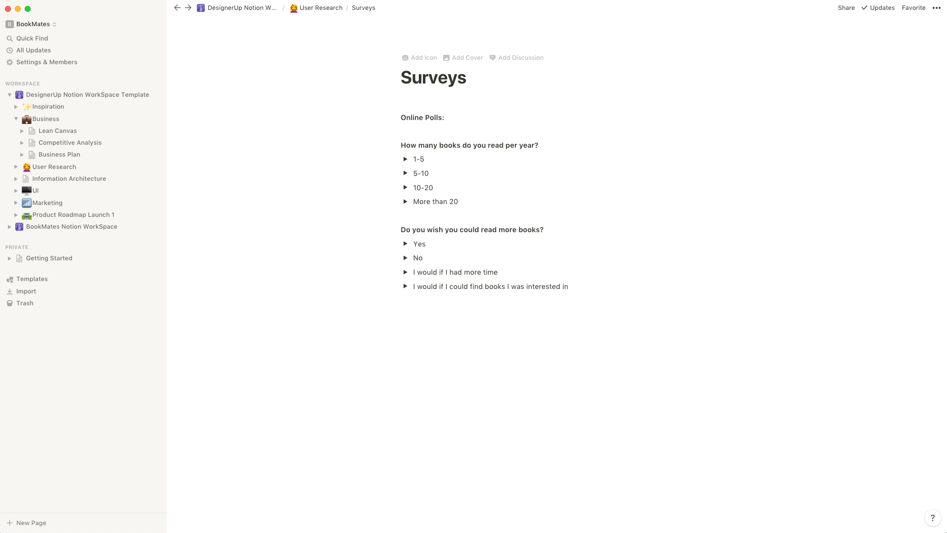
A combination of Headings and Toggle List Blocks do nicely to create survey's and manage incoming answers
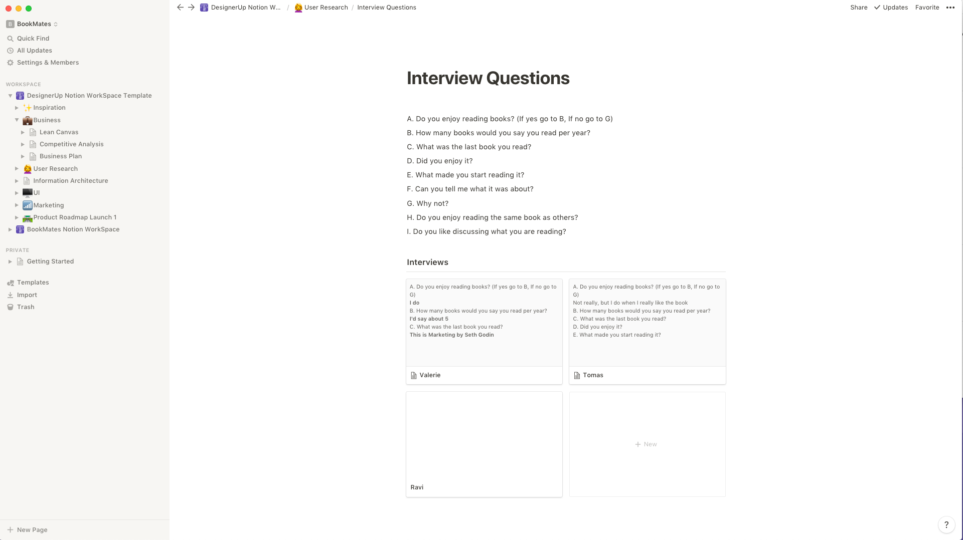
Good interview questions take some time to craft, so I like to write them down here while referencing my checklist of what goals I want to achieve for the interview and what logic based questions I want to pivot to based on my participants' answers. I create a Gallery Inline Block for each participant to keep everything organized and help me create my User Personas later on.
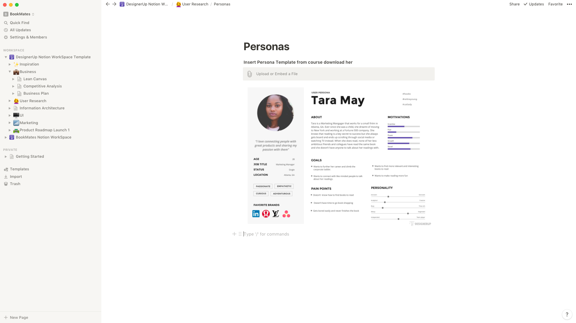
Speaking of personas, you can upload those here too so you can share them with your team and start to build the narrative of your users.
🕸 Information Architecture is the next section in my workspace and it's an important first step when you're getting into the UI phase of the design process. Here I can create a page for my site map and each of the different user and site flows so I can quickly jot them down before moving them into my favorite visualization tool. For those of you who want to know exactly what tools we recommend for this you can find out here.
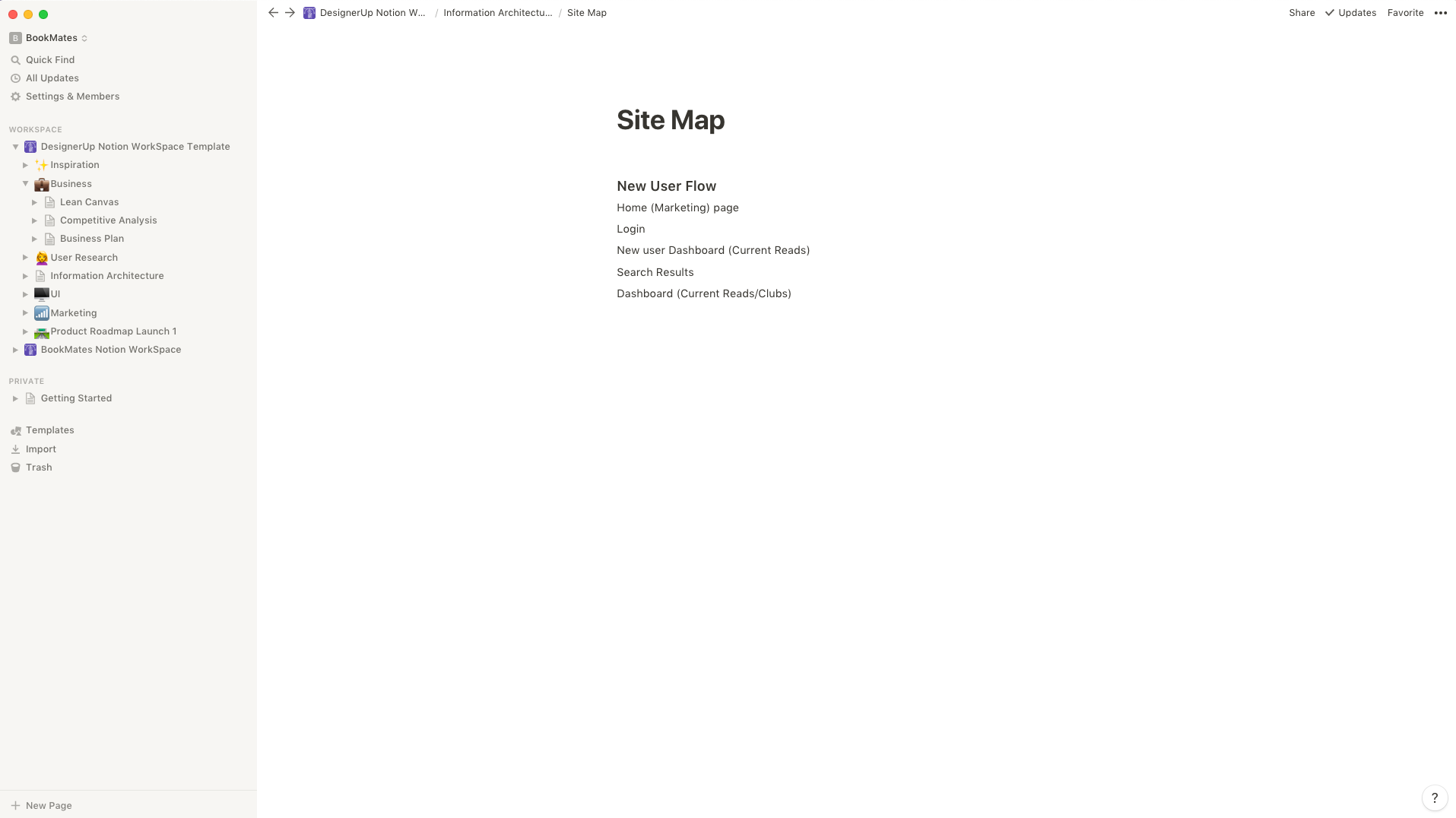
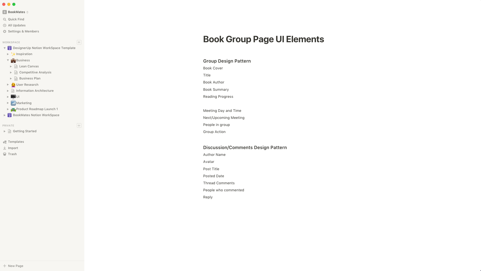
Over in the 🖥 UI Section, I collect things like color palettes, style guides or make simple lists of all the UI elements that I will need to style for my interface designs.
If you've managed to make it this far in your Product Design and UI/UX process well then you might actually have a product to market! In that case, you'll want to get your content strategy in order and for that, I like to use a combination of Gallery Inline Blocks or Table Inline Databases for writing and organizing my posts
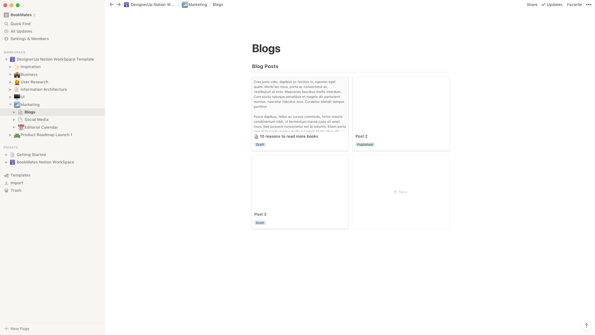
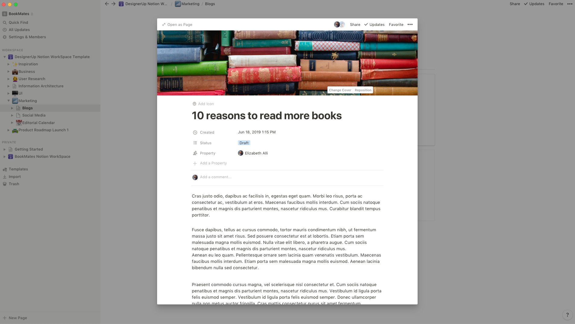
You can set the status and filters so you know which ones you've published and which ones are drafts, you can also set the author and other parameters:
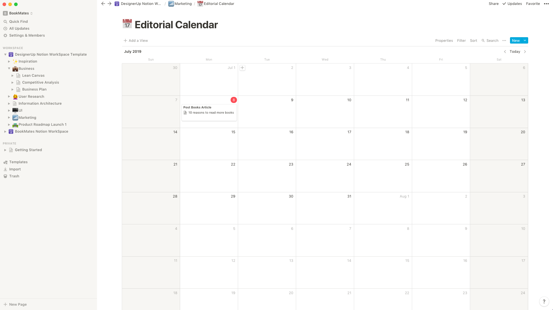
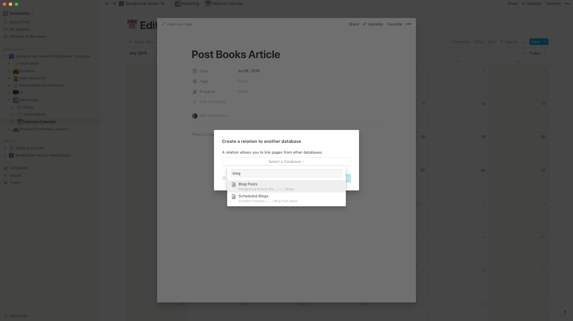
Having done that you can now easily connect these posts to an editorial calendar using the Database Relations Property so you know exactly what to post when!
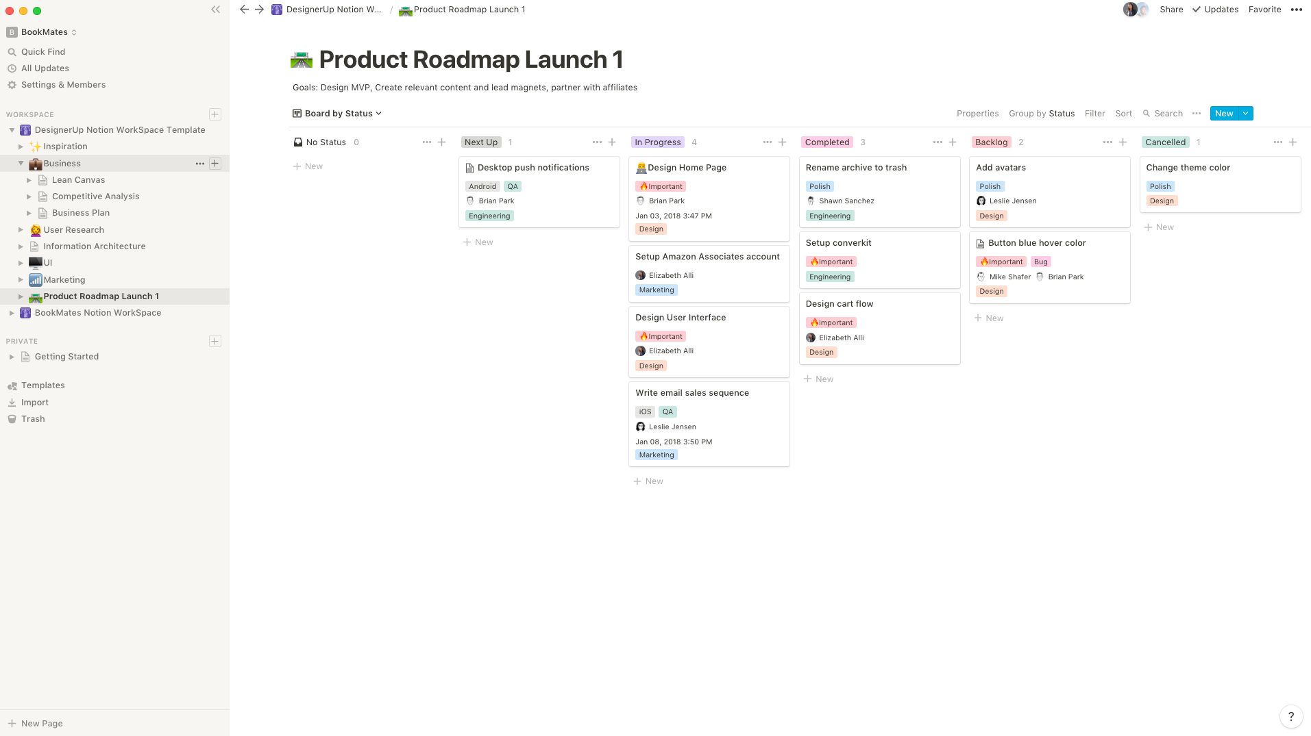
And finally, so you can keep all your efforts on track you can lay down a path in your Product Roadmap with a Kanban board full of milestones and tasks to chart a course to your goals!
As you can see Notion is a pretty incredible and powerful tool for Product Designers and UI/UX Designers. The ability to create a workflow that is so tailored to your needs with simple blocks and database connections can increase your productivity and sanity exponentially.
There are a lot more templates included in our Notion Template pack so if you want to save yourself time and get organized you can download those here.

If you want to see my setup in action, check out the video version of this article as I take you through my workflow as a UI/UX and Product Designer and how I use Notion to manage my product development and UX research process.
