Choosing images for your design projects can take forever. With an exhaustive amount of options, the trick is in curating images that fit your brand and project and coming up with creative ways to customize it to your content. It's all about making the images work for you.
Curating and choosing images
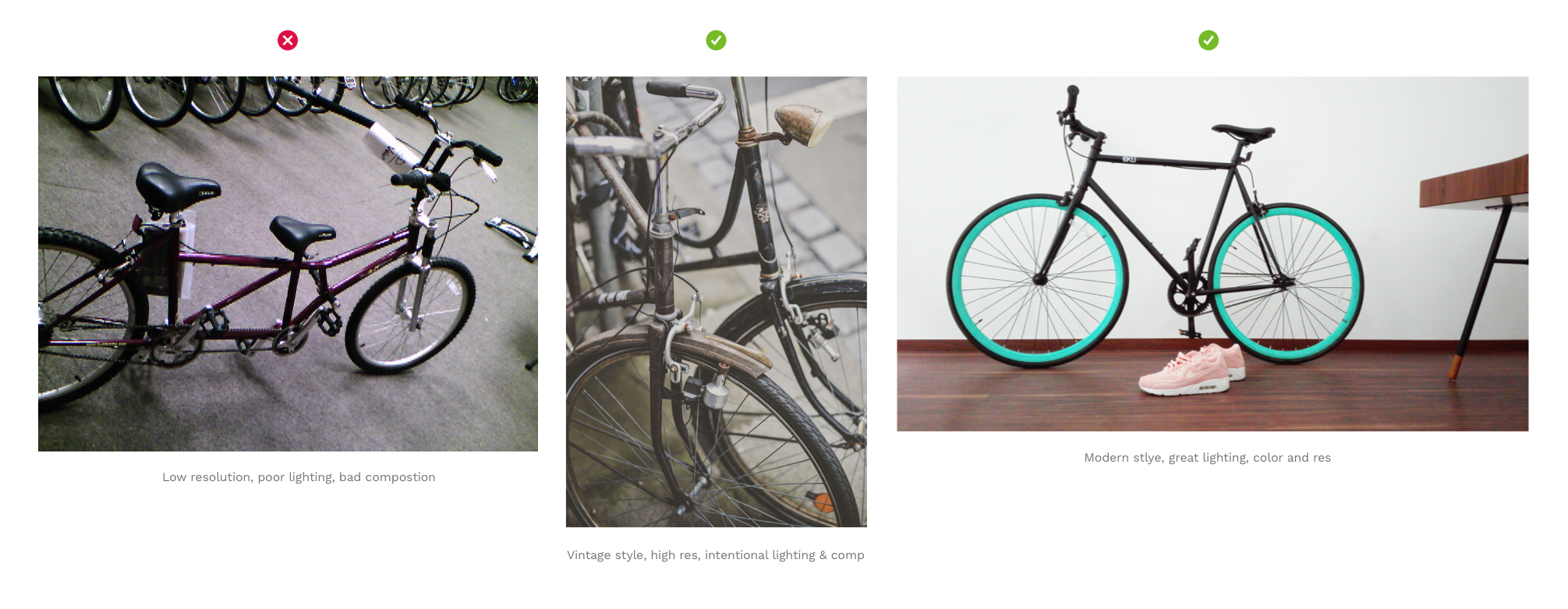
Say you need a photo of a bike. You will most likely come across an alot of them, however there are probably only a very limited few of them that will work for your project based on your specific design criteria. The trick is to look for a few important things and then customize the rest of the way.
Quality and style
First, always choose high quality images that compliment your brand mood, tone and message. Going back to our bike example. Look for intentional lighting, good composition, high resolution (not blurry or pixelated), and be aware of the different possible styles (vintage, modern, editorial, candid). Most importantly, ask yourself if the image you are choosing evokes the right emotion and message for your design. If a picture is worth 1000 words, make sure that those words align with your brand's image, values and messaging.
Orientation
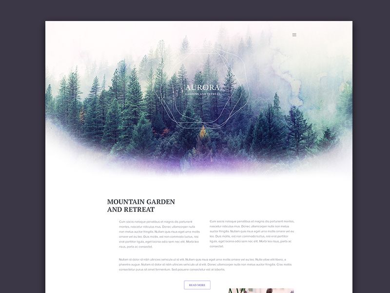
If you plan to use the photo as a hero image, make sure that it is oriented horizontally (like the teal bike above), so that the image is wide enough to be viewed in the correct proportions on large screens. If you must choose a vertically oriented image, than you'll probably need to crop and resize it, so make sure it's a large enough image so that your crop area is positioned effectively for your design.
Give credit where credit is due
All images are copyrighted by the author to some degree and then license or not licensed for reuse in different scenarios. These license levels range from 'All rights reserved' to 'CC0 No Rights Required” licensing. Make sure that you always attribute images according to it's license guidelines or use only images that are copyright labeled for reuse in the way you intend to use them.
A definition of all the levels of Creative Commons License attributions can be found here: https://creativecommons.org/licenses/
An ideal attribution would include the image title, author, source, and license and any relevant links:
“Creative Commons Bikes in San Francisco” by Elizabeth Alli is licensed under CC BY 2.0
Where to find images
There are a lot of cheesy, unnatural looking stock photo resources on the web, but some of my favorite modern, high quality 'unstock-like' photo sites include the following. Best of all, they are all completely free and require NO attribution at all:
Even though the images on these sites do not require attribution, it's always a lovely gesture that you might want to consider anyway.
Here is a nice comparison list of both free and paid stock photo resources and how they stack up.
Choose photos with your brand color in them
Look for photos or images that contain colors that either match or compliment your existing brand colors.
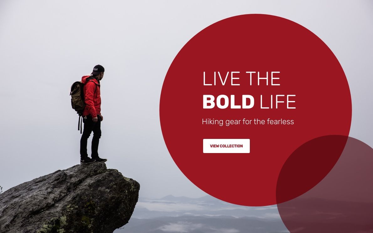
Scrims and Overlays
Color overlay
It's not always easy to find images that contain colors from your brand's palette, in that case a neat trick is to add scrims or overlays to your images that are tinted with your brand color to give them a custom feel. For instance, by simply adding a colored box on top of all the images you use and lowering the opacity until the image peaks through, you can achieve a custom and cohesive look across a collection of disparate images.
Spectrum or rainbow overlay
Instead of a solid color why not try adding a gradient to the overlay box. Mix monochromatic or complimentary colors from your brand's color palette to create spectrum gradient overlay.

Adding text on top of images
If you need to add text on top of your images there are a few ways to make it more legible:
Dark Overlays
Add a dark overlay to an image and lower it's opacity so that you can see the image just peaking through beneath it. The text on top should always be white or a bright, contrasting color to make it pop and appear crisp and legible.
Utilize empty space
Use the empty space in and around images as a placeholder for text. You can also try using your dropper tool to pick up a color from the image and use it as an accent on the text itself.
Brushes and effects
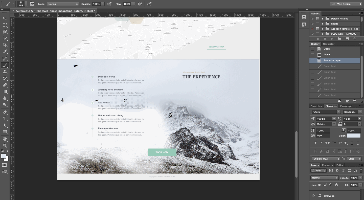
If the image has no true empty space or not enough, editing your photos with a brush tool in order to obscure certain parts is a great way to compensate for the lack of space or give yourself more room for copy where needed. Use your dropper tool to pick up a shade from the background color and then using a soft brush tool shade and blend over areas to create more empty space for your text.
Combine geometric shape and images
Make a bold, graphical statement and create space for text by adding overlapping shapes to your images.
Whether you combine the different methods above or get even more creative with your image and text treatments, starting with a great image that represents your brand and then manipulating it subtlety and strategically to accommodate your content can help elevate your UI designs to another level.
Become a more skillful and mindful product (UI/UX) designer with us.