There are lot of tutorials that detail how to choose color palettes and general branding colors for your websites, digital products and user interfaces. I've done one myself if you want to check that out .
But what about choosing colors for more complex data, like maps, charts, diagrams and other statistic visualizations?
The process of choosing colors for simple UI patterns can be a lot different than choosing them for more complex UI problems.
I've been working on a product recently that allows municipalities to see the state of their city's pipelines. The software, helps cities diagnose what pipes need to be maintained, replaced or fix and ideally when, thus saving the city time and resources.
One of the biggest challenges for this UI/UX design is coming up with colors that represent the pipes and their states, whether the user has selected them in the interface or not and how the user can control the mapping of the colors and what those colors signify. So in short it's a lot of colors.
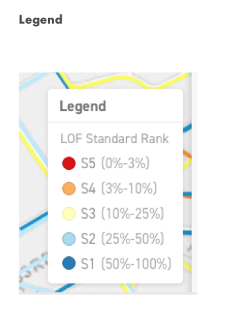
This week I tackled the problem of denoting which pipes were part of a selection in a city's project. I was tasked with coming up with 5 border colors that could be used in the user interface to color code each pipe that the user selects.
What was tough about this was that I wasn't starting from scratch with a nicely balanced color palette that I chose myself. I was working with a legacy legend and colors that the stakeholders needed to keep because their user's were already familiar with them from their existing platforms and other system dependent software.
So while it can be a bit annoying to have to work under these constraints, this is part of maintaining the integrity of what we call in User Interface Design a Usability Heuristic.
Specifically:
Memory Recognition and Recall - which is about showing users things they can recognize to rather than asking them to recall items from scratch.
and
Consistency and standards - this says that Users should not have to wonder whether different words, situations, or actions mean the same thing.
Part of creating a great user experience is being able to map the conceptual model of our interface as closely as we can to the mental model of our users
Problem 1
We can't change the existing color palette.
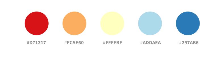
So how do we solve this? Well first, Let's start with what we do have and that is 5 really lame colors.
What’s our problem solving process? I'm going to take the existing colors and put them into Sketch. I'm just going to create 5 swatches out of this.

Problem two
Choosing borders that match everything
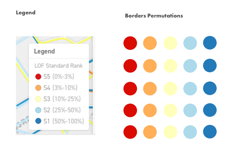
The problem here is that we have 5 colors
Each of these 5 colors need to have a contrasting border, which means we need 5 more colors and each one of them has compliment every one of the original colors.
So how do we solve this? Well we need to physically see how each border will look against each color.
My way of solving this is to visualize all the possible permutations.
I do this because:
A. I don't want any surprises if I happen to forget
B. I want to test the contrast and have other's that don't see exactly like me test them too
Basically I want to test all of my assumptions. So the easiest place for me to start is with the process of elimination:
What are the colors that I totally can't use?
Well the most obviously ones are the main colors.
So now that leaves me with some safe colors. I can use any color that is left.
Problem 3
How do we choose the right saturation of color?
Well first I think about the colors that we have, what are their attributes. Well they are all warm and have a high saturated.
So if I want colors that contrast this I need to be thinking of opposite attributes and avoid similar colors like these:

That's means I need colder, that are darker or that have higher luminosity
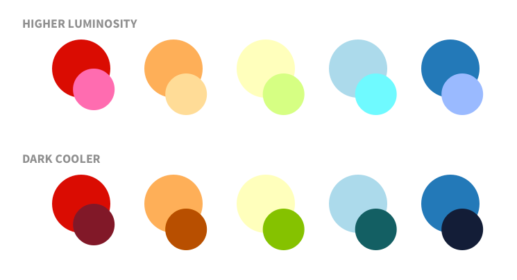
I'm going to eliminate black by default because I want to reserve that color for things that are not attached to user control dynamic content.
So now I have these possible colors for the borders.
Problem 4
So the 4th and final problem here is that the border colors themselves cant be too similar to each other, they need to be somewhat equidistant so that we can clearly differentiate them in the legend.
It seems like the dark colors looks quite similar to each other in the example above, so that leave is with the higher luminosity colors as the better option.
So now lets map out all the possible permutations to see if we're on the right track:
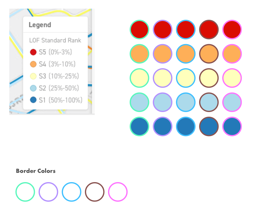
So it looks like these colors work really well, by using contrast colors, that are not similar to each other and can be seen no matter which combination of colors are paired, we've arrived at a safe, usable color palette for our cities pipelines!
So this is just one example where a simple ask from a stakeholder, "Choose 5 border colors" still relies on a good UI process and UX testing to ensure that the it's a successful result.