Choosing matching color palettes and color schemes is hard and color theory terms like traidic, monochromatic and analogous never really clicked for me, nor did it help me when it came time to code my colors.
And sure there are plugins and color pickers and color tools that you can use. But that still takes a pretty long time.
I just wanted to be able to jump into my design app and choose perfect color palettes by hand.
So I spent a few years studying color– color theory in traditional art, in graphic design, color models, color systems and color codes.
From this, I created a technique and method that allows absolutely anyone to choose perfectly balanced color palettes every single time --using numbers.
It revolves around two things, the HSB color model and my color family categories.
When we're designing in something like Figma, we're usually choosing a hex code– that's a hexadecimal code that correlates to a color.
Color Codes: Hex and RGBa
When coding designs, it's common for devs to use hex codes or RGB(A) where the (a) just stands for the opacity of the color.
It's common to use either color code–hex or RGB(A). Devs will often choose to use a hex code when they just want to make it easy and copy and paste one single color code or string of numbers. Or they might choose RGB(A) because they want more control over the color's opacity.
Either one is fine and you can decide which one you'd like to use, depending on how much control you want. You can even mix and match and use both of them together.
But there's still the matter at hand of how to create a well-balanced color palette that you can then translate to code.
Hex codes are actually just a shorthand for RGB(A).
There is a little bit of mathematical conversion involved but our design apps can do that work for us.
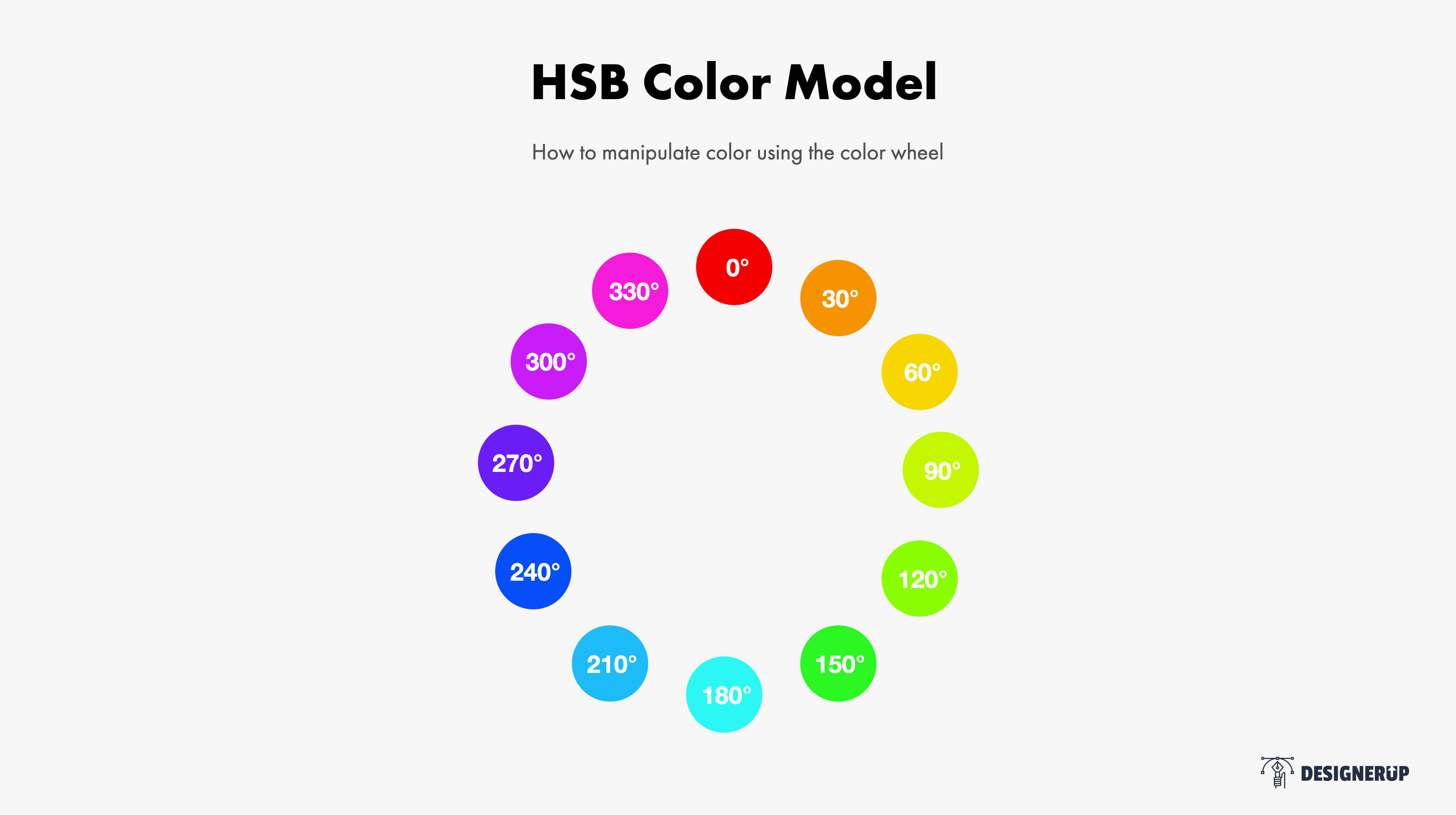
HSB Color Model
Then we have the HSB color model and this is the one we're going to be focusing on. HSB stands for hue, saturation and brightness. H = Hue, represents is all of the colors in the color wheel, S = Saturation is how dull or rich the color is and B = Brightness, is whether that color is closer to white or closer to black on the color spectrum.
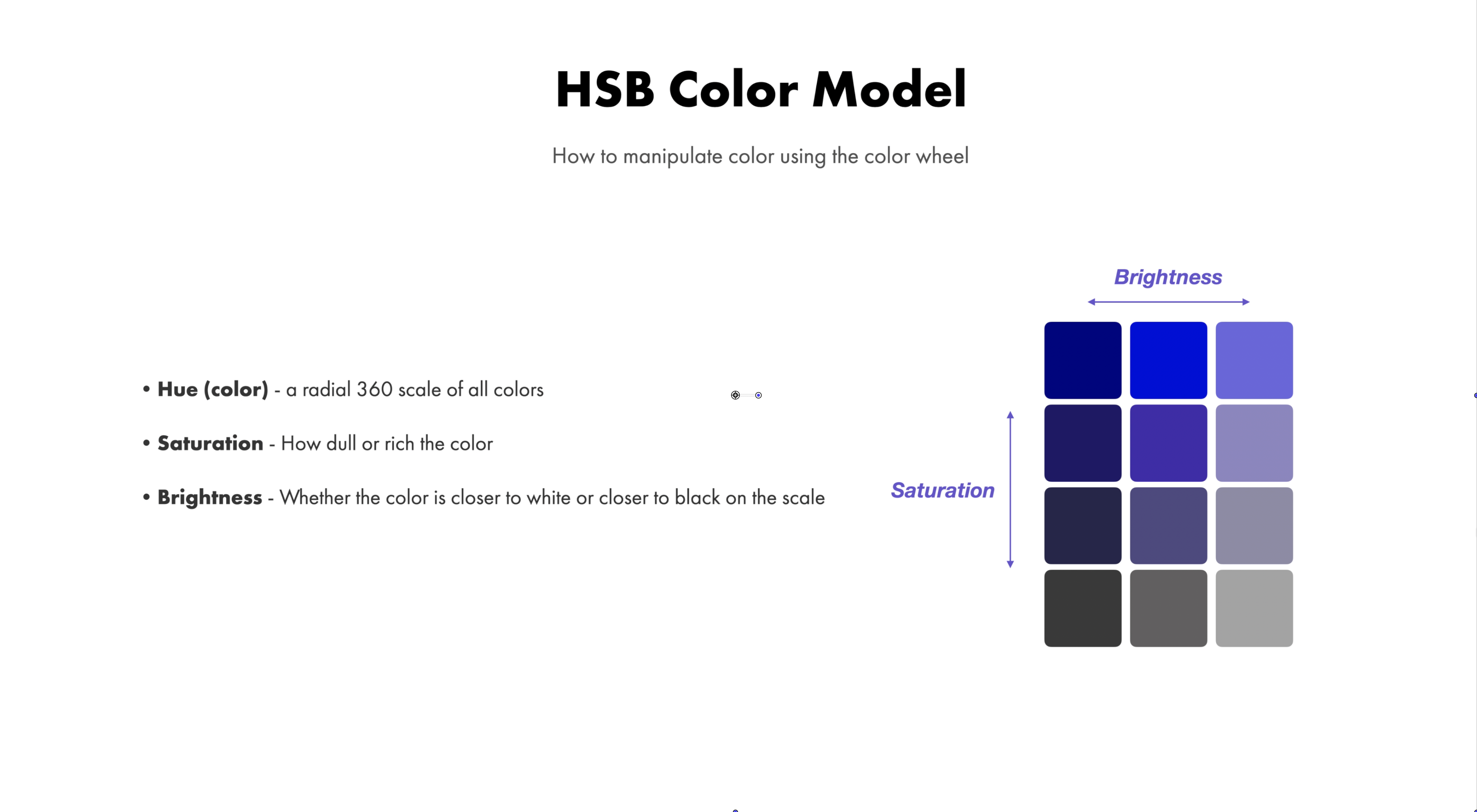
HSB is a great color model to use when we're designing because it gives us the ability to manipulate the colors based on a few different variables and still create colors that translate easily to Hex or RGBa.
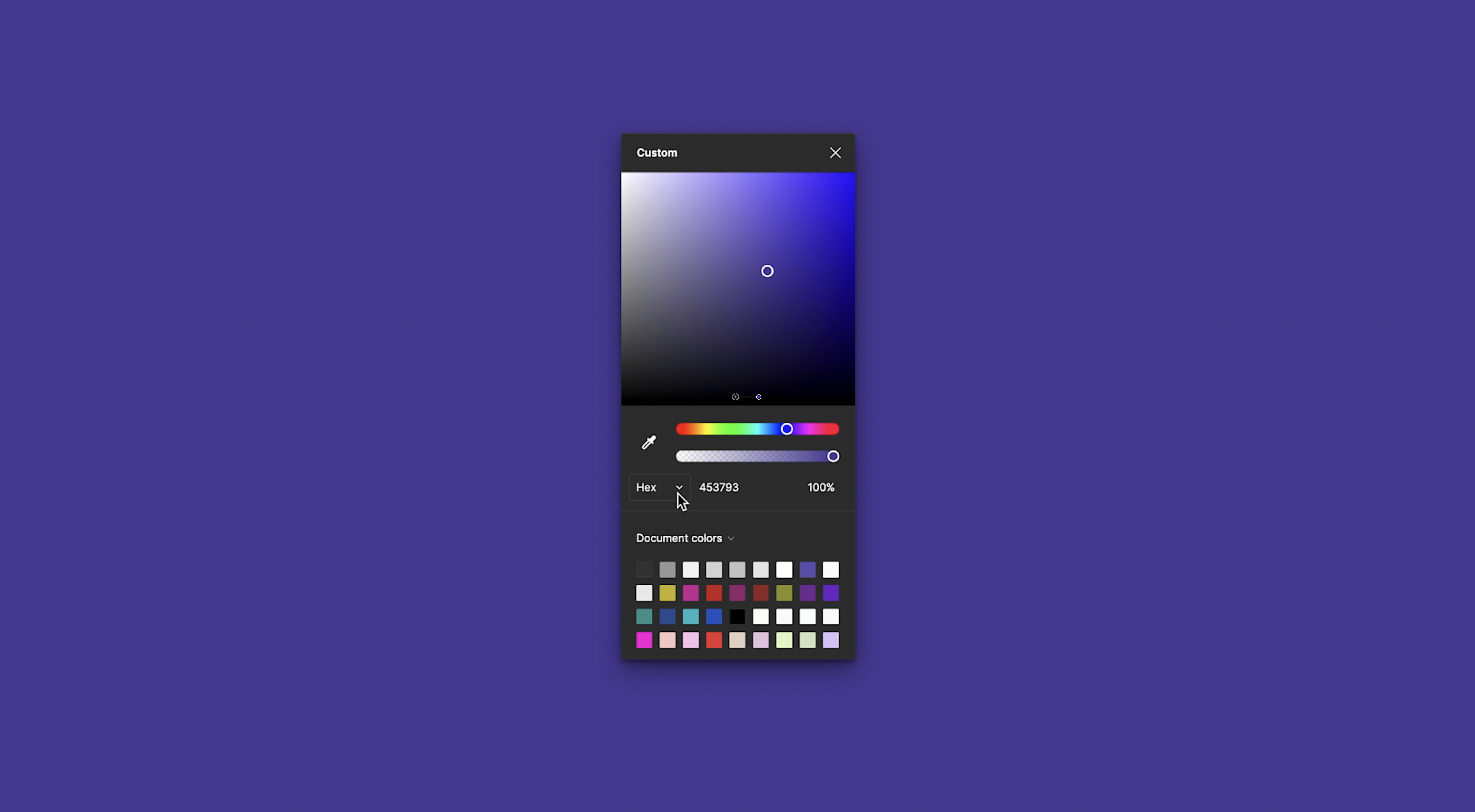
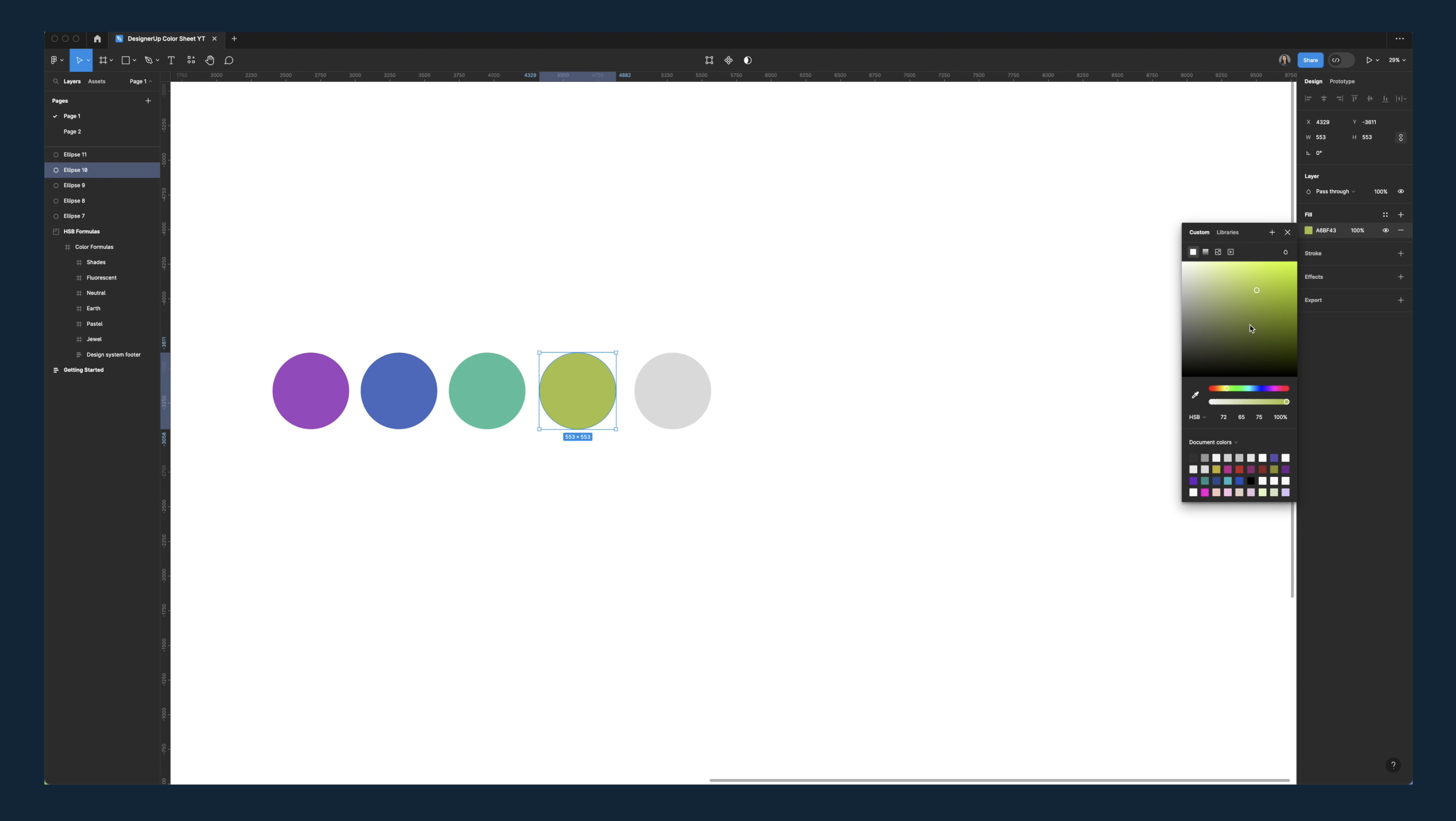
If we open up the color picker inside our design app, we can see that there is a spectrum of color here.
And as we slide our color picker from left to right and right to left, what we're seeing is a change of hue.
Now, normally, what we would do here is change the hex in order to change the hue or the color.
So we might select a swatch to change the hex or just type in a hex code like this.
But the real magic happens when you change the color model in Sigma.
If you click on this little drop-down arrow next to, you'll see the other color models, you'll see RGB HSL and HSB.
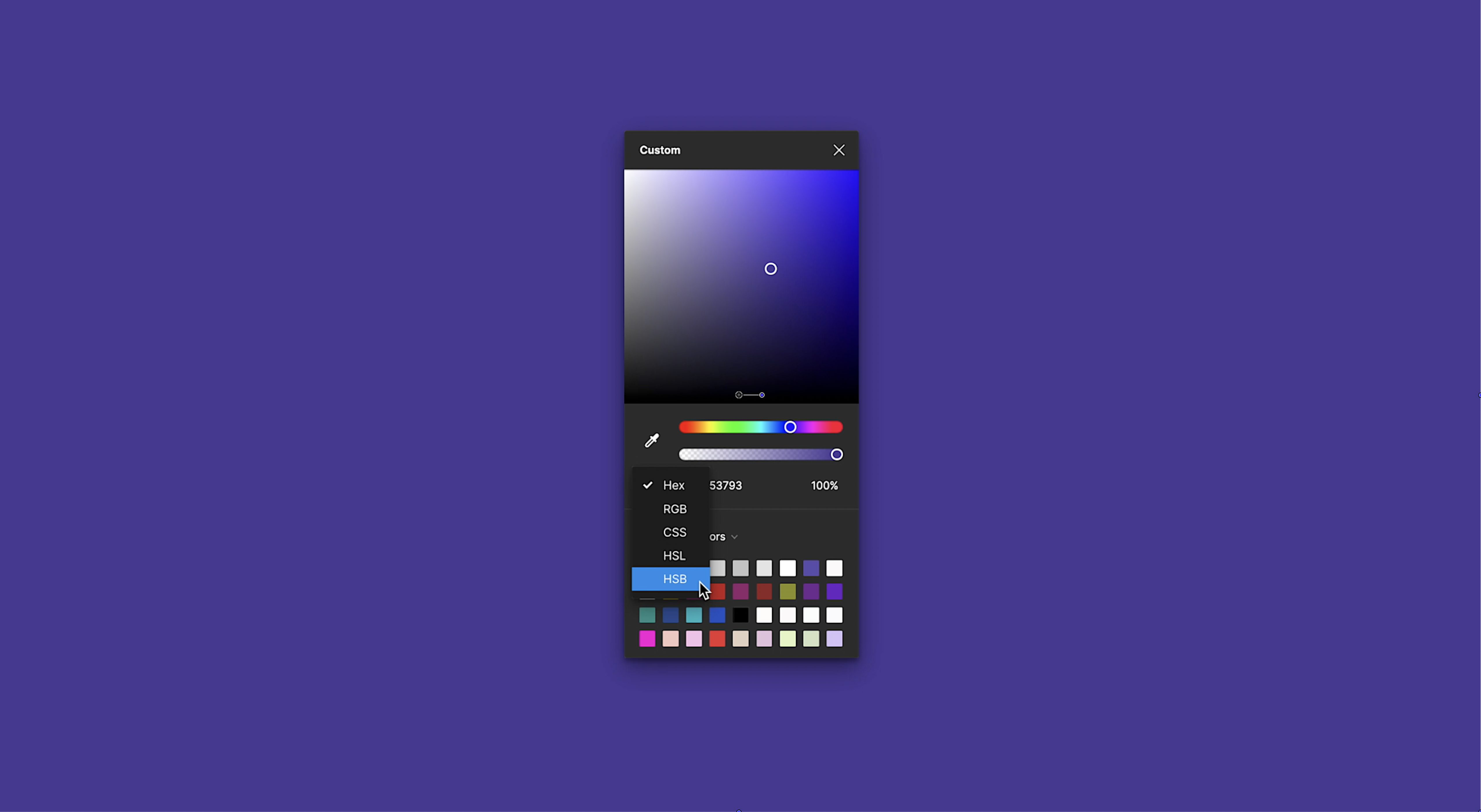
If you select HSB, you'll see some new variables come up.
Hue - The Color Value
The first one stands for Hue, the second one is Saturation and the third is Brightness.
Now, H can be thought of the same way we think of hex. It's a number that represents an actual color on the color spectrum.
Saturation - The Richness Value
On the other hand, Saturation tells us how rich or dull the color is, and on the color spectrum, that depends on how close you are moving toward gray or how far you are moving away from gray.
When we are at zero, that color is all gray.
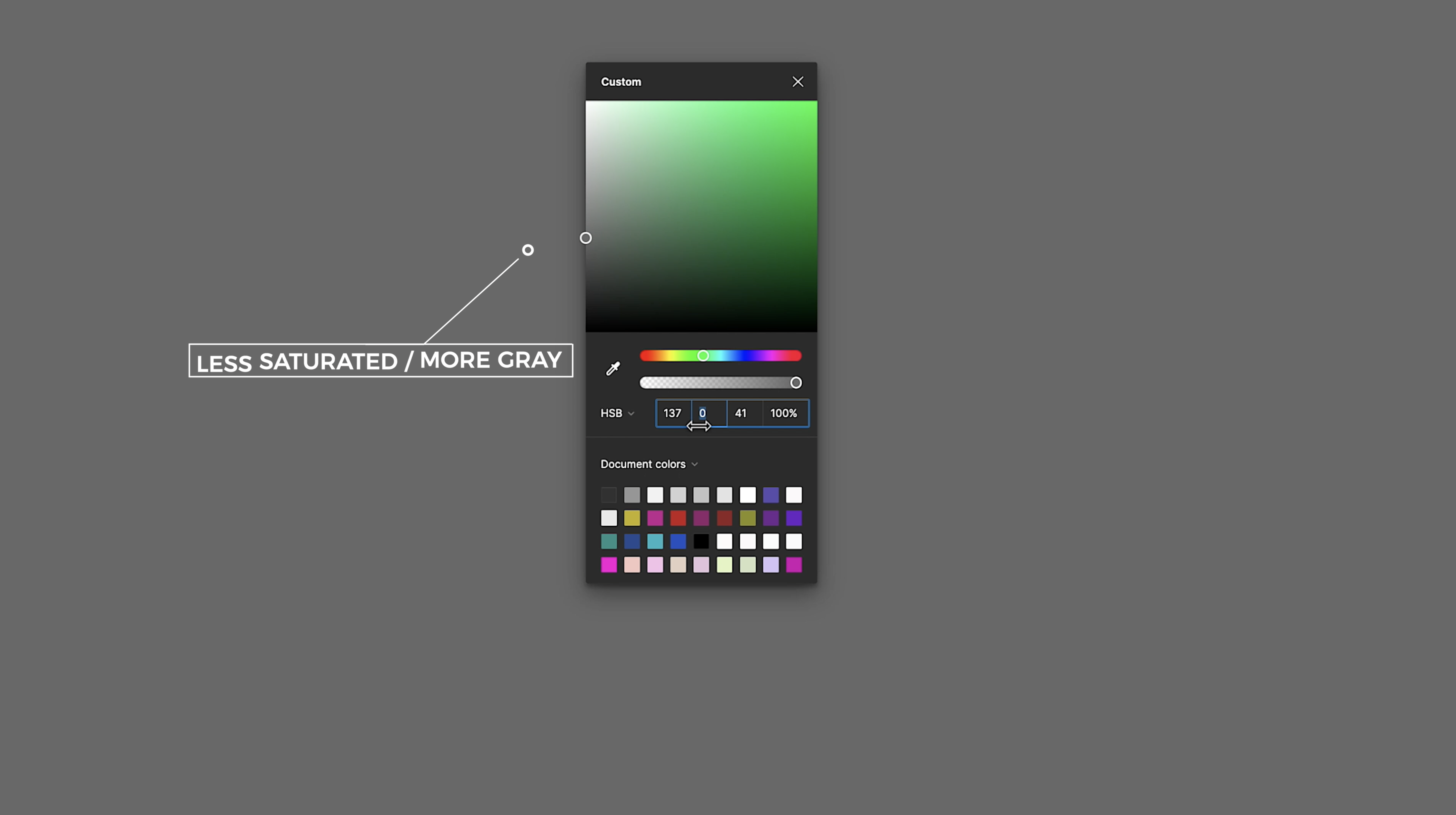
We've added gray to it or we've taken out all of the richness of color.
When we move to 100 we are adding 100% of that color or 100% pigment of that color.
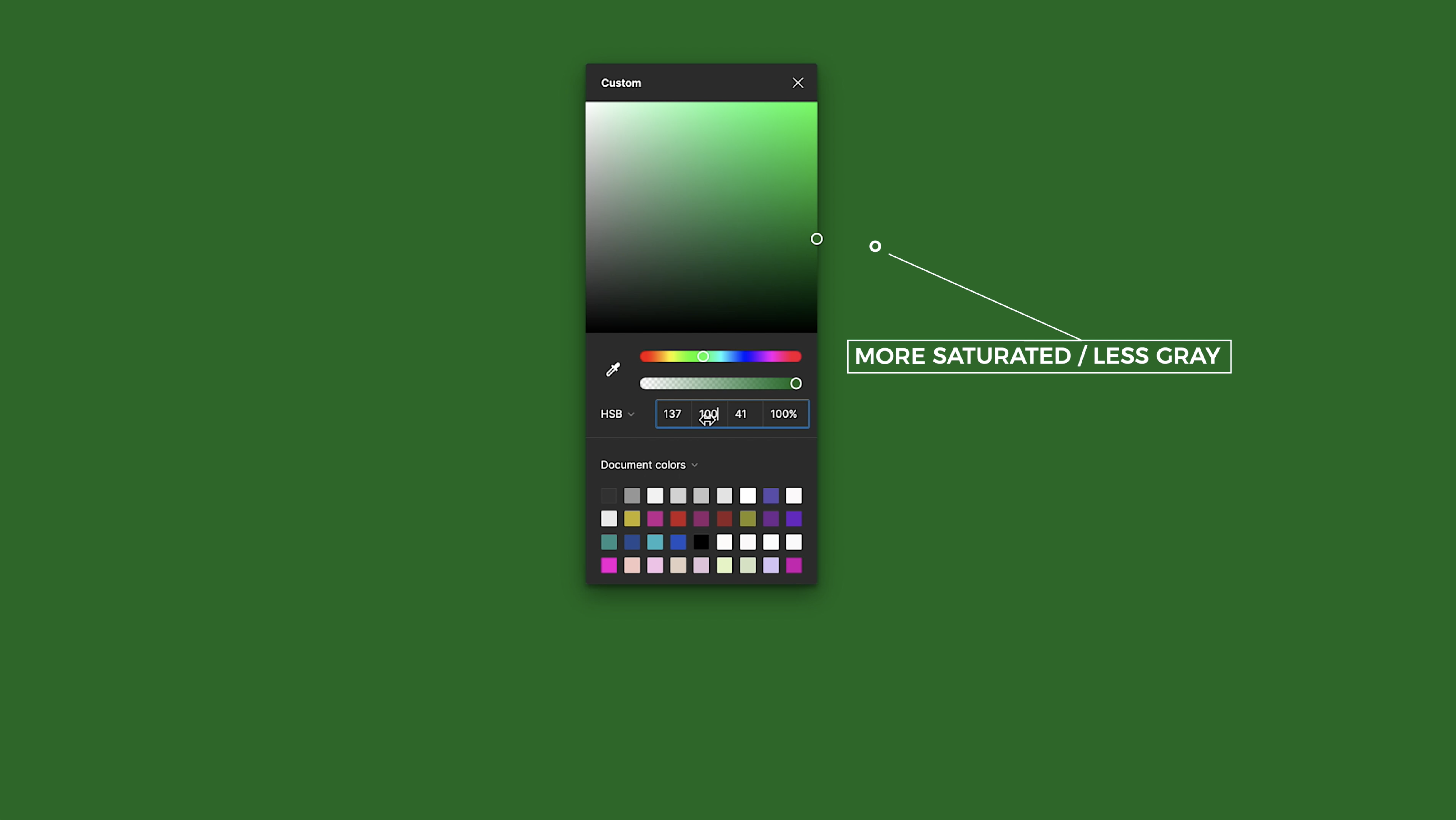
So it's as rich as we can get.
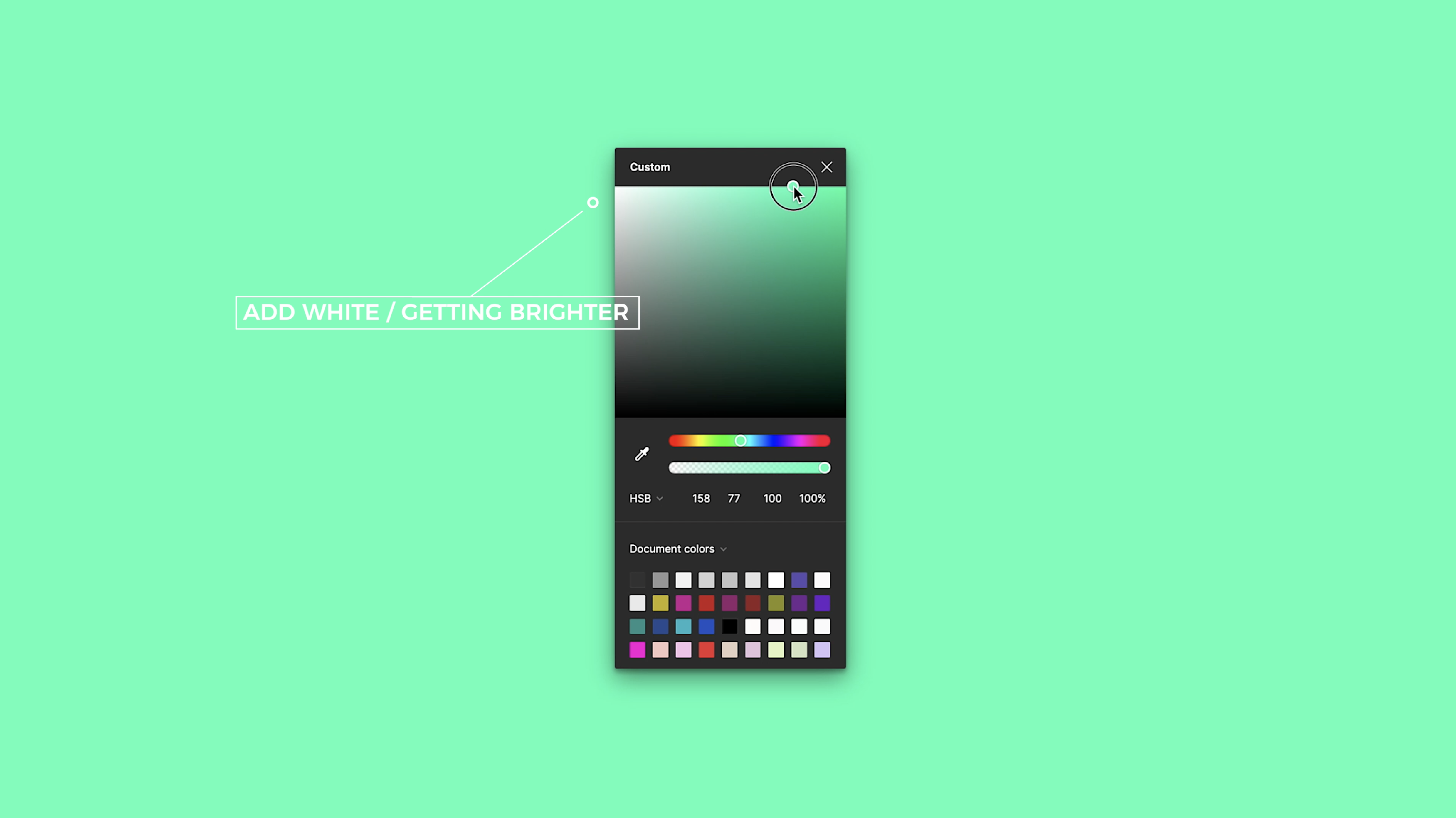
Brightness - The Whiteness Value
The final value is Brightness and that refers to how much white or black is added to that color.
So in this spectrum, when we go up, we're adding white and therefore, we're perceiving this color as brighter.
And as we go down, we're adding more black, we're getting closer to black on the color spectrum.
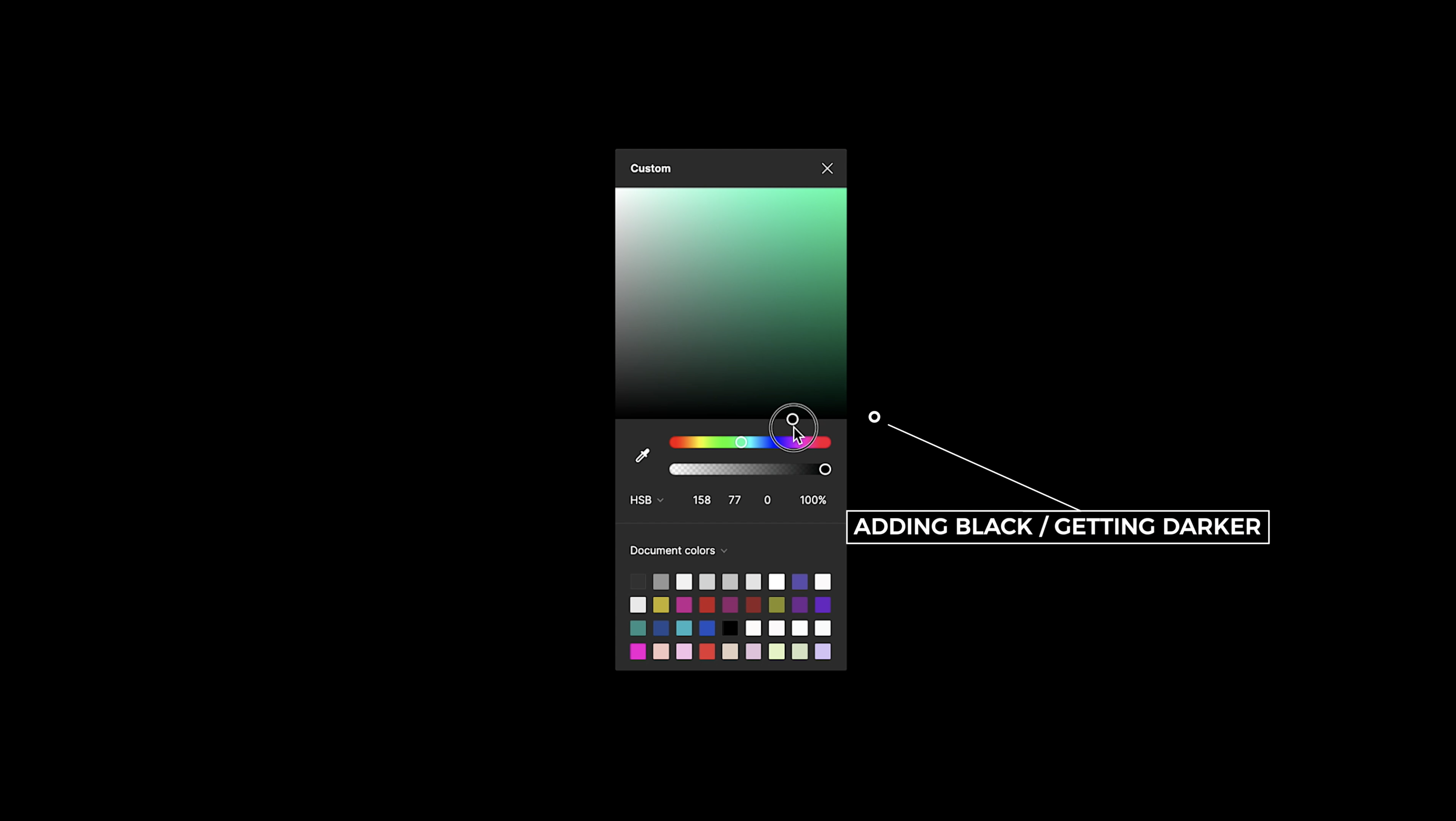
And therefore our eyes perceive this as darker.
So just to recap, as you go closer to the right side and you add more color, it's getting richer and richer and that is the saturation line.
As you go up, you're getting brighter and brighter by adding more white to the color.
And as you go down and closer to black, it's getting darker.
Correlation of Saturation, Brightness and Hue
When we move this slider, the hue number changes, but saturation and brightness stay the same.
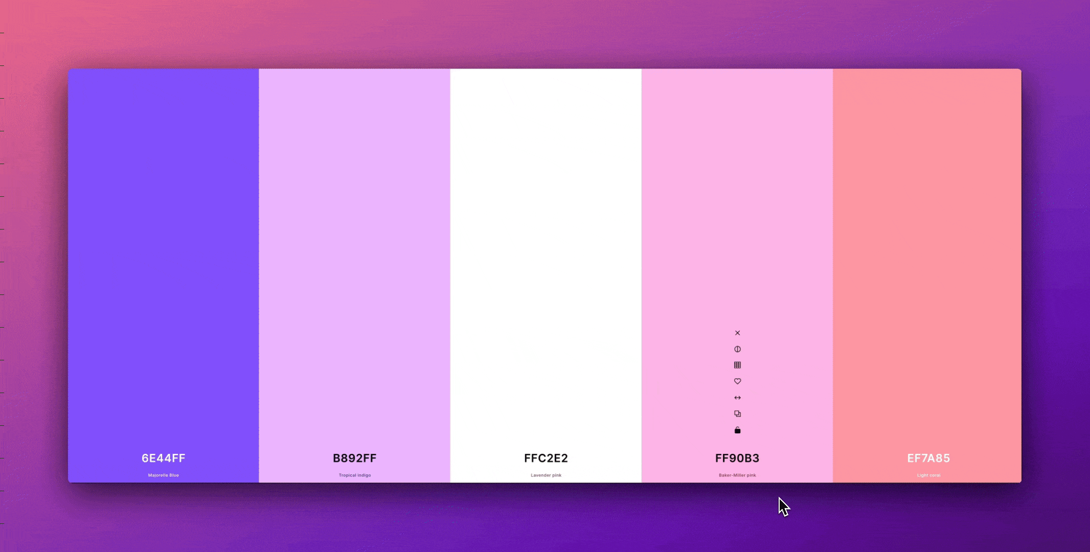
So add a fill color to your first swatch (make sure that the color model is set to HSB) and then drag the color spectrum handle and choose any hue that you want.
We want to move to the next swatch and then choose that exact same color.
Then, without touching the saturation or the brightness, we just want to change the hue, so you can move your color slider to the left or right.
Now, we can do the same thing and continue with all of our swatches.
And as long as you keep doing that every time only changing the hue, you're going to end up with a perfectly balanced color palette!
But what about the saturation and brightness? When do we tweak those? And how do we make different color palettes that match our brand?
Color Categories and Color Families
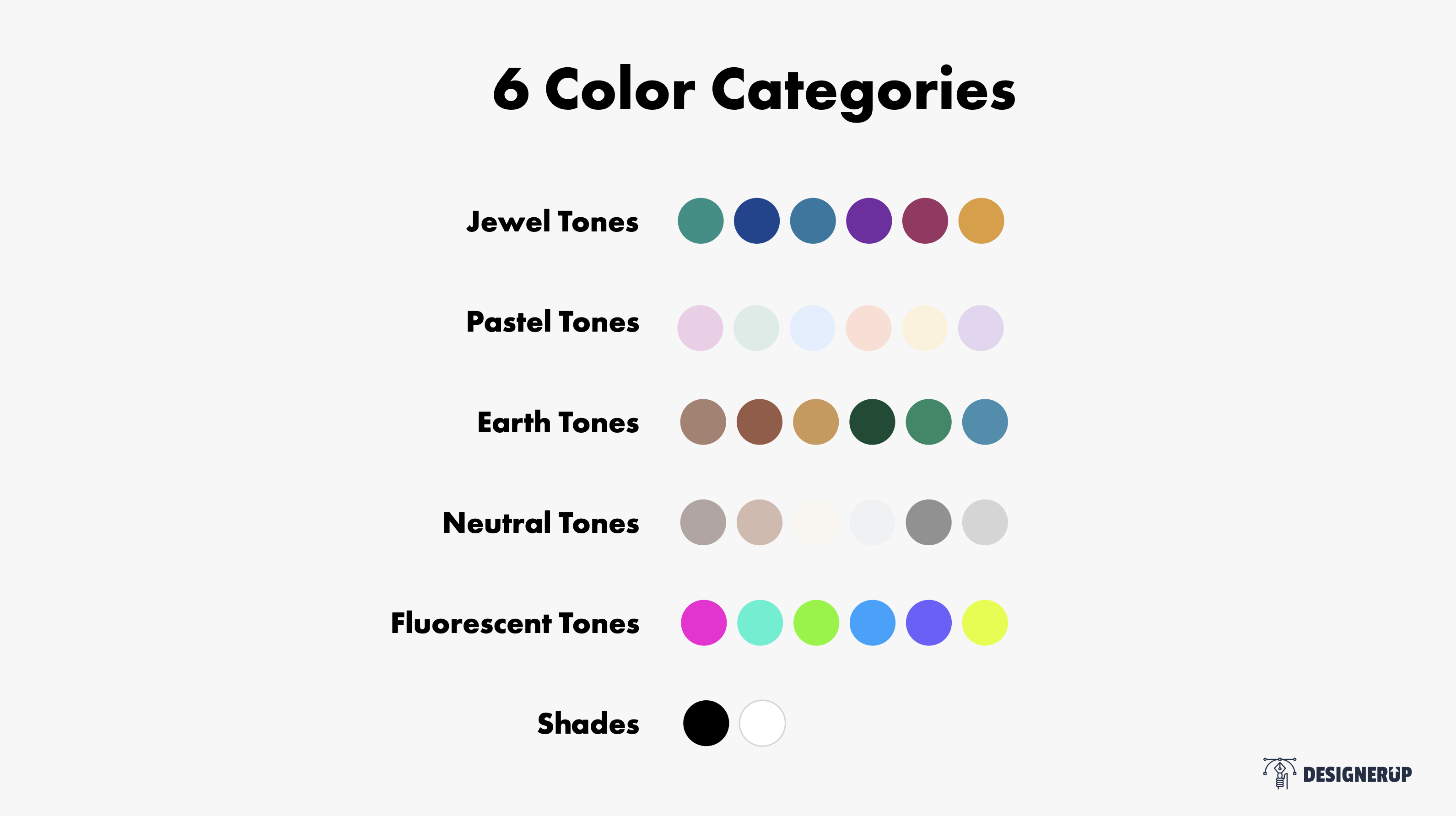
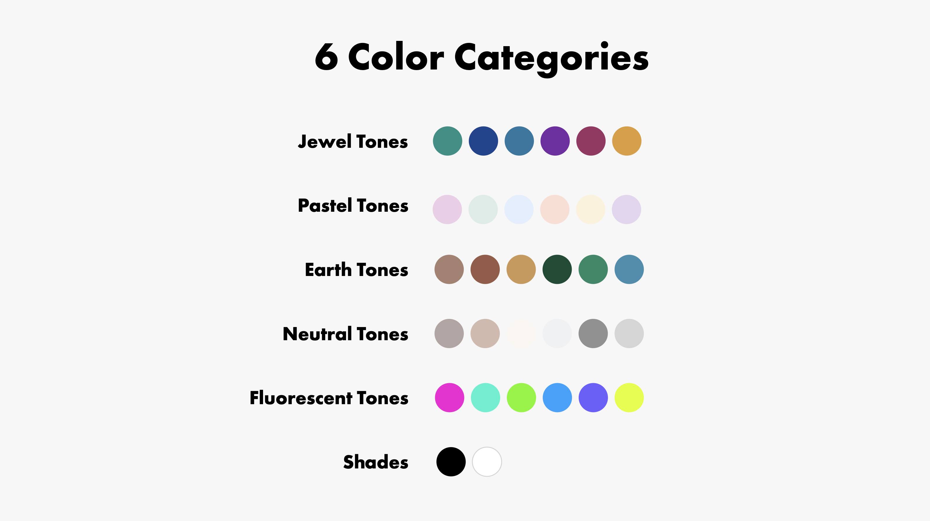
What I've done is grouped colors into 6 main color categories, these are based on color families that have similar attributes and look and feel.
Category 1: Jewel tones
Category 2: Pastel tones
Category 3: Earth tone
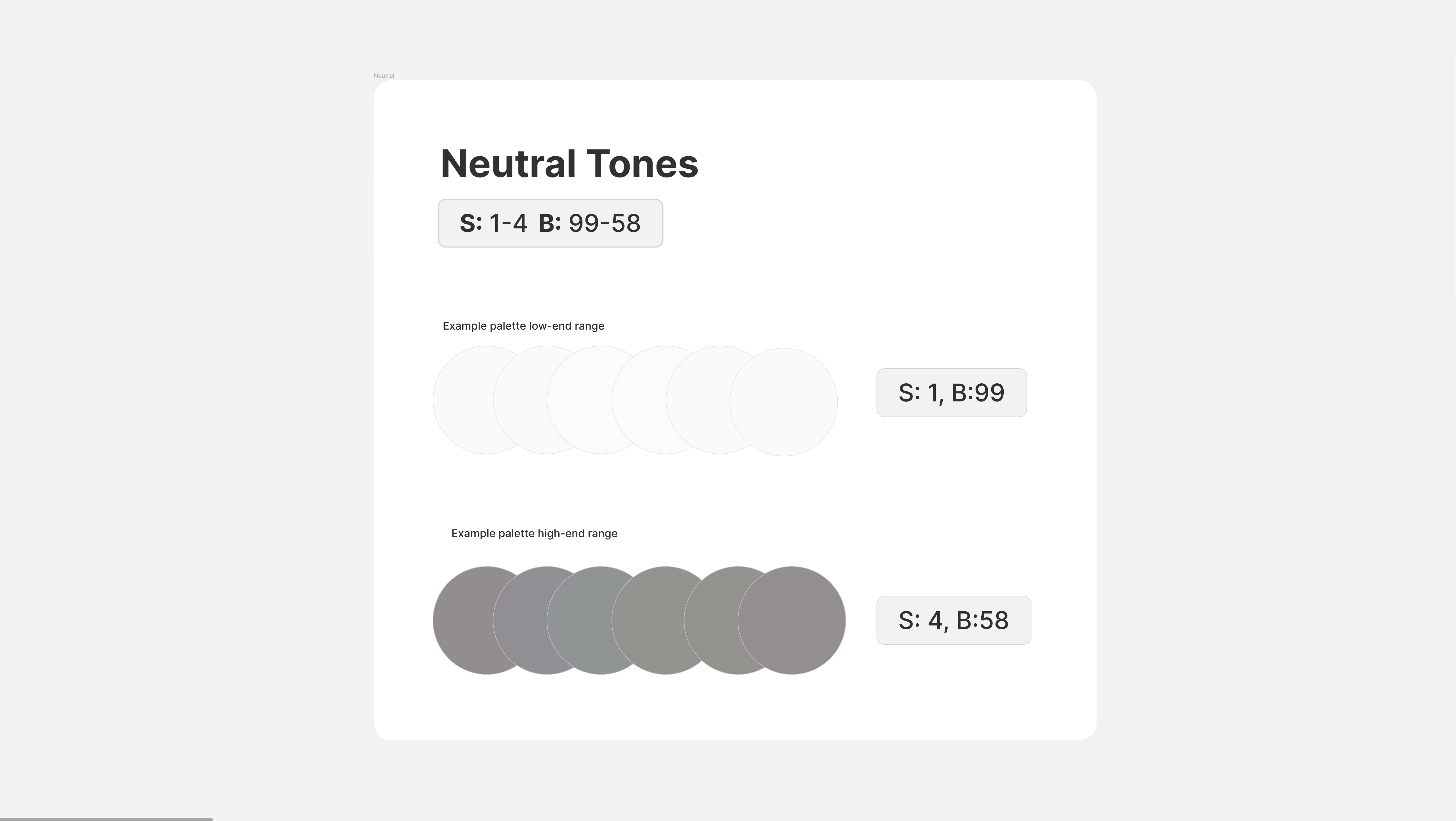
Category 4: Neutral tones
Category 5 is Fluorescent tones
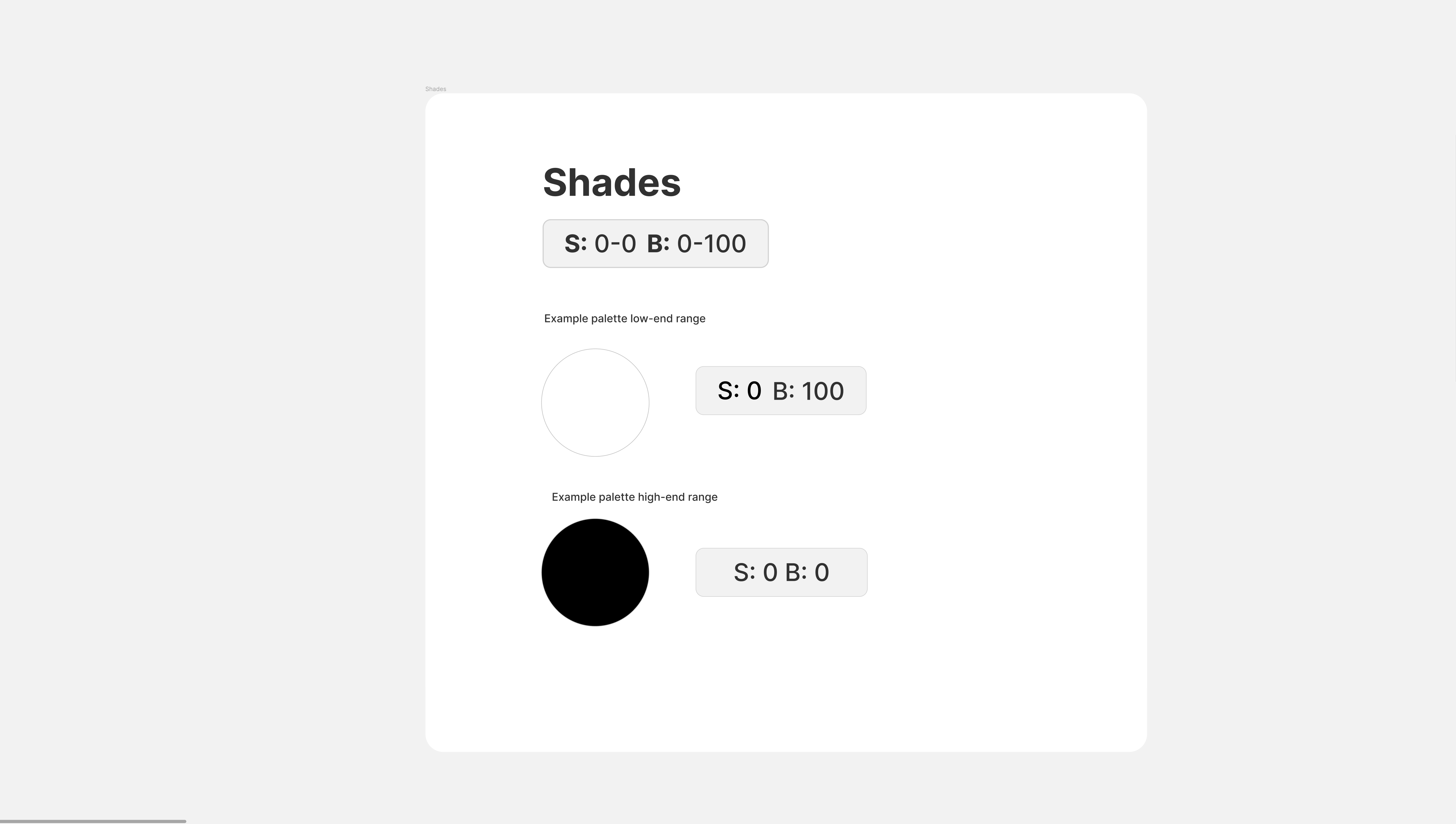
Category 6: Shades
Based on these color categories, I discovered there is a safe range of saturation and brightness for every color category!
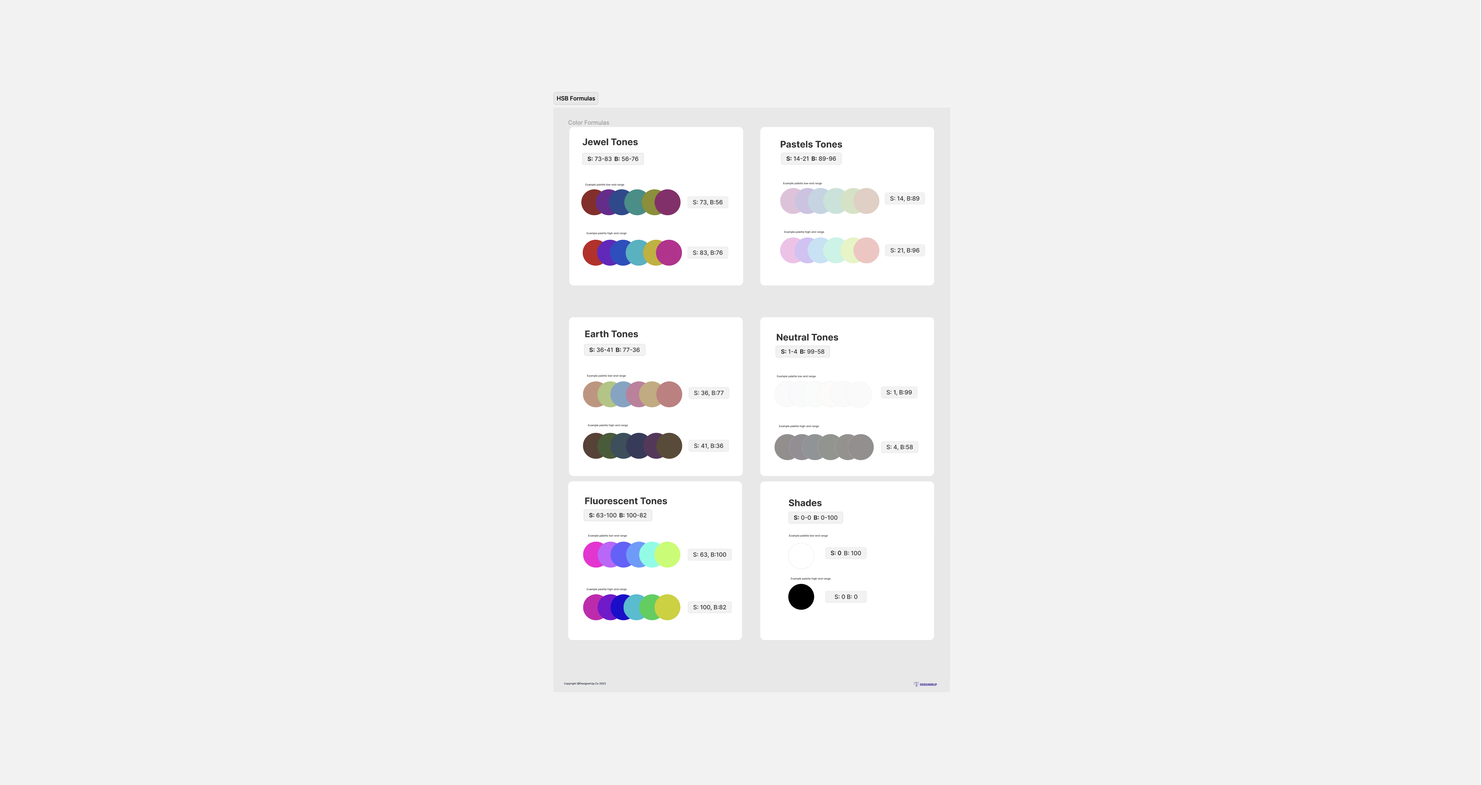
Jewel Tones
Jewel tones are so named because of their similarities to gems and stones like rubies, citrine and turquoise. For Jewel tones, the safe saturation range is between 73 and 83 and the safe brightness range is between 56 and 76.
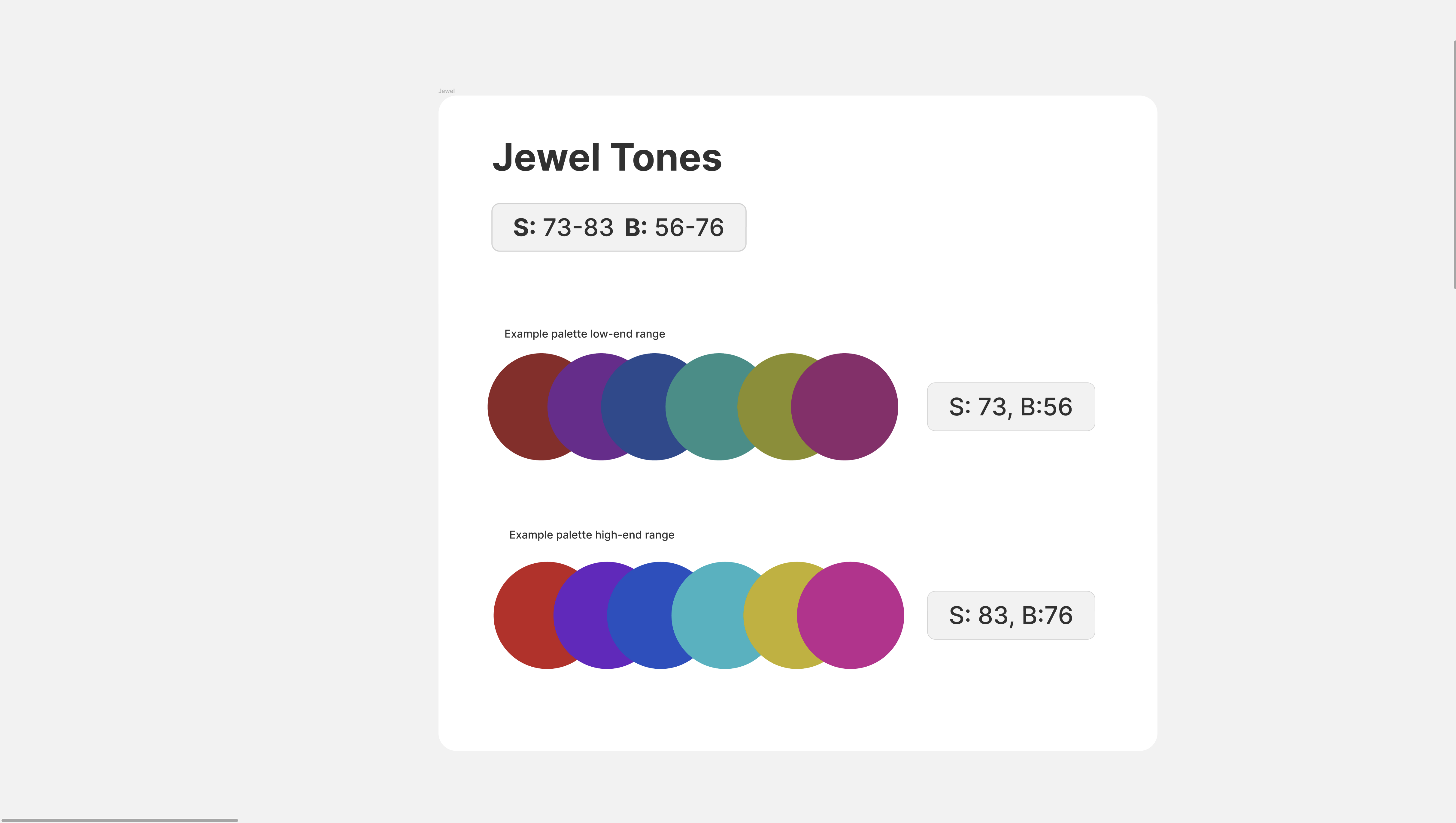
On the lower end, you'll have a Saturation between 73-83 and and Brightness between 56-76. This will give you a more muted jewel-toned color.
So for example, on the highest end, you'll have a saturation of 83 and a brightness of 76. This will give you a more vibrant color.
You can change the hue of any of your swatches, but make sure that the saturation and brightness stay within these safe ranges.
Pastel Tones
Pastels are softer tones with just a tint of color.
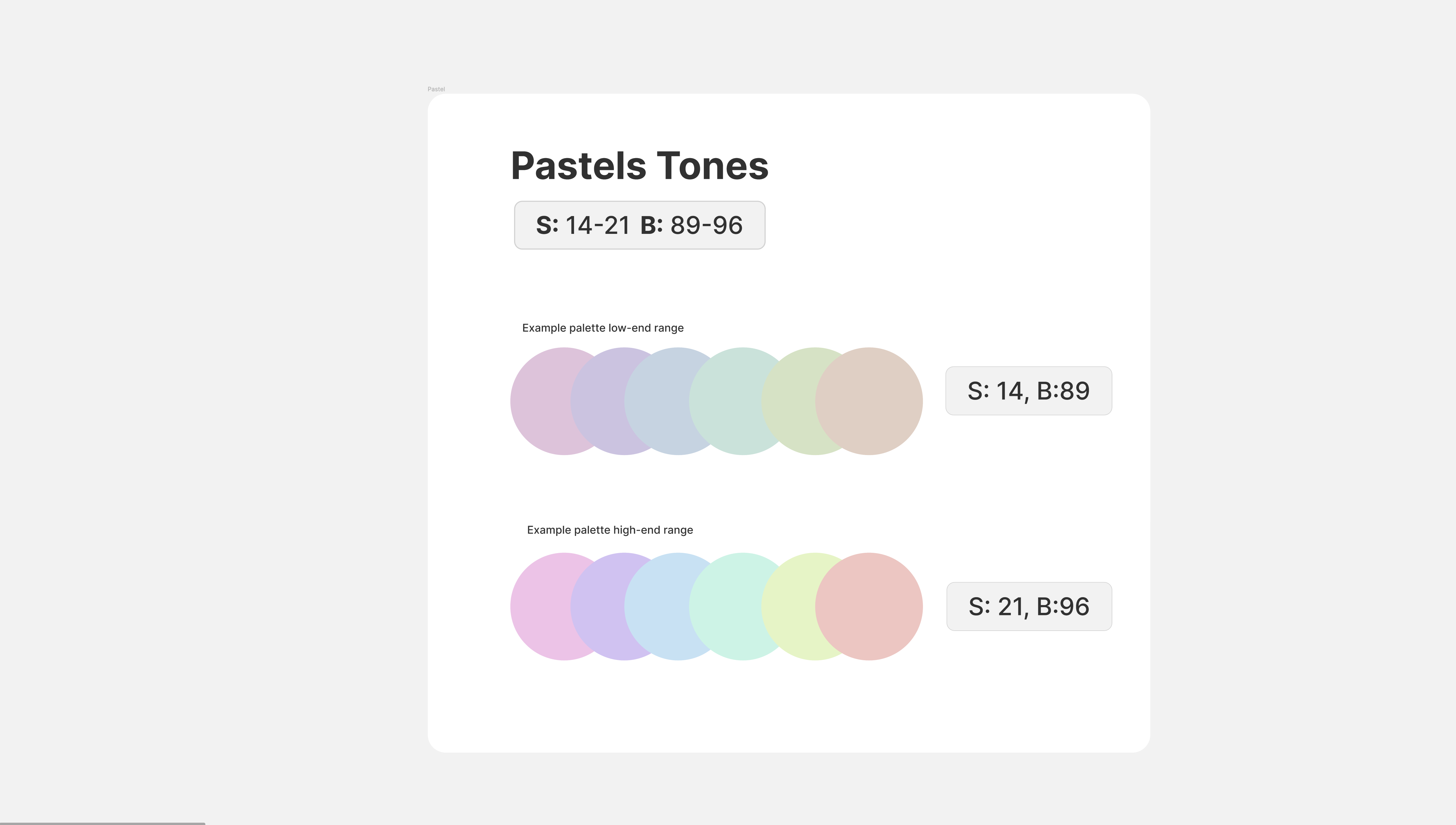
You can see here that this color category has it's own safe range as well. The saturation range stays between 14 and 89 in the low end and between 21 and 96 in the high end.
Earth Tones
These colors are a bit more organic and a little bit more dull. They are reminiscent of colors found on land in in the sea, like clay and sand.
The safe range for earth earth-toned colors is a Saturation between 26-41 and a Brightness between 77-36.
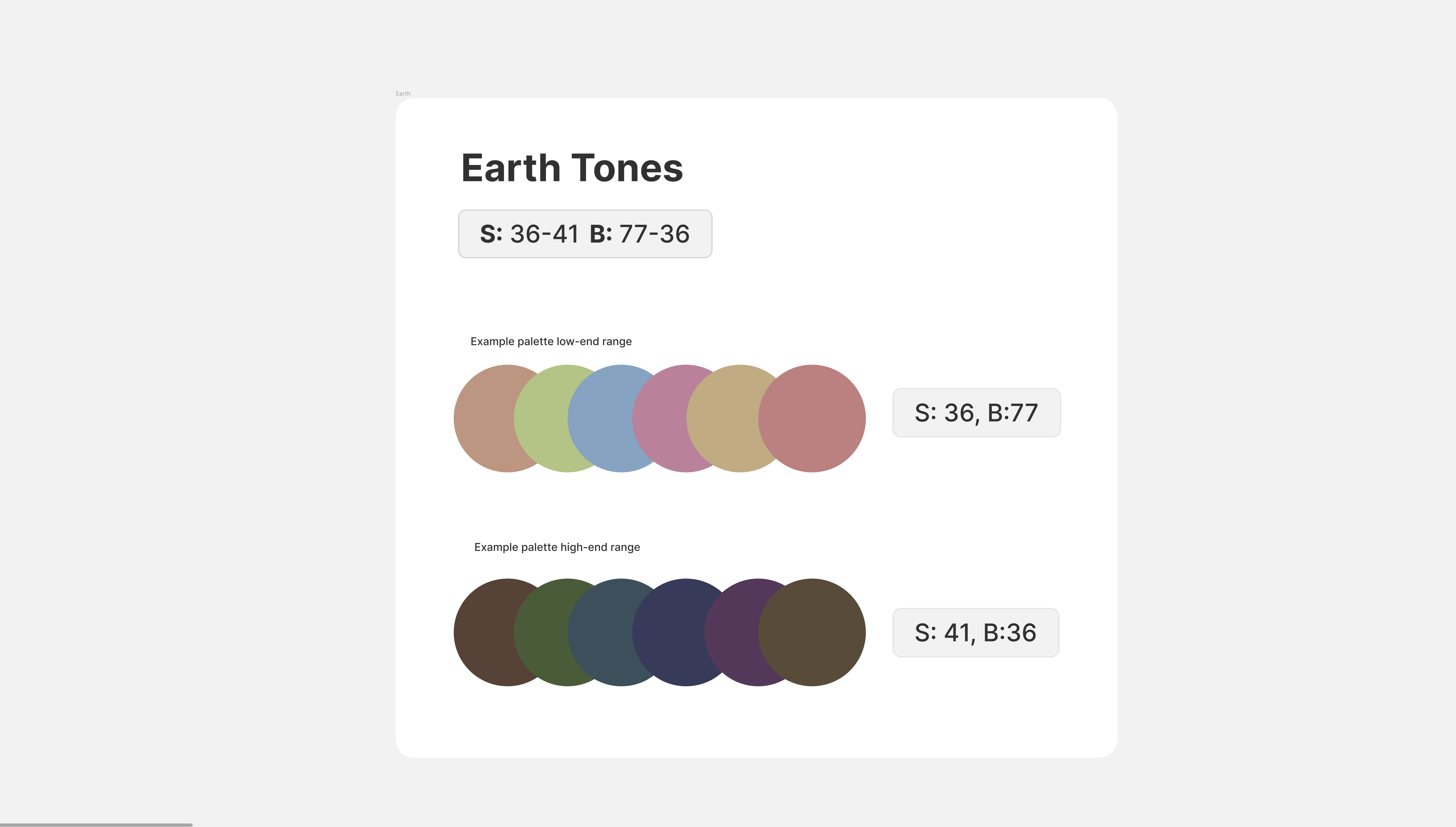
You can see that saturation has a lot more gray mixed in.
Neutral Tones
Next, we have our neutral tones which we tend to need a lot in UI design to create elevation and different cards and different depths on your components.
The safe range here is a Saturation between 1-4 and Brightness between 99-58
Fluorescent Tones
Here we have the fluorescent tones, which are really great for dark design because the colors really comes off the page due to their high saturation and brightness levels.
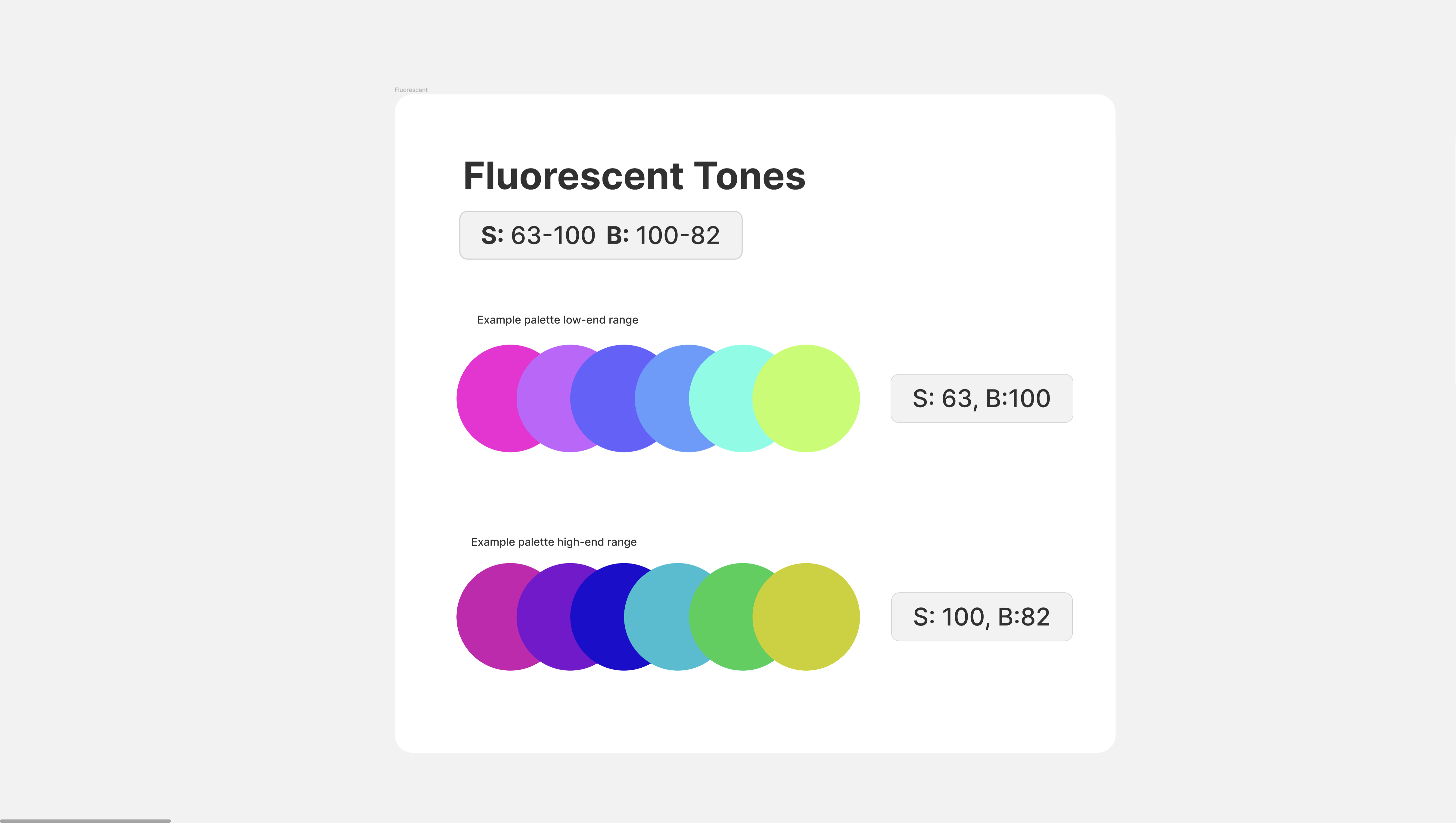
The safe range for fluorescent tones is a Saturation between 63-100 and Brightness between 100-82.
Shades
Finally, we have our two shades of black and white
If you need to use another color code such as hex or RGB(a) you can easily switch your color model and copy your color code.
You can download this color formula cheatsheet that shows you exactly how to change your color model, how to view the formulas, how to input the numbers and how to generate these colors perfectly balanced.
Now you can create perfect color palettes and color schemes every time and apply them easily to graphic, web and UI designs and feel confident that everything will match!
This lesson is an excerpt from our Product (UX/UI) Design Course. Want to get a comprehensive education in product design and build your portfolio with more lessons like this. Come check it out!