Color pairing and choosing ui color schemes is often a challenge. But in truth, most UI's don't need a ton of color. I pretty much design 80% of my apps with one single color. Maybe two if I want to go crazy.
If you're interested in learning my other super practical method for choosing perfectly balanced and matched color schemes and color pallets in your design app using just numbers check out this article and video.
To understand UI color schemes and color pairing a little better let's start off with the basics. Color theory revolves around the color wheel, this theory is a set of formulas that that have been proven to visually work harmoniously together. There are a few tried and true formulas that we can refer to to help ensure we're creating good color harmony within our color palettes and color schemes.
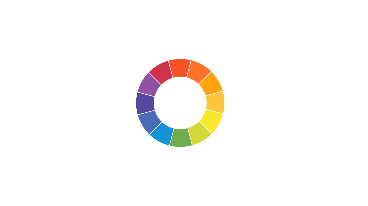
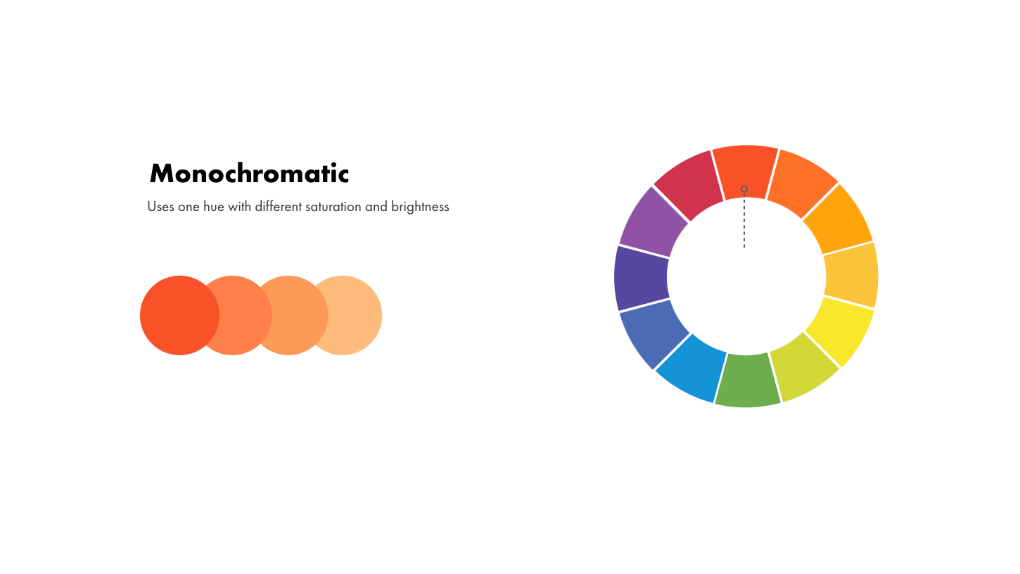
Monochromatic color schemes use one hue with different saturation and brightness, so to create a monochromatic color scheme or palette, choose a single color or hue from the color wheel and change it's saturation or brightness for each of the other swatches
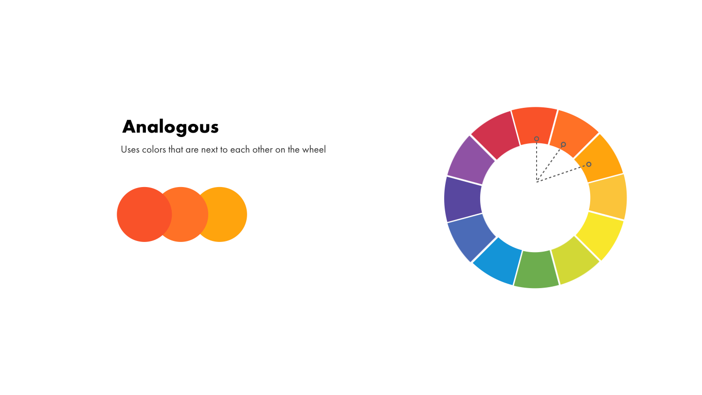
Analogous color schemes use colors that are next to each other on the color wheel
these can be warm colors like orange and yellow or cooler colors like blue and
purple.
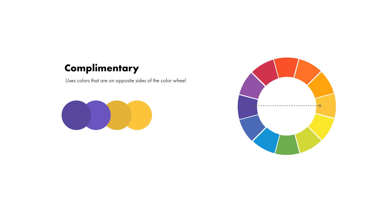
Complimentary color schemes use colors that are on the opposite sides of the color wheel for instance, purple and yellow which is the color scheme we use for DesignerUp. Play around with the saturation and brightness to create more refined color palettes.
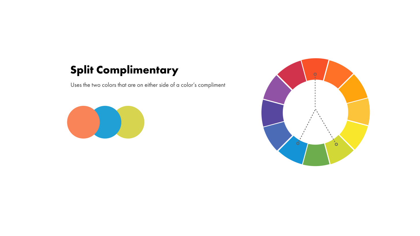
Split Complimentary color schemes use two colors that are on either side of it's
complement.
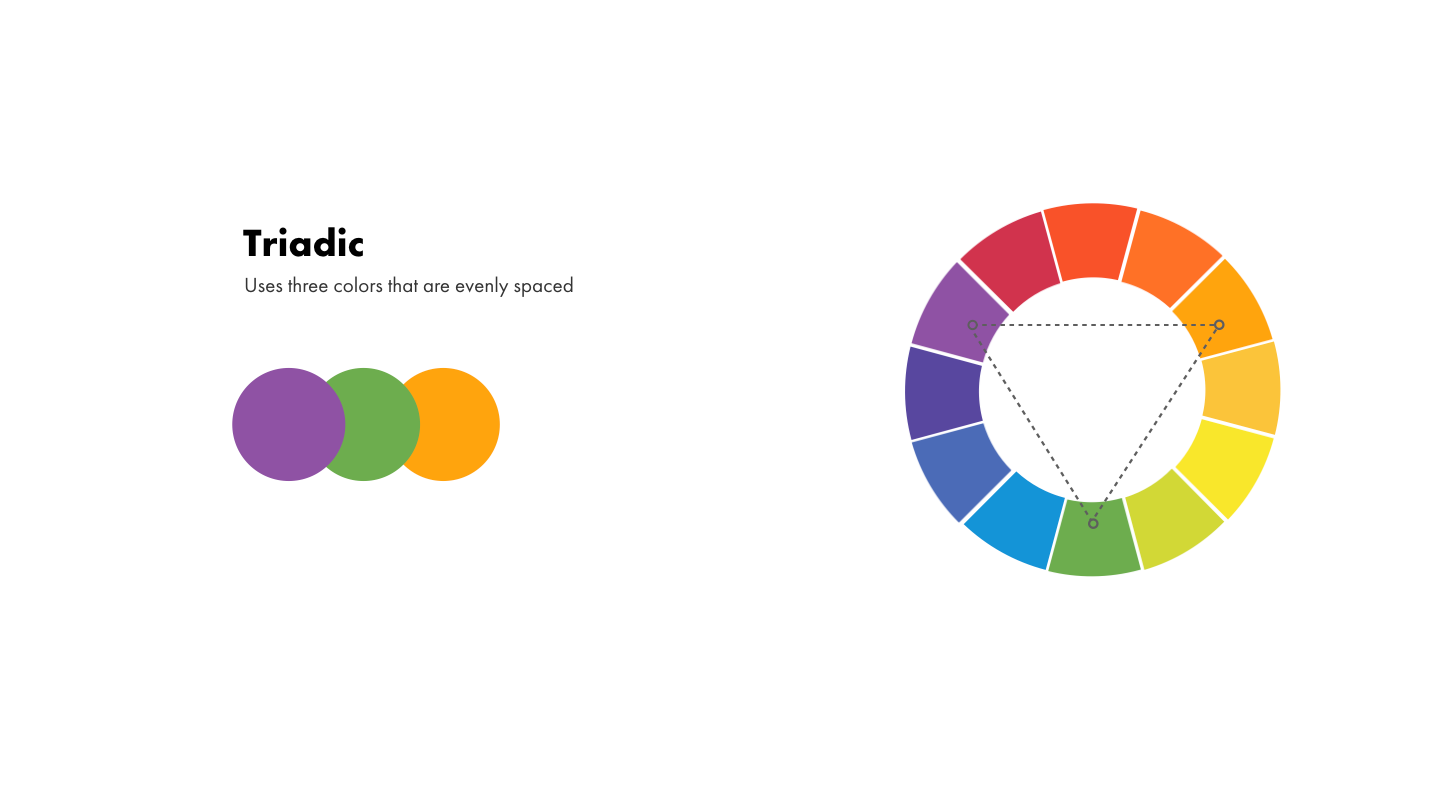
Triadic color schemes use three colors that are evenly spaced and
form a triangle on the color wheel.
Guidelines for choosing UI color palettes and schemes in your design app
The trick to simplifying colors for your UI designs is to start with a single primary color. Then using one of the above formulas you can select one or two supporting colors that have lighter or darker color variations by adjusting the saturation and brightness.
If you need a darker color variation you need to increase saturation and decrease brightness, so drag your color picker farther away from gray and closer to black.
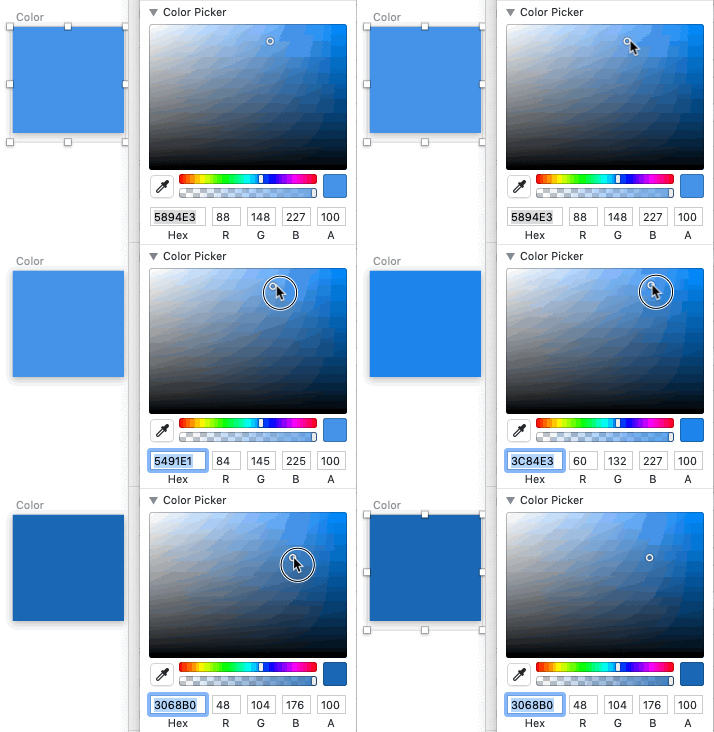
If you need a lighter color variation you need to lower the saturation and increase the brightness, so drag your color picker closer to gray and farther away from black. It is possible to design an entire interface with one single color or hue so let's talk about how we can do that.
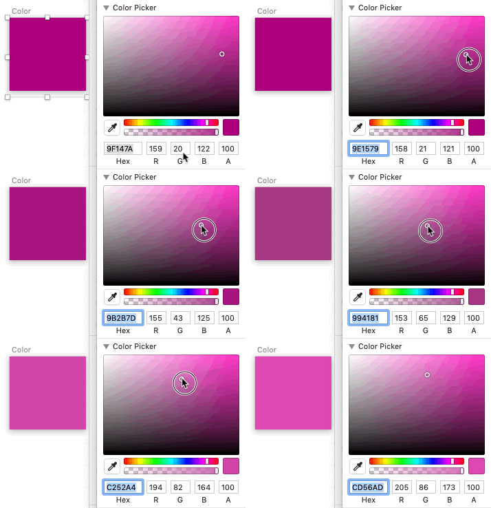
Once you have a few variations of your color you can start to apply them to elements and overlay them.
Here are a few rules to help you with applying them to your elements:
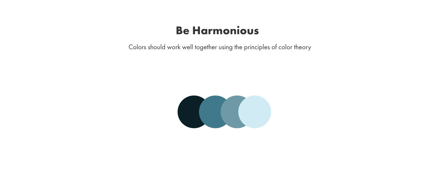
Harmony
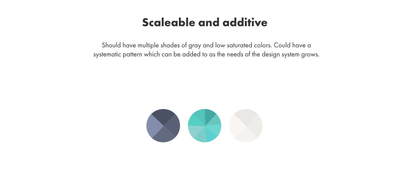
Colors should be scalable and additive within the larger scope of your user interface and design system, so it's a good idea to have multiple shades of grey and low saturated colors to work with. They could also have a systematic pattern which can be added to as the needs of the project or design system grows, in this case each hue has its own mini palette within it that can be expanded on when needed.
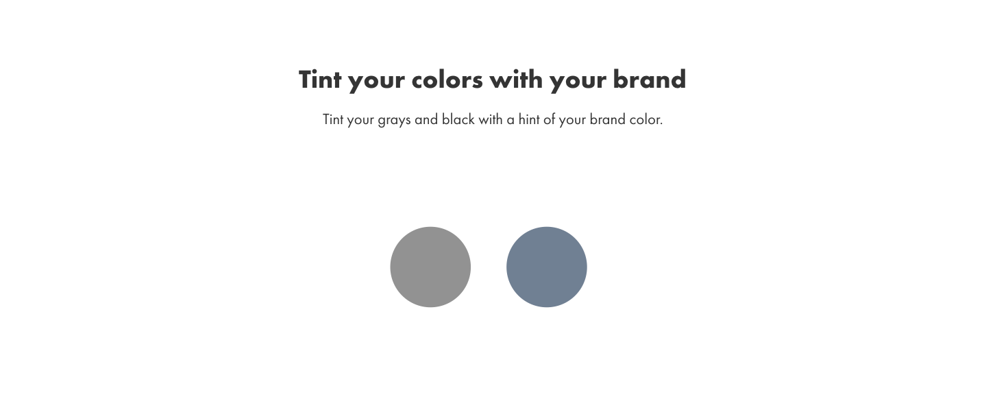
Tint your blacks and gray
Regardless of the primary color you choose to use, make sure to always tint your grays and blacks with a little hint of your brand color. Pure blacks and grays can be too harsh and appear amateur.
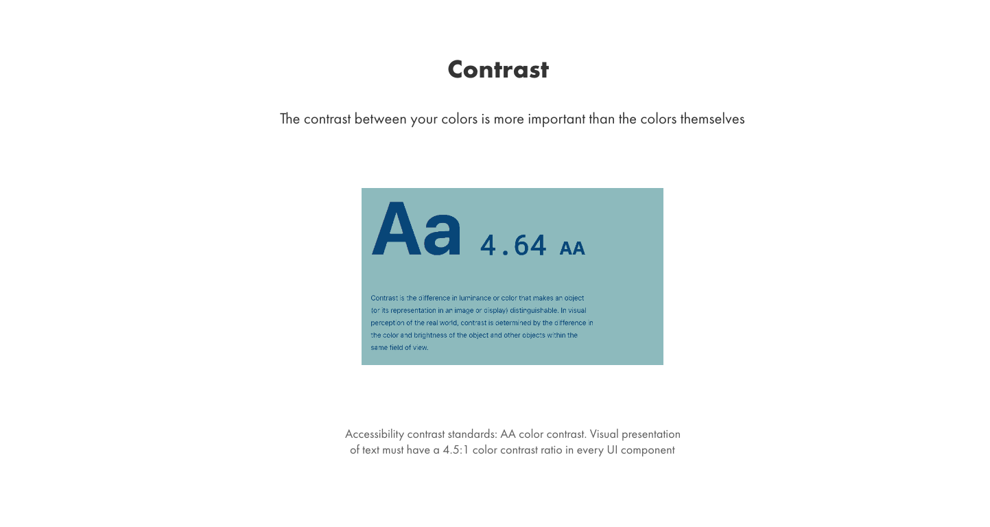
Even more important than the color you choose for your ui designs, is how much contrast is between those colors. Contrast is what leads to proper visual hierarchy and lets the eye know what to look at. It's also a big part of ensuring
accessibility. For those that can't detect the subtleties from one color to
another, it's contrast that really matters. WCAG 2.0 refers to the standard set for
accessibility, each guideline has three conformance levels A, AA and
AAA, AA is widely considered the industry standard. Colorable is a
great tool for testing your text color contrast, you can mess around with
various colors and get a pass or fail based on contrast standards.
Steps for choosing your UI color palettes and color schemes
- Choose your base color first. This primary or dominant color of your UI is usually your brand color.
- Next, choose the swatches near your base color. Change only the saturation or
brightness, leave the hue alone. These colors will support hover, active and focus states for the base color in actionable elements such as buttons links and form elements. - Finally, choose your darkest color and a few different grays by dragging the saturation over to the gray side of the color slider.These swatches are most often used as accents or backgrounds to give visual weight to UI elements in both light and dark interfaces.
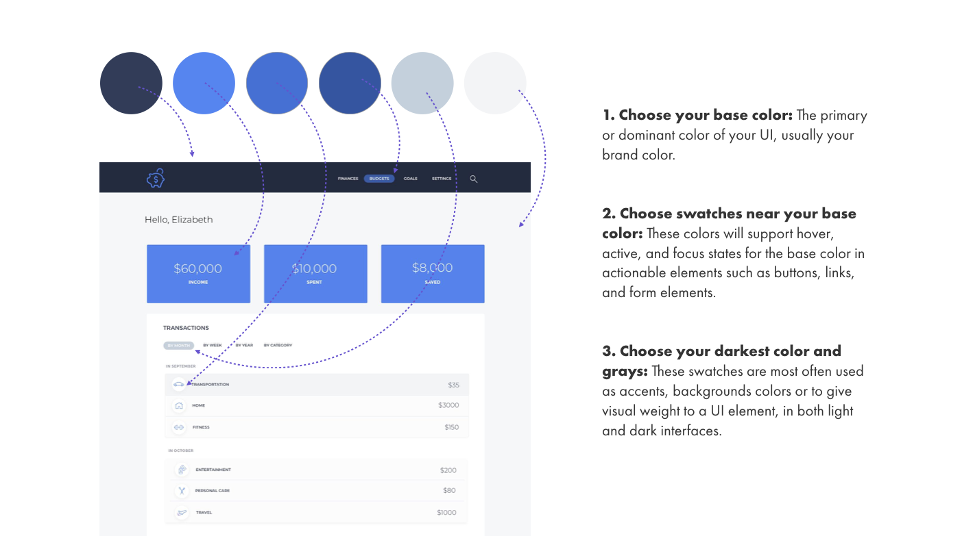
In this way one single hue; in this case blue, can be used to design an entire interface. You can apply this same concept using one of the other color theory formulas, making sure to reserve any secondary colors for specific actions or buttons and focusing on the main primary color as your anchor.
Download the Free Color Cheatsheet
Enter your email below for a link to our free color cheatsheet.
Alert and notification colors
Thankfully, when it comes to some of the default UI elements, like alerts and notification bars, the following rules apply:
- Red - used to indicate error, danger, wrong.
- Green - used to indicate success saved or correct.
- Yellow - used for temporary alert, caution, warnings.
- Blue - used for information.
There is a great article here that outlines a few other elements to consider when choosing UI color schemes such as data and charts. I've also done another video here on apply color schemes to map data.
If you need further help, one resource that I recommend for starting you off is Coolors.co this can help with generating harmonious color palettes and color schemes for your UI when needed.
Learn product design and UI/UX 1:1 with us.

