After working with many designers throughout my own career and helping many more build their job-ready portfolios, there are a few designers that I keep coming back to for inspiration and some that are inspiring a new generation of UX/UI and Product Designers to enter the field.
I've chosen 10 of our favorite UX/UI and Product Designers— from graphic designers, marketers, architects, engineers and everything in-between. Their unique backgrounds and journey bring something special to our industry and illustrate how we can all do more meaningful, interesting and impactful work:
There are 10 things in particular that make these 10 designers really stand out:
- They have each honed their craft from the bottom up (whether having gone through a traditional academic program, an online course like DesignerUp, or being self-taught).
- They are all at different stages of their careers (some newly minted and others seasoned veterans).
- They continue to learn, grow, push the envelope, document and share their genuine experiences.
- They each hail from a different background (and sometimes non-design industry) that informs who they are and what they work on as a designer.
- Their evolution is apparent in their work.
- They are passionate about the problems they solve and find joy in connecting with the users they serve.
- They are transparent about their processes, thoughtful in their communication about it and not afraid to show what worked and what didn't.
- They have focused portfolios that reveal their unique point of view as a designer.
- They are a diverse group of designers from different cultural, gender and socio-economic backgrounds.
- They have so much to teach us all about design and how to use it to express authenticity and to understand and help others do the same.
Ellen Covey
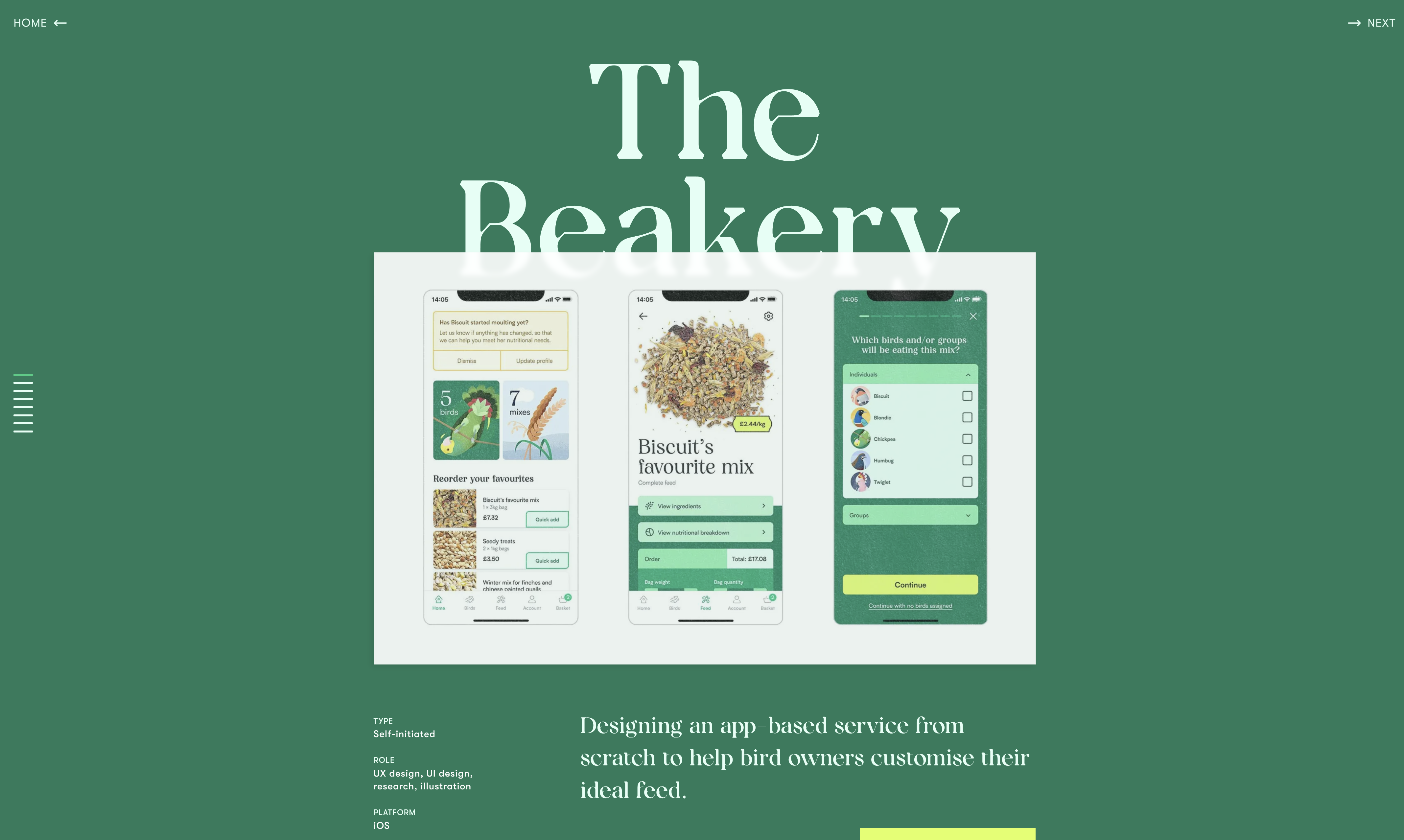
Ellen Covey’s The Beakery case study excels by combining a clear problem statement with a thoughtful, user-centered approach tailored to a niche audience—bird owners. It demonstrates a deep understanding of user needs through well-researched personas and user journeys, translating them into delightful yet functional design solutions. The process is transparent, showcasing sketches, prototypes, and iterations, while the final visuals are cohesive, playful, and accessible. Ellen masterfully aligns the design with both user goals and potential business outcomes, creating a case study that’s not just visually appealing but also a practical showcase of solving meaningful problems through design.
This case study not only demonstrates technical and aesthetic skills but also Ellen’s ability to empathize with users and deliver meaningful, thoughtful solutions. It serves as a blueprint for how to showcase UX/UI design work effectively, combining storytelling, process, and outcomes into a cohesive narrative.
Case Study Format:
- Introduction
A brief overview of the project, its purpose, and the target audience (bird enthusiasts and their pets). - The Problem
Clearly defines the challenges faced by bird owners, focusing on the lack of engaging, accessible solutions for pet care and enrichment. - The Solution
Describes the platform's goal to provide an intuitive and delightful experience for bird owners, combining product discovery, care tips, and community engagement. - Research and Insights
Details the user research process, including personas, user interviews, and key insights that shaped the design. - Design Process
Walks through the stages of ideation, sketching, wireframing, prototyping, and visual design, showing how the solution evolved. - Final Designs
Showcases high-fidelity mockups with an emphasis on branding, playful visuals, and usability. - Accessibility and Inclusivity
Highlights efforts to make the platform user-friendly for a diverse audience, including those with varying levels of tech-savviness. - Outcomes and Reflections
Summarizes the impact of the design and hypothesizes its potential to meet user and business goals.
In 2020, I hatched 6 Chinese painted quail chicks in my London flat.* It was something I’d planned meticulously—perfecting the incubation, setting up ideal habitats, and even filling their water dishes with marbles so they couldn't fall in. However, there was one element I couldn't nail… the feed. - Elle Covey
Simon Pan
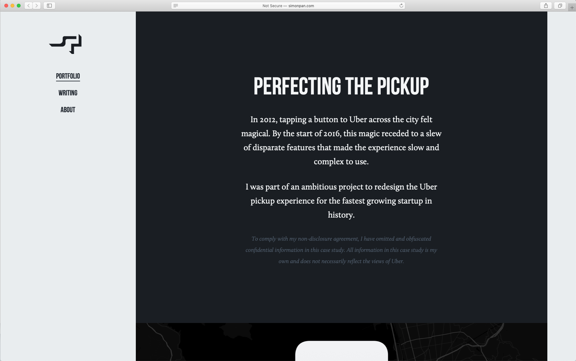
Simon Pan's case study on redesigning Uber's pickup experience stands out for its comprehensive and transparent approach. He begins by clearly defining the challenges faced by users and the business, providing context for the redesign. The case study details his role and the collaborative efforts involved, offering insights into the design process, including user research, ideation, and testing. By sharing specific design decisions and their impact on user experience, Simon effectively demonstrates how thoughtful UX/UI design can address complex problems and enhance user satisfaction.
Case Study Format:
- The Challenge
Simon identifies the core issue: pickups were frustrating and inefficient for both users and drivers due to communication gaps and unclear processes.
Why it’s good: Framing the problem this way highlights both user and business pain points, showing his ability to balance user empathy with business impact, a hallmark of great UX work. - Kickoff
The team aligned on goals and priorities to understand the pickup experience deeply, emphasizing collaboration across roles.
Why it’s good: By starting with a clear shared vision, Simon ensures that the process is focused and that all stakeholders are invested in solving the right problem. - Early Insights
Research revealed key pain points, like rider anxiety during pickups and miscommunication with drivers.
Why it’s good: These insights directly inform design decisions, demonstrating a user-centered approach that prioritizes solving the most significant frustrations. - Discovery
Simon explored behaviors and scenarios in depth to uncover patterns and nuances in how users interacted with the app.
Why it’s good: Deep discovery ensures that the design isn’t based on assumptions but on real-world behaviors, making the final product more relevant and impactful. - Reframing the Problem
Rather than focusing on isolated pain points, Simon reframed the challenge as improving communication and clarity throughout the pickup journey.
Why it’s good: Reframing allows for a more holistic solution that addresses the root causes of frustration, not just the symptoms. - The Redesign
Simon introduced features like live location sharing and clear visual cues to streamline rider-driver communication.
Why it’s good: These solutions are simple, intuitive, and directly address the key pain points, showing Simon’s ability to translate insights into actionable, user-friendly designs. - Design Strategy
He focused on scalability and consistency, ensuring that the redesign could evolve alongside Uber’s platform.
Why it’s good: A scalable strategy demonstrates foresight, aligning the design with both current needs and future growth. - The Launch
The new features were tested and rolled out incrementally to ensure smooth adoption and minimize disruption.
Why it’s good: Incremental launches reduce risk and provide opportunities to iterate, showing a practical approach to implementation. - The Impact
The redesign resulted in measurable improvements, such as reduced rider anxiety and faster, more reliable pickups.
Why it’s good: Highlighting tangible results ties the design work back to real-world impact, validating Simon’s process and demonstrating the value of good UX/UI design.
“In a city as busy as San Francisco, over $1 million was wasted per week because of problematic pickups.” Simon Pan
Madeline Wukusick
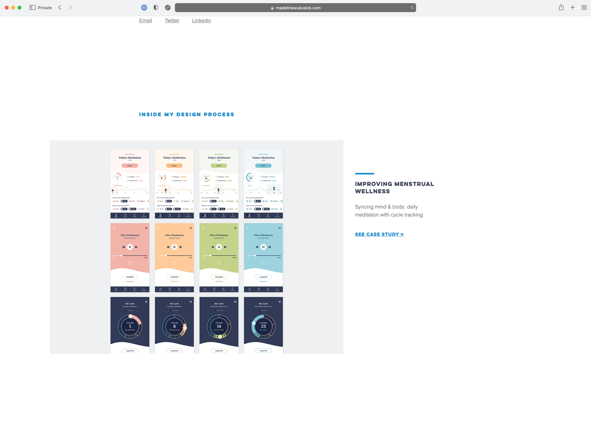
Madeline is a graduate of our DesignerUp Product Design course. She was able to create an incredible portfolio working through our curriculum, blended with her background in graphic and data design that set her up for immediate success landing professional design roles.
Case Study Format:
- The Result
- The Observed Problem
- The Research
- In the Insights
- The proposed How Might We Statements
- Lean Canvas and Product Strategy
- Business Requirements
- The Solutions and MVP Features
- Things that could be improved
- The impact
"Thanks for helping me work through these iterations—it's been tremendously helpful! You have such a knack for fine-tuning and teasing out subtle themes that I hadn't noticed before. From these comments, I have a better sense of some of my growth areas to work on and ways in which to push myself. It also helped me realize that I am most interested in hybrid roles, or at least roles with a strong visual component. Really grateful to have discovered this course :-)" - Madeline Wukusick
Johny Vino
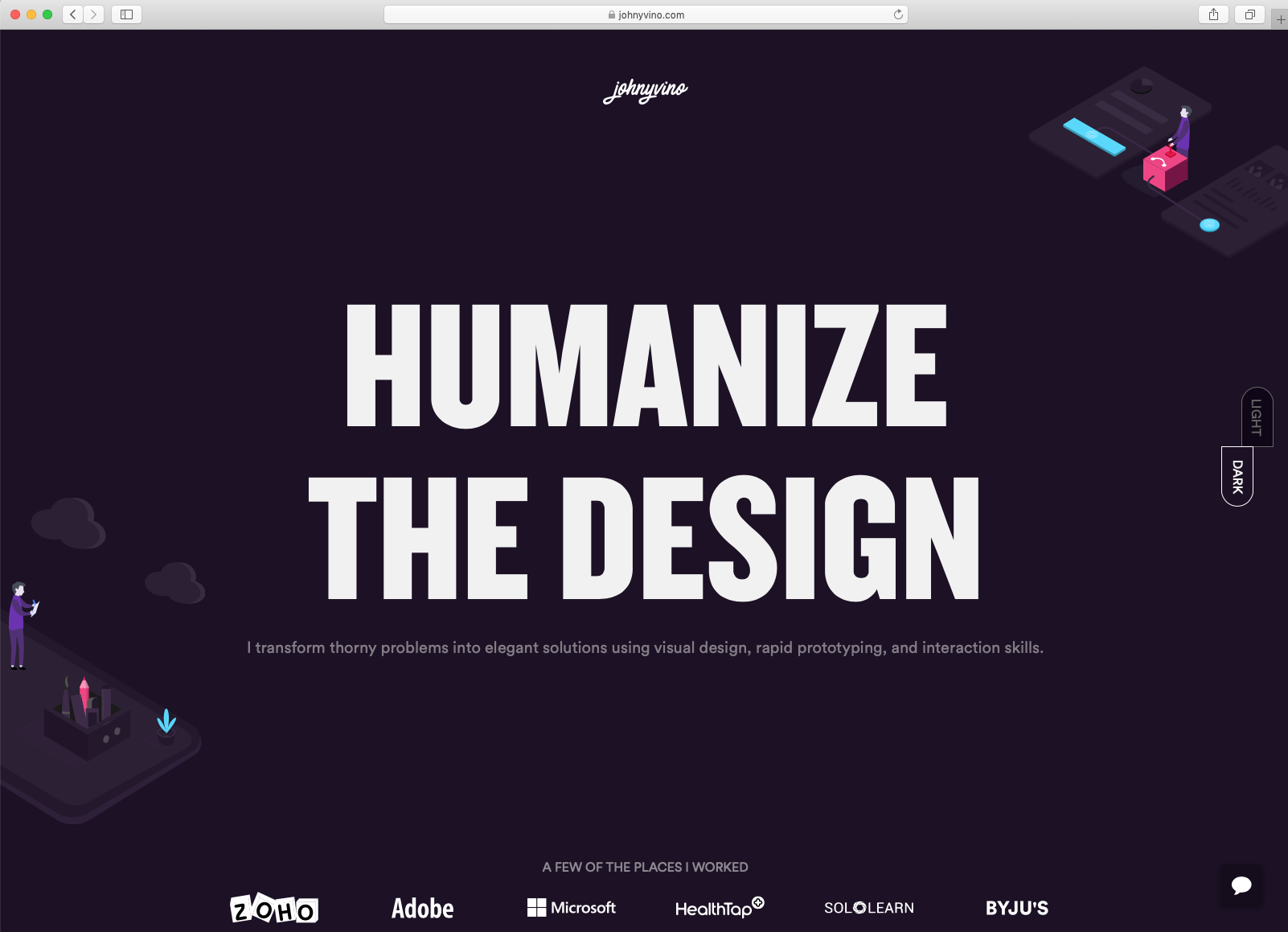
Not an Italian mobster; Johny Vino is an engineers' designer. I've been a long time admirer of his work every since his mind-blowing animations and micro-interactions arrested me mid Dribbble scroll many years ago. He is a thoughtful, meticulous designer that understands how to align user and business goals all while transmuting conventional interaction patterns into something that is altogether transcendent yet familiar.
Case Study Format: https://johnyvino.com/
Process, Goal and Task Oriented that varies with each project
- What he worked on
- What he aim to accomplish
- Business Goals
- Representation of complex data
- Integration
Humans are not perfect. I like to apply 3 principles to ever product I design to help me focus on that. Fitt's Law, Mimicry, Aesthetic Usability Effect
Steph Parrott
Steph is a product designer based in Toronto. Currently working on Plantd and most recently at Square in San Francisco.
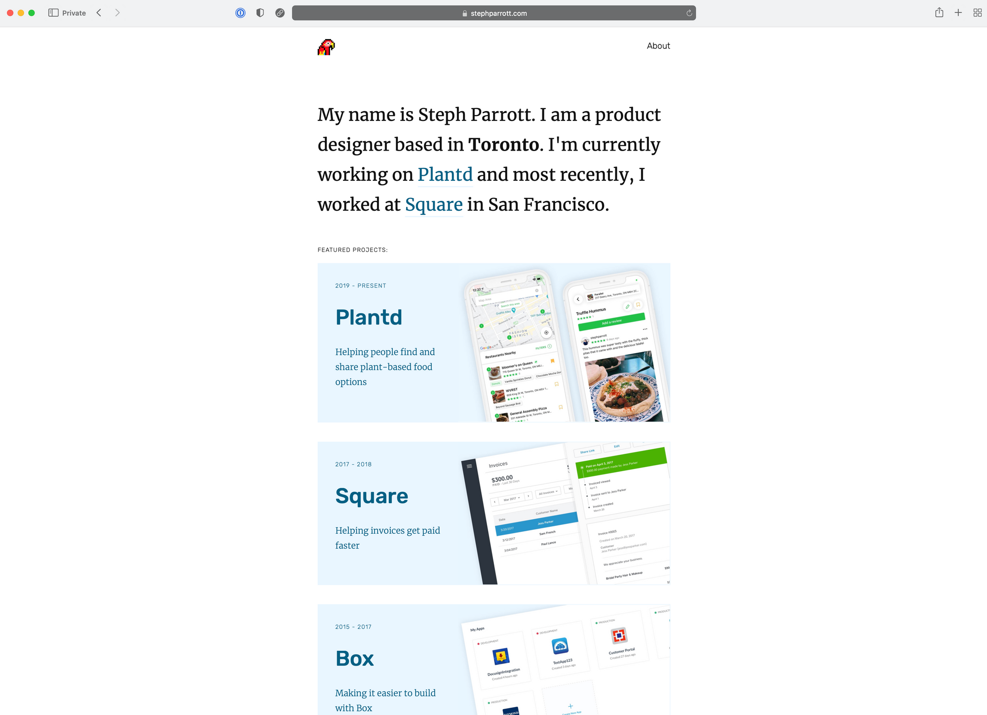
Case Study Format: https://www.stephparrott.com/plantd/
- Overview
- Goals
- Roles and Process
- App Overview
- Research
- Interviews
- Feature proposal
- Design to Development
- Looking to the future and what's next
"As someone who hasn’t eaten meat in almost 20 years, I’m highly motivated to put in the work to find plant-based options, but for those starting to dabble, how can we except them to do the same?" - Steph
Tom Petty
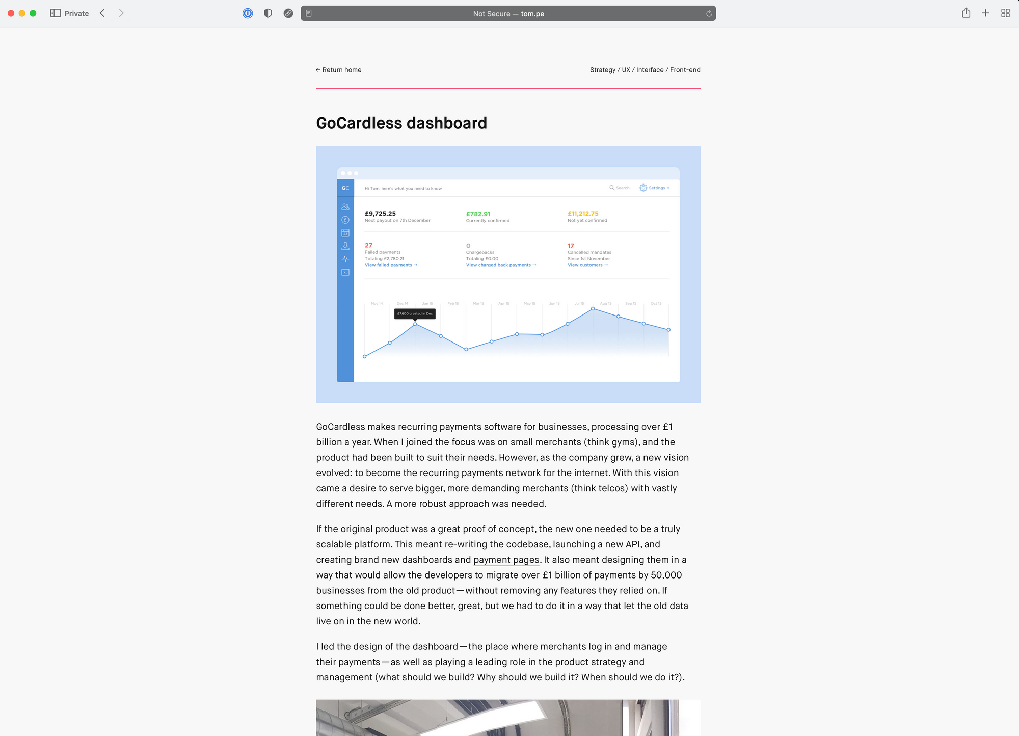
Tom is the co-founder of the community and event series Design Club, and an investor & advisor to Bricklane. He currently works own clients, helping invent, design, and launch new ventures. Before that he held design leadership roles at fashion and fintech startups, and was as a senior designer at a global agency.
Case Study Format: http://tom.pe/gc-dashboard.html
- Summary of the problem space, challenges, project and contribution
- Goal and Problem
- Design Principles applied
- Proposed solution and representation of dashboard and data
- Challenges
- Design frameworks used
- Future considerations
"The problem here is that by trying to create something for everyone, we risked helping no one. Avoiding the design equivelant of an identity crisis became a big focus of mine. I'd do this by finding ways to inject a point of view into the product. By knowing what it wasn't, as well as what it was." - Tom Petty
Want to create an incredible UX/UI portfolio like these full of amazing case studies to get you hired? Enroll in our Product Design Course today!
Garett MacGillivray
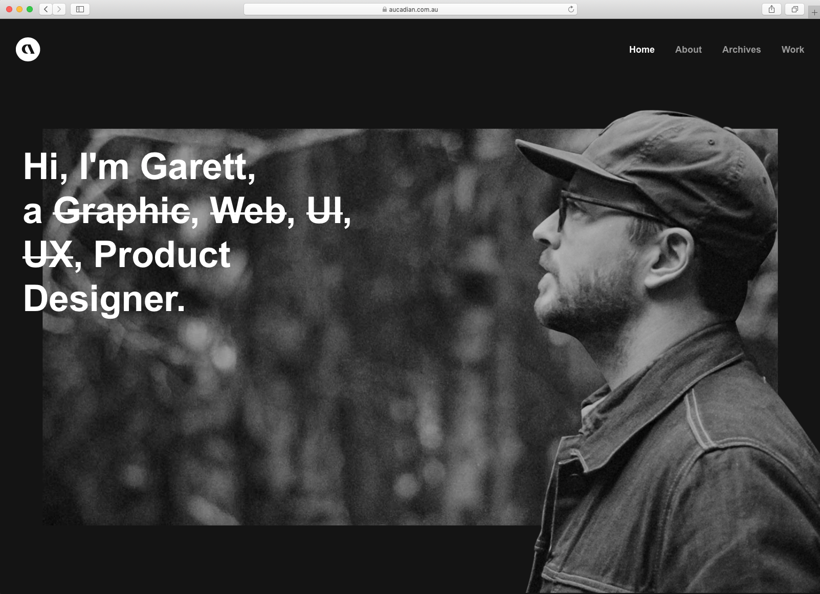
Much like myself and other designers of a particular generation, Aussie/Canadian Garett MacGillivray has been around the block and through the evolution of graphic designer, web design, UI/UX Designers and now landed squarely as a full stack Product Designer.
Case Study Format: https://aucadian.com.au/project/goloop
- His role
- Exploration and Ideation
- Branding
- Component Library
- Website
- B2B product interface
- Mobile App
I've had many labels throughout my career in the digital industry. It's safe to say that I enjoy crafting digital experiences.
Elise Fu
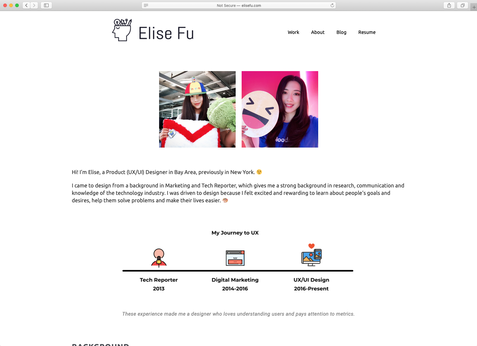
Elise is a Bay Area designer that jumped to the bay from NYU. She comes from an advertising and marketing background and has fine tuned her communication skills and processes vast knowledge of the tech and digital product industry has a whole having been on the broadcasting and marketing side of things.
Case Study Format: http://www.elisefu.com/work-komeeda/
- Impact/Metrics
- Background
- Problem
- User testing
- User research
- Information Architecture
- Design
- Implementation
- Major Findings
- Formal User Testing
- Conclusion
I was driven to design because I felt excited and rewarding to learn about people’s goals and desires, help them solve problems and make their lives easier.
Latiesha Caston
Latisha is a User Experience Designer passionate about holistic, accessible, and inclusive design, based in Seattle.
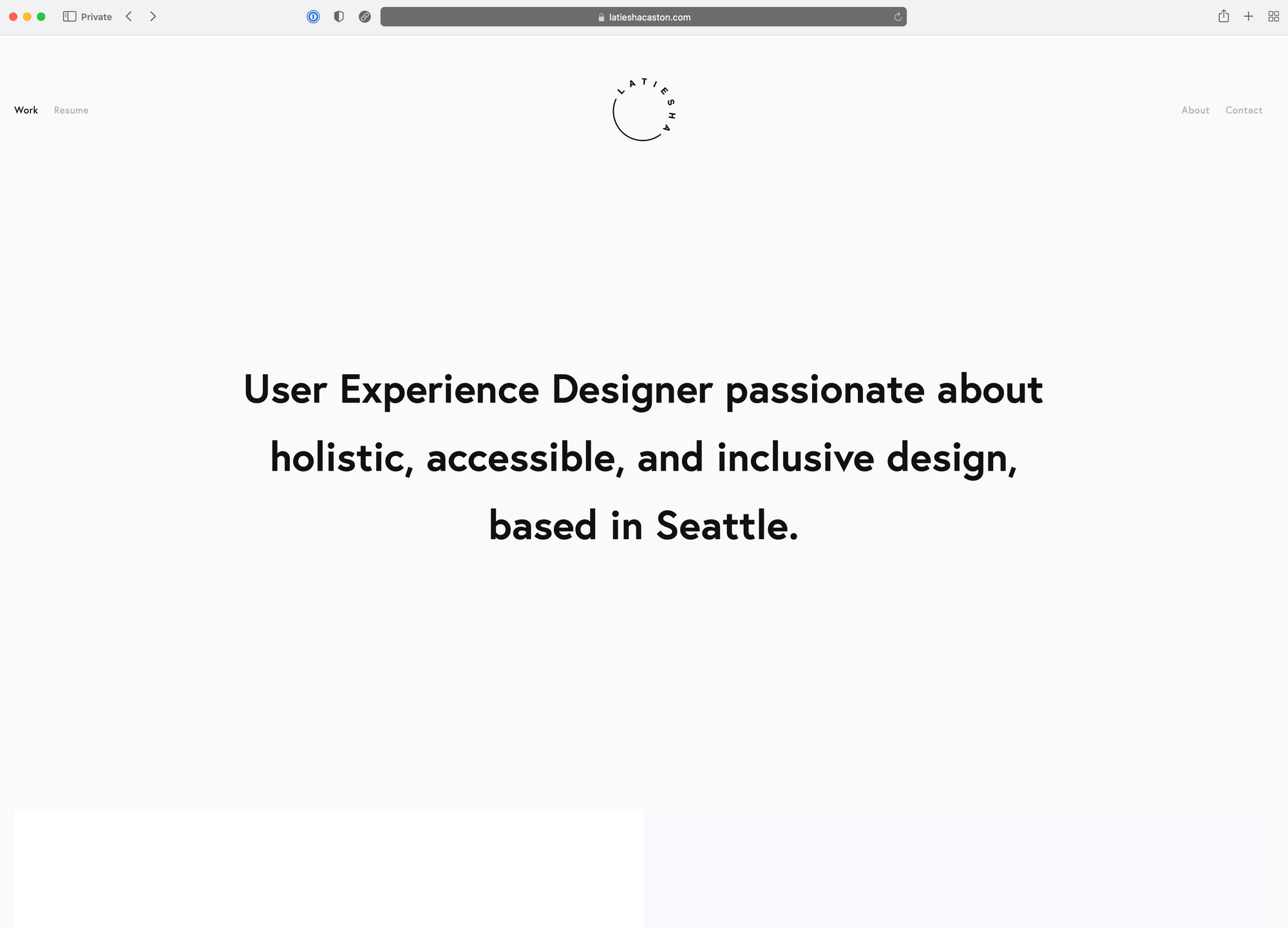
Case Study Format: https://www.latieshacaston.com/veggie-grill-online-ordering-experience
- The Problem
- The High-level Goal
- The approach
- Result
- Pain Points
- Optimizing flow and improving architecture
- Interaction model breakdown
- Challenges
- Looking to the future
"Our high level goal was to design a holistic order-ahead experience that keeps the core of what we've built, while delivering on opportunities, addressing pain points, and setting the stage for the future." - Latisha
Karolis Kosas
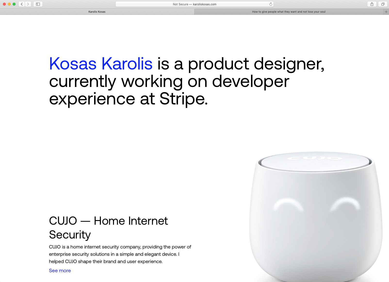
Having recently joined the amazing design team at Stripe as a Product designer, Karolis's portfolio is clean and minimal and his case studies really understand the mental model of the user, getting into their heads and revealing the friction points they are feeling and how he can insert a solution that improves on the experience with compromising the soul of the designer.
Case Study Format: http://karoliskosas.com/cinemaclub/
- My role
- User research
- prototyping
- UI design
- Built the product from zero
- Branding
- Results
Visual communication is a self-sufficient organism capable of adapting and evolving based on the input of multiple sources.Acting in such context, the designer is an initiator, establishing methods and boundaries for the system to establish itself as an independent entity.
Rohit Singh
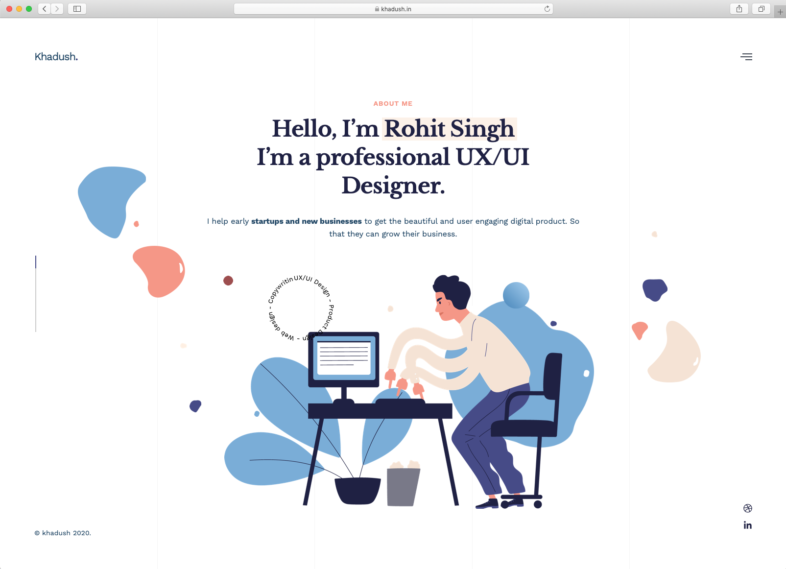
One of our very own graduates! Rohit Singh is an up and coming product designer with a focus on helping early-stage startups and new businesses blossom.
Rohit outlines his process for creating an MVP for his digital product from scratch, which serves as a sort of physical and virtual library for the poorest class of India.
Case Study Format: https://work.khadush.in/booksite-an-online-physical-book-sharing-platform/
- Inspiration
- Validation
- User Interviews
- Lean Canvas
- Information Architecture
- Visual Design
- UI Design
- Mistakes
- Problems
- Final Words
I specialize in helping early stage startups validate their riskiest assumptions using leading design methods
After analyzing all of these case studies and working with 100s of designers in our product design course to get them ready for the job application process, we've created our own tried-and-true templates to make it easy for designers to replicate the successful format and structure of these top portfolios using Notion.
Each of these amazing portfolios tells the story of the product designer, their evolution, their process and shows what they bring to the world. But it's not easy doing what they do or knowing exactly how to show and tell who you are as designer. Having a solid design education and getting feedback from the design community is the best way to ensure that your work is up to par and being presented in a way the shows your skills and your worth.
Have a look at our partners' advice over at Pathrise on building a strong UX design portfolio.
