There are a lot of usability heuristics and design best practices that we can (and should) follow to improve our user interfaces and the experience for our users. But to simplify things, here are a few simple things that you can focus right now that make users enjoy (and keep using) your products.
1. Atmosphere
Branding, Copy and Tribe
Even though Facebook, Twitter and Instagram all have a similar purpose; to connect us through social technology and even though the user flows and features are all quite similar; post text or a video, like and share.
If you've ever used Facebook or Instagram you can instinctively pick up on the 'vibe or atmosphere' based on the branding, tone of commentary and the communities (tribes) of people that contribute to the platform.
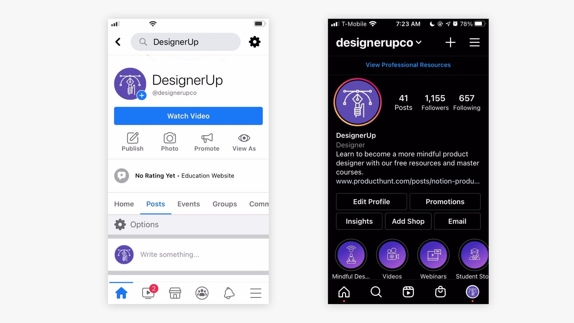
If you're about my age, Facebook has that my 'mom and dad’s social media' vibe while instagram has that 'I’m too old for this vibe'.
What you want is to leave your users thinking. “I'm one of you! You get me!”
Even if your product is in a highly competitive space - think about how you can differentiate yourself in these 3 areas and make your particular target audience or tribe identify more with you over the others.
2. Ease and Friction
Don’t make it hard for them
Users try a product in order to check off a functional, emotional, psychological or social task from their to do list.
The more interface, design and steps there are to getting that box checked, the more quickly you will loose that user or fail to convert them to a customer.
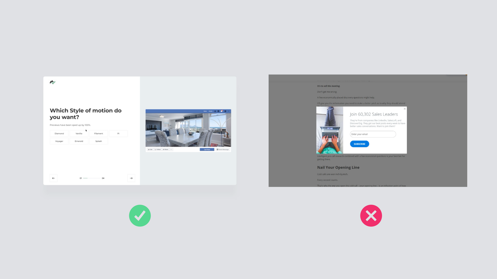
Do things that are helpful - Onboarding, easy account setup.
Don't do things that aren’t helpful - Popups before they've even had a chance to read the blog article.
The goal is to get them to say “Yay! Now I can check that off my list!” with the least amount of effort as possible.
3. Mental Model & Mind Mapping
Match their expectations
The more the task flows of an app feel and behave the way we expect them to, either because it mimics things the user is already familiar with or excels at doing it better) the better chance you have at keeping them around.
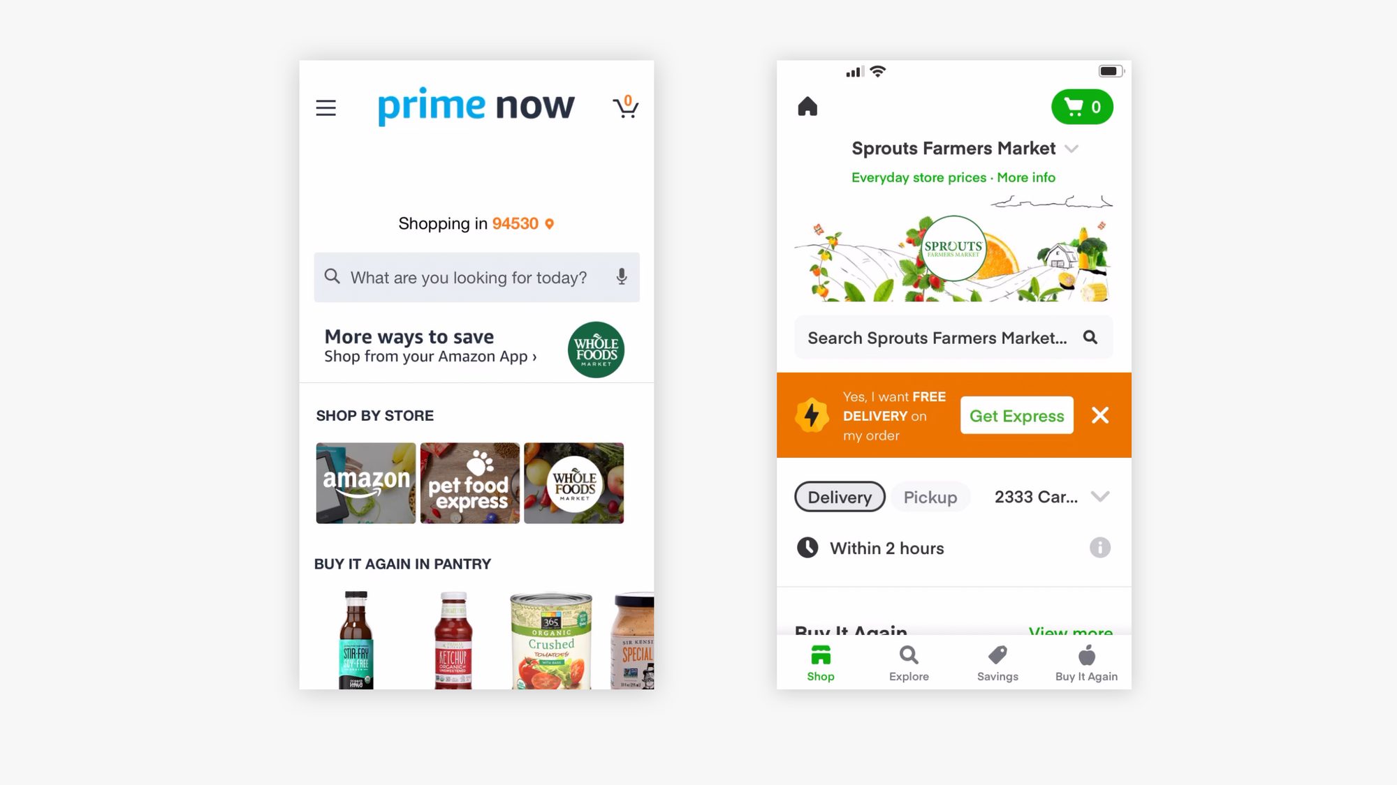
Take Instacart vs Amazon Prime. Both apps allow you to do similar things, yet they each have a slightly different way of doing it.
Understand your market and what they are already using and see how you can match or improve on that and get them to say yes… “This matches how I expect it to be“.
4. Flows that Flow
Sherpa their journey
A good UX almost feels like it reads your mind, it takes you down logical forks in the road and gives you directions along the way, it shows you how get back to where you came from or how to explore unfamiliar territory safely.
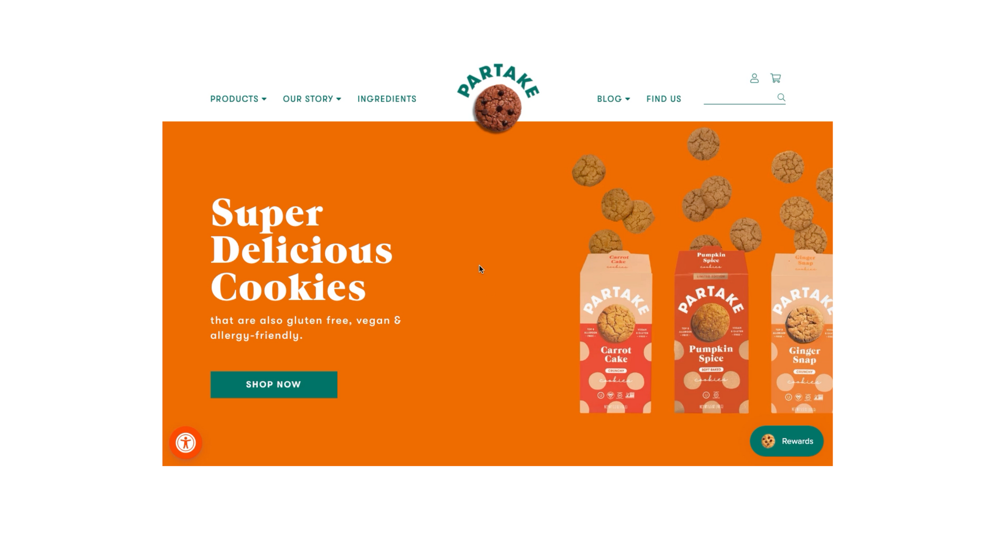
Be like a kind and adventurous sherpa and get your users to say "Thanks for guiding me through the process”.
5. Freeness-ish
Provide more value than it’s worth
Truth be told we love that feeling of getting more than what we paid for even better if we get it for free.
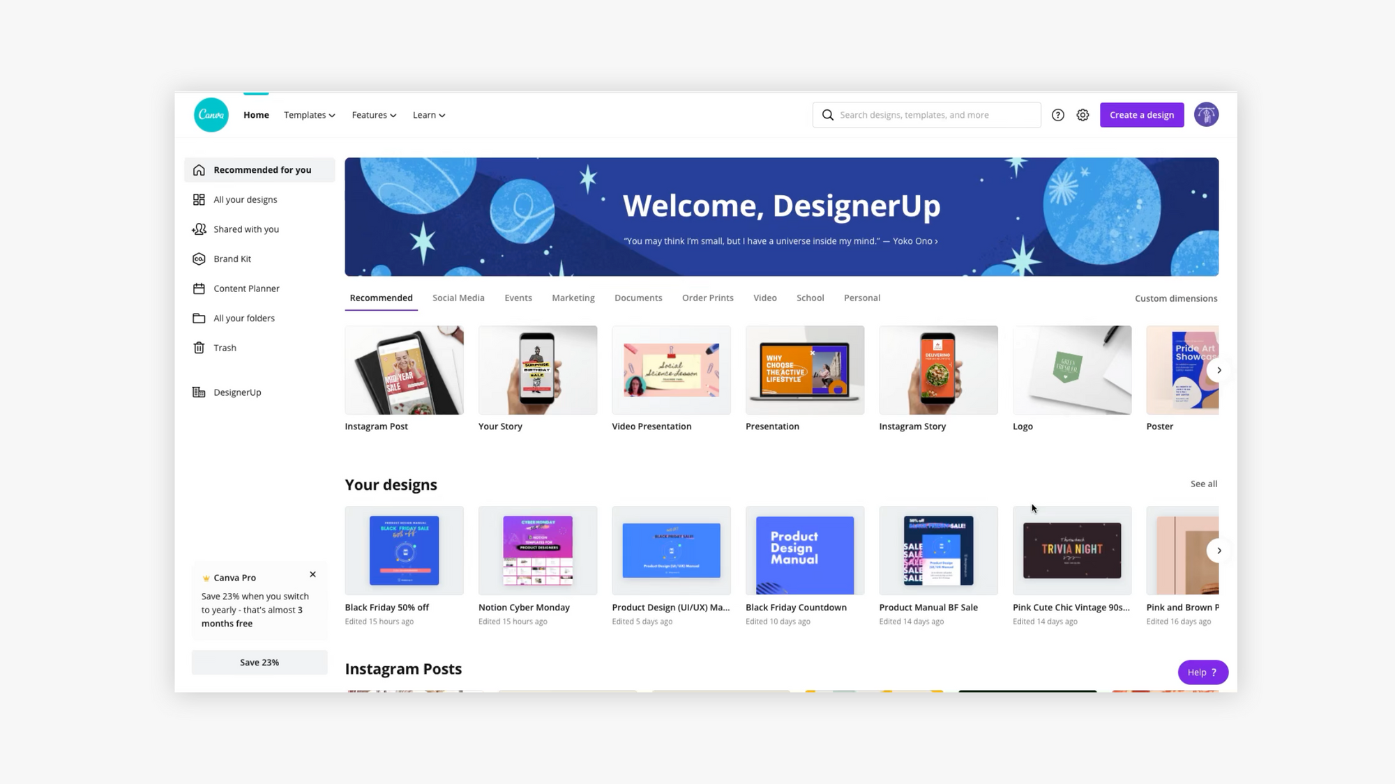
Canva is a great example that gives user so many features and so much functionality on just a free account. The user experience and mental mapping is exceptional and because of that people often want to convert to the paid version to unlock all of their awesome features.
It’s a tall order but if you can over deliver when it counts you could end up with customers for life...or at least for a really long time in tech years.
Aim for that chill down-the-spine moment when user sneekishly thinks to themselves “I can't believe that's all they are charging for this or I can't believe this is free!”
These hot tips are based on the foundations of usability heuristics, UX laws and best practices.
If you’d like to explore more of these things, we have a free UI and UX design checklist that you can download for Notion or as a PDF.
Learn Product Design (UX/UI) and how to create more usable and delightful products with us!
