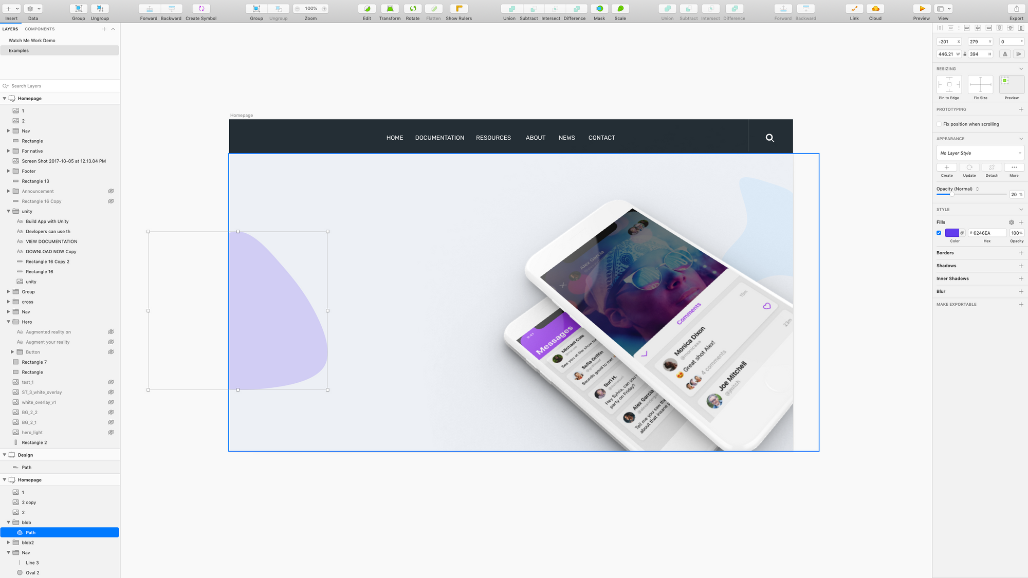
Picking up from my last Watch Me Work Wednesday, I've had just added some lovely device mockups and trendy blobs to my landing page and so you might be wondering how did I pick the colors?
Well there are a couple of color palette generators that I recommend when you're just starting out and you are still getting the hang of color theory, color harmony and choosing color schemes and color palettes for your designs. And we use these over at Desginerup.co with our students in our product design master course.
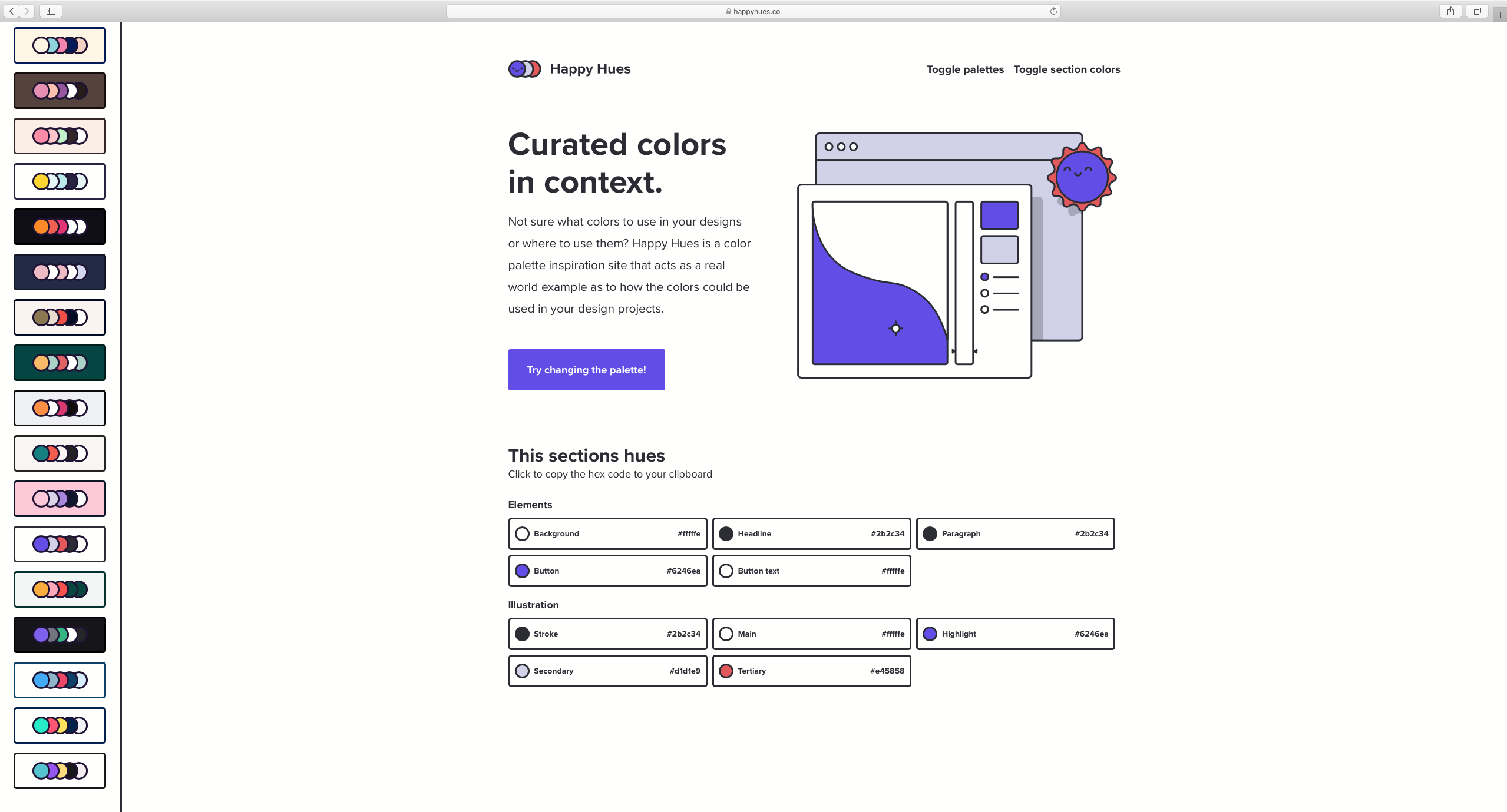
One my favorite quick and dirty tools to use is Happy Hues by Mackenzie Child.
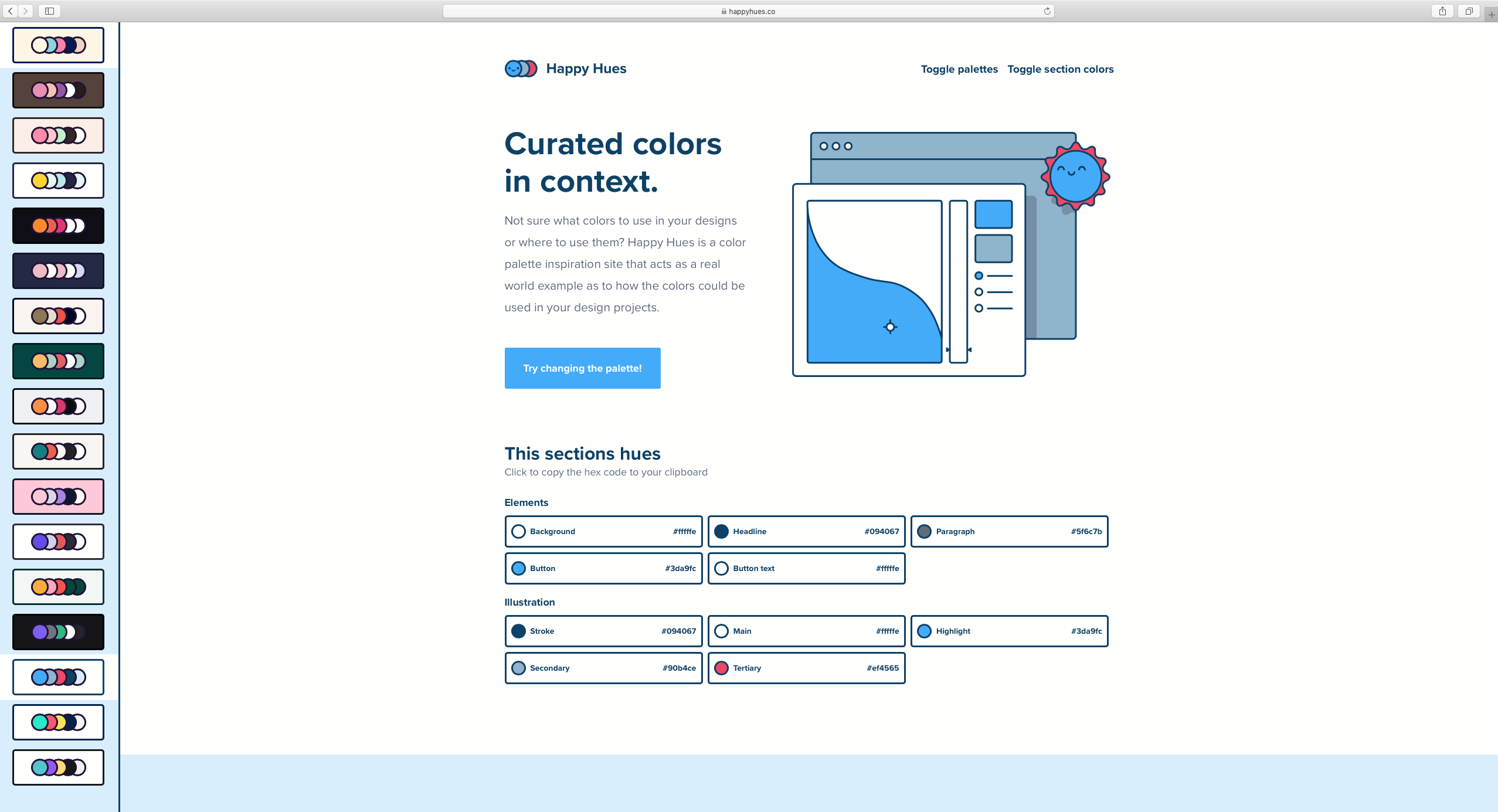
One of the big issues I've also found with most color palette generators as Mackenzie points out, is context. Seeing color schemes in isolation can be really different then seeing what they would look like on your actual UI designs, but Happy Hues takes care of that.
Here's how I use it to kick off my design:
✅ Head over to Happyhues.co
✅ Select one of the pre-made color palettes.
✅ You can preview them by selecting a combination from the left-hand sidebar.
What's really cool is that you get to see what these colors look like in context in an actual design. You can see the header font, body text, buttons, even illustrations.
✅ Scrolling down you easily one-click copy the hex codes for each element right to your clipboard so you can paste them into your design software.
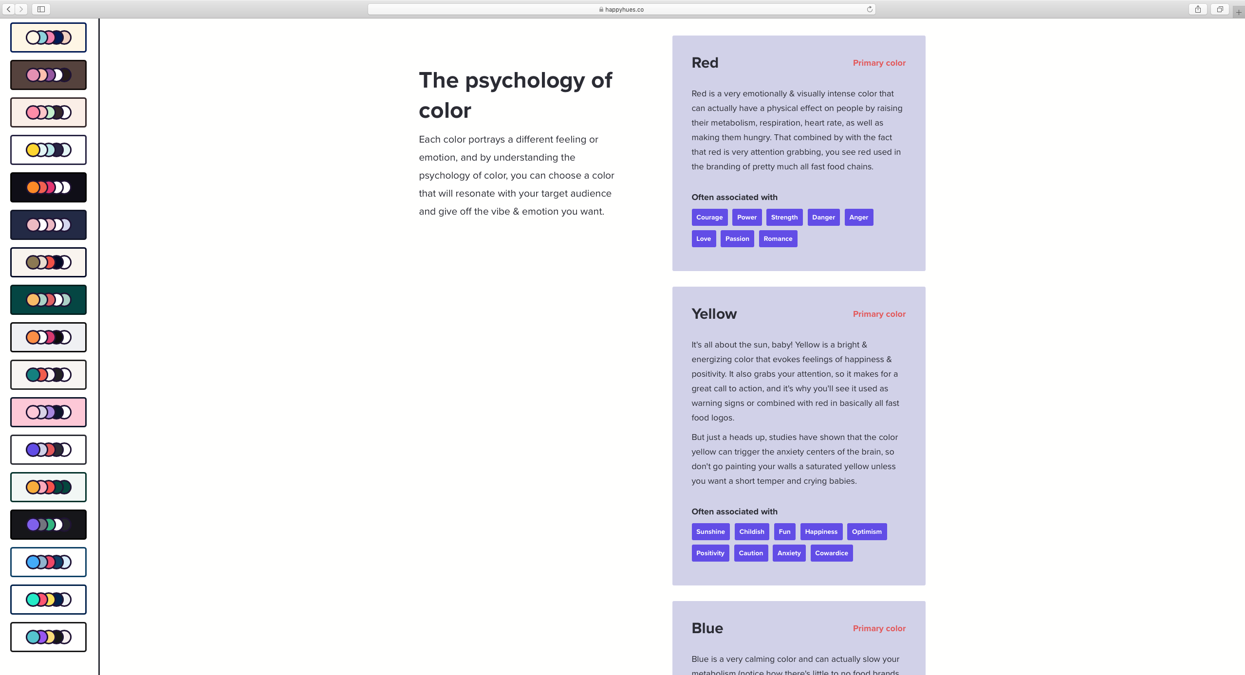
You can see them used on cards here and even better these cards also explain the theory behind color. Again this is just a quick shortcut tool, of course I always stress the importance of really studying and understanding color theory and color harmony and it's application and you can learn much more about that in detail in my video UI Design | How to choose colors and color palettes.
If we keep scrolling here we can read about the psychology behind these colors and the adjectives and associations commonly tied to them, which I really appreciate.
I went ahead and chose color palette 6 as a starting point
And back over at my design, that I'm continuing from last time, I'm just going to copy and paste the hex onto one of my trendy blobs, and then lower the opacity and voila!