
I was a bit stuck on creating a color system for the design system of a product I’m working on. The problem was, I already had some existing colors that I needed to incorporate, and my devs are using Tailwind, so I needed to customize things by hand and expand my scales.
I found a lot of tutorials on generating color styles, using a plugin or borrowing from an existing design system (many of which I wrote myself 😏) — but almost nothing that walks you through how to do it from scratch manually.
So after a few failed attempts (and creating far too many tiny color swatches), I thought I'd share my not-so-terrible final workflow:
1️⃣ How I pick a color palette from scratch
2️⃣ How to turn it into color scales.
3️⃣ How to convert those into styles and variables
4️⃣ How to generate a style guide that you can hand straight to developers.
Tailwind’s Color Palette—Explained
This is Tailwind CSS's Version 4.1 default color palette and to touch on it briefly, if you don't know Tailwind is just a CSS framework that developers love to use.
It includes all of these colors in code so they don't have to think about picking all of these scales, shades and tints for products making easy to implement colors. Most designers, however, want to customize this or use their own brand colors.
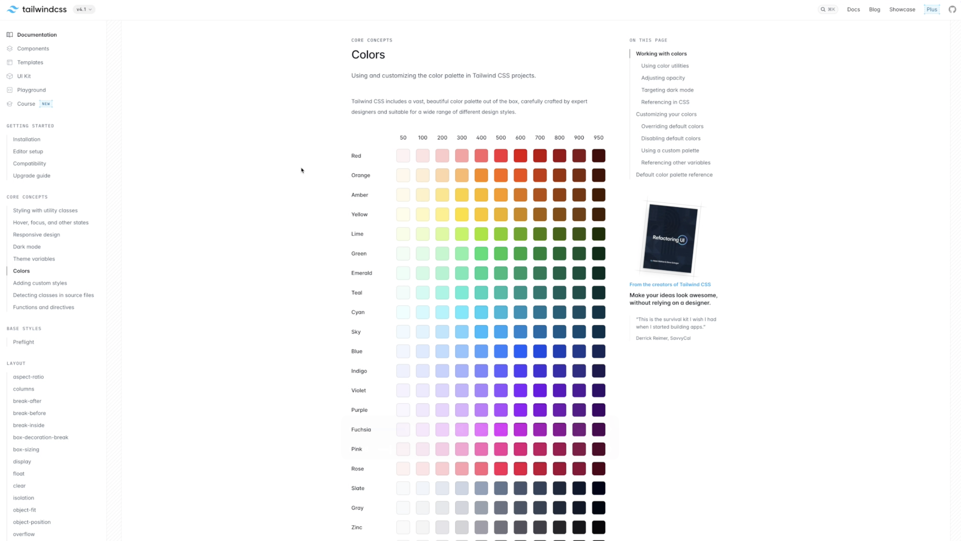
Now if you're wondering why we use THESE numbers, well Tailwind inherited Google Material's 50 through 900 tonal ladder because it already mapped to 11 perceptually even light to dark color stops. It also keeps class names short and sortable while still leaving plenty of numeric gaps for future shades (like the later 950 that was added) It also helps avoid any conflict that a literal 1 to 10 or 1 to 100 scale might create with percentages and other utility scales that are often used.
💡TL;DR - Why the numbers?
- Tailwind inherits Google Material’s 50 – 900 tonal ladder—eleven perceptually even stops from light to dark.
- Class names stay short and sortable (
bg-blue-500). - Numeric gaps leave room for future shades like 950.
- It avoids clashes with other “1-to-100” scales you might use elsewhere.
Tailwind’s numbering isn’t mathematical, but it isn’t random either: it’s a perceptual ramp. The goal is to change perceived lightness in roughly even steps while keeping the hue nearly steady.
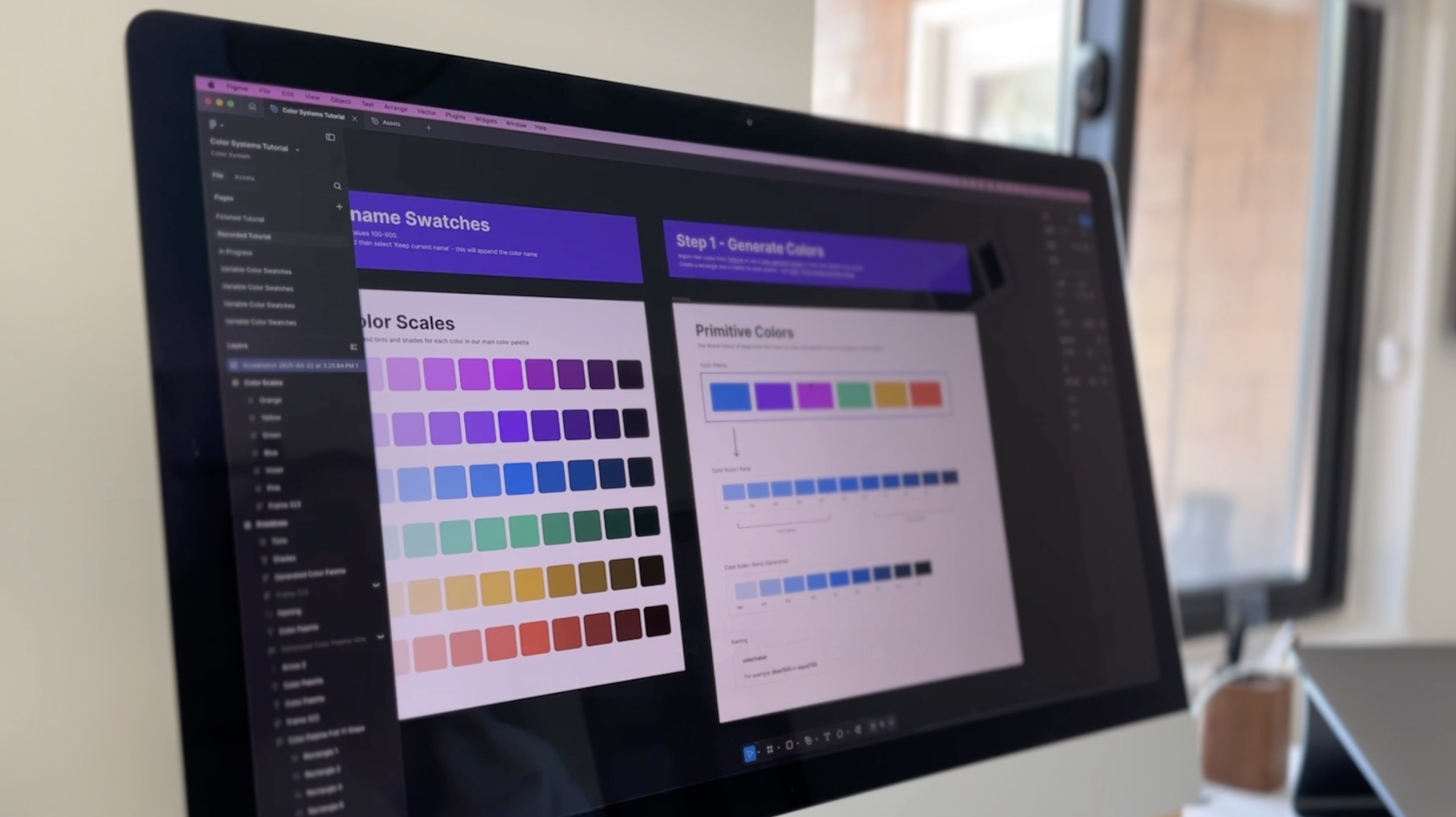
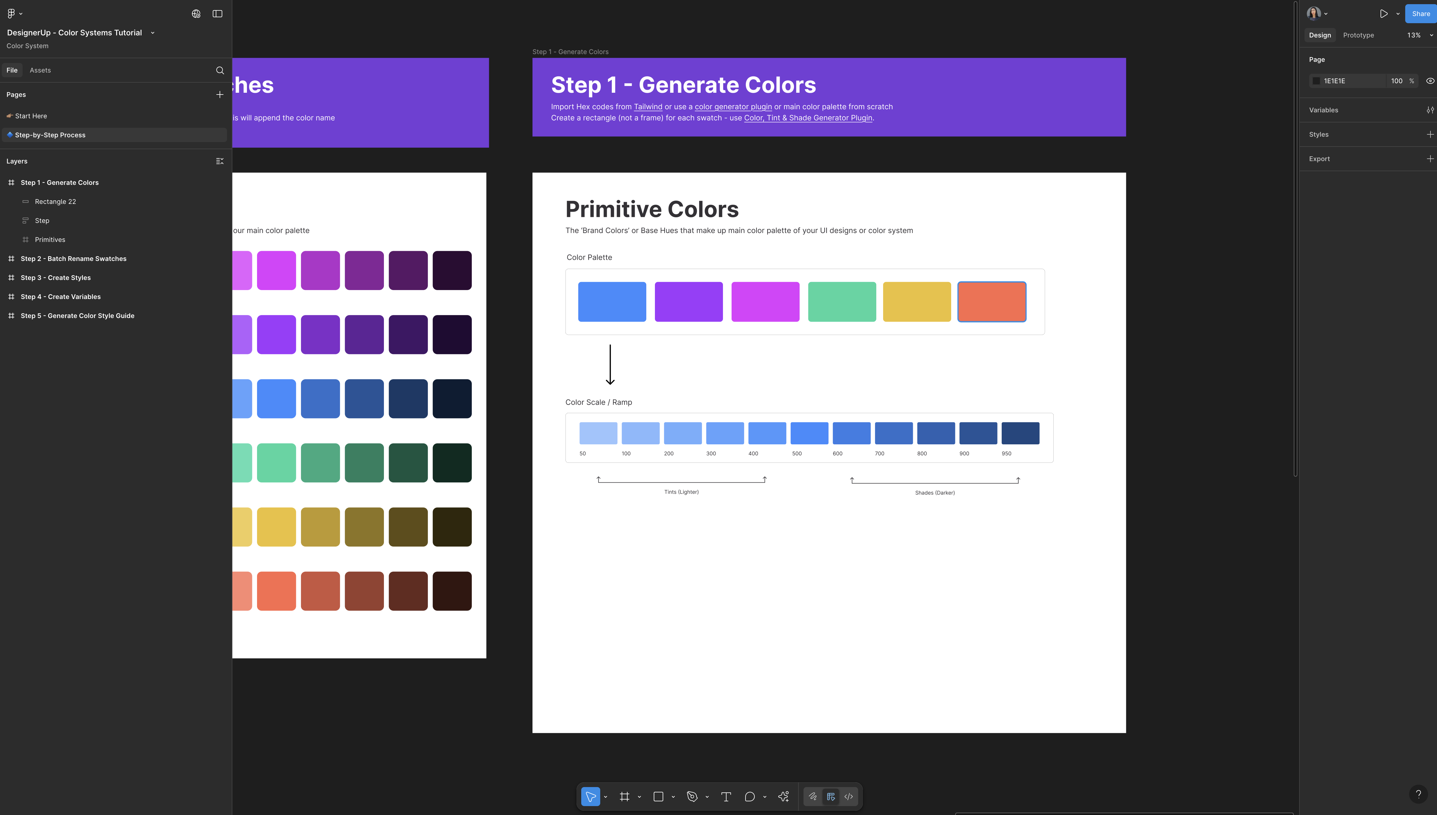
Step 1 – Choosing a Color Palette
Now let's get into Figma, and we’ll go step by step.
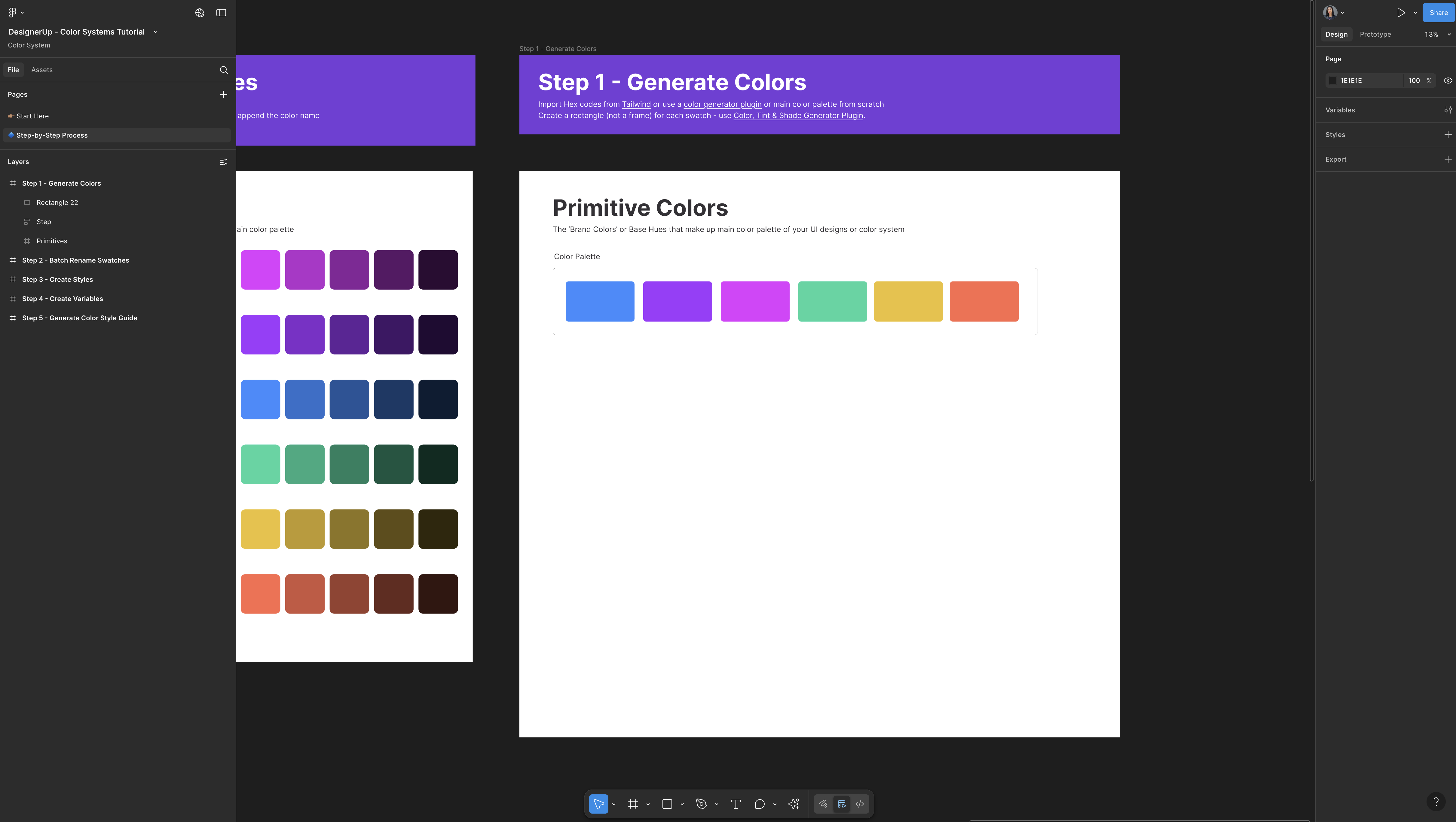
1. Create a frame in Figma—that frame will hold your entire palette. Inside it, draw one rectangle (yes a rectangle from a frame; there is a reason for this which we'll get to later). Give the shape some rounded corners for style.
2. Draw rectangles to build the palette, duplicate that rectangle across a row, then nudge each duplicate’s Hue in the HSB color picker while leaving Saturation and Brightness untouched. Keeping those two values identical perfectly balances every swatch, so the colors feel like they belong together.
3. Duplicate and repeat using this method to tweak an existing palette, build one by hand, or generate something brand-new—the technique works either way. By the time you finish, you’ll have your primary, secondary, tertiary, and alert hues (think red, orange, yellow for notifications and warnings) ready to go.
4. Add a heading above the row—these are your primitive colors, the base hues that power the rest of your system.
Real-World Color Inspiration
Now, if you need inspiration for picking that initial color swatch or that initial color palette, there's nothing better than getting inspired by real apps and products that are live in the wild, and that's why I absolutely love about Mobbin.
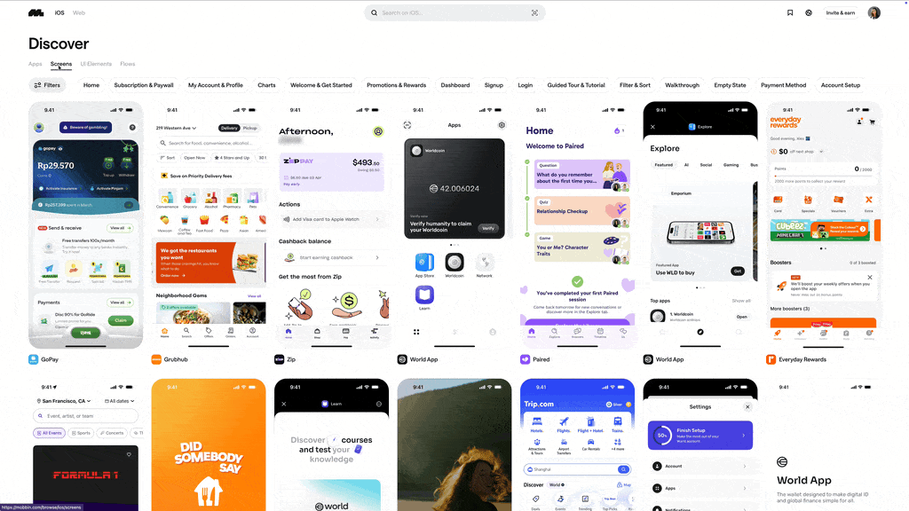
They catalog and categorize all of these apps and flows and prototypes from the world's biggest companies. You can view by mobile or web app, and there are lots of sorting and filtering options. You can even look up a UI elements and you'll be able to see all of the colors that they've chosen to use.
When you find some screens that you like, you can bring these directly into Figma, using their plugin so you can select these colors for your own color palettes.
How to use Mobbin:
- Filter by platform or UI element.
- Import screens into Figma with the Mobbin plugin.
- Sample colors directly.
Step 2 – Expand Each Hue into a Color Scale (Tints & Shades)
Each primitive color needs its own 11-step ramp. The base color sits at 500. Anything to the right (600 – 950) is a shade (darker). Anything to the left (50 – 400) is a tint (lighter).
Take one swatch—let’s use the blue—and create a tonal ramp. Tailwind uses 11 steps, so place the base color at 500. Everything to the right becomes progressively darker shades (600–950), and everything to the left becomes lighter tints (50–400).
Example Color Scale with Tints and Shades
| 50 | 100 | 200 | 300 | 400 | 500 | 600 | 700 | 800 | 900 | 950 |
|---|---|---|---|---|---|---|---|---|---|---|
| Tint | Tint | Tint | Tint | Tint | Base | Shade | Shade | Shade | Shade | Shade |
Manual method (HSL)
- Duplicate the 500 swatch to create 600.
- Switch to HSL and drop Lightness about 10 points.
- Repeat for the remaining shades.
- For tints, raise Lightness 5–10 points per step.
This isn't necessarily the fastest way or the best way to do it, but it does give you a keen understanding of how these scales are derived, what the ramp is and what the numbers mean.
Plugin Generator Method
Once you understand how these scales are derived, you can speed things up by using a plugin or generator if you so choose. I like to use Color Tint & Shade Generator Plugin then just paste any hex value (usually the brand color or 500 mark), and hit Generate. In seconds you’ll have a ready-made ramp.
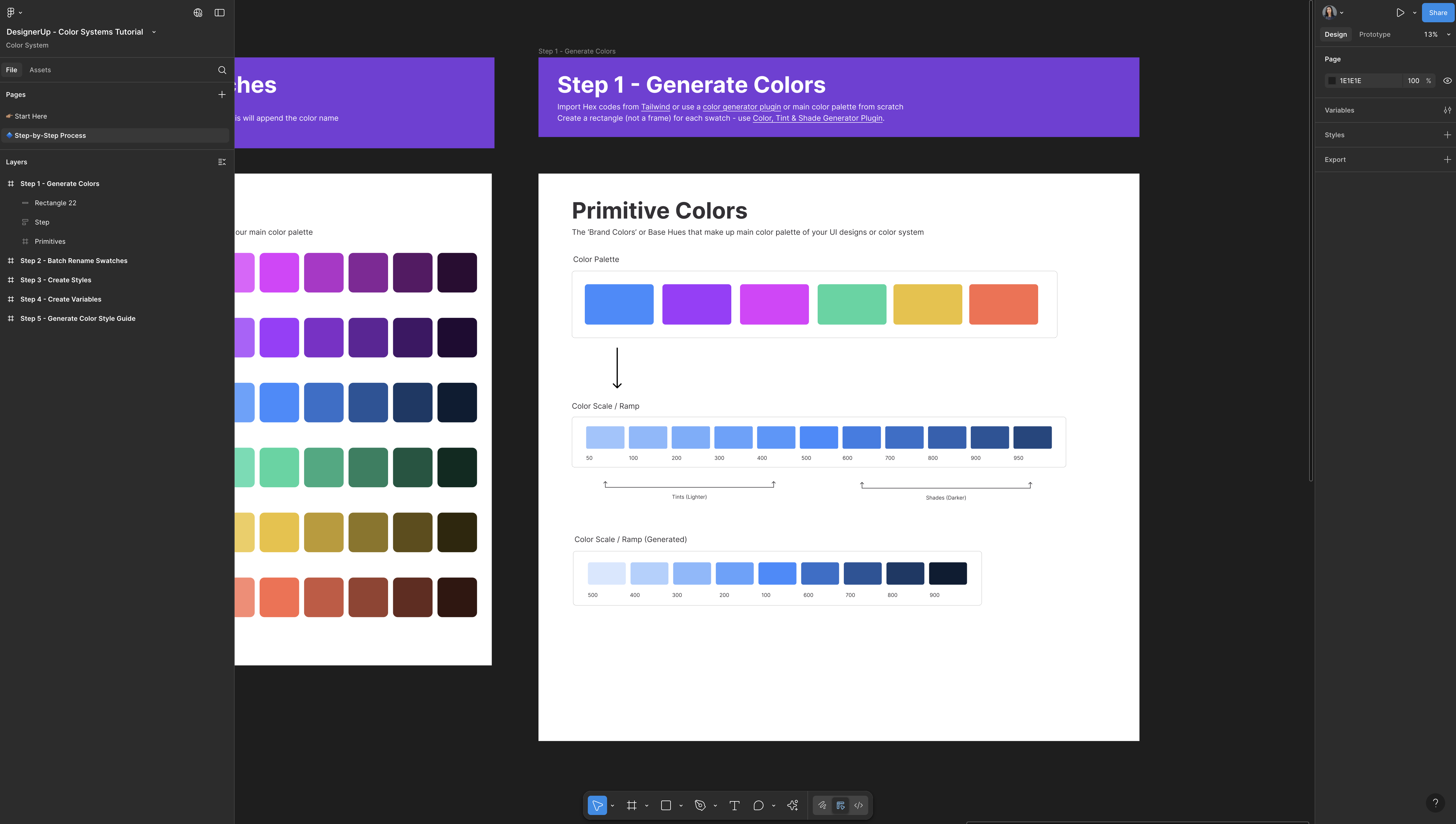
Generate Ramps for Every Primitive Hue
Drop each primitive hue into the plugin and let it crank out a ramp. Repeat until every brand, accent, and alert color has its own scale.
Remember, flexibility is the point: if an existing color needs a nudge or fails contrast, you can always regenerate or fine-tune individual stops.
With this palette, you can resize the row, adjust column widths, or spread the swatches out—whatever helps you match the rest of your file. The plugin keeps the base swatch at 500 and produces five darker steps (600–900) plus four lighter tints (100–400). The extreme endpoints—50 and 950—are omitted, but you can add those later if you need the full Tailwind ladder.
Note: Most plugins create nine steps instead of eleven; that works to—just fill in 50 and 950 if you need the full scale.
Naming Conventions and Bulk Renaming
We're going to keep the color naming simple which will help us later batch rename things faster and create styles and variables.
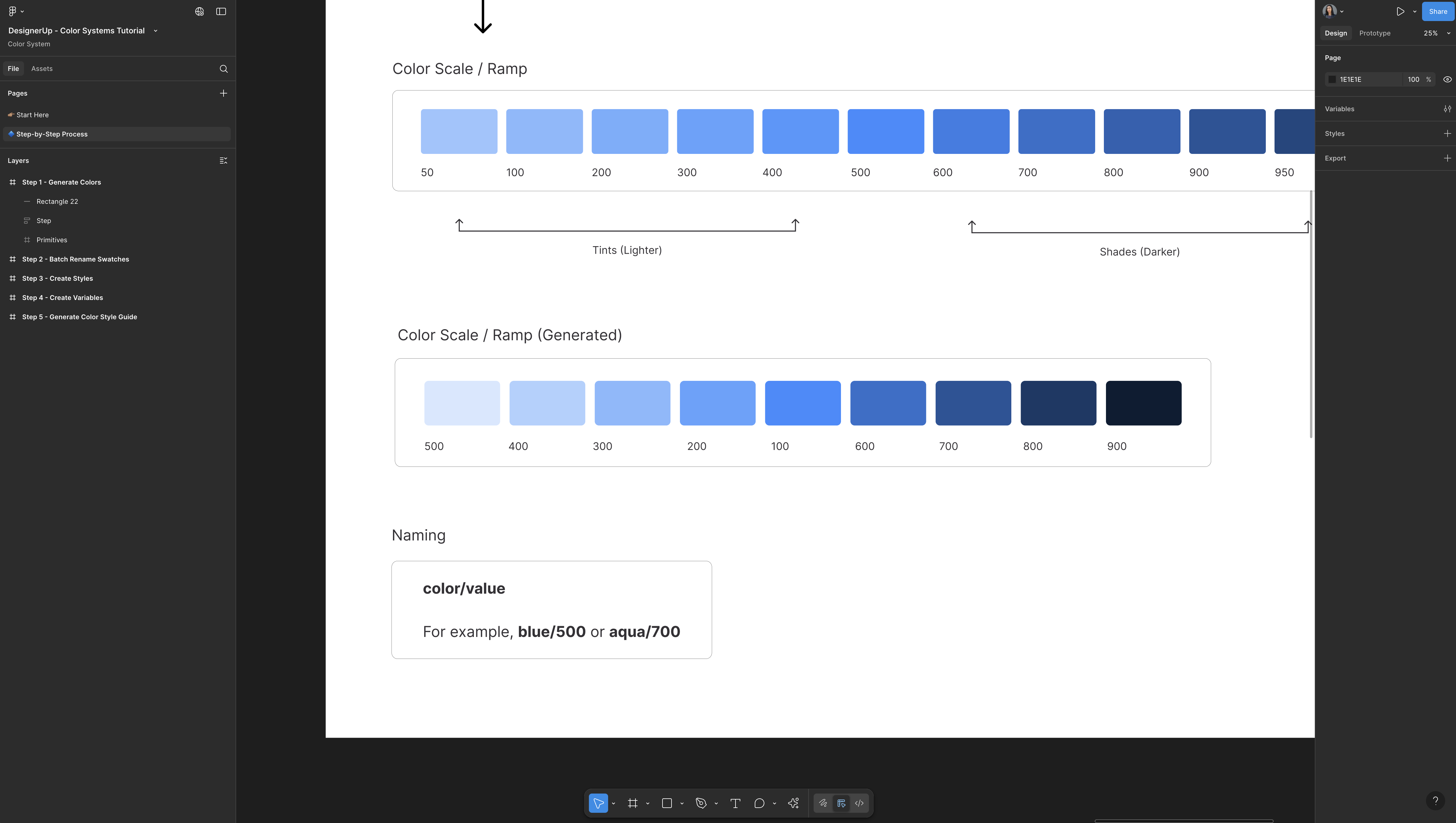
Use colorName/number
blue/500aqua/700mustard/300- Etc
(lower-case color name, slash, numeric value, no spaces)
Bulk-Rename Swatches to Tailwind Format
Once each ramp is in place, swap out those hex labels for Tailwind-style names. Figma’s native Bulk Rename feature makes the job painless—no extra plugin required.
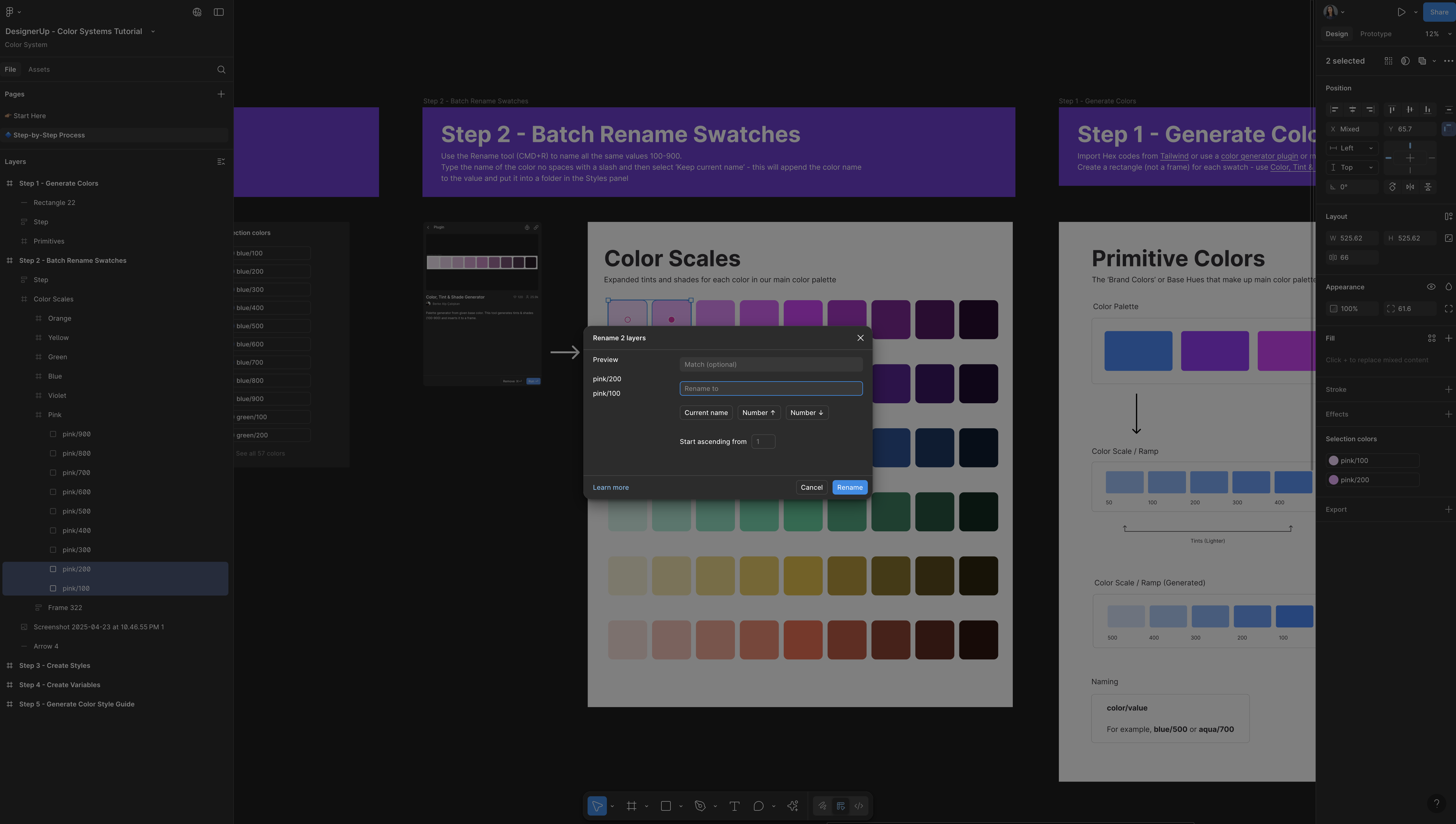
- Rename the frame. Select a ramp’s frame (for example, the one labeled generated color palettes), type a simple hue name like
pink, and press Enter. Figma automatically selects every swatch inside that frame. - Assign numeric values. With the swatches still selected, press ⌘ R (Rename), enter
100, and Figma numbers the row100…900in sequence. - Append the color name. Select the same row, hit ⌘ R again, type
pink/followed by{current}, and confirm. Each swatch now readspink/100,pink/200, and so on—exactly the convention Tailwind expects (lowercase hue, slash, numeric value, no spaces). - Repeat for every ramp.
violet,blue,green,yellow,orange—same two-step rename routine, done in seconds.
Step 3 – Convert Swatches to Styles
All we're going to do is take all of these colors, and use this plugin called Styler.
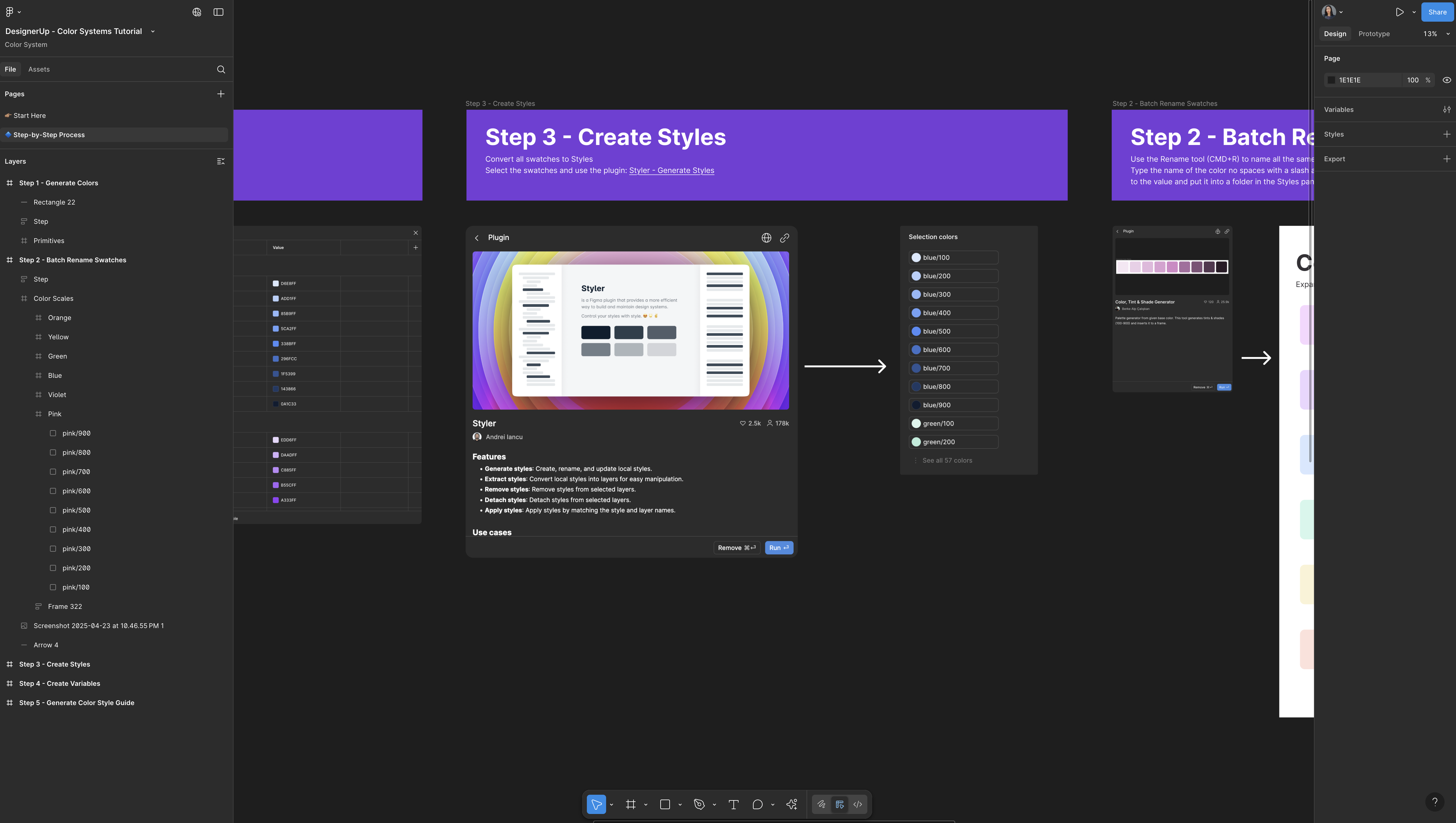
- Select each ramp’s swatches.
- Press ⌘ R (Rename) in Figma:
First row →100,200, …900. - Append the color name (
pink/100,pink/200, etc.). - Run the Styler plugin and click Generate Styles. Figma instantly creates perfectly ordered styles.
And just like magic it made all 54 styles from 100 down to 900, perfectly ordered.
Step 4 – Turn Styles into Variables
Turning Styles into Variables is pretty easy again using the Style to Variables Plugin.
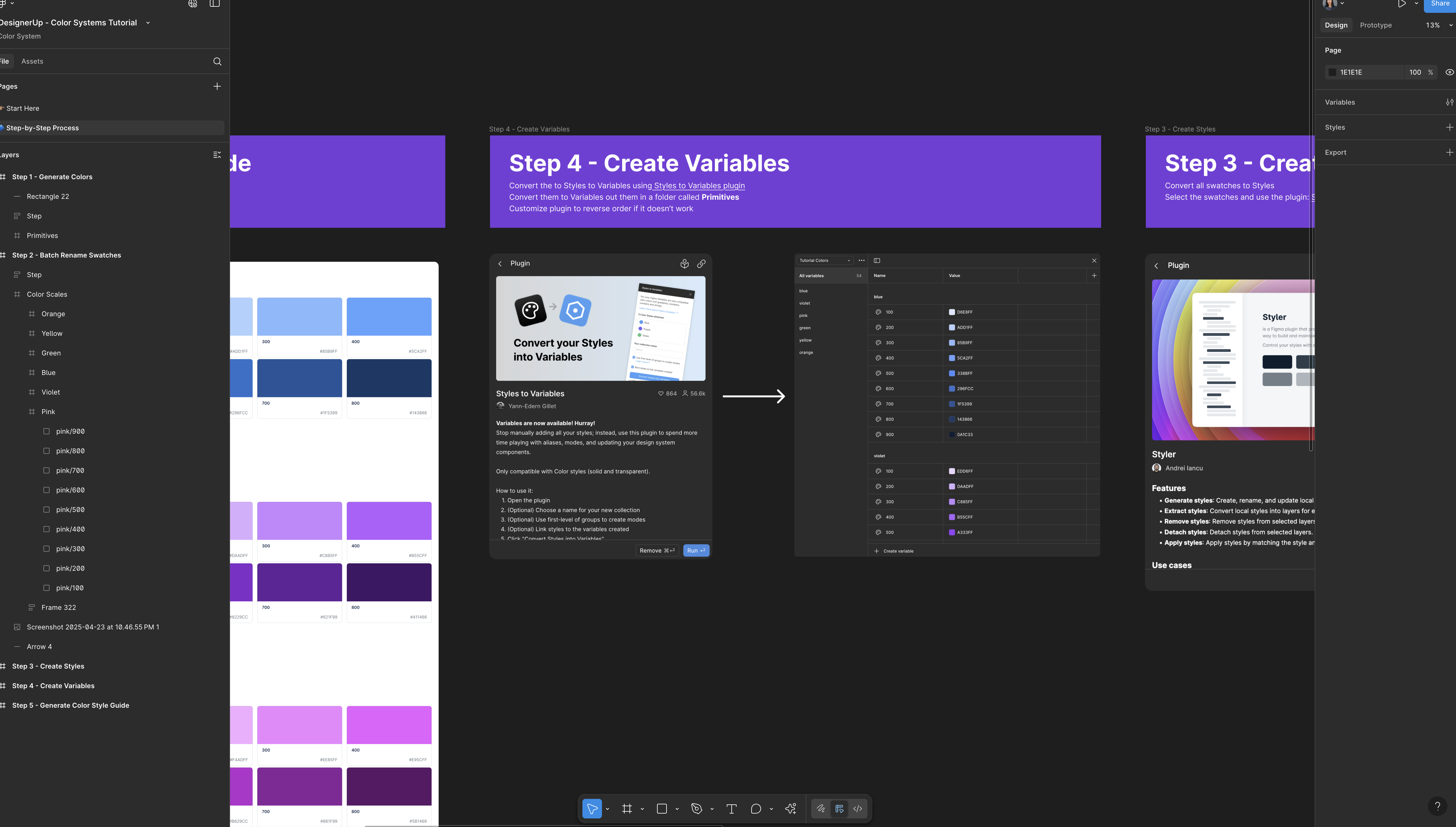
Find the plugin—styles to variables—and you'll see that it's selected all of our styles, we can name this collection and I'm just going to call this primitive colors.
There are a few other options here—grouping, binding styles to the variables created—but we're just going to convert these styles into variables.
- Run Styles to Variables plugin
- Select all styles, name the collection (e.g., “Primitive Colors”), and click Convert.
- In the Variables panel you’ll see every swatch, ready for theming or semantic aliases.
To find your Variables panel - Deselect everything on the canvas, come up to variables icon and there are all of our colors that we created turned into variables and now you can go ahead and semantically name those if you choose to.
Step 5 – Build a Share-Ready Style Guide
By now every swatch carries a Tailwind-style name, but the underlying hex values are hidden inside styles and variables. To hand off brand-ready specs—or drop colors into marketing decks—we still need a visual style guide.
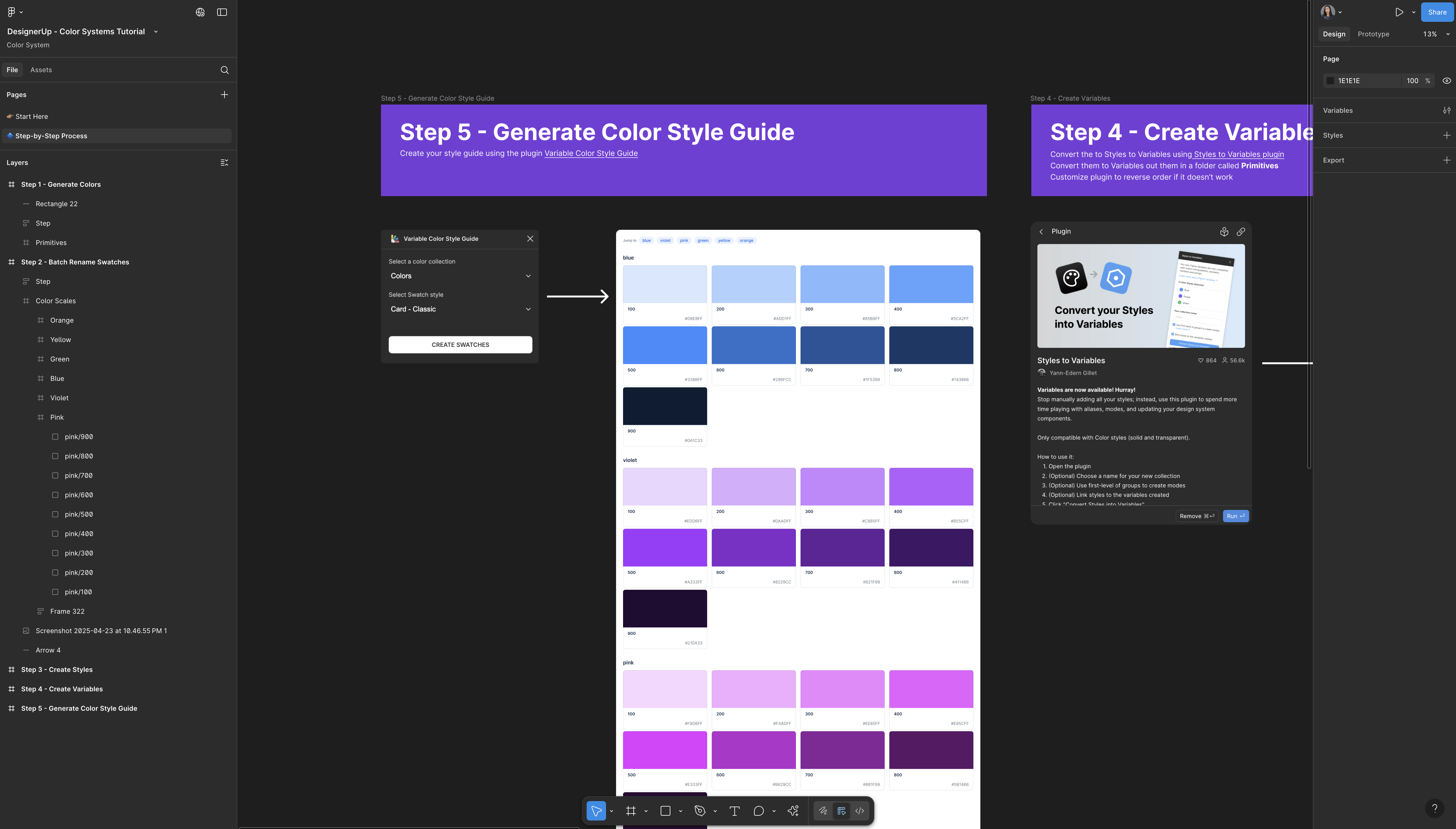
- Fire up the Variable Color Style Guide Plugin (Plugins → variable color style guide). Two quick choices:
- Palette: select primitive colors—the variable collection you just created.
- Layout: pick a template. Modern gives a neat grid; Classic mimics old-school brand books.
- Click Create Swatches and let the plugin build the page.
Figma adds a frame packed with labeled chips, hex codes, and a handy mini-navigation sidebar that jumps to each hue. Want a different look? Re-run the plugin, switch layouts, or tweak the frame’s max-width to display all chips in a single row.
In seconds you have a polished, copy-and-paste style guide—perfect for dev hand-off, stakeholder reviews, or marketing collateral.
📕 TL;DR Steps
Step 1: Manually create swatches (rectangles) for each color and make a scale for each one
Step 2: Batch rename your color swatches
Step 3: Convert swatches to styles
Step 4: Turn styles into variables
Step 5: Generate a Style Guide
🧰 Quick Reference of Tools Mentioned
| Task | Tool / Plugin |
|---|---|
| Generate 11-step ramps | Color Tint & Shade Generator |
| Bulk-rename swatches | Figma ⌘ R |
| Rectangles → Styles | Styler |
| Styles → Variables | Styles → Variables |
| Auto-build style guide | Variable Color Style Guide |
| Real-world palette inspo | Mobbin |
Figma Source File
Final Thoughts
This workflow isn’t the only way—and it’s not always the fastest—but it’s flexible and powerful:
- Works with existing brand colors or strict accessibility tweaks.
- Plays nicely with developer-friendly Tailwind.
- Scales from tiny side projects to enterprise design systems.

I'm Liz btw 🙋🏽♀️ the Founder here at DesignerUp, it's nice to meet you! If you're interested in hands-on training like this, in modern product design—from UX and UI to business and strategy—check out our course. It's comprehensive, affordable and includes 1:1 mentorship. I’d be honored to have you as a student.