So do you think UI is all about visual design or maybe that UX is all about research? I'm here to debunk some commonly held myths about UI and UX design.
If you're just getting yourself oriented to the world of UX and UI design or even if you are well into your career, the quickly changing nature of design means there is an inordinate amount of roles, subroles and information to consider. A lot of which swirls around the internet and gets pickup and spread without us having the chance to test it for ourselves. There is only so much time and it seems there is so much we have to know.
The funny thing is that the questions and confusion that I’ve experienced in my own design journey are the same things I still hear from my students and the companies I work with. What I’ve observed is that it boils down to two main things: blind-spots and myths.
So I want to talk about some of these myths today.
A myth is defined as a widely held, but false belief or idea.
Sometimes it’s an external idea that we've heard repeatedly that we hold as truth because we've never questioned it. And sometimes, it’s an internal narrative that we tell ourselves because we’re insecure, fearful or unwilling to go deeper.
I want to challenge some of these myths and give you my take.
Myth 1:
A UX designer is an analytical type that deals with user research and data.
Secret: A UX designer is an empathetic individual and most importantly a great listener, observer and storyteller.
In terms of design thinking, you may not always have the time and resources to conduct UX research and do usability testing in nice linear flows. More than learning just processes UX designers need to become good and collecting qualitative data and interpreting it.
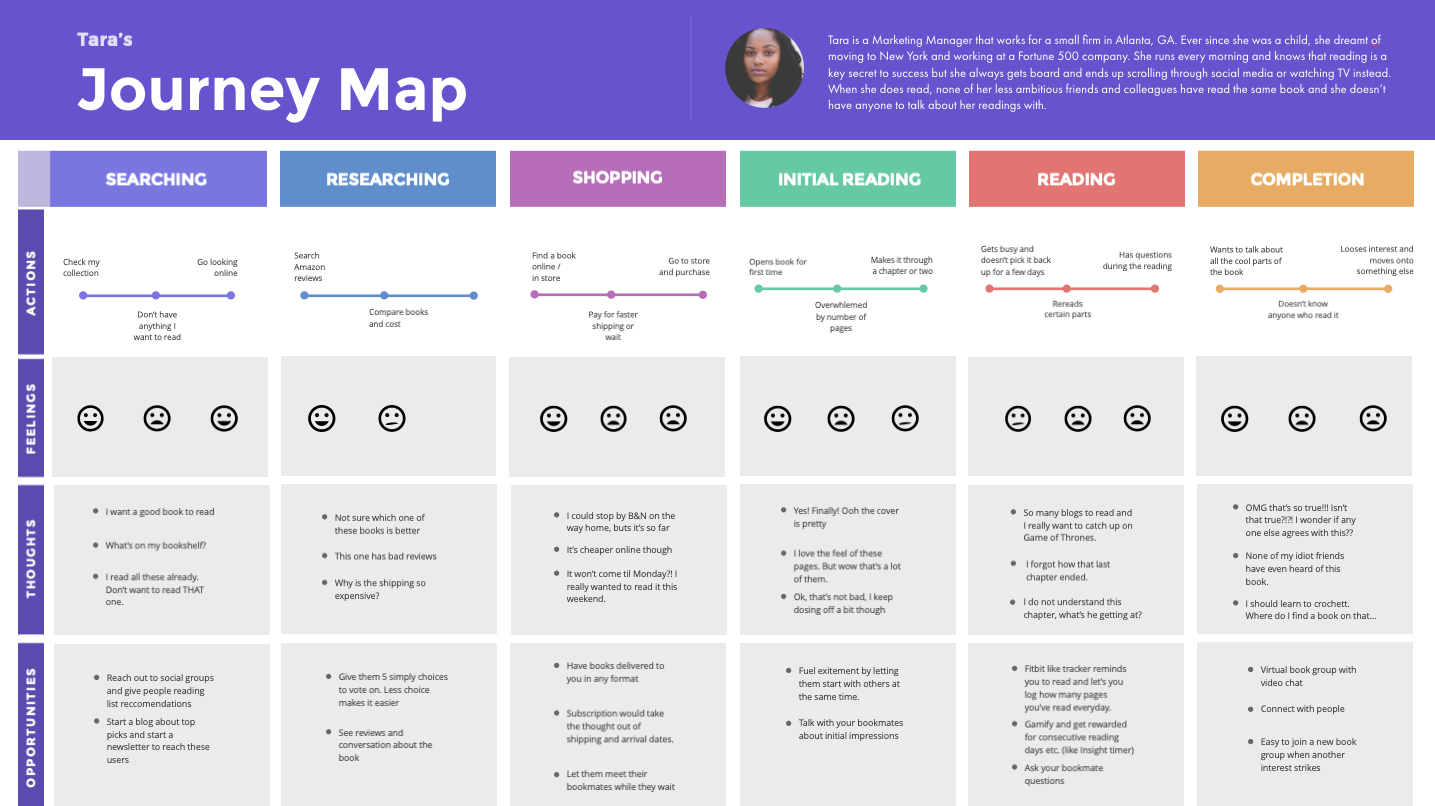
To do this we need to empathize with our users and that means building rapport with them and stepping inside of their world, then leveraging the research we do to identify patterns and insights to help shape the narrative about them. This story, is also what gets everyone on your team on the same page about your users and that’s really important.
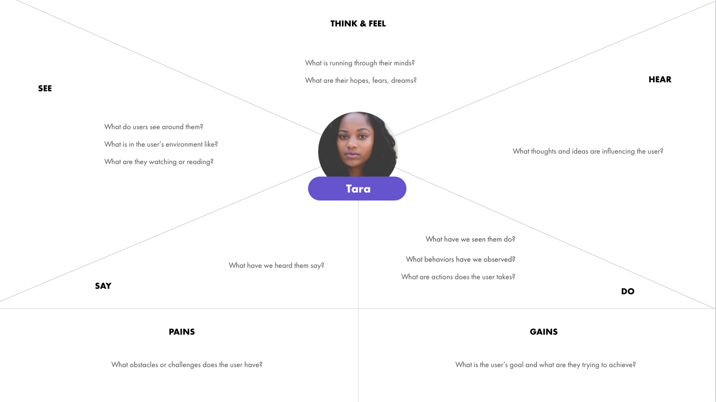
You goal is figure out what your users need and not what you want them to use. We do this through connecting with them and telling their story.
Don’t stop there, ask ‘Why’. Why are you conducting THIS research? And creating THIS deliverable?
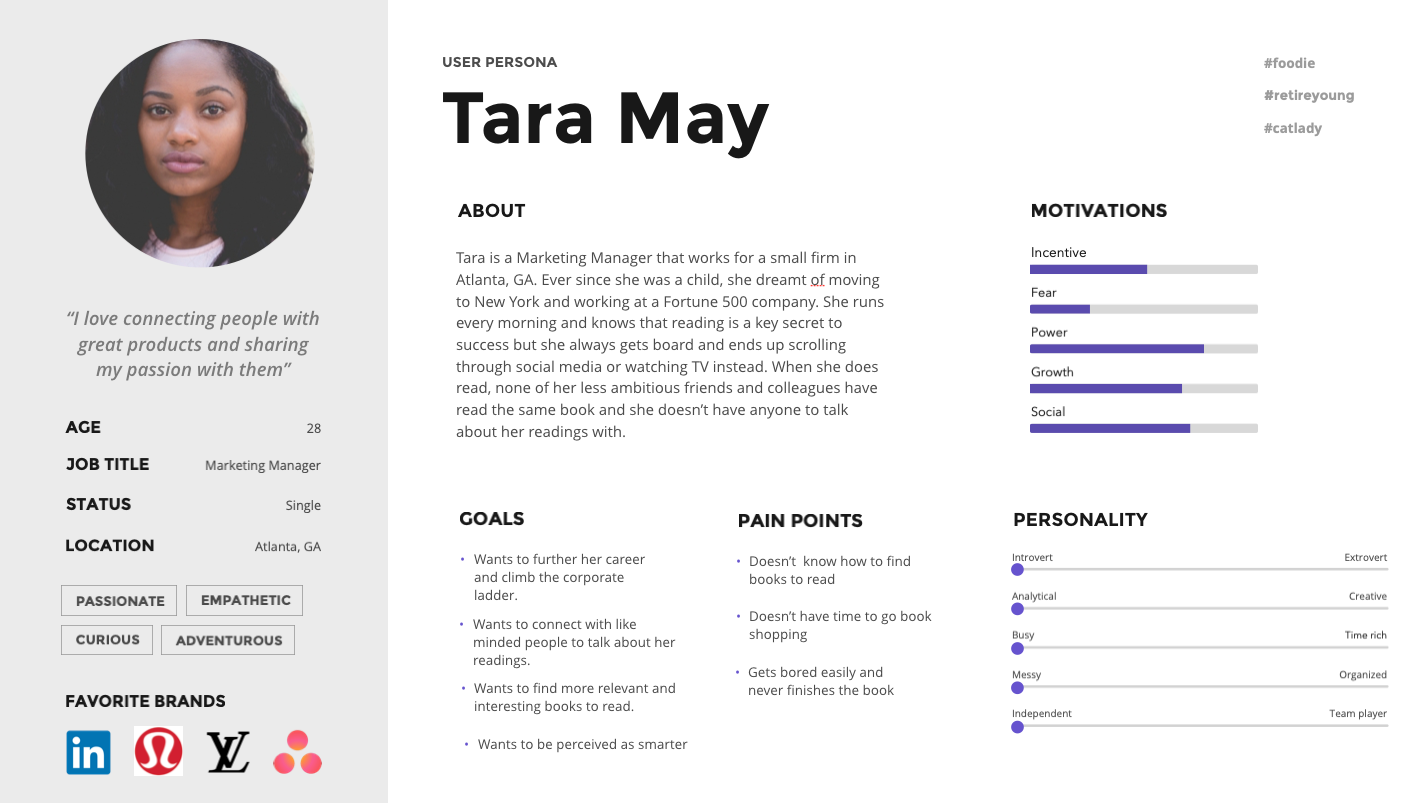
It’s about the quality of your research findings and how well you synthesize and present it.
Myth 2:
As a UI designer it will take lots of practice before my portfolio looks as good as the stuff on Dribbble.
The secret: Your portfolio does not need to look like the stuff on Dribbble.
Most designs in the real world are nothing like what you see on Dribbble. That's because most companies have many voices influencing design choices. There are accessibility requirements, business requirements and many technical considerations that go into building a successful product that can’t always be wrapped up in a Dribbble worthy UI shot. Many working designers don't have an active portfolio like the stuff you see on Dribbble and that also isn't the aim.
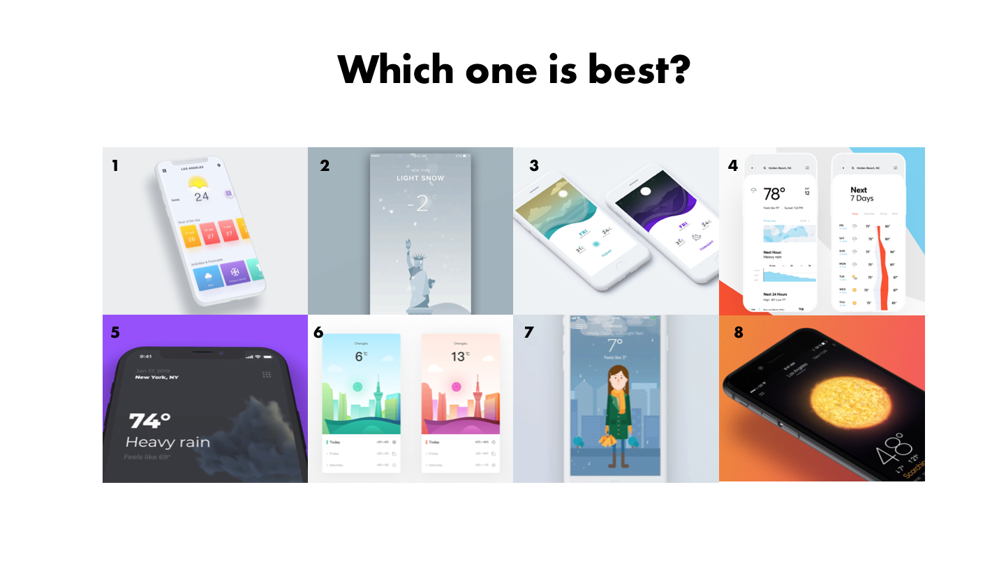
To be completely honest, most of the designs on Dribbble look great but don't or wouldn’t work well in real life or solve a real problem.
Which one of the weather apps above do you think looks best?
From what I can tell, these are all well designed apps from an aesthetic perspective, they all have great color harmony, make good use of white space, illustrate proper visual hierarchy etc. but only one of them solves the real problem...
If you guess number #7, you're right.
That’s because what we really want to know when we check the weather is usually, how to prepare, what to wear that day or what to pack when we are going on a trip.
74 degrees fahrenheit is only relevant by association. It’s relative to how we think it will feel when we go outside and we want to know how to prepare. An app that illustrates this, is a lot more useful than one that tells us temperature alone. This is what a great UX design and process is great at sussing out. The designer that that figures this out will stand out and make the biggest impact with their product and a deeper connection with their users.
Yes you will need good design skills, but even that is subjective. Style and aesthetic are subjective. But if you have a solid design foundation and sound reasoning for doing what you’re doing based on things like user research, design patterns and usability standards, that will naturally result in better designs and you can take that much further than simply mimicking what you see on Dribbble.
Myth 3:
Companies and clients will pay me for my exceptional skills and services to design their product or website.
The secret: Companies and clients will hire you to help make their business more profitable and create a commodity (product or website) that they can monetize. Companies are results driven. They want to do right by and delight their customers with products that will accepted and adopted in order for them to continue to have the means to provide them value.
When it comes to hiring, companies and clients want to know how you as a designer think, how you understand their customers and the problem space and how you plan to solve their problems and make them the company more profitable. Companies don’t care as much about your process or that you understand typography or how to create an empathy map - even though you should. That’s just a by-product of what they are ultimately trying to do with the business; arrive at a specific outcome.
Myth 4:
The design tool I use makes all the difference in my productivity and output.
The secret: It's about the right tool for the right job that feels right to the person using it.
It does not matter if you use Sketch, or Figma or Abobe XD. If you are efficient with your design tool and you can produce results, that is all that matters. Pick a program that makes some innate sense to you and matches your mental model and learn it inside out over the weekend and keep practicing with it as you learn more. Block off a couple of hours and watch an application specific tutorial to get started. You don't need to be too precious about the app you choose to work with because chances are that app is going to be updated tomorrow and then app will be obsolete next week. So be open to trying out new ones and accepting that there will be a little learning curve but most of the popular design software apps are quite similar.
Myth 5:
UI design is about how things look and your creativity
The secret: UI Design is about symbolism and mapping visuals and interaction to perception.
UI is not about the pretty colors and shapes in and of themselves. We humans are creatures of habits, the nature of how our senses and our minds work generally follow patterns. UI designers need to understand these patterns and how the human mind perceives color, shape and dimension and then effectively and delightfully map their visuals to the user’s mental model.
You need to be thinking in terms of components and states and determining things like:
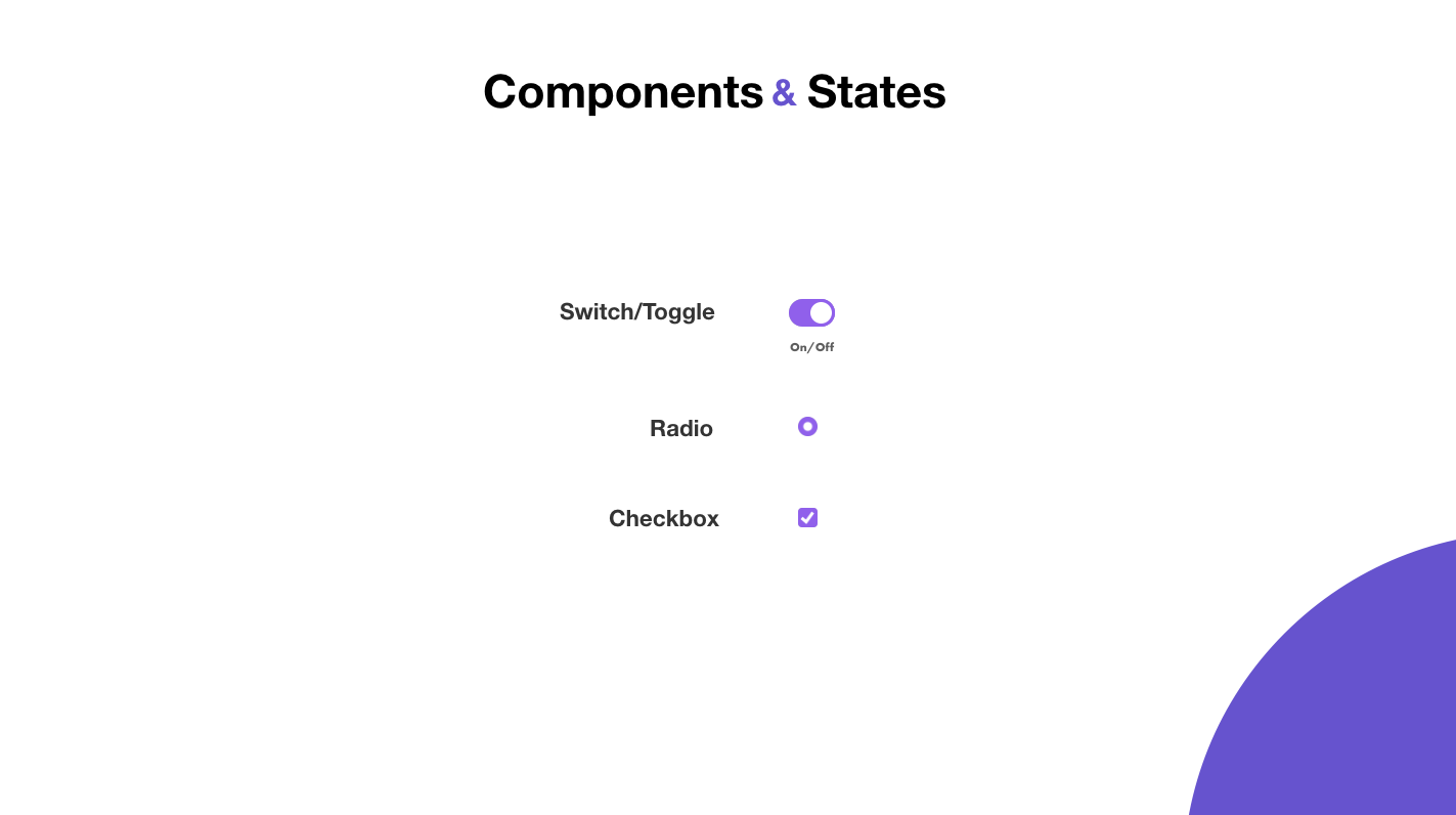
- What should this element look like when it’s off vs on?
- Where should the label be placed? (Usability heuristics)
- What does the system do when the component is in the off state vs on state? (Systems thinking)
- What should the user see to let them know? how do we provide proper feedback about this? (Interaction design)
- How should this thing be categorized? (Ontology)
- Should we even be using a radio button or should this be a checkbox?
- How should this element be placed or grouped with other element? (Gestalt)
Being a great UI/UX and Product Designer is not about limitless creative options, it’s about, problem solving, healthy constraints and being deliberate about the design choices we make.
As designers, especially as beginners, sometimes we sit down in front of a blank canvas or a design challenge and are just overwhelmed by endless possibilities, but when you understand the reason you’re doing something and what to measure it against, you start to see that there are very few choices in that moment that make sense and this is quite liberating.
A great UI/UX design does the following things:
- It limits the choices of UI design
- It shows empathy to the users
- It converts better for the business
- It creates better outcomes all around
