← Back to all student perks

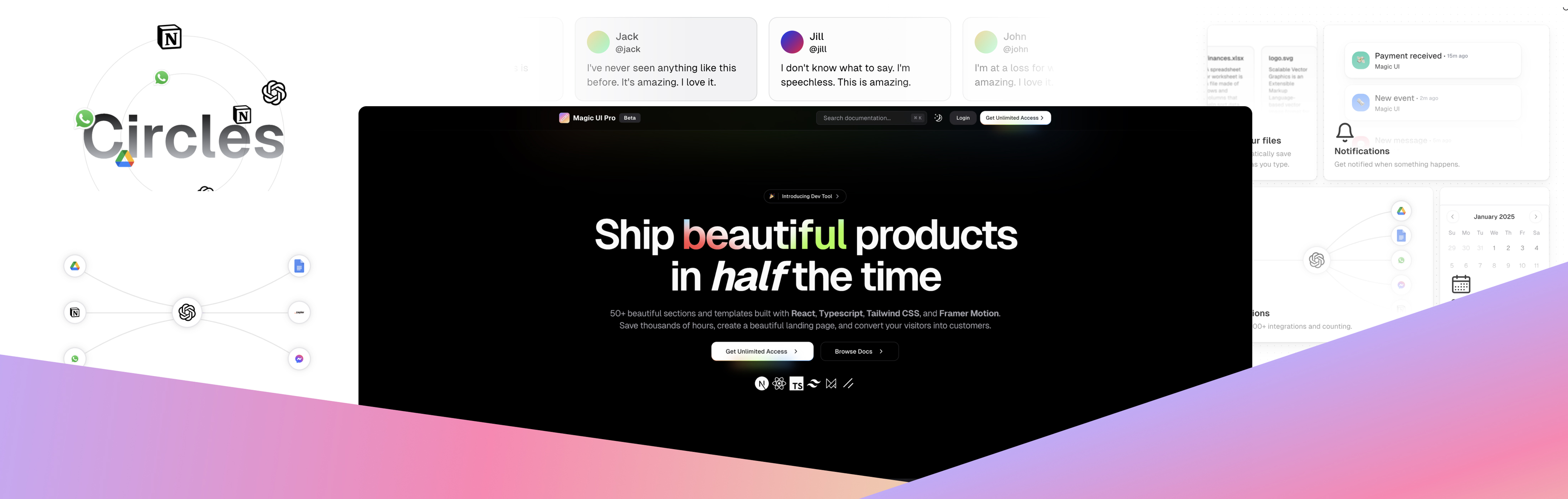
Magic UI Pro
Ship beautiful products in half the time
About Magic UI Pro
Magic Components Pro is a comprehensive library of UI components designed for Figma. It’s tailored to help designers and teams streamline their design process by providing pre-built, customizable components that are easy to integrate into projects. Whether you're working on web, mobile, or other digital platforms, Magic Components Pro offers a robust set of tools to speed up design workflows while maintaining consistency and high-quality visual standards.
Features
- Extensive Component Library: A wide range of pre-designed components for various UI needs, including buttons, forms, cards, and more.
- Customizability: Fully editable components that allow designers to tweak styles, layouts, and functionalities to match project requirements.
- Auto Layout Support: All components are optimized for Figma’s auto layout feature, ensuring responsiveness and adaptability.
- Scalable Design System: Built with scalability in mind, making it ideal for both small projects and large design systems.
- Dark and Light Modes: Components are available in both light and dark themes for easy integration into any design.
- Interactive States: Predefined states (hover, active, disabled, etc.) for a seamless prototyping experience.
- Pixel-Perfect Design: High-quality, precise designs that align with modern design standards.
- Global Styles: Includes predefined text styles, color palettes, and grid systems for consistency across projects.
- Regular Updates: Continuously updated with new components and features to stay ahead of design trends.
- Multi-Platform Support: Components are optimized for web, iOS, and Android platforms.
