As we move into 2024 I've been noticing some interesting design trends emerging particularly in hero layouts and at the top of websites. If you're looking for some inspiration in the new year, here are some of the hottest hero design trends for 2024 that you've got to try!
Up until now, we’ve been seeing a lot of simple header lockups with a heading, a description, a call to action button and a full screenshot of an app or software, but moving into 2024 we’re seeing a lot more creativity happening with website hero layouts.
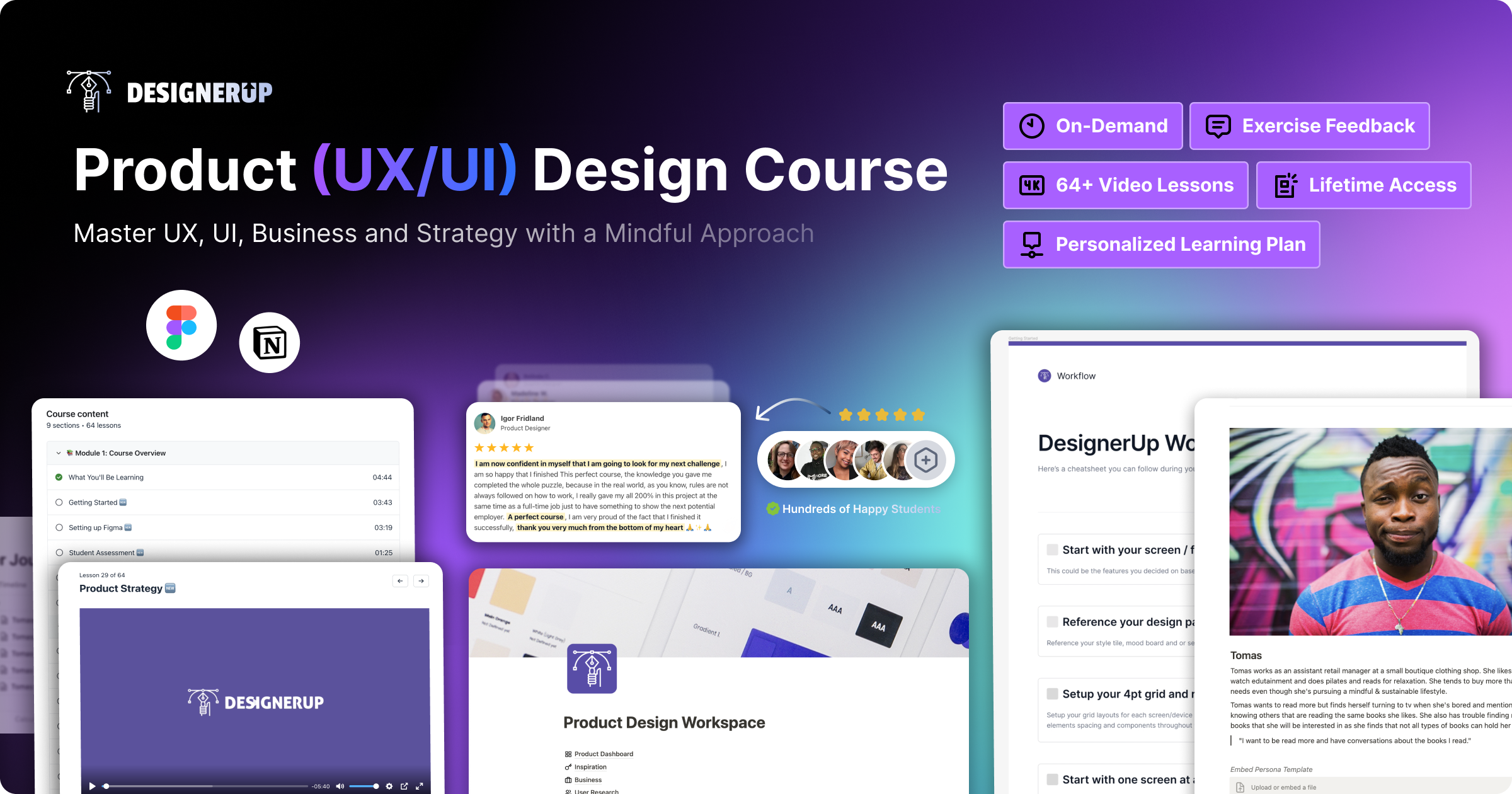
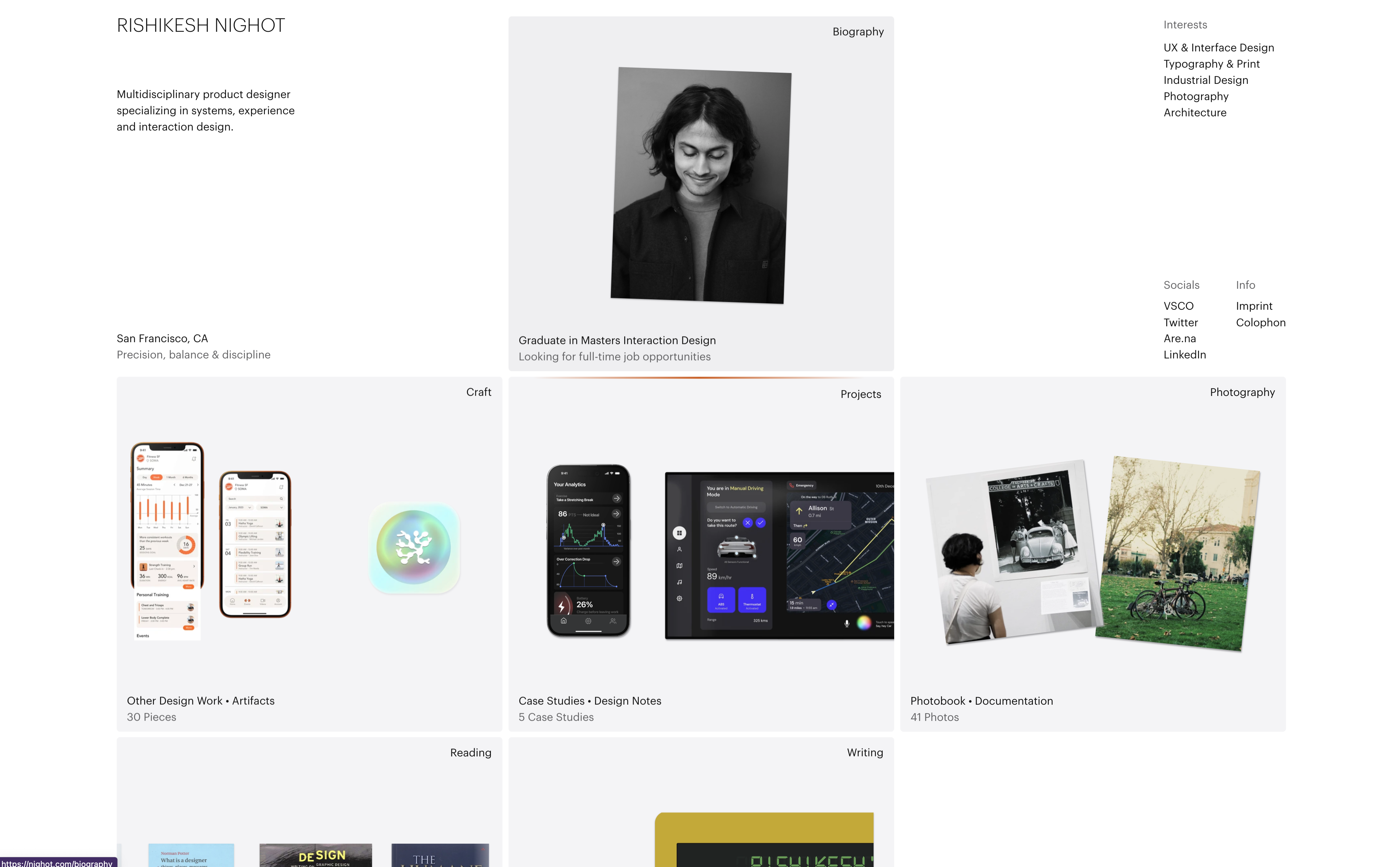
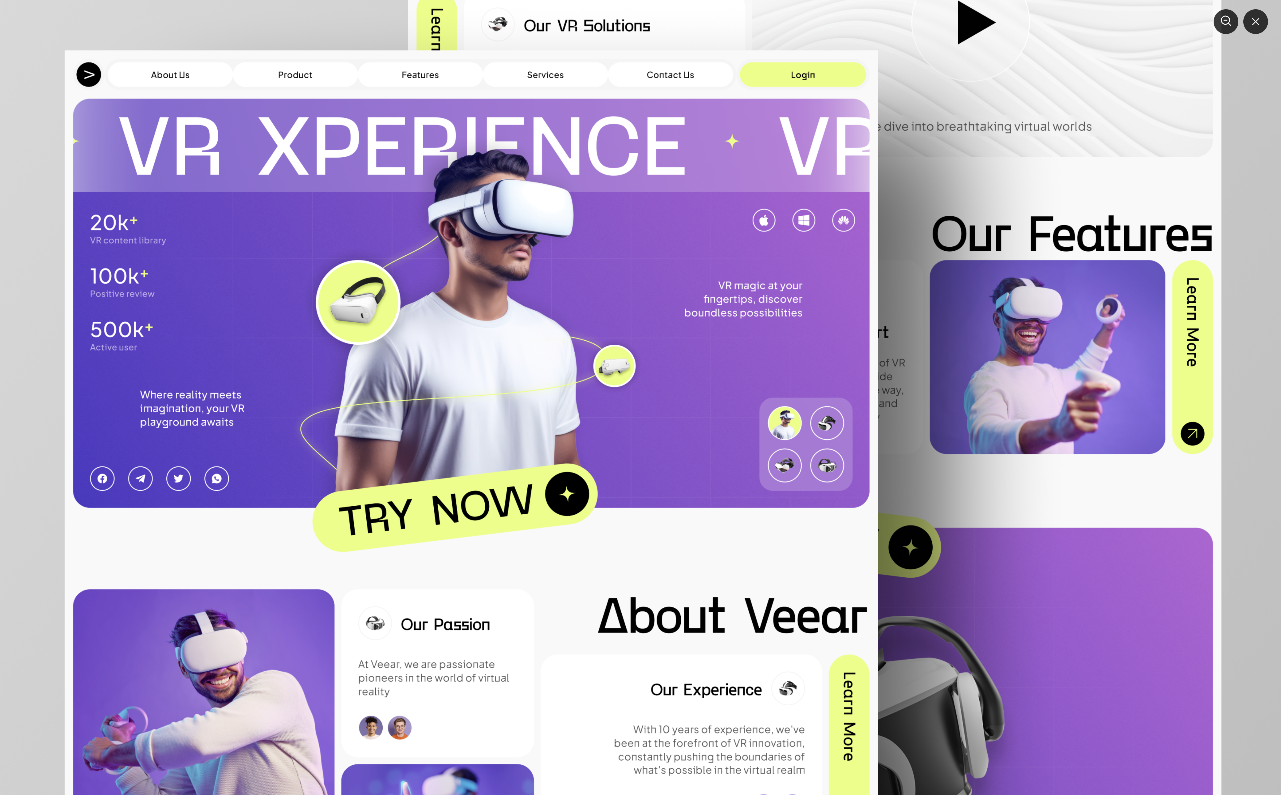
1. Isolated Component Hero Layout
The isolated components hero is a way to showcase certain parts of an app or software without showing the entire thing. Designers can pull out and isolate certain UI components from the app in order to pull focus.
Thus layout can be treated as a single image combined together and layered with creative placement and positioning.
When you approach this type of design trend, think of it as if you are deconstructing the app to highlight certain features and then reassembling them in a way that tells the story and benefits of the product rather than just showing the product itself.
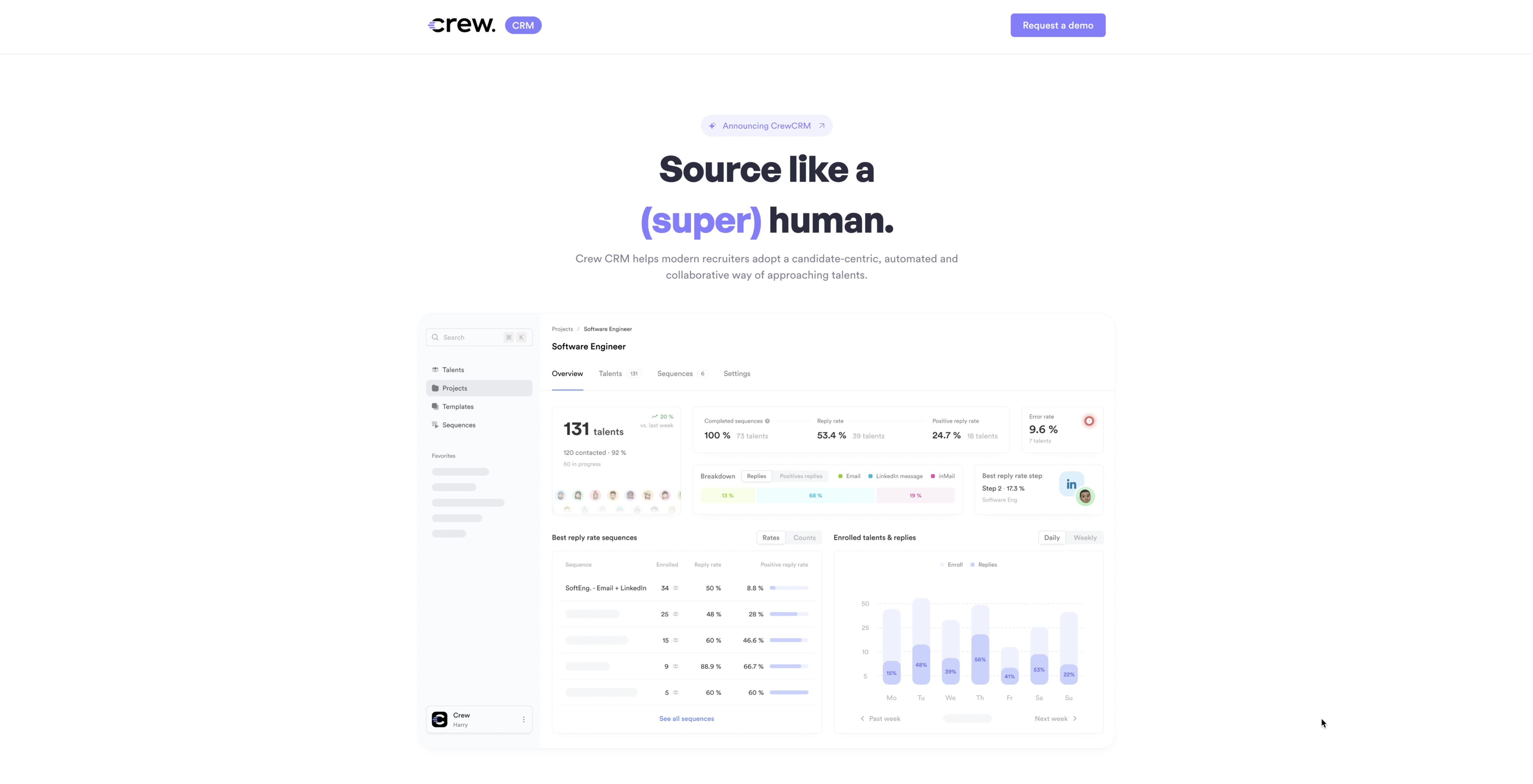
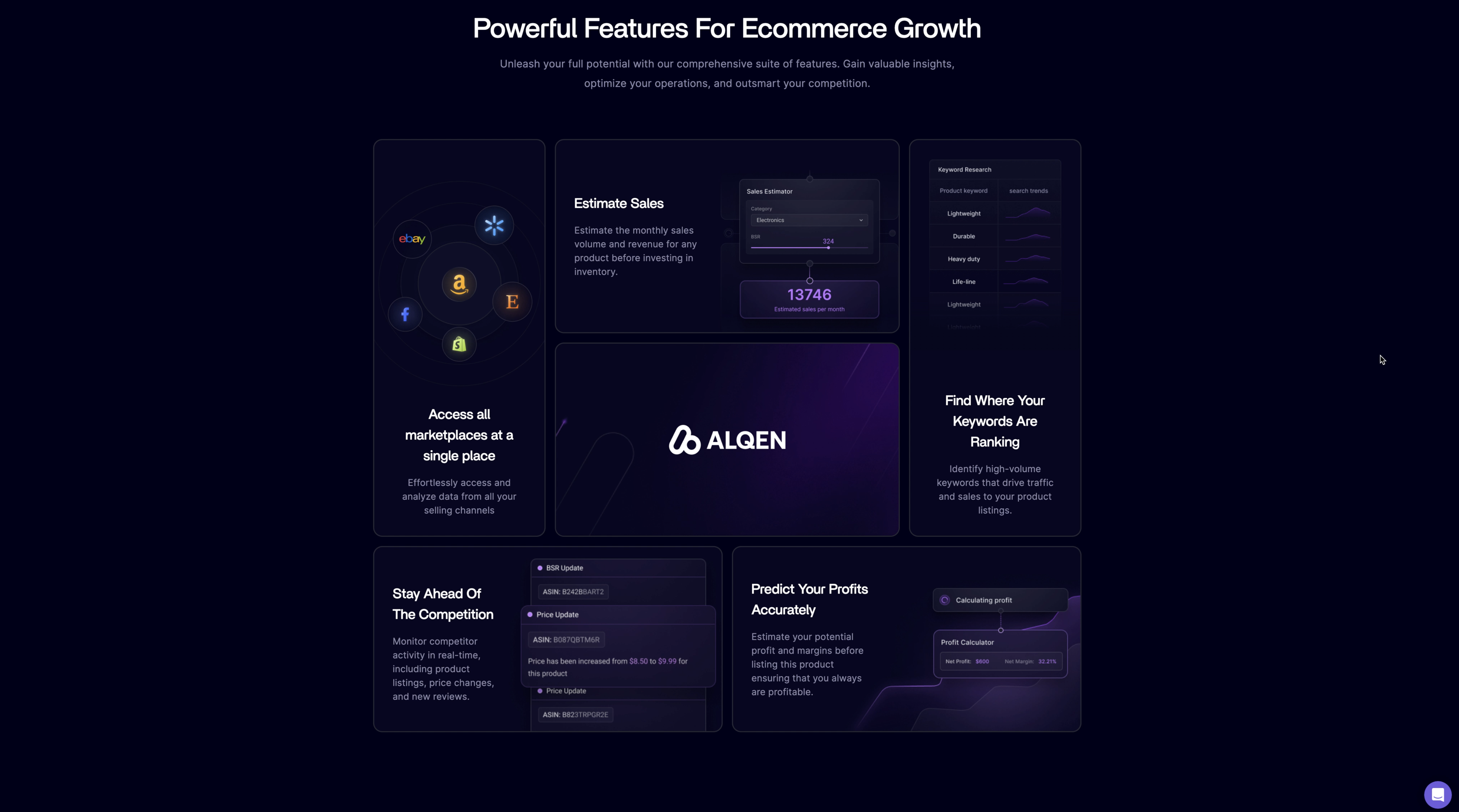
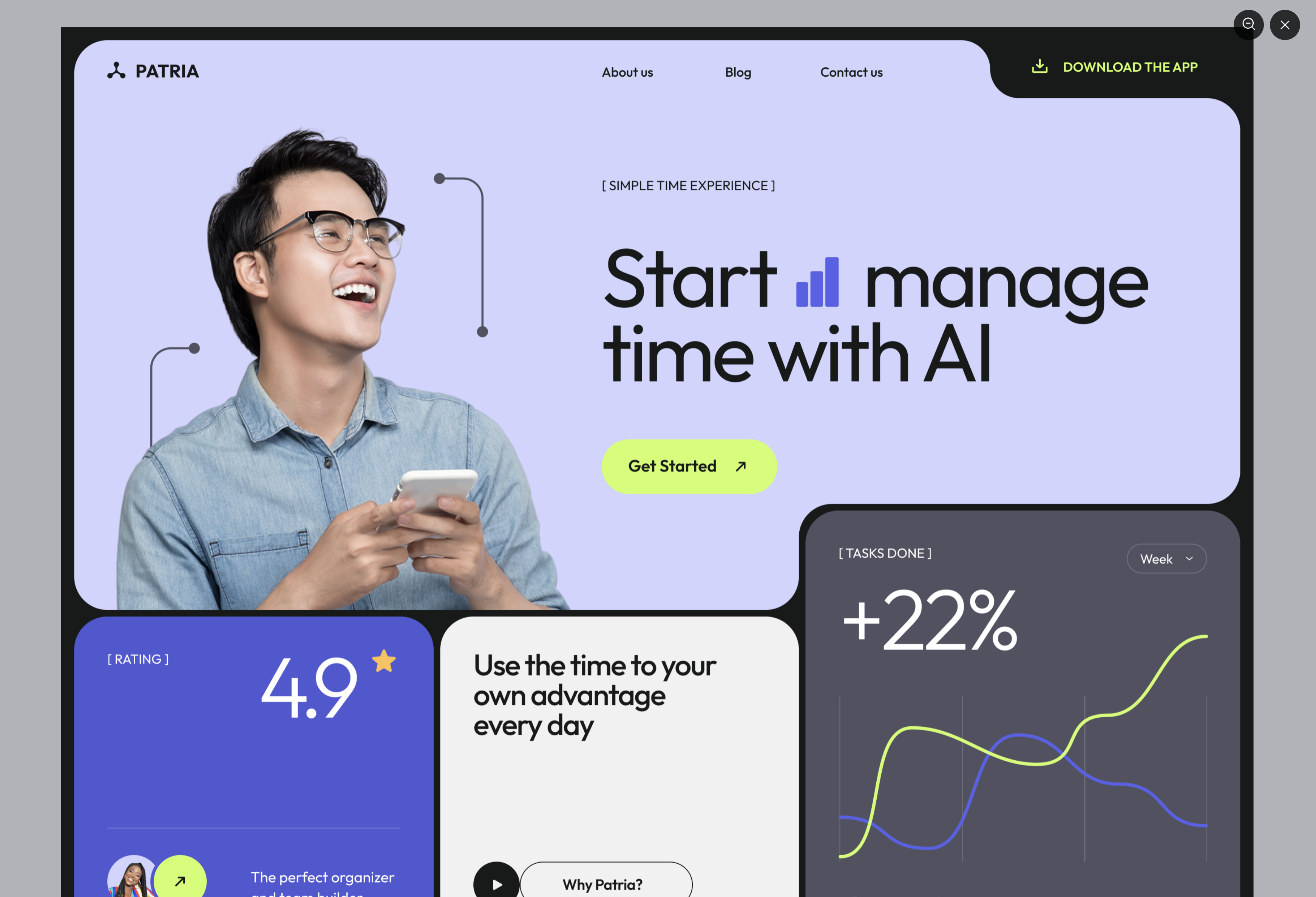
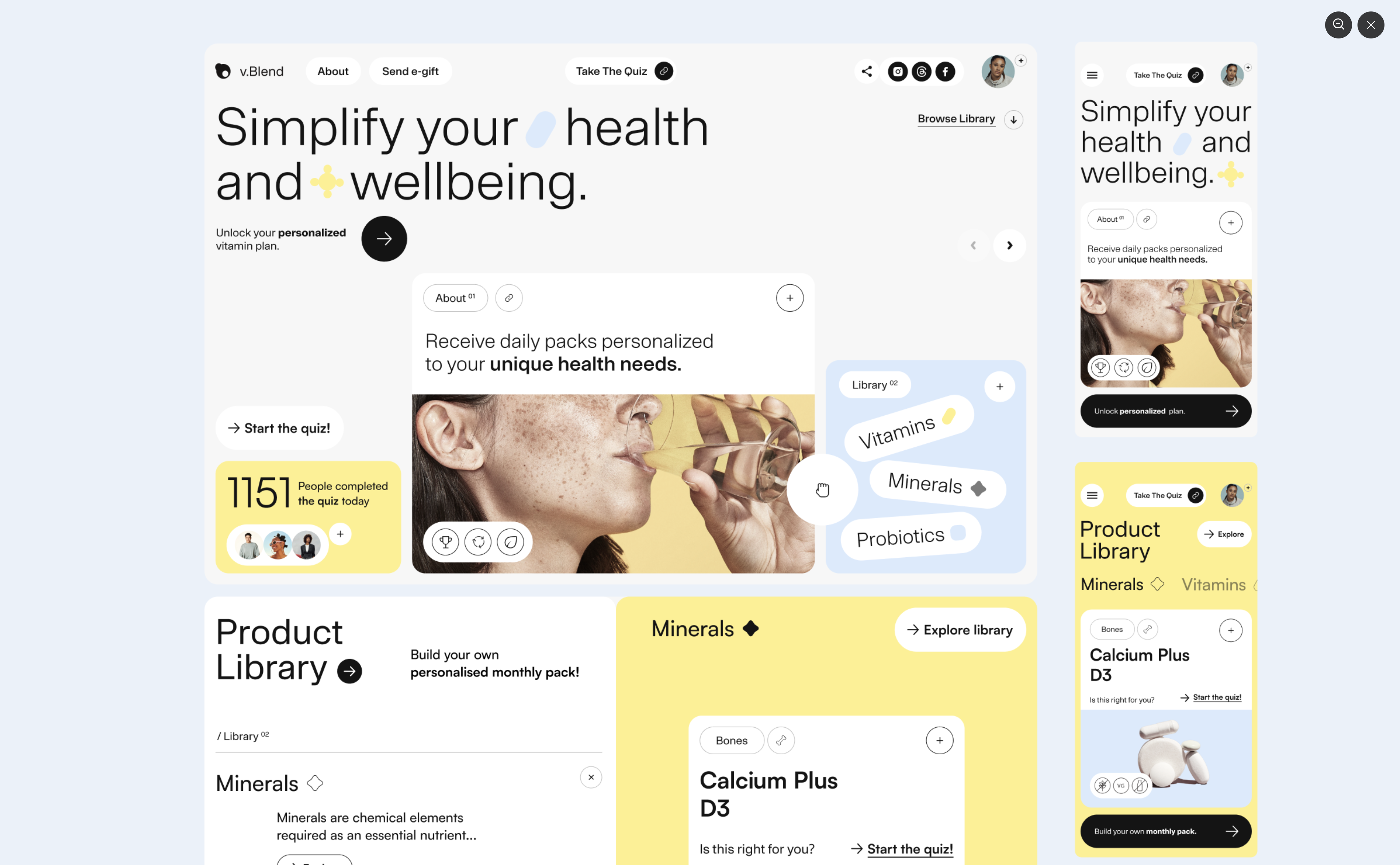
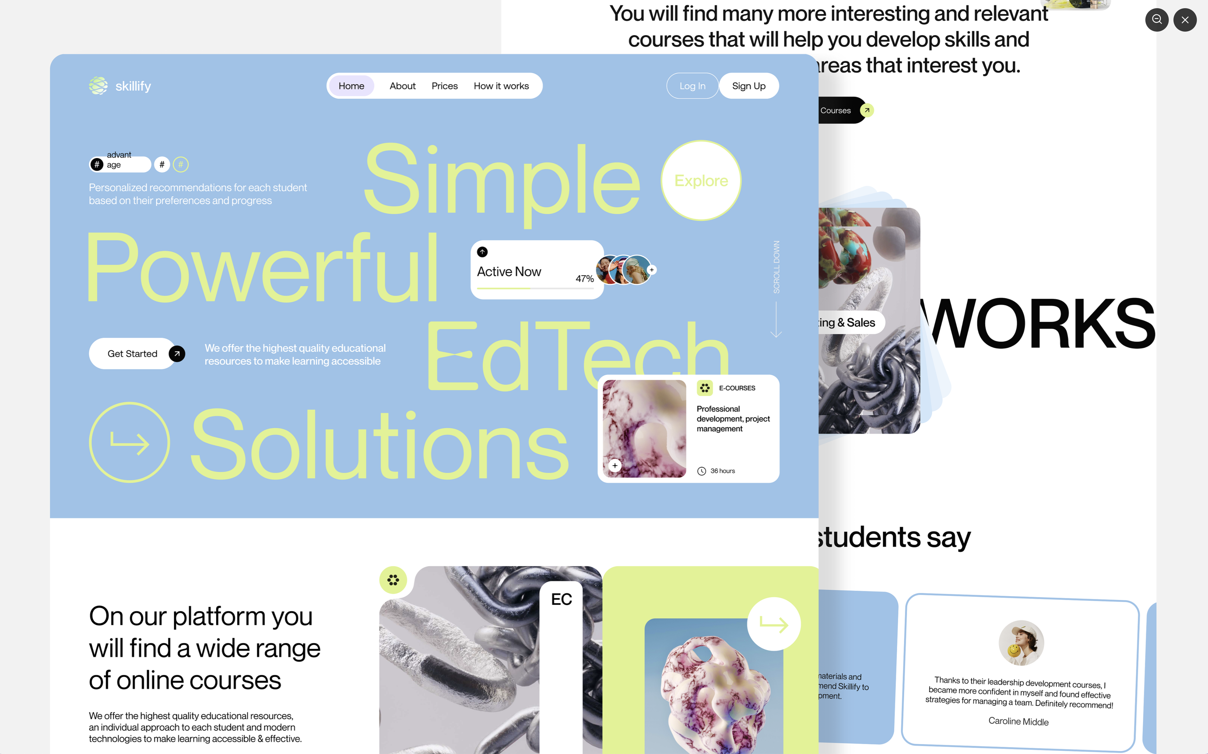
2. Bento Hero Layout
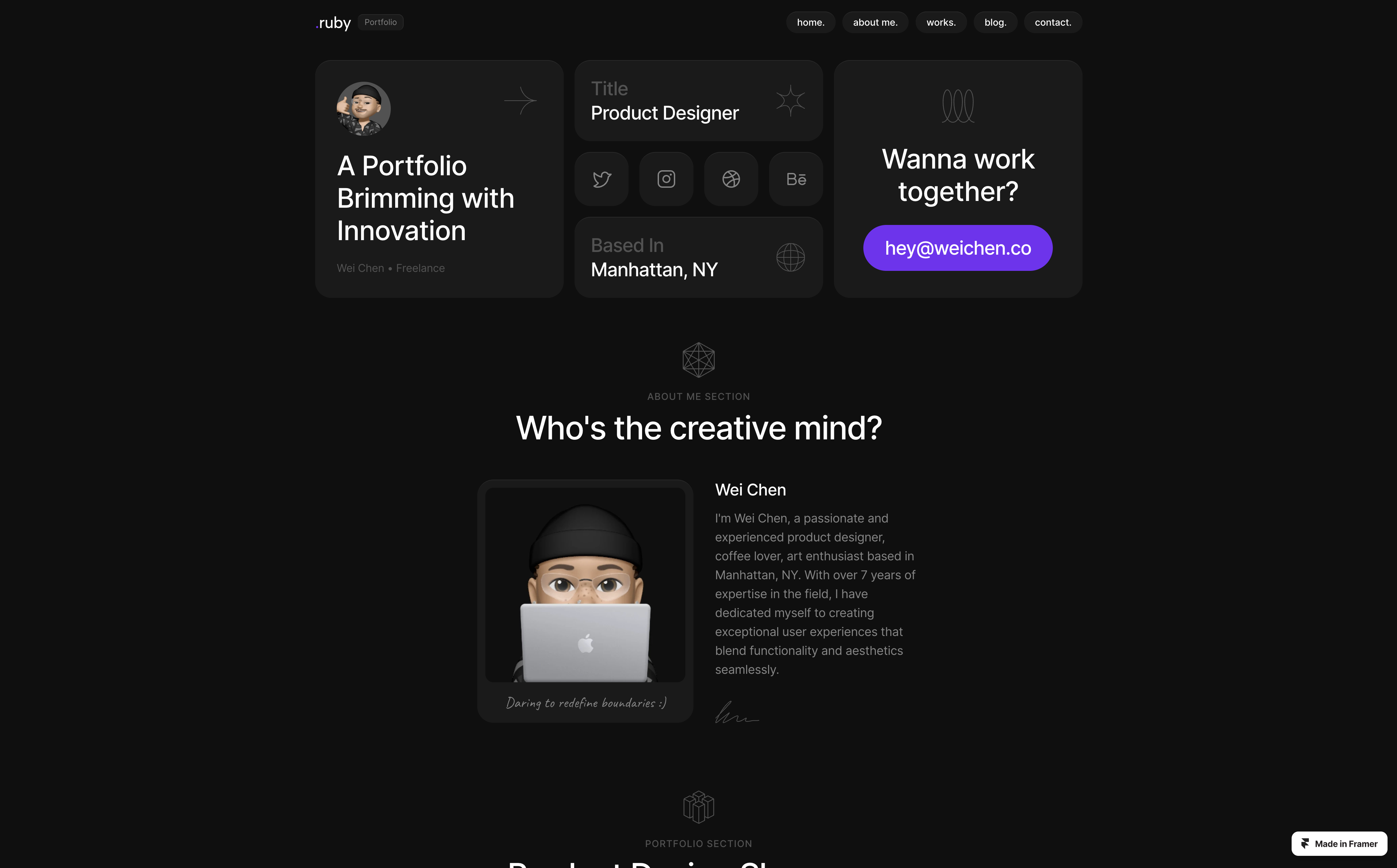
The bento design style is nothing new, we’ve seen it from Microsoft back in 2021 with Windows 8 and also from Apple over the years on their websites and in presentations.
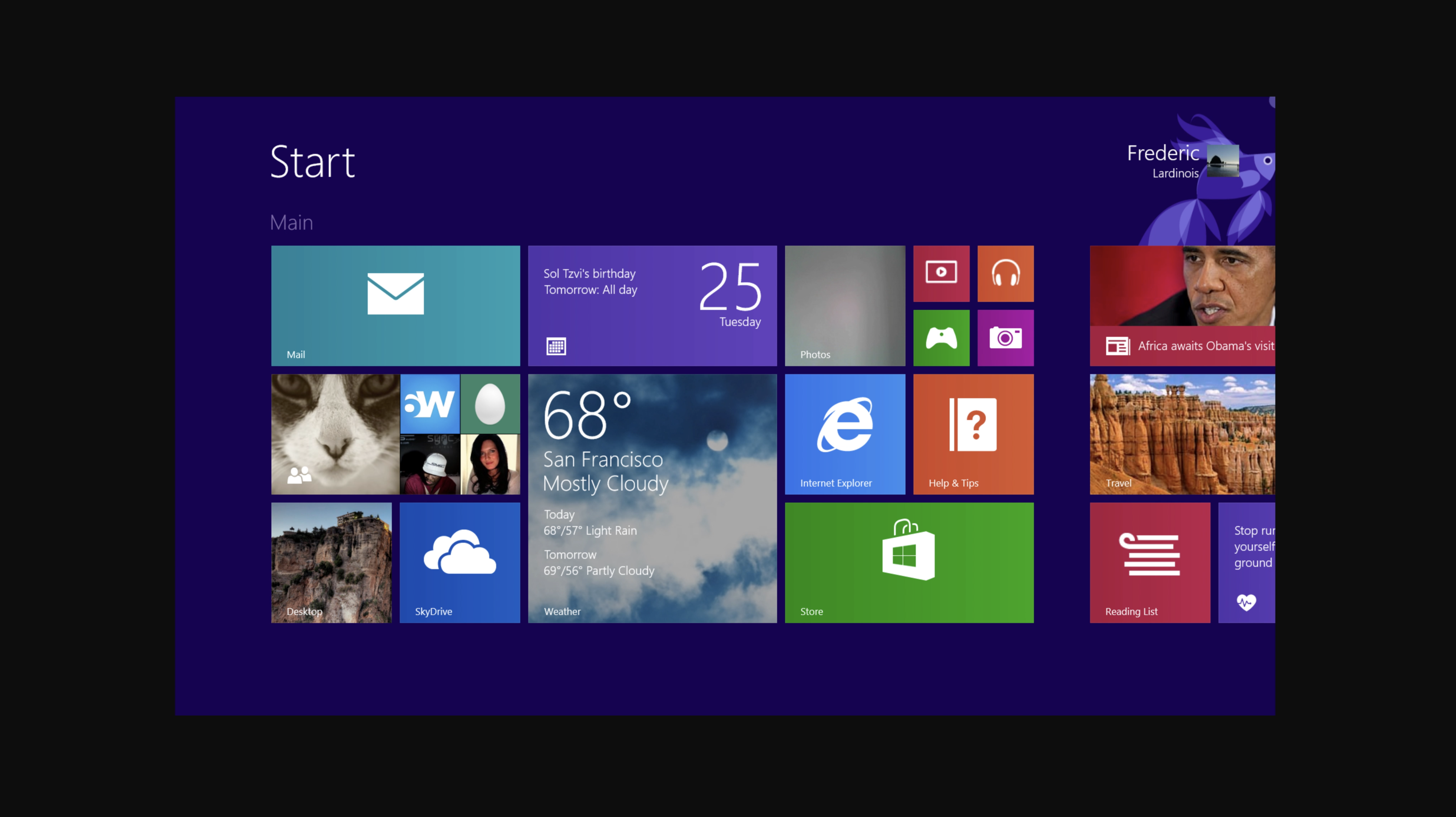
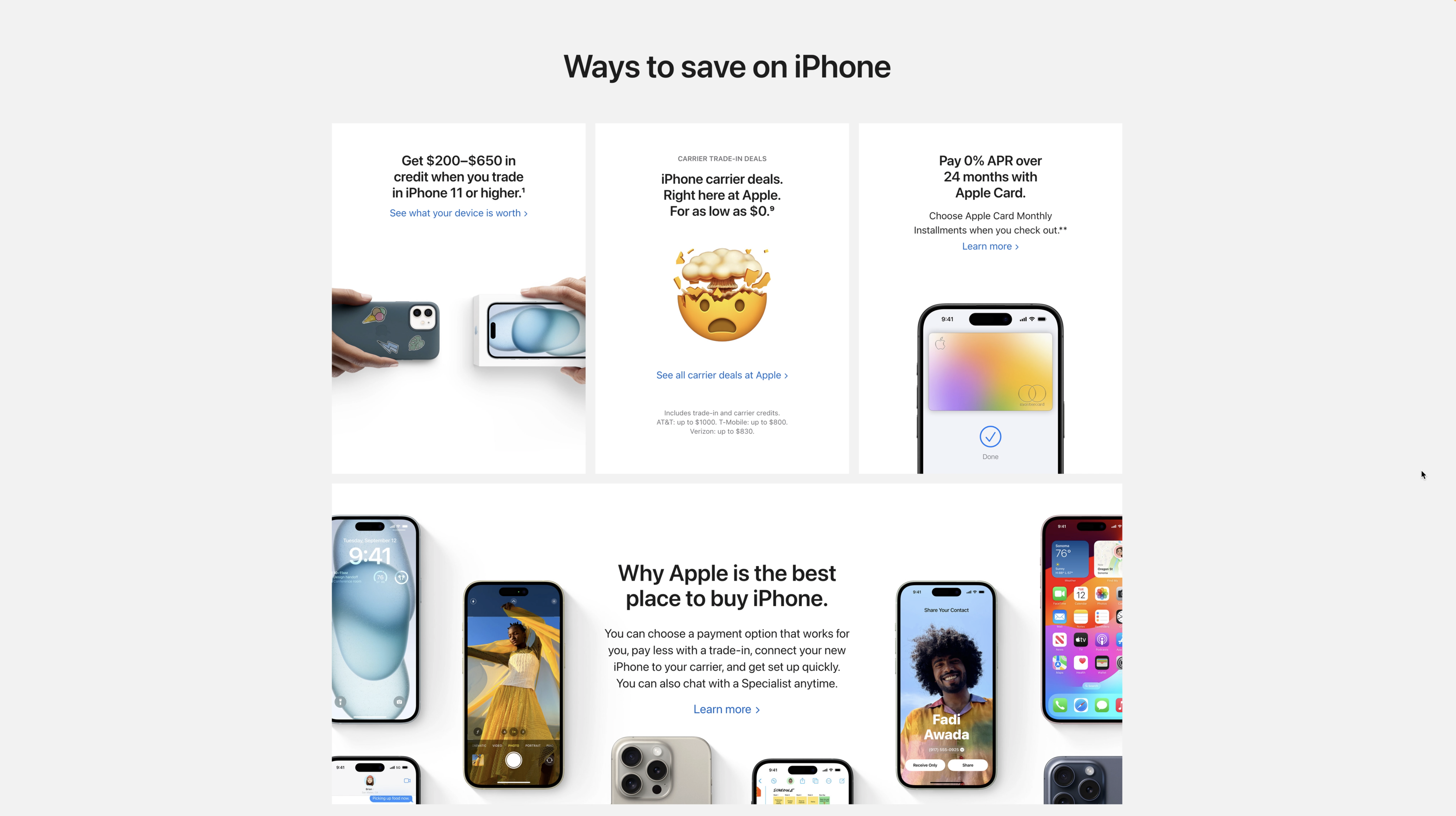
Microsoft Windows 8 | Apple iPhone
The Bento name itself comes from the Japanese Bento box which refers to those cute little compartmentalized meal boxes
and now we’re starting to see this style extrapolated and used in heroes.
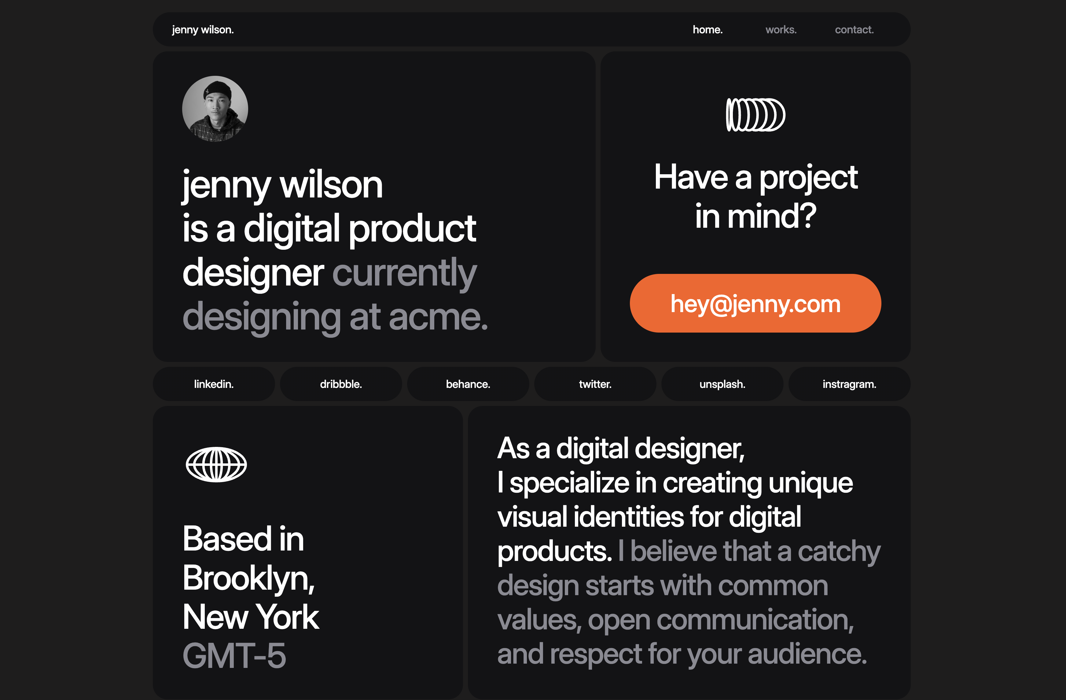
Rather than telling a linear visual story, the bento grid allows for more or a choose-your-own-journey experience, with each card or box being a self-contained adventure that the visitors can explore.
3. Lava Hero Layout
Another style that we’re seeing is what I’m calling the Lava Layout, normally the edges of things are squarely aligned to the edges of other things on a horizontal or vertical axis, but how love these elements hug the contours of their surrounding elements creating what reminds me of a lava lamp even with the white space around the text it creates a very fluid and unique look.
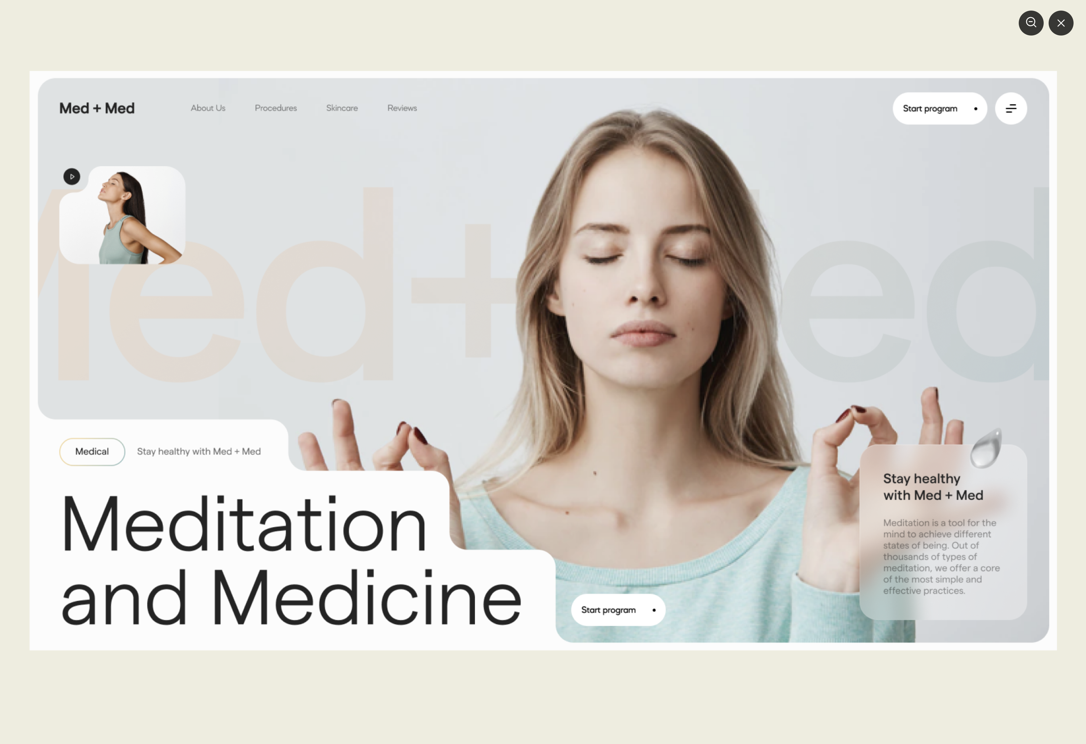
This has a very similar look and layout to the bento grid but with some creative twists involving shapes and white space.
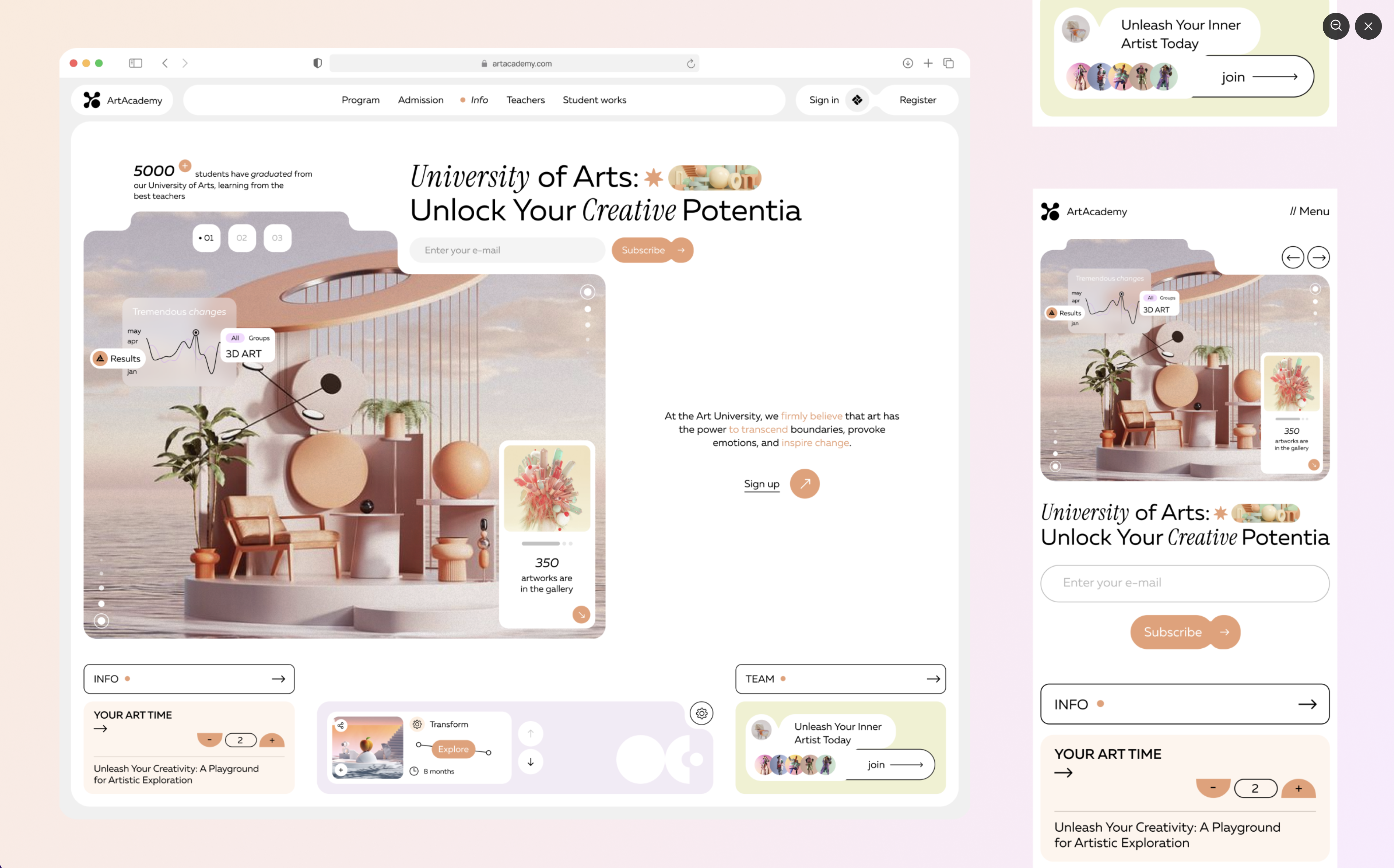
4. Callout Hero Layout
Next, we've got heroes with callouts. These are pretty interesting because they combine some of that Bento layout as well as the isolated components but the difference is that these have little interactive components within the hero.
Here you'll see that you can click on the add button you can click on the link sometimes there are avatars with reviews or there are little call-to-actions here and there kind of embedded in the graphics so it's a lot less static and more interactive.
5. Tied To Scroll
Another popular hero style we're seeing is the tie-to-scroll. This is when the mouse scroll causes certain elements or cards to come into focus or to carousel across or move around or up and down here is a super cool example of a tie to scroll where everything animates and morphs as you scroll.
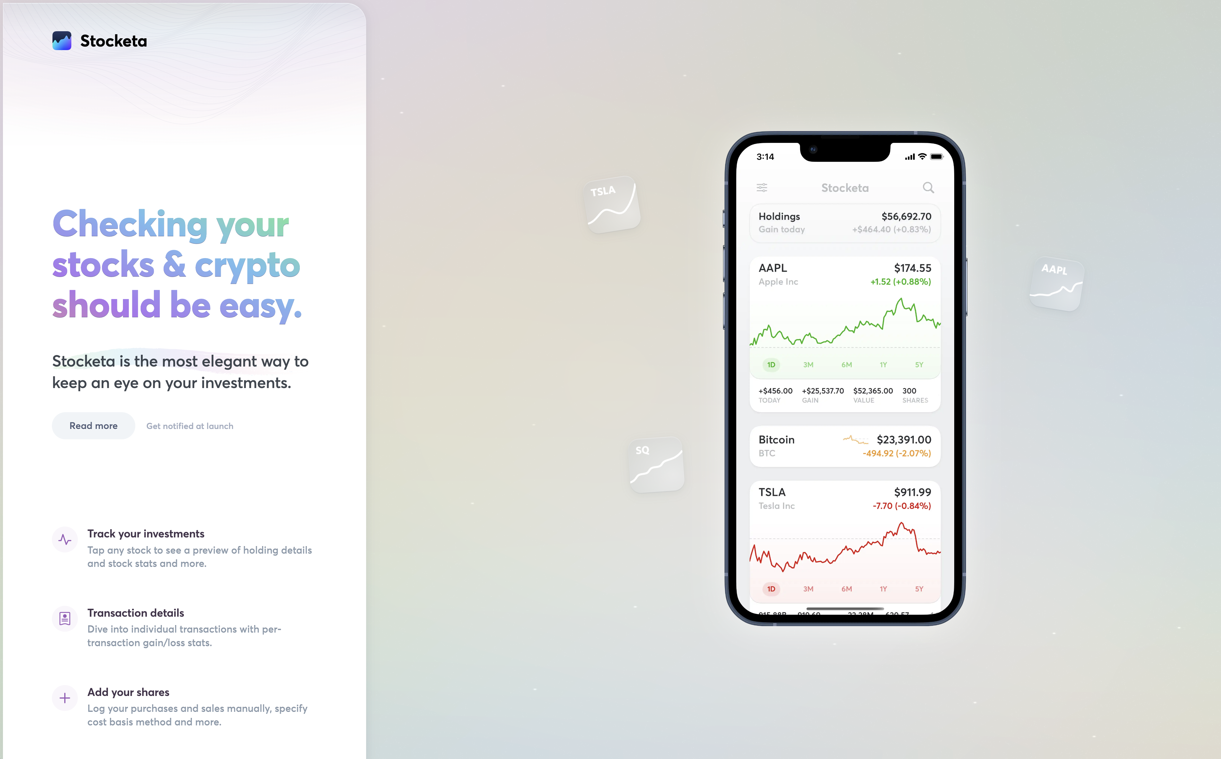
This great example of Stocketa's mobile app landing page where the left side is scrolling but the right side stays in place and as you hover or scroll past these features on the left the image switches out on the right side and appears in the device now
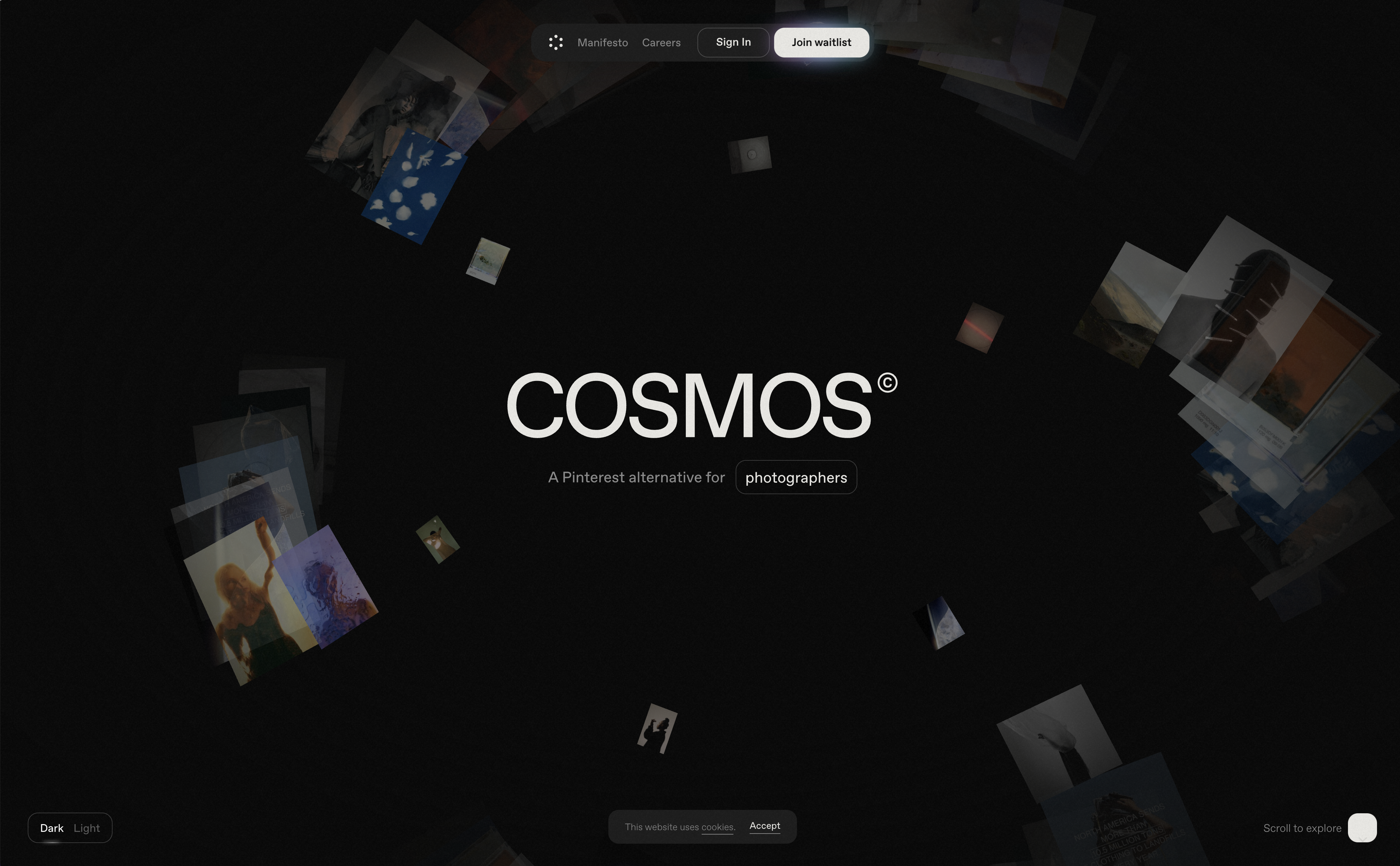
Cosmos is a really crazy example where there are lots of animations happening and as you scroll it's sucking things out and spinning things around and has a very multi-dimensional effect to it the animations also work in reverse which is very cool.
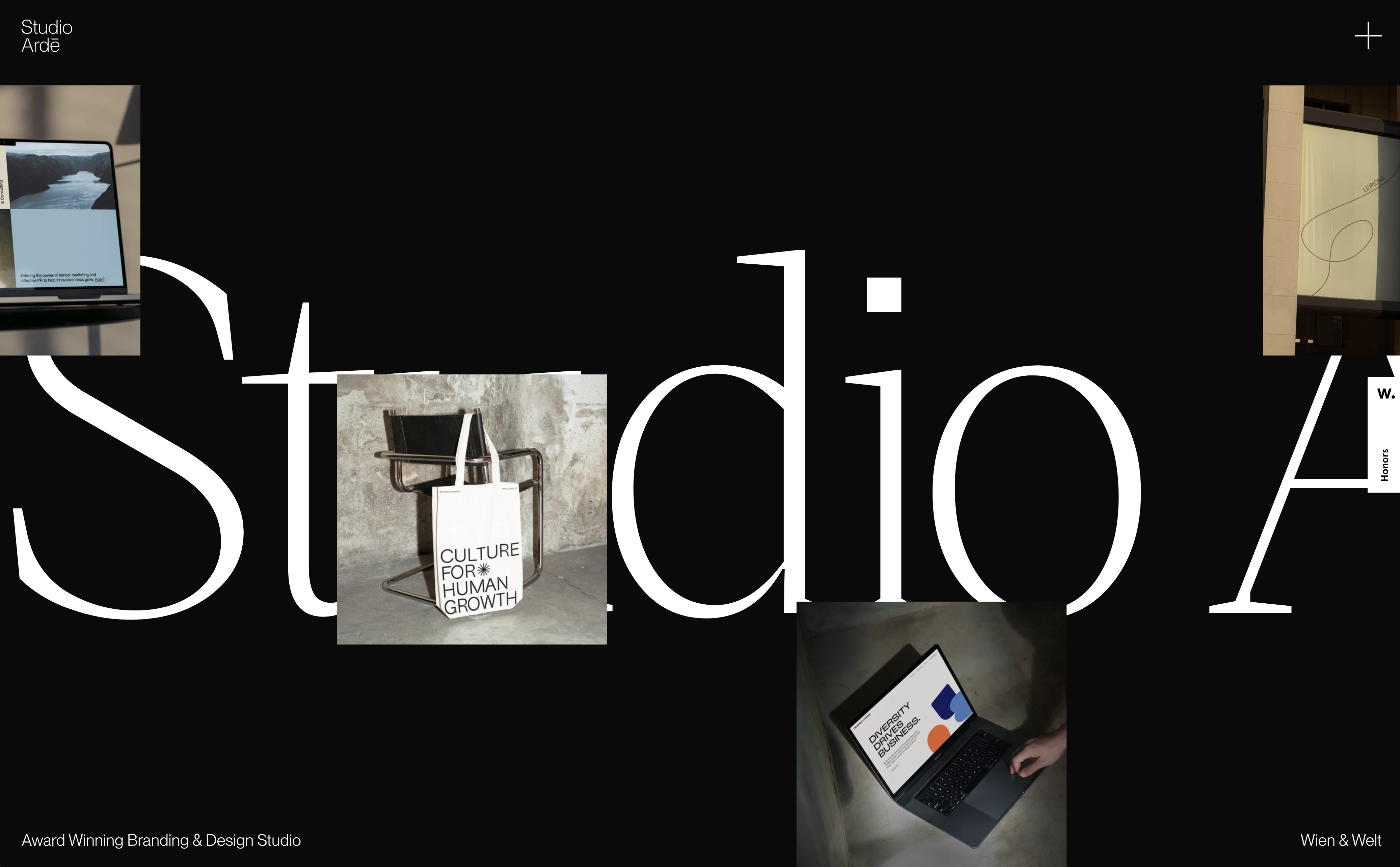
Another cool horizontal hero animation can be found on Studio Arde's website, another great example of how we can use horizontal, rather than linear space to create a striking visual presentation.
Combing Hero Layout Styles
If you really want to get creative, you can also mix and match these design styles for example this Framer template has a bit of the bento grid layout mixed with some callouts and tie to scroll animations.
Things to consider
Some things to consider when trying out these design trends yourself:
- Responsive and adaptive design: You want to consider how these unconventional layouts will behave on different screen sizes and mobile. On mobile devices, many of these layouts will probably just need to stack or have adaptive design considerations so they they may not look as interesting.
- Development and execution: Some of these designs may be much more labor-intensive to develop and code compared to your standard hero design. You’ll also want to think about how difficult they are to execute and weigh the pros and cons of development time and resources that will be needed to code and maintain these designs.
- Be intentional - Does this design style make sense for this brand and its audience? Make sure you are doing your user research and marketing research and leveraging the insights you gather to make intentional design decisions.
- Don't be random - Make sure that you are adhering to some sort of grid, and alignment and always maintaining consistent spacing between elements.
Ready to design these yourself? Checkout this Full Figma Tutorial Next
Trying new and innovative hero styles like these is a great way to infuse some fun and uniqueness into your brand and show off your products and services a creative ways. If you do try any of these styles share them with us and tag us @designerupco on X (Twitter). Happy designing!
Want to learn Product (UX/UI) Design and create amazing web design trends and interfaces like these? Come check out our Product Design Course!