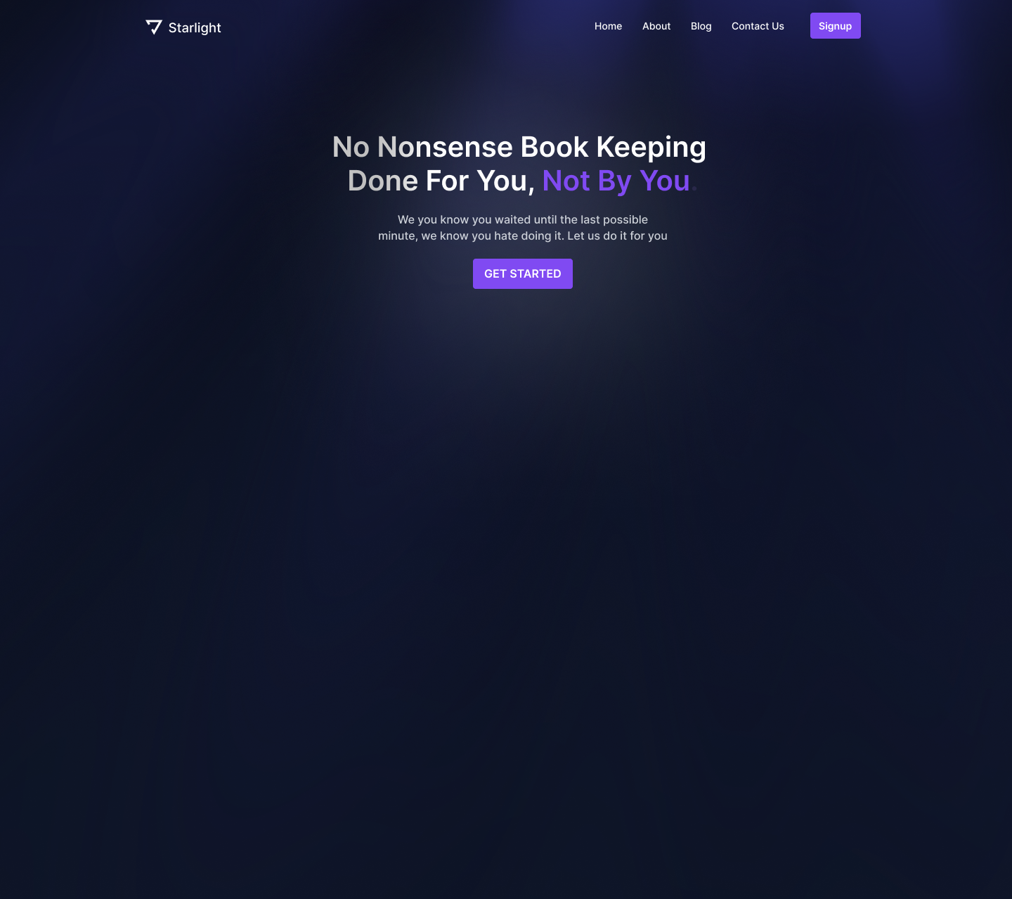
In this step-by-step Figma tutorial, I'll be designing some of the hottest web design hero layout trends of 2024 for both web and mobile.
If you haven't read our previous article on Must-Try Hero Design Layouts of 2024, then, definitely give that read here for a more thorough explanation of these trends.
For each one of these following trends, I'm going to start with a simple design layout, one that we see all the time, and we're going to make it a lot more interesting by morphing it into each of these different layouts.

1. Isolated Component Hero Layout
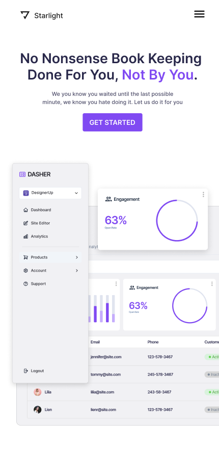
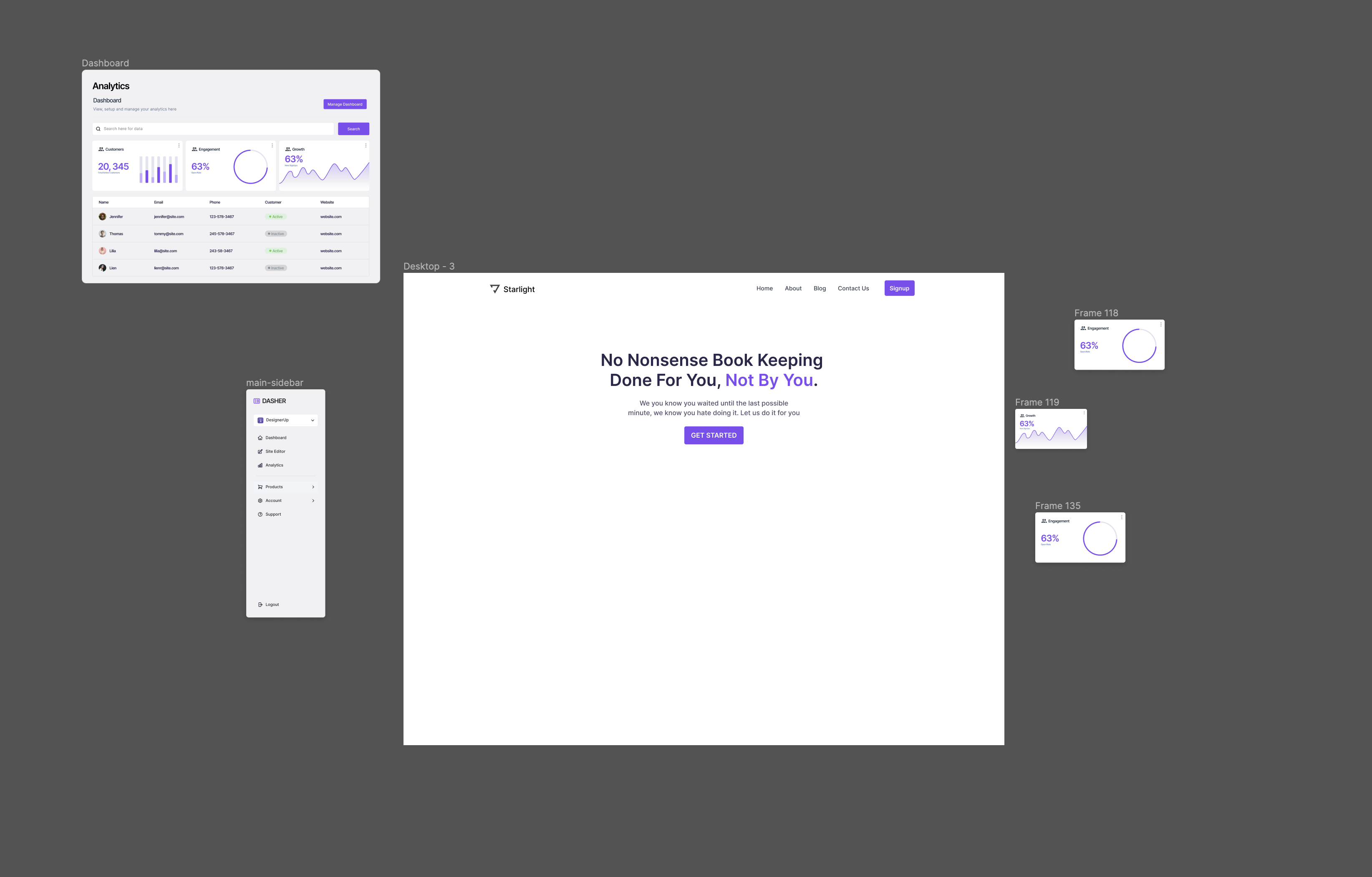
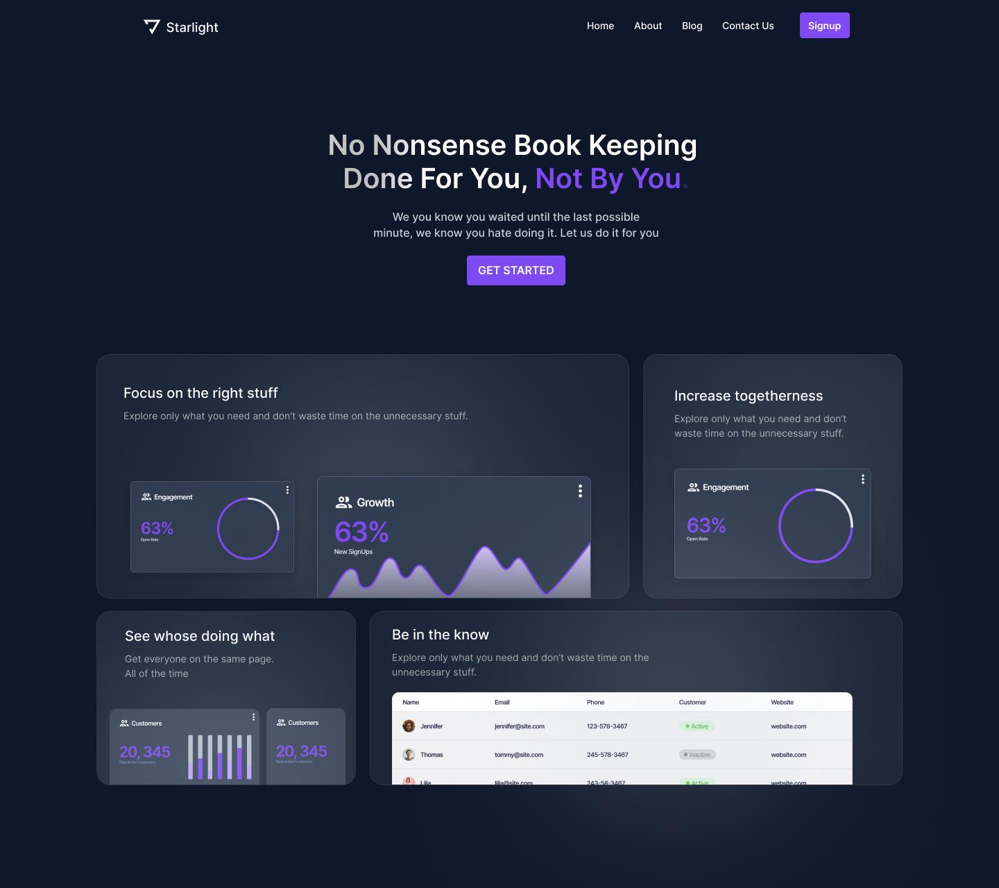
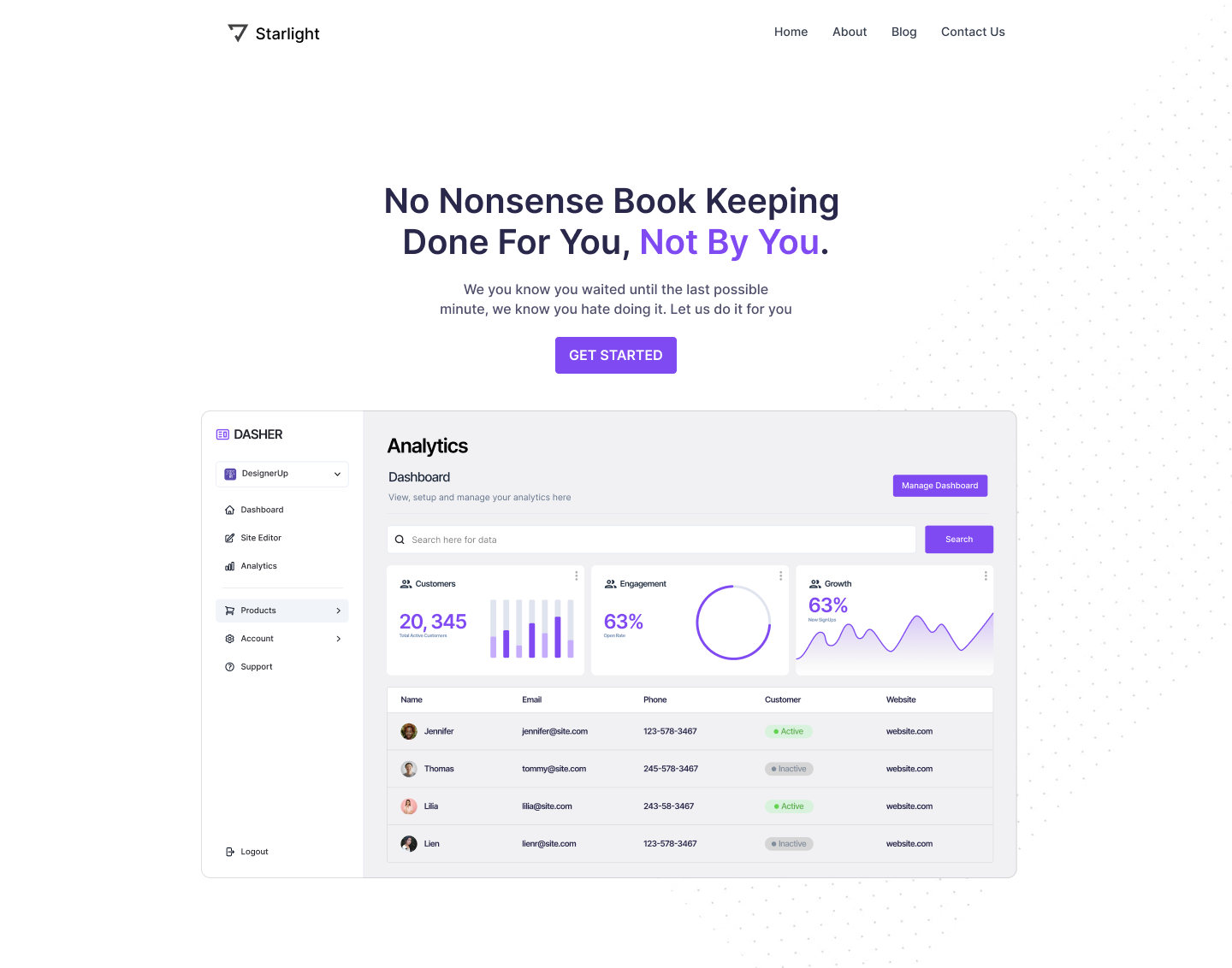
Starting off with the isolated components hero. We'll take the same base design, but rather than having just one screenshot in the middle with some text and a CTA button above it, what we're going to do is pull out certain parts of this that are important or interesting or features that we want to highlight.

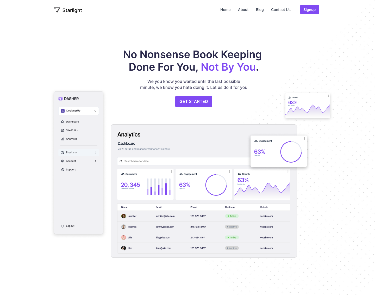
This is an example screenshot that I've assembled from a UI dashboard design I recently did for a SaaS app. I'm gonna change the design a little bit and separate out these components because we want each element to stand on its own.

Follow these steps to create an Isolated Component Hero Layout
- Remove auto layout from the UI dashboard so that you can freely move around components
- Decide which elements are most important to prioritize and showcase the benefits 0f the product
- Arrange them in an overlapping way (scale down elements that are too large)
- Add drop shadows to overlapping components to create elevation and separation
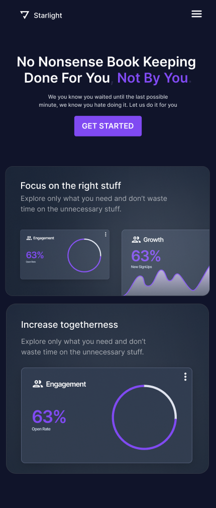
Isolated Component Hero Layout Mobile
For a design like this, rather than responsive design, I would consider using adaptive design instead. What the difference?
With responsive design, what you're really doing is just scaling everything down to and stacking elements to fit into smaller and smaller breakpoints on different devices, You're not really changing or moving or adding anything.
But with adaptive design, you can completely change or significantly alter the designs that you serve to the different breakpoints.
So when you have a lot going on like this, you might want to completely remove some elements or move certain things around which you can't do with responsive design.
We want this to adapt to that new breakpoint or screen size.
So for this, I might get rid of that growth card and just have these three here.
This is one way that we can layer and stack things up in mobile.
- Decide if you want the design to be responsive or adaptive
- Consider a mobile-first approach to reduce the number of elements
- Design your breakpoints as needed
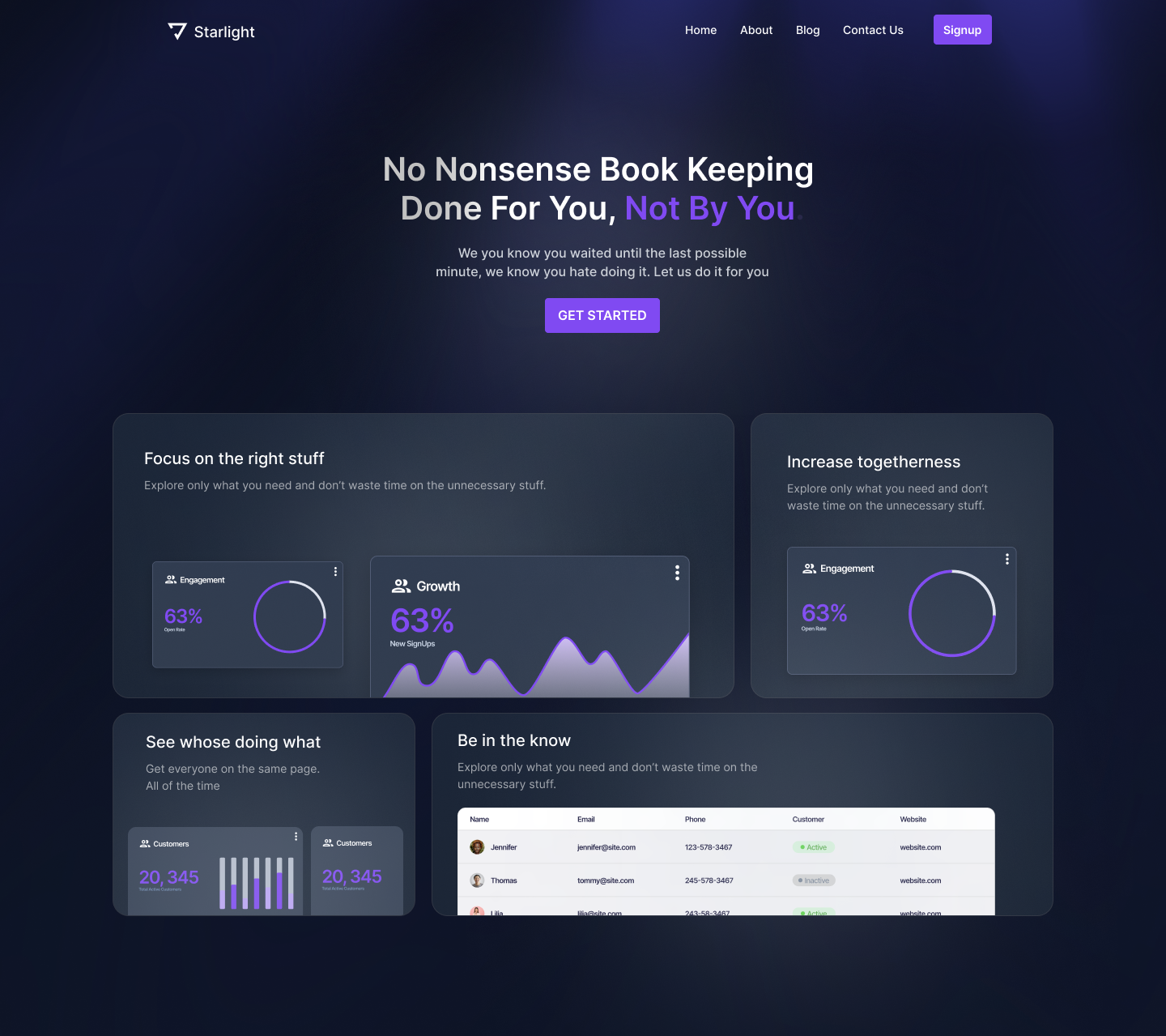
2. Bento Hero Layout
Moving onto the Bento Hero Layout. How can we create something like this from our base design?

First I'm going to the components that I've isolated and I'm going to move them off of the canvas for now.
I also want to convert this to a dark design by inverting these colors and giving us more of that linear style look.
I'm going to create my Bento grid layout by out three drawing boxes and then placing them in an auto layout frame with a horizontal direction and let's put a stroke on them so we can see them. I'm also going to add 20 pixels of gutter between them.
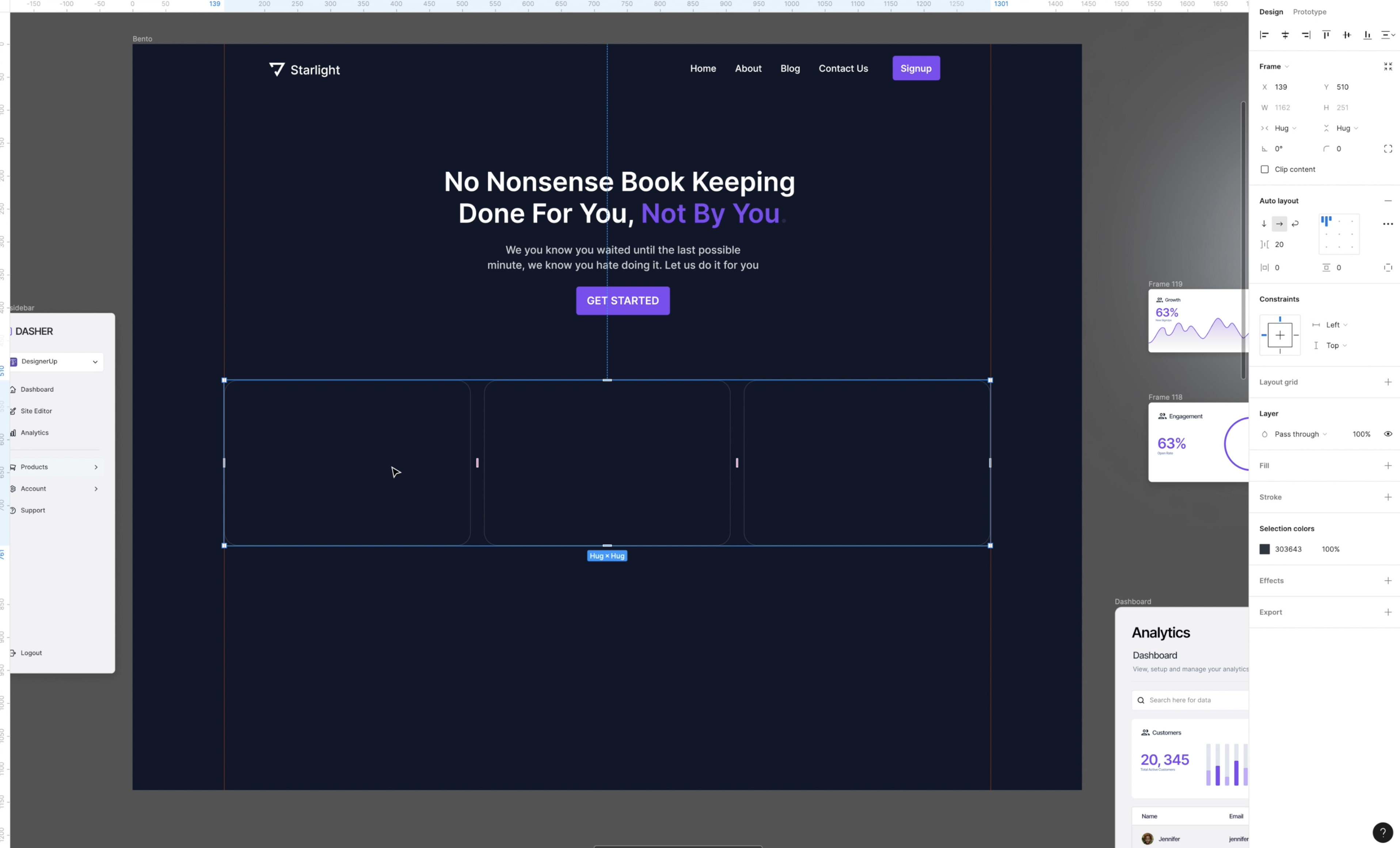
I want one of these boxes to take up two columns and the other to take up one. So I'm going to delete this third box or at least hide it.
And then I'm gonna drag the first one out to fill that remaining space. So we have something like this and then I'm gonna duplicate this layout so that we have two rows and switch the columns so they are alternating
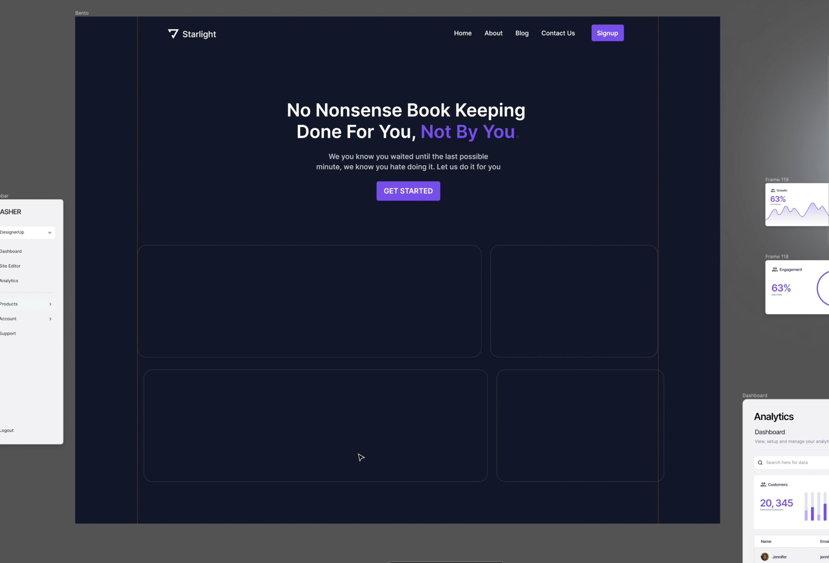
You can just get creative with this, and try out a couple of different Bento grid layouts with empty cards to get a feel for what you want to prioritize and how you want to handle the hierarchy.
Each Bento box is meant to act like its own little contained ecosystem of information and give the user a 'choose your own journey' type of experience.
So imagine that each box is like a little hero and it's all about that one feature or benefit that you want to call out.
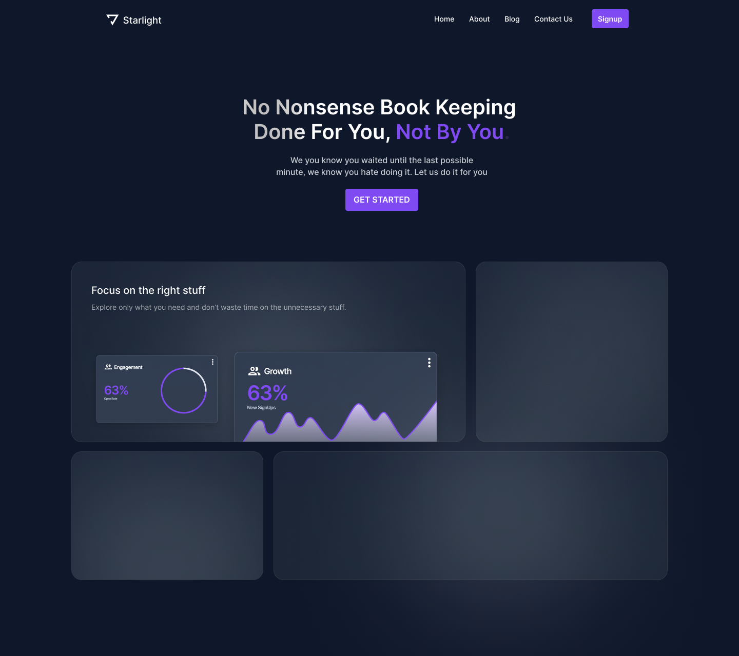
Follow these steps to create a dark design Bento Hero Layout
- Add a headline and a subheading and then maybe a graphic to each bento box/card (I've just taken these same components from the isolated hero design and inverted the colors and dragged them in here).
- Make the background color of the boxes a little lighter than the page background and add a stroke around each box
- Add a linear background gradient to each box
- Add a spotlight behind the text of each box
You can see the difference when it's flat and when it has a little bit of gradient, it gives it more depth.
And that's the little secret trick to doing dark design in general and doing these Bento cards is that each one needs to be very rich in detail.
And now we're going to use that same style and just add some more content to each of these boxes.
Now there's something else that I want to add to this and it's a really popular trend right now and it's a graphic element that designers are calling 'God Rays'.
But rather than doing this painstakingly by hand, we're going to use a great little plugin created by Rogie King called Noise and Texture.
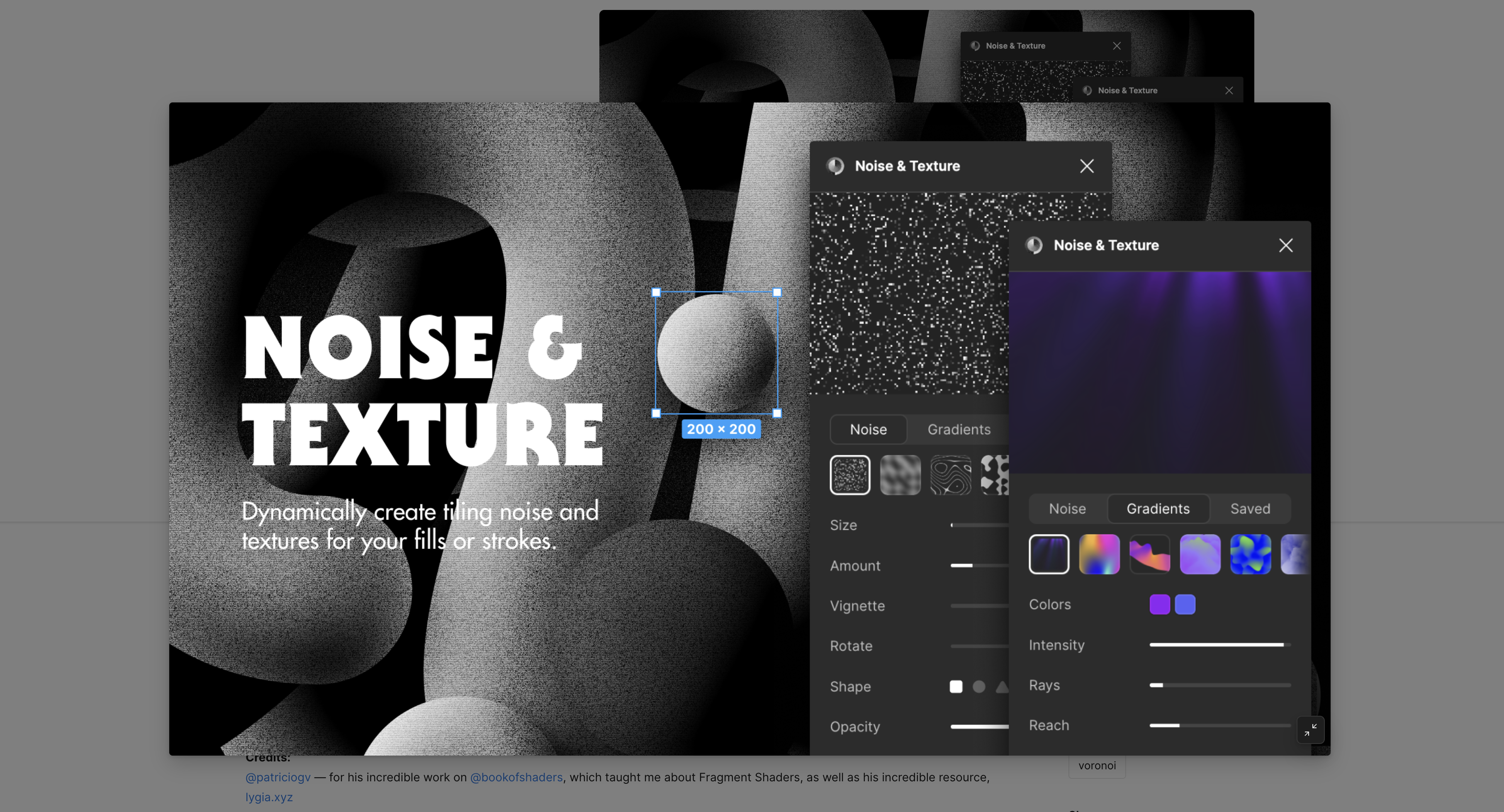
We are going to click on Animated > God Rays and then we can mess around with the intensity of these. We can change how many rays there are and just have a few coming down from the top.
And it's just that beautiful touch that we're looking for.
These are the little things that make this style so much more interesting than just flat design.
It's layering different light and shadows and strokes and textures. And you can just keep adding more and more details.
Just be patient, take your time, and focus on all of the fine details of every single element.
Bento Hero Layout Mobile
Now looking at the mobile version of this, I am again, just going to scale everything down and stack it.
So these Bento cards are now all going to be the same width and they're just going to stack on each other and we can use the vertical space to create more room where we need to.
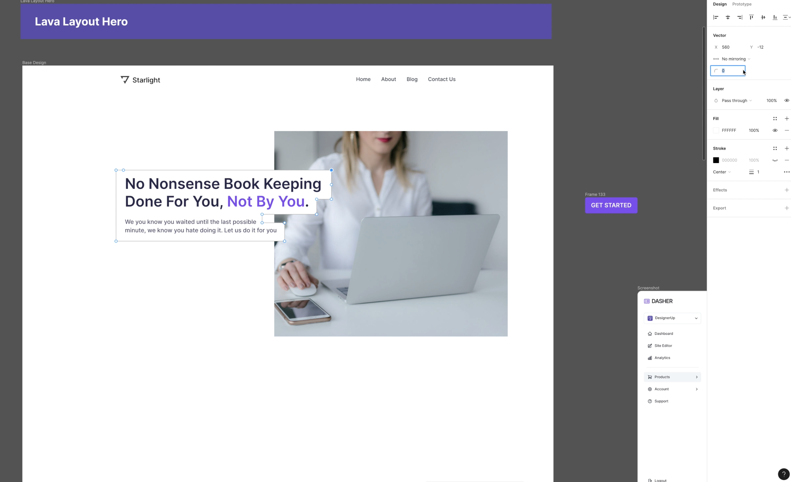
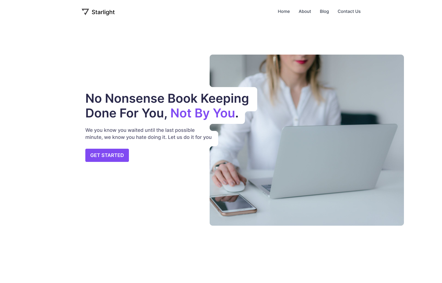
3. Lava Hero Layout
Next, we have the lava layout hero starting again with the base design.

And then I'm going to go ahead and remove some of these components again and just place them off to the side. I'm gonna remove auto layout and then slide everything over left align that as well.
And I'm going to grab a square instead of a frame because I'm eventually going to flatten this image.
Then I'm gonna use the Pexels Figma Plugin to add a stock image of someone at a computer with a similar color palette.
Now, I'm going to take my pen tool and freehand draw a shape to create the contours that I want around this text.
I'm holding down shift as I do this so that my lines are nice and straight and I can just follow it around like this, next I'm going to add a fill that's the same color as the page background in this case, white.
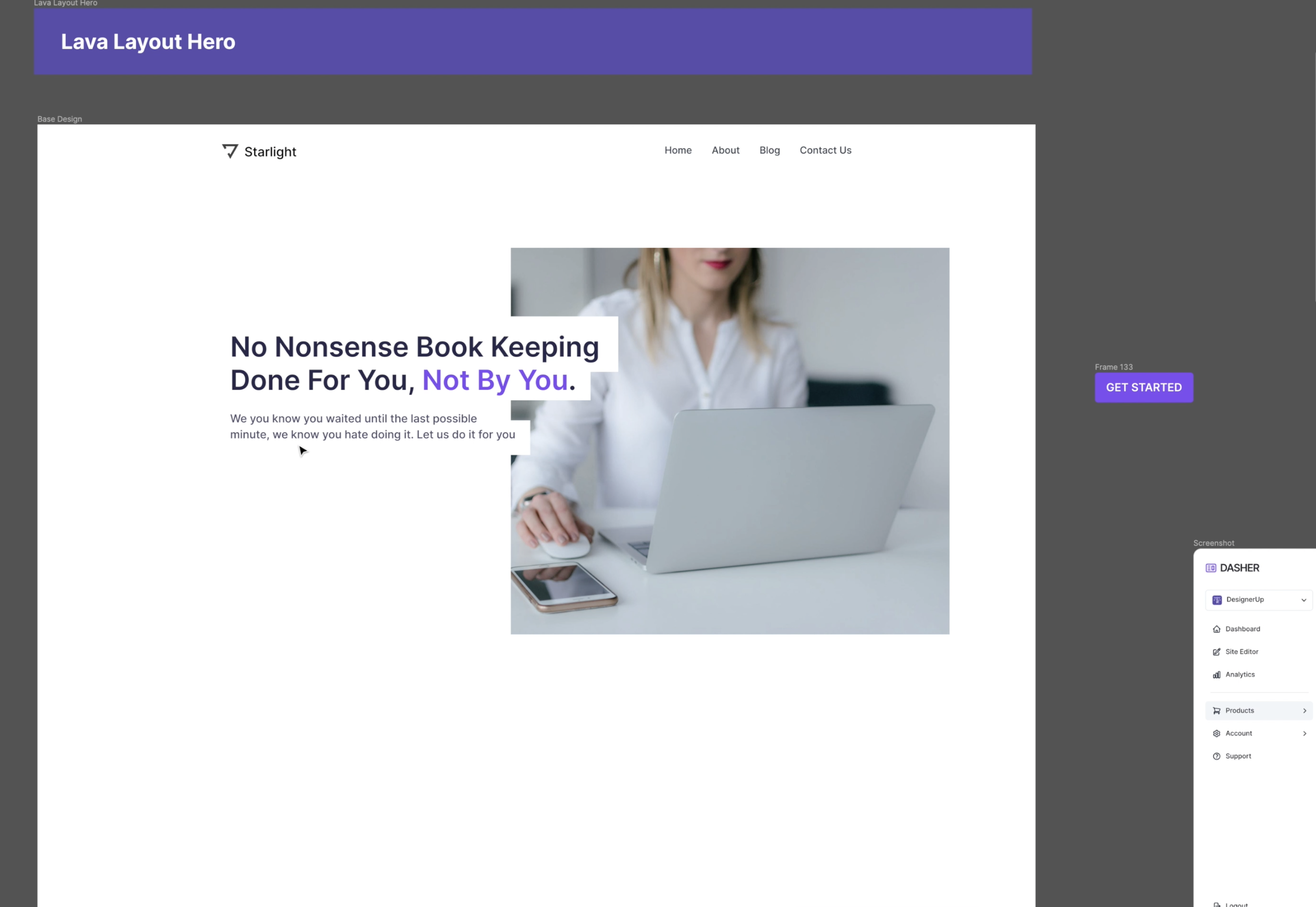
To make corners smooth and rounded, I'm going to need to select all of them by hitting enter on the vector shape to make it editable then holding down shift and clicking on each one of these little dots until they turn blue and then I'm going to change the corner radius in the vector attributes to 10 pixels.
Now, everything's nice and round and you might think that you're finished.
But to make this look professional is you also need to round the corners of the image to match the contours of the text.
So we're going to do that by taking this vector that we've created that goes behind the text, duplicate and subtract selection from the image so that now these two are together and the vector cuts out the shape from the image.
Now, all we have to do is flatten than later so that we can edit those points and make those smooth rounded corner contours match. We can also add our button back in here.
Follow these steps to create a Lava Layout Hero
- Add your text
- Create a vector shape behind the text by outlining the contours of the text
- Select all of the points on your vector and change the radius to round them.
- Place this over an image
- Duplicate the vector shape and group it with the image and use 'subtract' to cut the vector shape out of the image
- Flatten the image and edit the vector to adjust the sharp edges to match the radius of the vector behind the text.
A note on implementation
If you are coding this, you can use padding behind this inline text and then position absolute over this image.
But what you'll notice is going to happen is that when you position this text with the padding and the background color over it it doesn't create the perfectly rounded contours in the image.
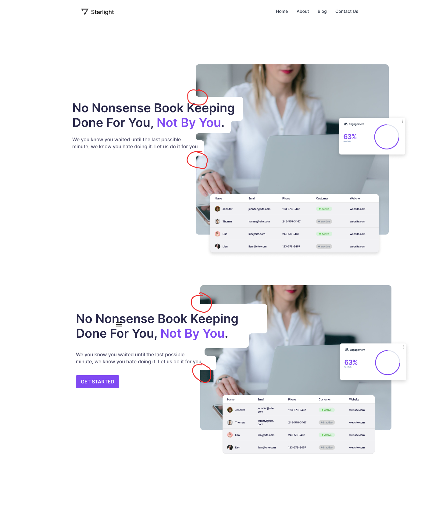
Do you see this subtle difference where the edges at the bottom are sharp and not rounded?
That's because we're not actually cutting this shape out of this image.
So one way to do that is to leave it as is to give us the ability to change the length of the text over the image if we need to and move the text block around. But we will have to compromise and have these sharp edges.
If that bothers you and you want it to perfectly match the contours, then what you'll need to do is cut this SVG vector shape out of this image and then when you're coding it, apply a CSS image mask. An SVG mask will allow you to follow this exact shape and contours of the text but the downside of that is that every time you want to change this text or resize it, you're going to have to recreate this image and reupload it again to your website.
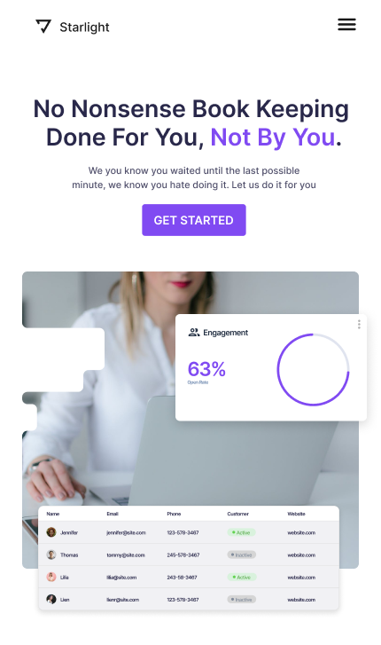
So those are two ways to do it and something to keep in mind when looking at the mobile version of lava layout, we're going to want to adapt this to this screen size.
Lava Hero Layout Mobile
4. Callout Hero Layout
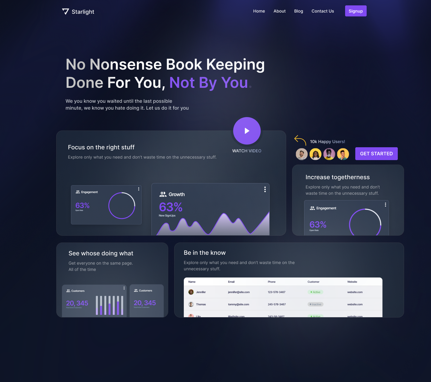
Next up, we have the Callout Hero. I'm going to use our dark design from earlier as our starting point. I'm going to make the headline a bit larger and I'm going to left align everything.
I also need to make some room here for different call-out elements, so the first thing I'm gonna do is reduce the height of this second bento box.
Then I'm going to grab our button and I'm going to align it right above the small box as one of my call-out components.
I always think some social proof would be helpful here, so I'm going to grab my ellipse tool and quickly draw out four circles. I will put them in an auto layout frame that goes horizontally with six pixels of spacing in between. Then I'm going to use a plugin called Content Reel to fill them all in with fictional avatars. I'm also going to add an arrow here and I'm going to use a plugin called Iconify, which is great for finding icons and shapes and I'll use this hand-drawn style.
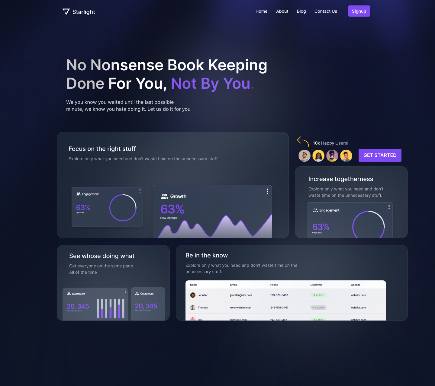
I'm going to add a little description text here and then I'm I'll add the same linear gradient over that text to give it a little bit of dimension.
It's really up to you what callout elements you want to add based on your user research and what you want the viewer to focus on and interact with most on your website.

For example, if you have a walkthrough video you could add a button for that. You can continue to add different elements, components, and layers to this to create an interesting and unique layout.
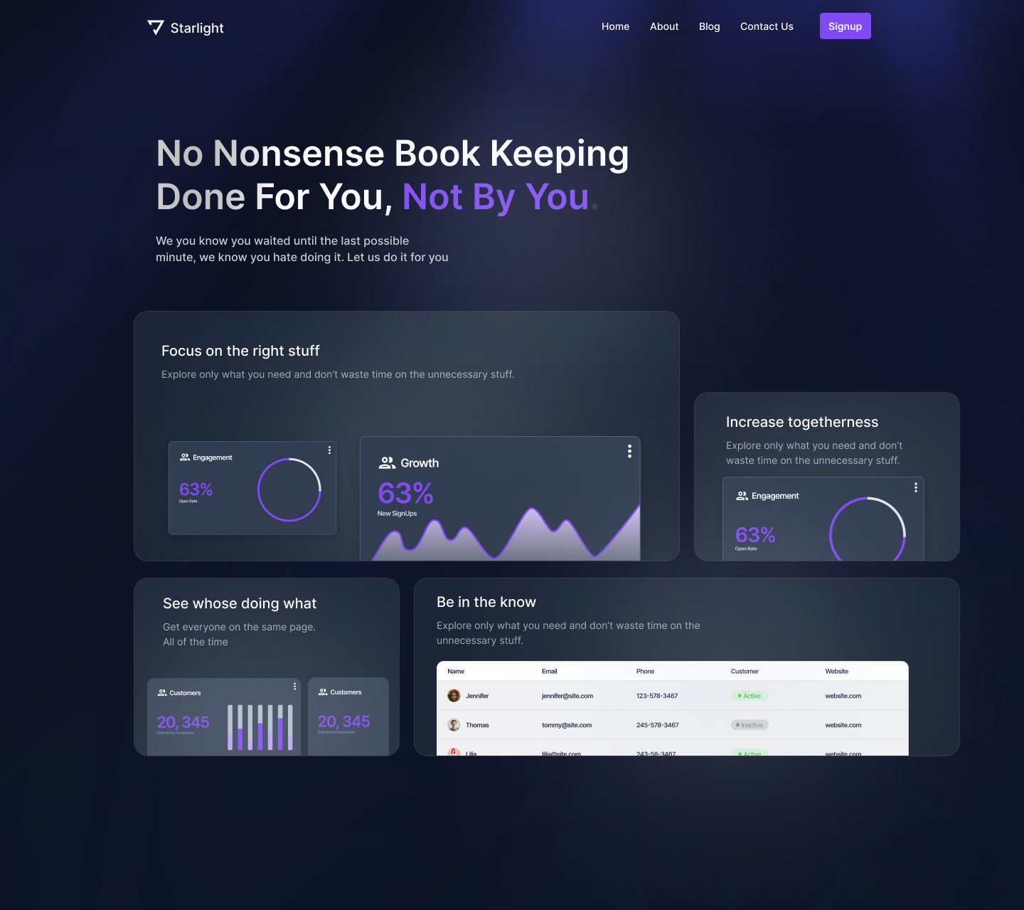
Callout Hero Layout Mobile
Looking at the responsive or adaptive version of our Callout hero. You don't always have to display all of the same elements and you can reorder them when you do this in an adaptive way.
Here I've removed the social proof and realigned some elements.
Follow these steps to create a Callout Hero Layout
- Combine the Bento Layout with the Isolated Callout Layout
- Position important, interaction elements to be featured prominently
- Simplify the design for an adaptive mobile layout
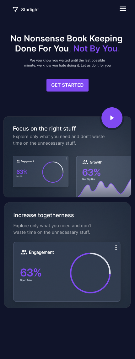
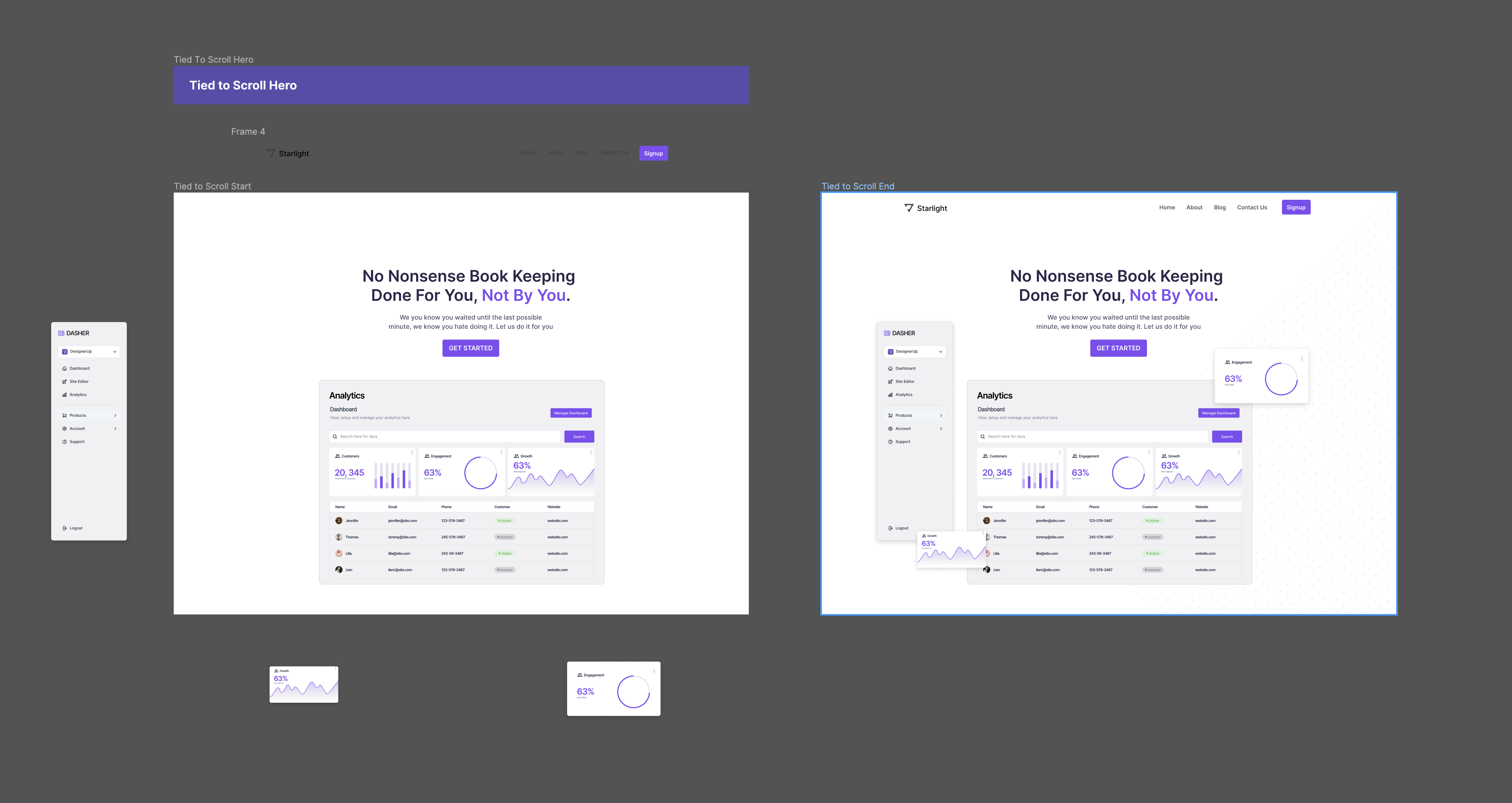
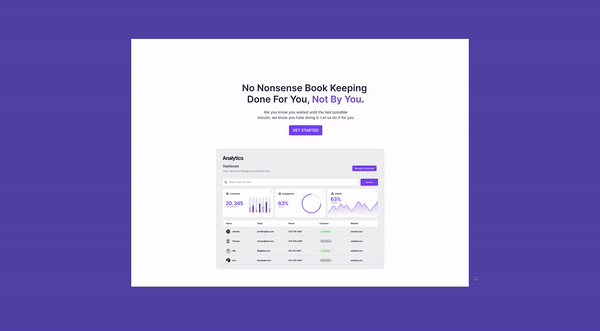
5. Tied To Scroll Hero
The Tied to Scroll hero is more of an interaction animation trend and you can apply this to any of the other trends that we've covered.
I'm going to use the isolated hero components layout as the starting point for this one.
To achieve this, we're going to create a prototype. First, we'll need to duplicate this final screen because this is what it's going to look like in the end.
Then we'll want to break apart the components of the starting screen.
Since there isn't a mouse scrolling action that we can use in the prototype, I'm just going to use a mouse hover to imitate this action. I'm going to click on that first frame, add a flow, then I'm going to connect the dots between the two main frames. And then instead of onclick, I'm going to switch this to while hovering and it's going to go to the end screen. I want it to Smart animate and I want it to ease out and I'm going to do about 1,000 milliseconds here.
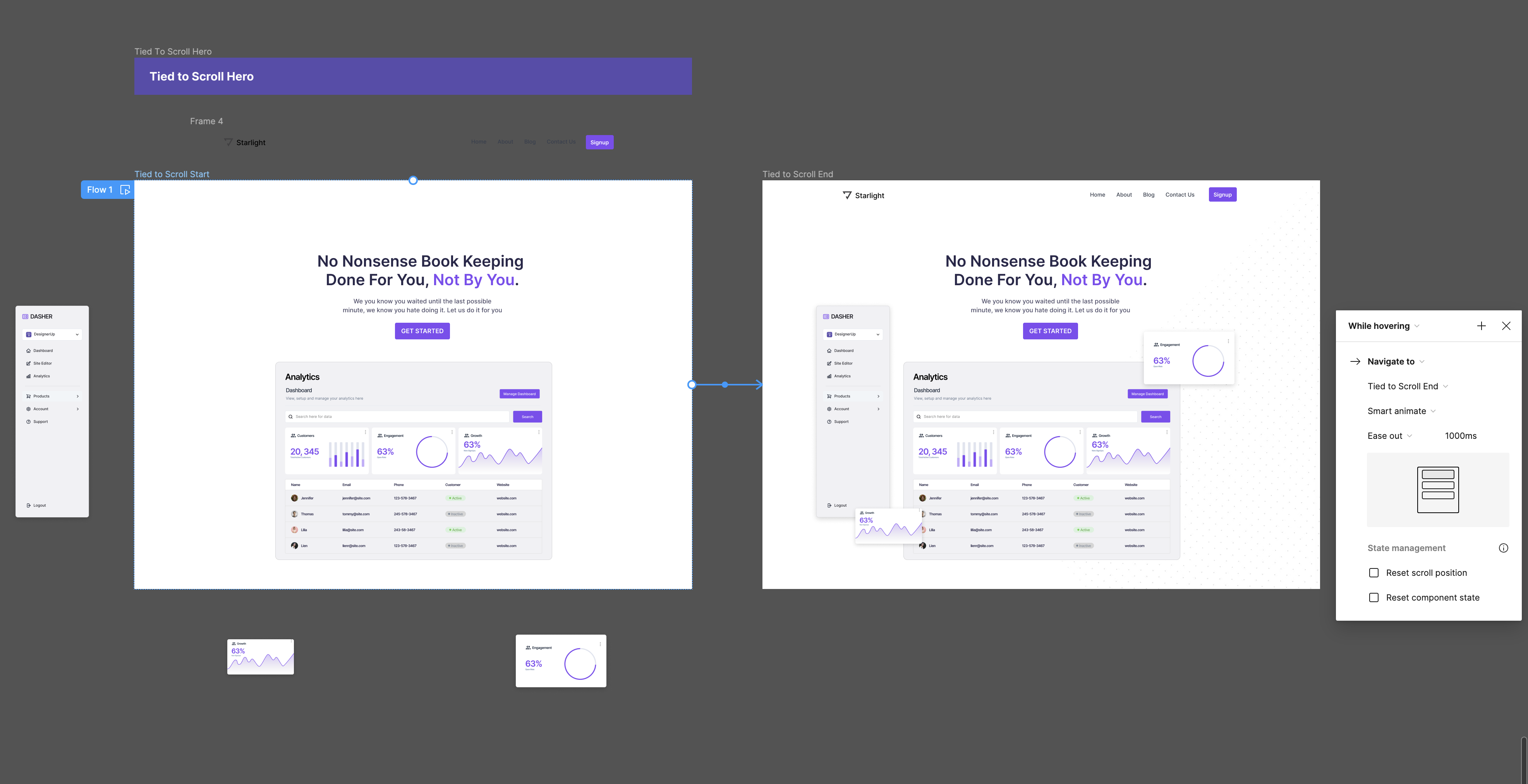
and there you have it, a very cool tied-to-scroll animation hero!
Want to learn more about these trends? Read this article next!
 DesignerUp