
There are a lot of internet-enabled devices to consider when we're designing websites and software applications. Most of us are familiar with the term 'responsive design' as an approach to making sure that our websites and apps can be accessed across these different devices. But responsive design isn't the only way to serve up your website or app and it doesn't always work for everything- especially for the more complex web layouts and trends that we're seeing today. That's where 'adaptive design' comes in and why you might want to consider it for your next web design project.
The Main Difference Between Responsive and Adaptive Design
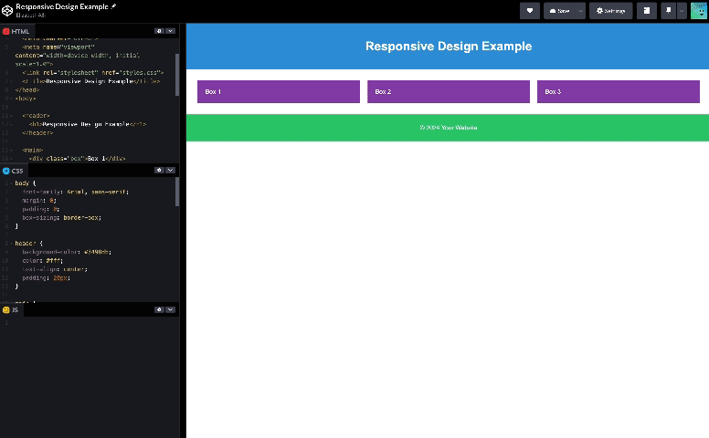
Responsive Design
With responsive design, we are designing one single layout that will be served to all of the different possible devices that our website might be viewed on. Then, using CSS code called 'media queries' we can define certain breakpoints (usually a standard 6 different sizes that your browser size might be) to ensure that certain UI elements stack or scale in order to fit within the available space of that device or browser's viewport. So you will see the same content and UI elements whether you are on mobile or desktop (with a few slight positioning adjustments or collapsed elements).
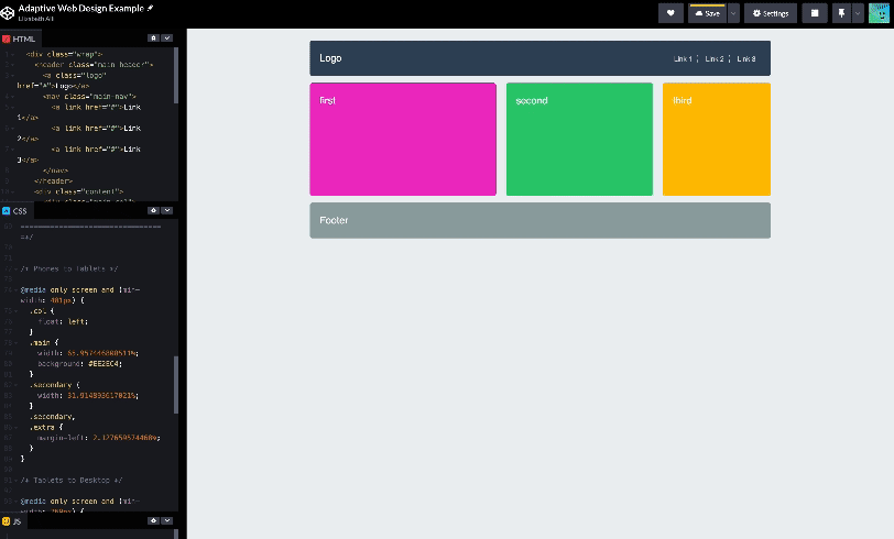
Adaptive Design
In contrast, adaptive design involves creating specific, predefined layouts and templates for each device is being served. For instance, a news website using an adaptive design approach might have one homepage template for desktop users, another for tablets, and a totally different template design for smartphones. Each template layout could be very different and allows you to add, remove or show totally different UI elements depending on the device it's being accessed on. This approach takes a lot more work and code but provides far more control over the UI that is being shown on the device for a more tailored experience.
Which to use when?
The question arises: why choose an adaptive approach over a responsive one? Especially when adaptive design seems so labor intensive? Well, that depends on the context of the project.
Adaptive design is usually more suited to complex software and native web applications. Such as iOS apps, Android apps, and Desktop apps. Garageband, Notion, YouTube and Facebook for example employ adaptive design to deliver specific experiences depending on the device you install it on, you may even notice that some functionality is different or unavailable on certain platforms. You might also see this in web design in cases where there are very complex website layouts, graphics or animations that you want to completely change, scale back or remove when viewed on mobile browsers.
Another scenario where adaptive design really excels is in retrofitting existing sites to make them more suitable for mobile viewing. We've all seen them, those old, large news sites or web portals that are mainly accessed through a web browser. Try to use them on mobile and they don't load properly or this lovely, bonus side-scroll effect. Updating that would require redesigning and recoding the entire website to make it responsive, so instead you could choose an adaptive approach and design an entirely new and appropriately simplified version of the site that is only served to users that are accessing it on their mobile devices without having to touch the main website. In that case it's actually a lot less work than redoing an entire website or application.
Overall Comparison
Here's a quick list to help you decide which one might be best for your project.
Adaptive Design Use Caes
The adaptive design approach gives designers and developers more granular control over what's being shown and how on specific devices.
- Better for complex sites
- Great for native software and platform-specific applications
- Usually, more code required
- Often more maintenance required
- Can be economical for older websites that need to be brought up to current standards and best practices
Responsive Design Use Cases
The responsive design approach allows designers and developers to ensure that no matter what device or browser a user is on their site will load and be viewable without the need for creating multiple layouts or versions.
- Most simple websites and browser-based apps today are designed with a responsive approach
- Most useful when flexibility is prioritized over platform-specific optimization
- For newer sites, it will usually involve less code and less maintenance
- Not as useful for complex designs or interactions that need to change significantly on certain devices or screen sizes
So hopefully now you know that you have options to deliver the best experience to your users no matter what device they're using.
Want some 1:1 with all this web and UX/UI design stuff then consider joining our course where we break down complex concepts like these and get you into the habit of creating great designs through strong research and strategy.

A Note on Fluid Design
One last note, you may have also heard of fluid design, this is really just a subset of responsive design in terms how a responsive design is implemented and what happens when you drag and scale to resize your browser in real-time. With responsive design we are using pixel values to determine the breakpoints, whereas with fluid design we are using ratios of percentages in relation to other UI elements to determine what happens 'in-between' the defined breakpoints. This just helps use utilize math a little more to allow the browser to determine how things should scale rather than us defining it by pixel.