If you're thinking of creating a design system for you or your team, Notion can be an incredibly simple, yet powerful option. You can create something entirely custom and even connect the other parts of your design process and tools such as Figma or Github to simplify and supercharge your entire workflow.
What is a Design System?
In a nutshell, a design system is a collection of documents, articles, examples, code snippets, screenshots, design guidelines, design patterns, components, philosophies and other digital assets for a digital product. It’s usually hosted online on a platform or self-hosted website (public or internal). Think of it as a collaborative environment with everything you need to design, build and market a product consistently and systematically all rolled into one place.

Why Use a Design System?
A design system can be used by a team of one or a team of many. Creating one can help you make decisions more quickly and execute on tasks that are repetitive more easily. Like a lego set with a manual, anyone can use its premade constituent pieces and follow its instructions to create different combinations and larger parts that have a consistent look and feel with minimal effort and confusion, or at least, that’s the goal.
Why use Notion to Create a Design System?
Design systems often have many interlinking parts. You may have the visual and UI design assets in your design tool like Figma or Sketch, you may have code on GitHub and you may have a separate project management system. What Notion allows you to do is create a central, knowledge-base type website (that can be either internal and private or external and public) and store everything in one place. You can also tie together any external tools or resource you may already be using without having to move everything into Notion. I do this through a combination of Notion databases, Embeds and Swipe files.
How to set up a design system in Notion
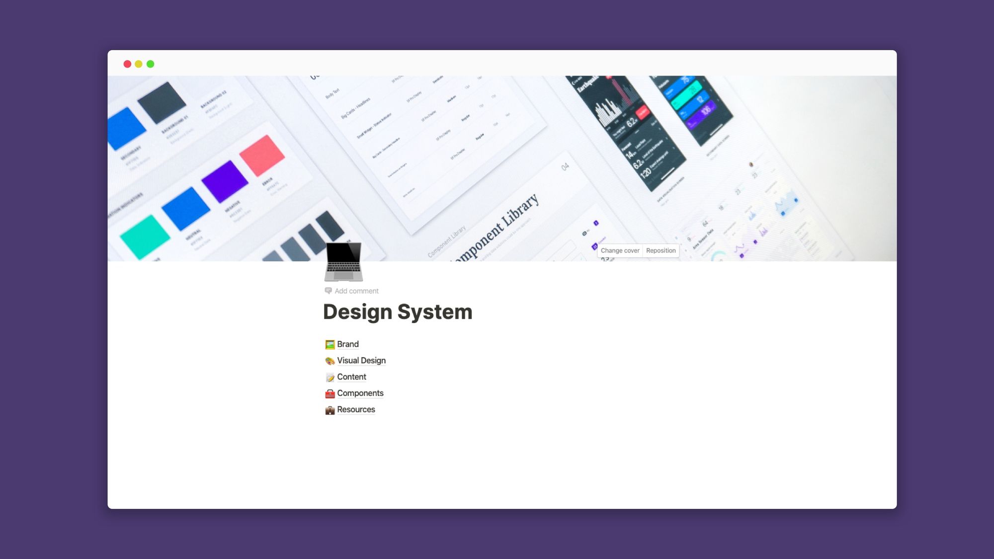
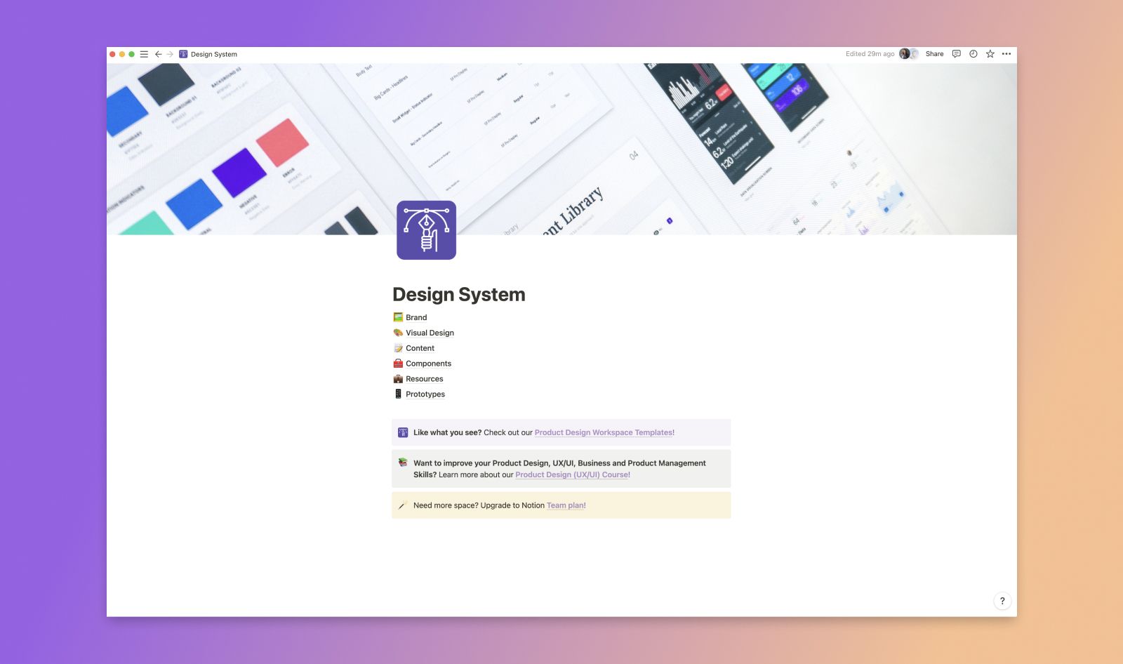
I usually start with a basic foundation of 6 sections.
🖼 Brand
🎨 Visual Design
📝 Content
🧰 Components
💼 Resources
📱Prototypes
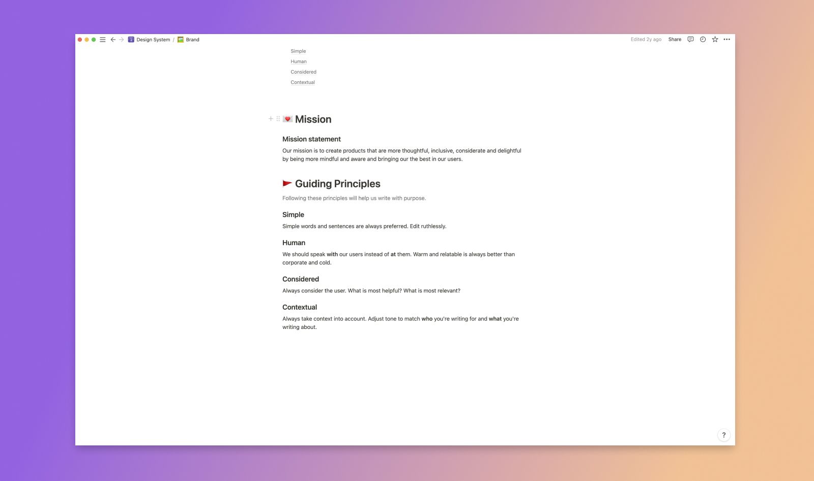
1. Brand Section
In the brand section of my design system, I usually include things like the product logo, value proposition, elevator pitch or slogan. This could also include higher-level things like a mission statement, guiding principles etc.
2. Visual Design Section
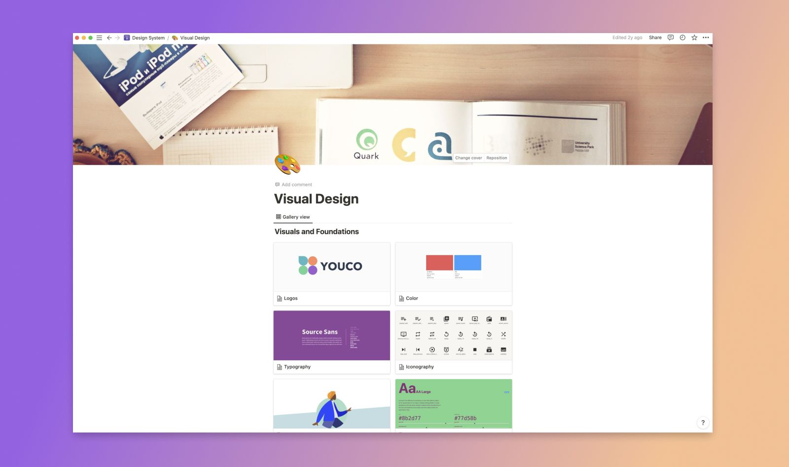
Here, I usually choose a Gallery Database View to create a page for each section of my visual design assets. This could be logo files, font files and guidelines, grid systems, iconography and any other digital media assets that others might need and best practices for how things should look.
3. Content Section
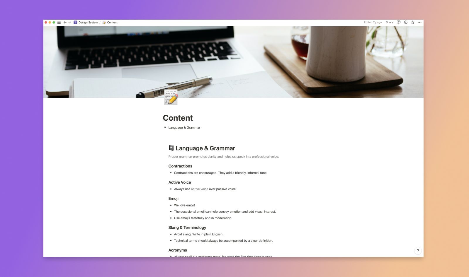
The content section of my design system usually details things regarding tone, language, UX writing and UI messaging guidelines. The intention here is that anyone representing your product can use these guidelines to speak about it in a consistent way that aligns with your product's brand voice.
4. Components Section
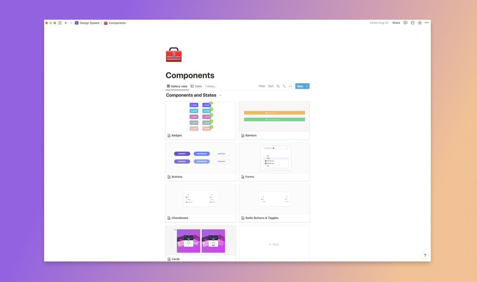
This is usually the most robust section of my design system in that it houses both atomic UI elements (such as banners, tables, checkboxes etc) as well as instructions for behaviors and implementation. I often embed interactive designs and prototypes from Figma directly into Notion here. Devs can also embed code snippets and everyone can leave comments and have discussions right inside the page. It's really a brilliant and easy way to collaborate and keep things organized in one central place. You can also create multiple database views with more advanced database relations (such as a Kanban-style board view) that include things like tags and progress bars so that I can keep track of task progress and collaborators. That's the power of Notion!
5. Resources Section
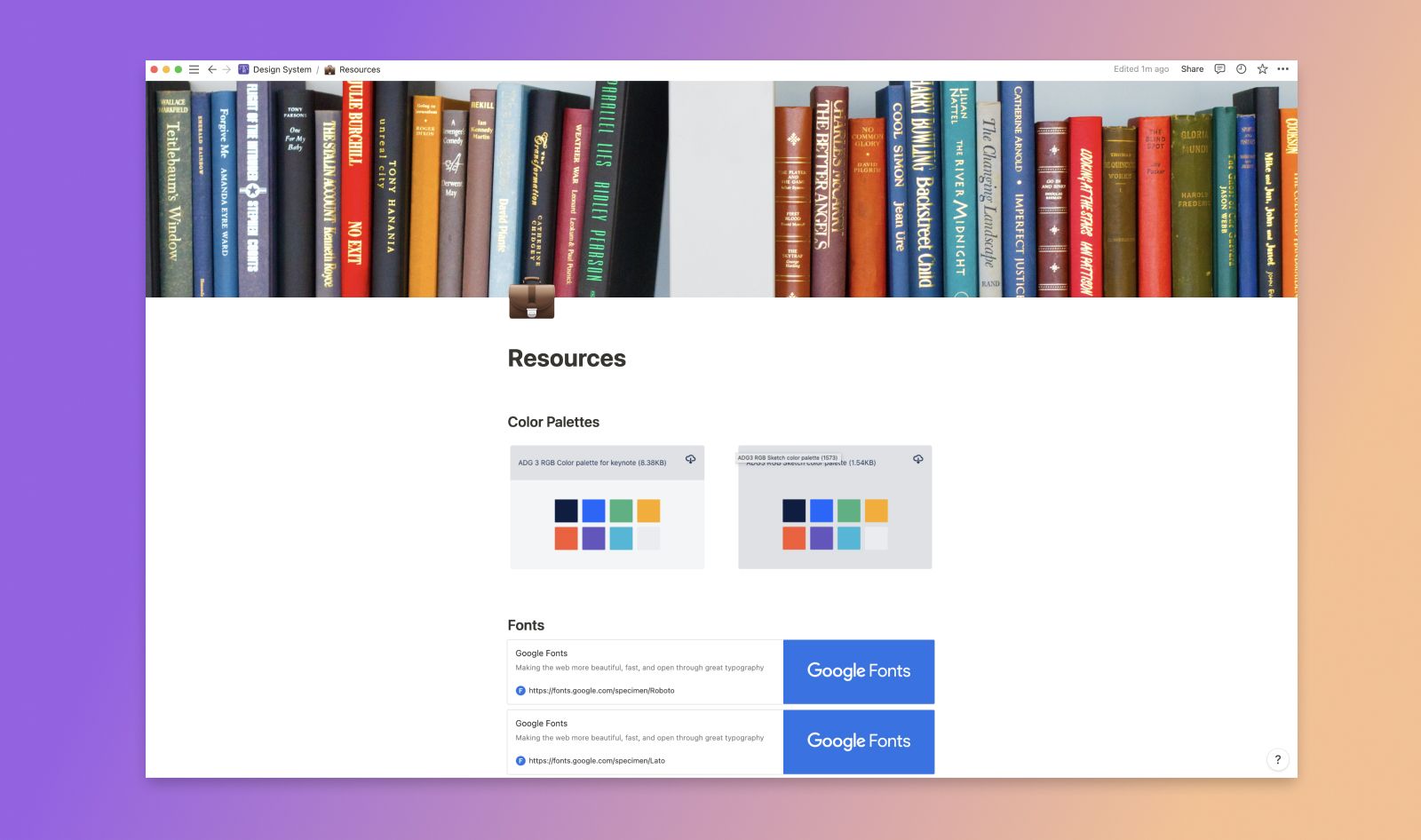
This is the area of the design system where I will add bookmarks or external tools, resources or articles that I want to refer back to or share with my team so that we can discuss them or use them as a reference.
6. Prototypes Section
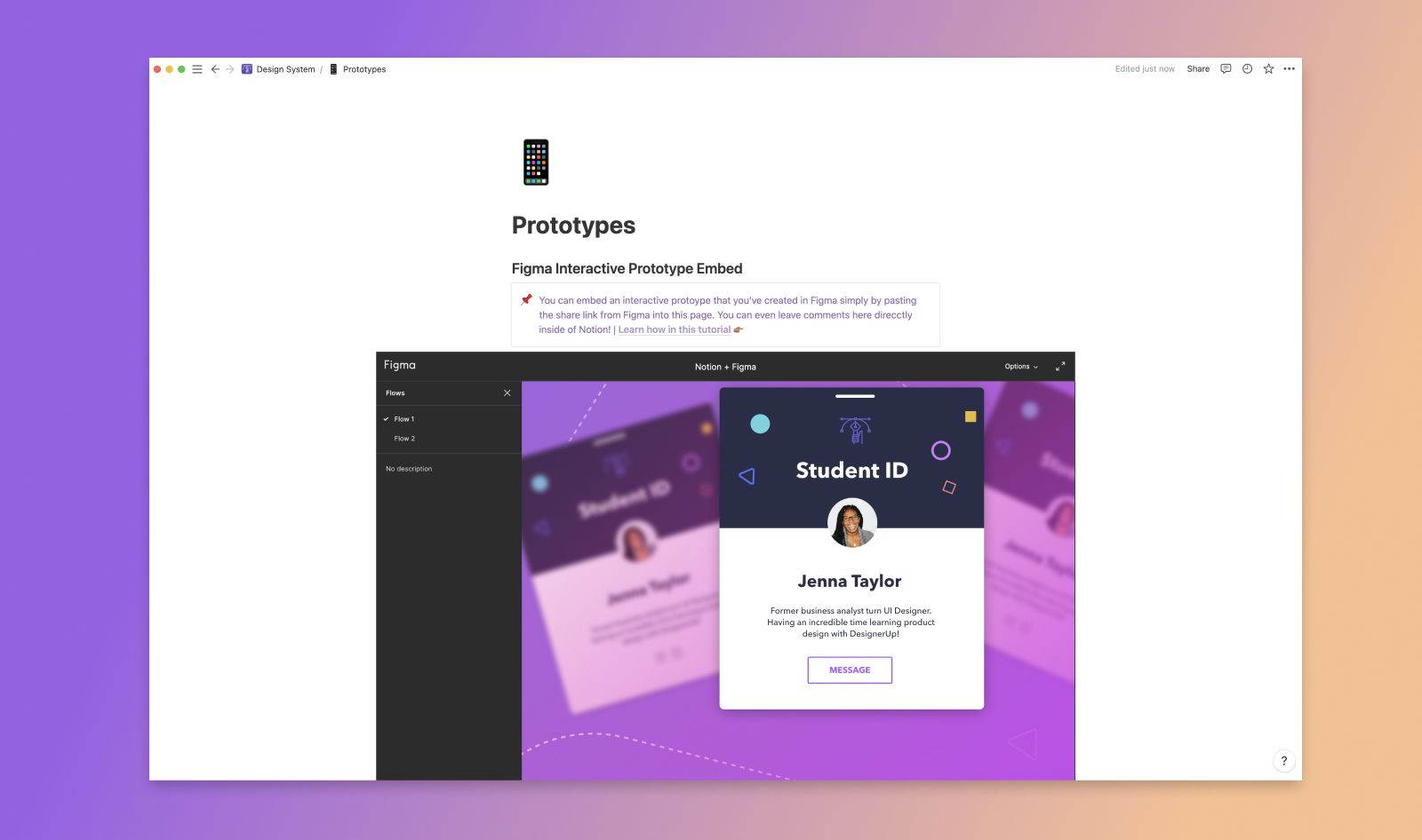
There is where I can embed any number of prototypes whether they are low-fidelity experiences and ideations or final high-fidelity screen flows. Again using this method to embed Figma prototypes into Notion.
Creating Your Own Design System
Another great reason to use Notion is that allows for flexibility of setting permissions for who can do what within the design system. For example, you may have some members of your team that need read-only access (such as a new member of your marketing team) and others that need full read and edit access )such as product designers and developers) and you can do this on a per-page or per-section basis.
There are generally two design system collaboration models:
Centralized model - Assigning a single team or team member permission to edit update and maintain the system. This configuration is a hierarchy in which the contributors are required to get approval from the Design Systems team before committing changes or making updates to the system.
Distributed model - Giving access to several members or several teams. Allowing everyone to be more hands-on and involved in the creation and maintenance of the design system.
It's up to you and your team to discuss the structure and the rules that are best suited to the way you work as you embark on the creation of the system.
Examples of Great Design Systems
These are just some of the common parts and ways you can structure your design system. For reference, I highly recommend checking out this in-depth guide that walks through some of the best design systems created by top product companies in the world and the why and how behind them.
