My search for mindful design continues in Las Vegas. But if LA is the city of angels, then Vegas is the city of demons. Here's why Vegas is designed the way it is and how it fit into my search for mindful design.
To see the start of my journey, check out Part I here.
"Jem! Wake up! We're here!"
I groggily leaned out of the makeshift pillow I had jammed behind my head and looked around. Nothing. Massaging a crick in my neck, I turned to my Dad.
"What do you mean 'here'? Are we in Boston already?"
My Dad turned to me with a gleam in his eye. "No, anak. Welcome to Las Vegas!"
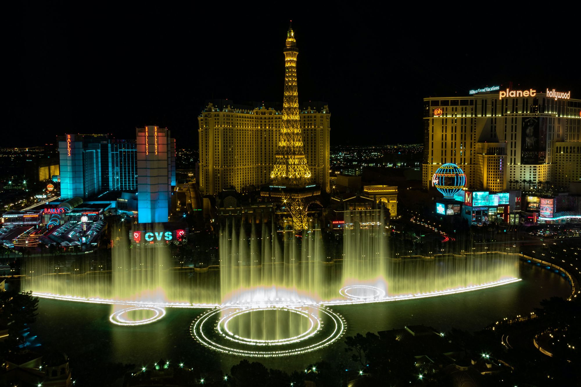
As if on cue, the world outside the car burst into a vivid explosion of neon colors and lights. Everywhere I turned, I spotted glowing tourist attractions and flashing strobes, all vying for my attention. One second, we passed an incandescent Eiffel Tower replica laced with golden bulbs and burning spotlights. The next, we drove past a beamingly-purple Ferris Wheel surrounded by bedazzled hotels and gleaming street corner gift shops.

And as I swiveled my head to try and take in every flash, flicker, and dazzling light, I remember catching a glimpse of the Replica Statue of Liberty in our car's rear-view mirror. Lit up by the chaotic night life along her strip, she brandished a torch in her right hand; in her left, she held a tablet commemorating the Declaration of Independence. Watching the statue slowly disappear behind the other million lights dancing around me, I couldn't help but imagine Lady Liberty as a clerk, smiling and signing us into her casino with a guestbook in hand.

If Los Angeles is the city of angels, then Vegas is the city of demons.
"What happens in Vegas, stays in Vegas," my Dad said, looking out across the glowing buildings. "You ever heard that before, anak?"
I had.
Known worldwide as 'Sin City', Las Vegas is home to dozens of major resorts, accompanying casinos, and some of the most notorious nightlife in the continental United States.
In other words, Vegas could not be any more different from my quiet, homeschooled upbringing in suburban California.
So, naturally, I took strong interest in the hustle-and-bustle across the strip. As our car weaved in and out of traffic, I allowed myself to sink into the sensation of being in Vegas. Bright lights. Ringing bells. Echoing laughter and groans of disbelief.
But, in a city so full of activity and life just like Los Angeles, I still felt firmly out of place. Why didn't I feel the same connection with Vegas that I felt with my hometown metropolis in California?
Really, it comes down to three things about Vegas' design:
- While Las Vegas is bright, shiny, and alluring, its outward appearance hides a darker, more sinister reality — the city capitalizes on your attention. Every neon light, flashing announcement, and 24/7 sign is designed to grab your attention and seduce you (and your wallet!) into a mindless game of slots.
In a way, this is no different from the modern-day dilemma of social media and the market for human attention, a topic that Elizabeth Alli and I discuss in detail on the DesignerUp podcast! - Vegas also showed me how much I value transparency in interactive experiences, especially given how data-driven and addicting modern user experiences are made to be.
- And, finally, I realized that brighter... isn't always better. It's true — Vegas' lights were visually stunning. But they were also overwhelming and migraine-inducing. My eyes couldn't focus and I was looking at both everything and nothing at the same time!
Luckily, we didn't spend too much time in Vegas. In fact, at my Mom's request, we booked a room at a small motel just outside the city, away from the flashing lights and screaming neon.
Two cities into my cross-country journey to Boston and I had already seen the highest of highs and lowest of lows. On one hand, LA was a city that I could call home. It was moving, bohemian, steeped in culture and it truly represented me.
On the other hand, I met Las Vegas, where the never-ending lights, bells, and whistles made me feel like I was stuck in the world's largest gift shop. Every turn brought me face-to-face with yet another something fighting to capture my attention, even for a split second.
Reflecting on the stark differences between LA and Vegas, it's become clear to me now that a mindful design isn't always the brightest or the flashiest. It's something that truly empathizes with its audience, rather than using its viewers as a means to an end.
I woke up the next morning as my Mom and Dad re-packed our cars for the next leg of the cross-country roadtrip. I took a glimpse at my notes for our next stop — Denver.
As I got up from bed, I realized that my head was still pulsing with the neon lights from the night before.
Sighing, I clicked through my notes and mentally checked Vegas off our cross-country list. Two cities down, five more to go.
