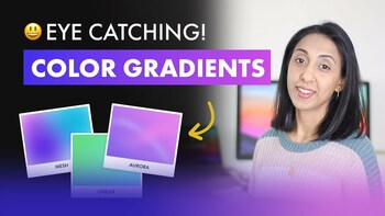
Super Practical Guide to Color Theory, Color Models and Perfect Color Palettes | UI Design
Maybe you’ve followed all the color harmony and color theory tutorials to a tee and generated a complementary color palette, but you notice that the colors don’t seem to match very well, perhaps they look harsh or a bit muddy and unprofessional and you don’t really know why. The part that's often missing is understanding tone, tint, shade and temperature What I discovered is that on digital screens, there is a formula and safe range of Saturation and Brightness that will result in a perfect palette for each category every time. In this super practical guide, I'll show you how to setup your design apps (Sketch or Figma) and create color palettes that match every single time. Using a few tricks and a few numbers.
🔗 Full article here
📘 Download the color formula cheatsheet for Figma and Sketch!
🔗 Full article here
📘 Download the color formula cheatsheet for Figma and Sketch!
Product Design Course
Go deeper in our full Product (UX/UI) Course and master the skills you need to become a great Product Designer!
Learn More →

